

Understanding Colors: How to Pick and Use Them
Imagine a world without colors. Everything would look like an old black-and-white movie. Not very exciting, right? Colors are like magic for our eyes. They can make us feel happy, calm, or excited. When you design something—a website, a poster, or even your room—the colors you choose matter a lot. They are the first thing people notice. They can even make someone decide to buy something or visit a website again.
This guide will walk you through everything about color palettes in a simple, clear way. We will look at how colors make us feel, the simple rules that make them work together, and the new color styles everyone is using this year. You'll also learn some expert tricks for picking and organizing your colors.
The Big Picture of Color Palettes
- Colors Speak a Feeling: Every color we see creates a feeling in us. This is called color psychology. For example, blue often makes us feel calm and trusting, which is why many banks and tech companies use it.
- Harmony Makes Things Pretty: Putting colors together in a pleasing way is called color harmony. Tools like the color wheel show us which colors look best side-by-side, such as complementary colors (opposites) or analogous colors (neighbors).
- The Year of Warmth and Technology: Two big trends are shaping how we use color. People are loving warm, cozy earth tones that feel like a welcoming hug. At the same time, futuristic, shimmery colors are popular for brands that want to look innovative.
- Plan Your Palette with Roles: Good color palettes are planned like a team. There's usually one main (primary) color, one or two supporting (secondary) colors, and a special (accent) color for important buttons or links. A helpful rule is to use your colors in a 60-30-10 ratio.
- Tools Make It Easy: You don't have to be a scientist to find great colors. Free online tools can help you generate, test, and save beautiful color combinations in seconds.
The Simple Science of How Colors Make Us Feel
Colors are not just for looking at. They talk to our brain without using words. This is called color psychology. It means that before you even read a sign, the color of it has already given you a feeling about what it might say.
For example, think about a stop sign. It's red. Red is a color that often means "stop," "danger," or "urgent." That's why it's also used for "buy now" buttons on websites—it gets your attention and tells you to act fast. On the other hand, look at the logo for a park or a health food store. You will probably see a lot of green. Green makes us think of nature, growth, and feeling peaceful.
Our feelings about colors come from a few places:
- What our ancestors learned: Long ago, red meant fire or blood, signaling danger. Green meant plants and water, signaling safety.
- What our culture teaches us: In some countries, white is worn at weddings for purity. In others, white is worn at funerals. It's important to know who you are designing for.
- What we have personally experienced: Maybe your favorite childhood blanket was yellow, so yellow makes you feel cozy and safe.
Here is a quick look at what common colors often make people feel:
|
Color |
Common Feelings & Ideas |
Where You Often See It |
|
Blue |
Trust, calm, peace, dependability |
Banks (PayPal), social media (Facebook) |
|
Red |
Excitement, passion, urgency, danger |
Sales, food (Coca-Cola, Netflix), and warning signs |
|
Green |
Nature, growth, health, harmony |
Wellness brands, organic stores, finance (Spotify uses a bright green) |
|
Yellow |
Happiness, optimism, warmth, creativity |
Brands for young people, playful apps (like Snapchat) |
|
Black |
Luxury, power, sophistication, mystery |
High-fashion brands (Chanel) |
|
Orange |
Energy, friendliness, creativity, and affordability |
Creative brands and stores |
|
Purple |
Royalty, luxury, wisdom, imagination |
Brands that want to feel special or creative |
The Color Wheel: Your Map for Making Colors Work Together
Now you know that colors have feelings. But how do you pick colors that look good together? This is where the color wheel and color harmony come in. Think of the color wheel as a map of all the colors. It helps you find colors that are neighbors or opposites, so you can create a team that works well.
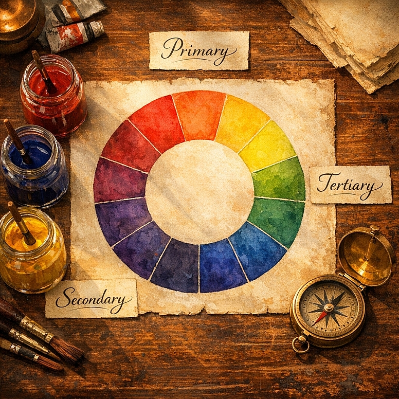
The wheel is built on three simple groups :
- Primary Colors: Red, blue, and yellow. You can't make these by mixing other colors.
- Secondary Colors: Green, orange, and purple. You make these by mixing two primary colors.
- Tertiary Colors: Colors like red-orange or blue-green. You make these by mixing a primary and a secondary color.
With this map, you can follow different "recipes" for color harmony. These recipes are called color schemes.
Here are the main ones, explained simply:
|
Scheme Name |
What It Is |
How It Makes You Feel |
Good For... |
|
Monochromatic |
Different shades, tints, and tones of ONE color. |
Very clean, unified, and elegant. Can be calm. |
Minimalist designs, professional websites, and creating a focused mood. |
|
Analogous |
Colors that sit next to each other on the wheel (e.g., blue, teal, green). |
Harmonious, peaceful, and natural. |
Backgrounds, nature-themed brands, and creating a soft look without harsh contrast. |
|
Complementary |
Two colors that are opposite each other on the wheel (e.g., blue and orange). |
High contrast, vibrant, and energetic. It grabs attention. |
Call-to-action buttons, headlines, and making important elements stand out. |
|
Triadic |
Three colors that are evenly spaced around the wheel (like a triangle). |
Balanced, yet lively and vivid. |
Playful brands, children's products, and designs that need multiple strong colors. |
An expert tip from designers is to sometimes start your design in grayscale—using only black, white, and gray. This helps you arrange everything clearly before you add the emotion of color. It ensures your layout works, even without the "pretty" part.
The Colors Everyone Loves Right Now
Trends change, just like fashion. Knowing what's popular can help your designs feel fresh and modern. People are loving two main styles that seem opposite but make perfect sense: comforting earth tones and futuristic tech colors.
- Neo-Organic Earth Tones: Colors That Feel Like Home. After a lot of time spent on screens, people are looking for designs that feel real, calm, and grounded. Earthy colors are perfect for this. These are your warm browns, soft sage greens, dusty terracottas, and creamy beiges. These colors are timeless and connect us to nature.
- Why it's trending: They feel authentic, stable, and welcoming. A survey found 36% of consumers expect these earthy palettes to be big this year.
- How to use it: Use these as your main background colors. They create a warm base. Then, you can add a small pop of a brighter color (like a coral or turquoise) for a little sparkle. This trend is perfect for wellness brands, coffee shops, or any business that wants to feel friendly and trustworthy.
- Futuristic Iridescents & Digital Brutalism: Colors from the Future. On the other hand, technology is moving fast, and some colors look like they're from a sci-fi movie. Think of metallic shines, holographic glows, and bright neon colors on dark backgrounds. This trend is all about energy, innovation, and breaking the rules.
- Why it's trending: It represents AI, augmented reality, and a bold, confident future. It grabs your eye and doesn't let go.
- How to use it: This is a bold choice. Use these glowing or neon colors as accents on a dark background (like black or dark blue). This "dark mode with neon" look is very popular in tech and gaming. Another idea is a "digital brutalism" palette that uses intentionally clashing, high-contrast colors to create raw energy and surprise.
Other key trends include:
- Adaptive "Living" Palettes: Some apps and websites now change their colors slightly based on the time of day (lighter in the morning, darker at night) or user preference. It makes the design feel alive and personal.
- The "Unexpected Red" Theory: This is a fun trick from interior design that works online, too. It says adding just one small item or accent in red can make any color palette look more interesting and well-designed.
Building Your Own Color Palette: A Step-by-Step Plan
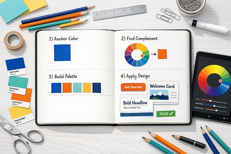
You don't need to guess. Creating a strong color palette is like following a good recipe. Here’s a simple plan you can use.
Step 1: Find Your First Color (The Primary) Start with one color that fits your goal. What are you making? A website for a yoga studio? Maybe start with a calming sage green. A poster for a summer sale? Maybe a bright, energetic orange. This color will be the star of your show.
Step 2: Use the Color Wheel to Find Friends Take your first color and look at the color wheel. Choose a color scheme recipe from the table above. Do you want a calm feel (Analogous)? A vibrant look (Complementary)? Pick 1-3 more colors based on your chosen recipe.
Step 3: Assign Jobs to Your Colors A good palette has a team where everyone has a job :
- Primary Color: This is your main brand color. Use it the most.
- Secondary Color: This supports the primary color. Use it for less important headings, borders, or background sections.
- Accent Color: This is your "action" color. Use it sparingly for the most important things you want people to click or notice, like buttons and links.
- Neutral Colors: These are your whites, light grays, blacks, and dark grays. They give everything space to breathe and make your main colors stand out.
Step 4: Follow the 60-30-10 Rule This is a golden rule for balancing your colors so nothing looks too messy.
- 60%: Your dominant neutral (like a soft white or light gray).
- 30%: Your secondary color.
- 10%: Your accent color.
Step 5: Check for Readability and Accessibility This is a crucial expert step. Your colors must have enough contrast so everyone can read the text easily. If you put light gray text on a white background, it's very hard to see. There are free online tools that can check this for you instantly.
You should also think about color blindness. Don't use color alone to give information. For example, if a form has an error, don't just make the text box red; also add an error icon or message.
Put Your Colors to Work
You have your beautiful palette. Now, let's use it.
- On a Website: Use your neutral color (60%) for the main background. Your secondary color (30%) can be for menu bars, footer backgrounds, or section dividers. Your bright accent color (10%) should be for every button you want people to click. Always be consistent. If your "Buy" button is coral pink on one page, it should be coral pink on every page.
- In a Presentation or Poster: Use your primary color for the title and main points. Use the secondary color for subtitles or charts. Use your accent color to highlight the single most important number or quote you want people to remember.
Remember, tools are just the start. For a vast library of specific color ideas and inspiration, visiting a dedicated site like Colorik can provide endless examples to spark your creativity.
Create Your Own Color Story
Colors are a simple but powerful tool. They are the first thing we see and the first feeling we get. By understanding the basics of color psychology, using the color wheel to create harmony, and following a simple plan to build your palette, you can create designs that not only look good but also feel right.
Don't be afraid to start. Use the free tools, play with the trends, and remember the simple rules. Whether you choose the cozy warmth of earth tones or the electric buzz of futuristic colors, the most important thing is that your colors tell your story clearly.
Frequently Asked Questions
Q: How many colors should be in my brand palette? A simple and effective palette usually has 3 to 5 colors. This includes your primary, secondary, and accent colors, plus one or two neutral colors (like white, black, or gray). Too many colors can look messy and confusing.
Q: What's the difference between RGB and CMYK? This is about where your design will be seen.
- RGB (Red, Green, Blue) is for screens—like computers, phones, and TVs. Light is added to create colors. It's what web and app designers use.
- CMYK (Cyan, Magenta, Yellow, Key/Black) is for things that are printed, like flyers or business cards. Ink is subtracted from white paper to create colors. Always design in the right mode to avoid color surprises.
Q: Should I change my brand colors to follow trends? Not completely. Your brand colors should be stable so people can recognize you. However, you can play with trends in small ways. For example, if your brand is blue and gray, you could add a trendy earthy tone like "Mocha Mousse" (Pantone's 2025 Color of the Year) as a temporary accent in a social media campaign. Think of trends like accessories for your outfit—they can freshen up your look without changing your core style.
Q: What if I'm not good at choosing colors? Where can I find inspiration? Inspiration is everywhere! Look at nature, your favorite movie, a piece of art, or even a well-designed product package. Some websites gather color palettes from beautiful photos. You can also use tools like Site Palette (a browser extension) to see the color palette of any website you like. Finally, for a more playful and exploratory approach to colors, platforms like the Colouring Cave can offer interactive ways to experiment.
LEAVE A COMMENT
Recent Posts


0.0172