Why Colour Temperature Matters in Design & Art
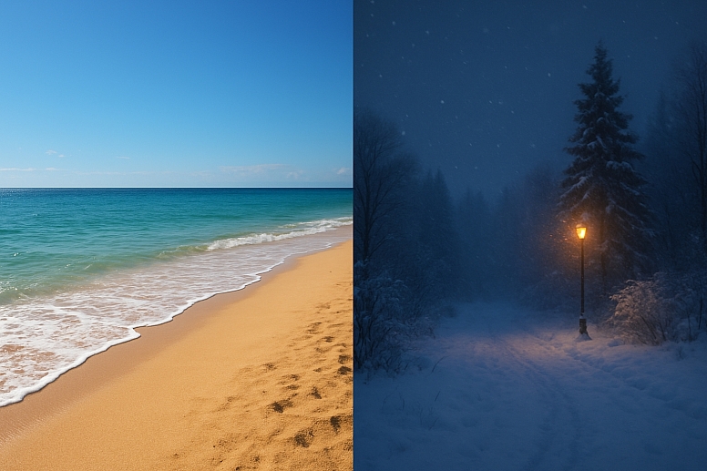
Look at a picture of a sunny beach. Now, look at a picture of a snowy evening. They feel different, right? Part of that feeling comes from colour temperature. It is one of the most powerful tools an artist or designer has. It helps create mood, suggest light, and even make a flat image look deep and three-dimensional.
Understanding colour temperature is not about being technically perfect; it is about knowing how to make people feel the warmth of a sunset or the chill of a shadow.
This guide will show you what colour temperature is and why it matters so much in everything you create.
The Core Ideas to Remember
- Colour temperature describes how warm (yellow, red, orange) or cool (blue, green, purple) a colour appears.
- Warm colours seem to advance, making objects feel closer. Cool colours seem to recede, making objects feel farther away.
- Temperature is relative; a colour can look warm or cool depending on the colours next to it.
- Using temperature correctly creates realistic light and shadow, setting the mood of a piece.
- Our brains associate warm light with artificial sources (like lamps) and cool light with natural ones (like moonlight), but the reverse can also be true and create powerful effects.
What Exactly is Colour Temperature?
Colour temperature is a way to describe the visual warmth or coolness of a colour. We group colours into two families:
- Warm Colours: Reds, oranges, yellows, and warm browns and beiges. They remind us of the sun, fire, and heat.
- Cool Colours: Blues, greens, purples, and cool grays. They remind us of water, ice, shade, and overcast skies.
This concept is so ingrained that we use it to describe physical heat. We say a light bulb has a "warm white" or "cool white" glow.
The Science of Feeling: Why We Feel Temperature
Our reaction to colour temperature is deep-seated and evolutionary.
- Biological Pull: For thousands of years, humans have gathered around warm, fiery light for safety, community, and cooking. Warm light feels inviting and safe. Cool light from the moon and stars meant it was time to rest and be cautious. These primal feelings are still with us.
- Cultural Learning: We are taught that red on a tap means hot water and blue means cold. A red warning sign signals danger and heat. A blue lake looks refreshing on a hot day. These associations reinforce the psychological effects of temperature.
How Temperature Creates the Illusion of Light
This is where colour temperature becomes magic. To paint or design realistic light, you must understand that light and shadow have different temperatures.
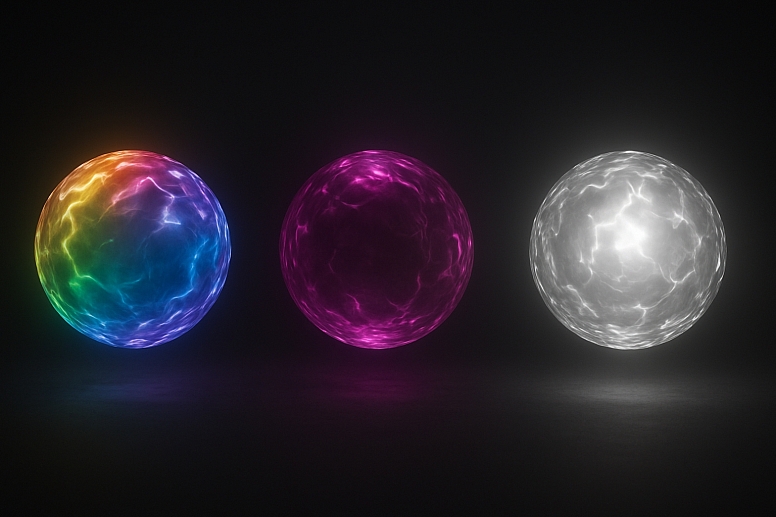
- Warm Light, Cool Shadows: Imagine a sunny day. The sunlight is warm and yellow. But look at the shadows. They are not just gray; they are filled with cool, reflected light from the blue sky. This is why shadows often have a blue or purple tint.
- Cool Light, Warm Shadows: Now imagine a scene lit by a cool, blueish fluorescent light. The shadows it casts will often have a warmer, duller tone. This is a more advanced concept, but it is key to painting indoor or artificial light scenes accurately.
Getting this relationship right is what makes a painting feel luminous and believable. If you paint a warm yellow sun and then use gray-black for the shadows, the scene will look flat. Using a cool blue in those shadows makes the yellow sun feel even brighter and warmer.
How Temperature Creates Space and Depth
Your eye is drawn to warmth. Artists use this to control where you look and to create a sense of depth on a flat canvas or screen.
- Warm Colours Advance: Warm colours feel like they are coming toward you. Placing a warm colour in the foreground of a landscape helps it feel closer.
- Cool Colours Recede: Cool colours feel like they are moving away from you. Using cooler, bluer tones for the distant mountains in a painting makes them look hazy and far away.
This is called atmospheric perspective. It is why faraway objects in a landscape appear bluer and less distinct than objects close up. You can use this trick in graphic design to make a key element "pop" forward by making it warmer than the cooler background.
How Temperature Sets a Mood
The temperature of your colour palette sets the entire emotional tone of your work.
- Warm Palettes feel energetic, happy, comfortable, passionate, and intense. They can also feel aggressive or urgent (think of red).
- Cool Palettes feel calm, peaceful, sad, lonely, serene, or professional. They can also feel cold and impersonal.
A designer choosing a palette for a spa website will lean heavily on cool, calming greens and blues. An artist painting a lively market scene will use warm reds and yellows to convey energy and excitement.
The Golden Rule: Temperature is Relative
This is the most important lesson. A colour is not inherently warm or cool. It depends on what you put next to it.
- A blue can look warm if it is placed next to a much cooler blue. For example, a cerulean blue appears warm next to a deep ultramarine blue.
- A red can look cool if it is surrounded by warmer reds and oranges. A crimson red can appear cool next to a blazing scarlet red.
This is why colour theory can feel confusing. You cannot just label a tube of paint "warm." You must always think about the relationship between colours in your specific piece.
Applying Temperature in Different Mediums
The principles are the same, but the application changes slightly depending on what you are creating.
In Painting and Drawing
- Mixing Paints: Knowing the temperature prevents muddy colours. To mix a clean, vibrant purple, you need a cool red (like alizarin crimson) and a cool blue (like phthalo blue). Mixing a warm red (like cadmium red) with a warm blue (like ultramarine blue) will give you a grayish, muted purple.
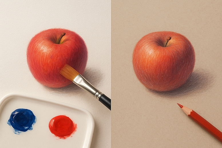
- Creating Form: To make a red apple look round, you would use a warm red for the lit side and a cooler, red-violet for the shadow side. This creates a more realistic form than just using light red and dark red.
In Digital Design and UI/UX
- Branding: A brand that wants to feel innovative and professional might use a cool blue (like Facebook or LinkedIn). A brand that wants to feel friendly and energetic might use a warm orange (like Amazon or Fanta).
- User Interfaces: Temperature guides the user's eye. A warm "Submit" button on a cool blue background will attract attention. Designers use cool colours for passive background elements and warmer colours for interactive buttons and important alerts.
- Readability: Warm text on a cool background (or vice versa) creates good contrast and is easier to read than, for example, warm text on a warm background.
In Photography and Filmmaking
- White Balance: Photographers manually set the white balance to tell the camera what "white" light looks like in a scene. Setting a "daylight" balance in a room with tungsten bulbs will make the photo look very warm and orange. Setting a "tungsten" balance will cool down the colours to look more neutral. This is a direct manipulation of colour temperature.
- Cinematic Colour Grading: Entire movies are colour graded to establish a mood. A cold, blue palette might be used for a dystopian sci-fi film (The Matrix), while a warm, golden palette is used for a nostalgic memory (The Secret Life of Walter Mitty).
A Practical Exercise to See Temperature
Take two pieces of small white paper. Place one on a table under direct sunlight (warm light). Place the other in a shadow outside, where the light is reflected from the blue sky (cool light). Look closely at the "white" papers. You will see the one in sunlight is a warm white, and the one in shadow is a cool, blueish white. This simple observation is the key to understanding light.
Your Palette of Feelings
Think of colour temperature not as a set of rules, but as a palette of feelings. You are not just placing red on a canvas; you are placing warmth. You are not just adding blue; you are adding coolness and depth.
Start training your eye. Look at the world and notice temperature. Is the light from your window warm or cool? Are the shadows outside blue or brown? Look at your favourite paintings and photographs and analyze how the artist used warm and cool colours to create light, space, and emotion.
This awareness is what separates a good creator from a great one. Now go and paint with temperature.
Answers to Common Questions
Is black warm or cool? Black can have a temperature. A black with a brown undertone is warm. A black with a blue undertone is cool. This is crucial for mixing clean shades and shadows instead of just using a flat, neutral black.
Is white warm or cool? Like black, white has temperature. "Warm white" has hints of yellow or cream. "Cool white" has hints of blue. Most white paint straight from the tube is cool. To make it warm, you add a tiny touch of a warm colour like yellow or red.
What is a balanced colour temperature? A balanced temperature uses both warm and cool colours effectively to create harmony and contrast. A painting with only warm colours can feel overwhelming and flat. A design with only cool colours can feel sterile and distant. Balance is key.
How can I practice seeing colour temperature? Try a limited palette exercise. Paint a simple object (like an apple) using only two colours: one warm and one cool. For example, use Ultramarine Blue (cool) and Burnt Sienna (warm). You will have to mix all your values and tones from just these two, which forces you to see and use temperature to create form.


