The Basics of Hue, Saturation & Brightness in Color Design
Have you ever tried to describe a color? You might say "light blue" or "dark red." But what exactly makes that blue "light" and the red "dark"? There is a simple, powerful system that breaks down every color into three easy-to-understand parts: Hue, Saturation, and Brightness (HSB).
Understanding these three ideas is like learning the ABCs of color. It gives you the precise language and tools to choose, create, and adjust any color you can imagine. Whether you are painting, designing a website, or just picking an outfit, knowing HSB will change how you see and use color forever.
The Three Pillars of Color at a Glance
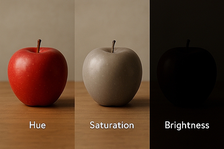
- Hue is the pure color itself—what we usually mean when we say "red," "blue," or "yellow." It is the base ingredient.
- Saturation is the intensity or purity of the color. High saturation is vivid and bold. Low saturation is muted and grayish.
- Brightness (or Value) is how light or dark the color is. High brightness is close to white. Low brightness is close to black.
- These three properties are independent. You can change one without drastically altering the others.
- Mastering HSB allows for precise color matching, harmonious palette creation, and effective emotional messaging through design.
Pillar 1: Hue - The Name of the Color
Hue is the first thing you think of when you imagine a color. It is the attribute that defines a color as red, green, blue, etc. Technically, hue is the wavelength of light we perceive.
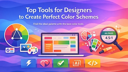
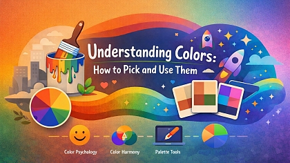
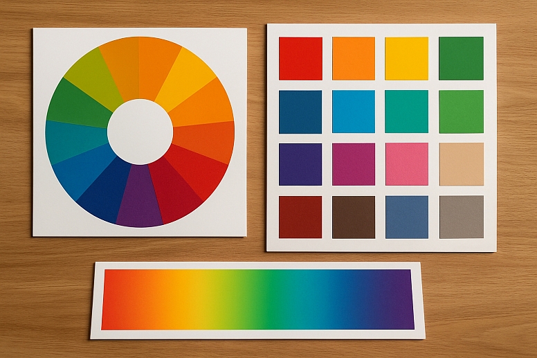
The easiest way to visualize hue is to look at a standard color wheel. The wheel is a circular arrangement of all the pure hues. The primary hues are red, blue, and yellow. When you mix these, you get the secondary hues: orange, green, and purple. Mixing a primary and a secondary gives you tertiary hues like red-orange or blue-green.
Why Hue Matters: Hue is your starting point. It sets the foundational mood of your design based on common color psychology:
- Reds, Oranges, Yellows: Warm, energetic, passionate.
- Blues, Greens, Purples: Cool, calm, serene.
Choosing your dominant hue is the first and biggest decision in any color design process.
Pillar 2: Saturation - The Intensity of the Color
Saturation, sometimes called chroma, describes how pure a hue is. It measures the intensity of the color relative to gray.
- High Saturation: A color with 100% saturation is the pure, vivid hue at its most intense. It has no gray mixed in. Think of a brightly colored plastic toy or a neon sign.
- Low Saturation: A color with 0% saturation is a shade of gray. It has completely lost its hue. Colors with low saturation appear muted, soft, dusty, or pastel. Think of a faded photograph, a concrete wall, or a dusty rose.
You can think of saturation as a dial. Turning the dial up makes the color more vibrant and loud. Turning the dial down makes it more subtle, quiet, and sophisticated.
Why Saturation Matters: Saturation controls the visual weight and energy of a color.
- High Saturation commands attention. It creates excitement and vibrancy but can be overwhelming if overused. It is often used for highlights, call-to-action buttons, and children's products.
- Low Saturation is calming and easier to look at for long periods. It feels more mature, elegant, or vintage. Desaturated palettes are common in minimalist design, luxury branding, and websites where readability is key.
Pillar 3: Brightness - The Lightness or Darkness
Brightness, also known as value or lightness, defines how much black or white is mixed with the hue.
- High Brightness: A color with 100% brightness is pure white, regardless of its hue or saturation. As you increase brightness, you are adding white to the hue, creating what artists call a "tint." A light blue is a tint of blue.
- Low Brightness: A color with 0% brightness is pure black. As you decrease brightness, you are adding black to the hue, creating a "shade." A dark blue is a shade of blue.
Brightness is all about light. It determines whether a color is pastel, mid-toned, or deep and dark.
Why Brightness Matters: Brightness is arguably the most important pillar for creating clear, readable designs. It creates contrast, which guides the eye and organizes information.
- High Contrast (e.g., dark text on a light background) is essential for readability and accessibility.
- Low Contrast (e.g., light gray text on a white background) is difficult to read but can create a subtle, quiet mood.
- In art, variations in brightness are what create the illusion of form and depth. Without a range of values, a painting will look flat.
How Hue, Saturation, and Brightness Work Together
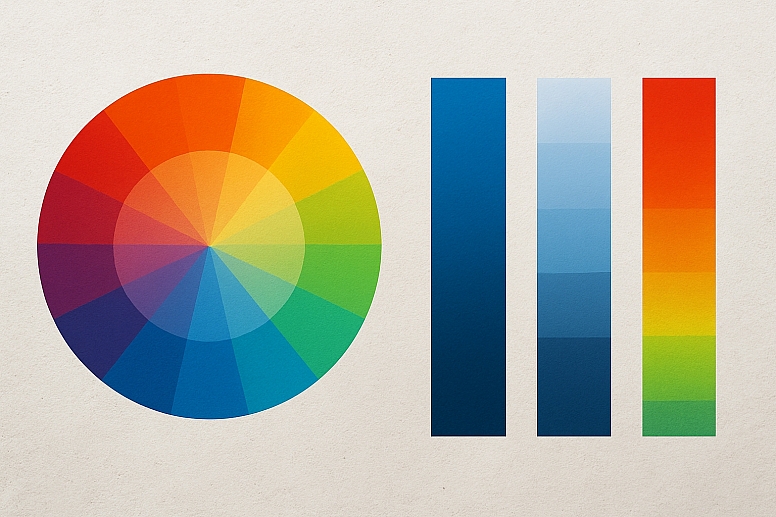
The true power of the HSB model is that these three properties can be adjusted independently. This allows for incredibly precise control.
Imagine you have a pure blue hue. You can:
- Change its Hue to slide it toward purple or green.
- Change its Saturation to make it a vibrant electric blue or a muted gray-blue.
- Change its Brightness to make it a light sky blue or a deep navy blue.
This is far more intuitive than trying to mix paint by adding "a little more red" or "a touch of black," which often affects saturation and brightness in unpredictable ways.
A Practical Example: Designing a Button
Let's say you are designing a "Subscribe" button for a website. Your brand color is blue.
- You start with a Hue of 240° (a standard blue).
- You want it to be attention-grabbing, so you set the Saturation to 80% (vibrant but not neon).
- You want it to be dark enough for white text to be readable, so you set the Brightness to 60%.
The result is a perfect, vibrant navy button. If it doesn't stand out enough against your background, you don't need to change the blue hue. Instead, you can:
- Increase the Saturation to make it more vibrant.
- Decrease the Brightness of the background elements to create more contrast. This targeted adjustment is the superpower of understanding HSB.
HSB in Action: Creating Harmonious Palettes
The HSB model makes it easy to create professional, cohesive color schemes.
1. The Monochromatic Palette This is the simplest harmony to create with HSB. You use only one Hue and create your palette by varying only the Saturation and Brightness. This guarantees your colors will work together because they all share the same base hue. It creates a very unified, serene look.
2. The Analogous Palette You choose a group of hues that sit next to each other on the color wheel (e.g., blue, blue-green, and green). To keep the palette cohesive, you can maintain similar Saturation and Brightness levels across the different hues. This creates a harmonious but more varied palette than a monochromatic one.
3. The Complementary Palette You choose two hues that are opposite each other on the color wheel (e.g., blue and orange). To make these strong opposites work together without clashing, you can adjust their Saturation and Brightness. For example, using a dark, desaturated blue with a bright, saturated orange accent creates balance and focus.
Seeing HSB in the Real World
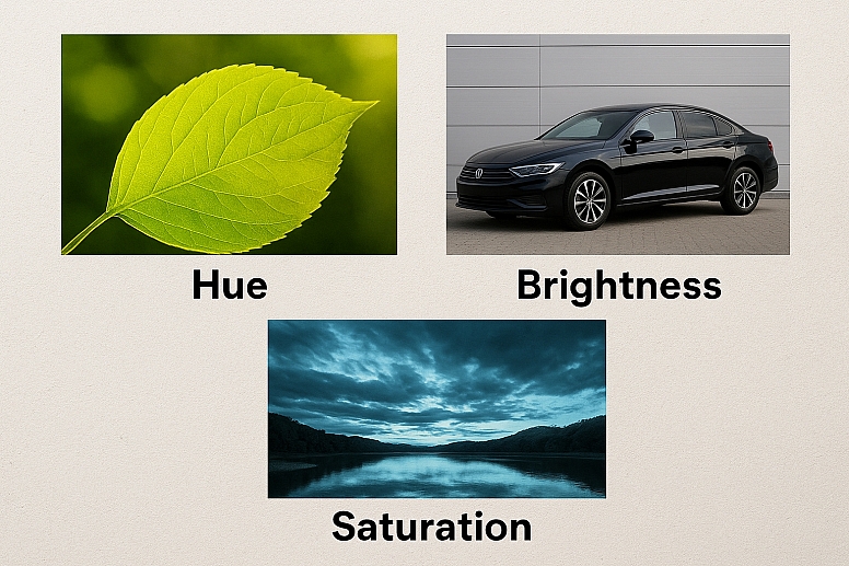
Train your eye to see these properties everywhere you look.
- Nature: A green leaf is a perfect example. The parts hit directly by the sun have a higher Brightness (almost yellow). The parts in shadow have a lower Brightness (darker green) and often a lower Saturation (muted, gray-green).
- Product Design: Look at a car. The base color is the Hue. A glossy finish has high Saturation; a matte finish often has lower Saturation. A white car has high Brightness; a black car has low Brightness.
- Photography Filters: Many photo filters work by adjusting these exact properties. A filter might increase Saturation to make colors pop, decrease Brightness to make it moody, or shift the Hue of the blues to make them more teal.
HSB vs. Other Color Models
You might have heard of RGB (Red, Green, Blue) or CMYK (Cyan, Magenta, Yellow, Key/Black). These are important for technical reasons (RGB for screens, CMYK for print), but they are not intuitive for humans to understand.
Trying to make a color "less intense" in RGB involves guessing how much to lower the red, green, and blue values. In the HSB model, you simply turn down the Saturation slider. Want to make it lighter? Turn up the Brightness slider. It translates human intuition into digital commands perfectly. This is why every major design software—like Adobe Photoshop, Figma, and others—features an HSB (or HSL/HSV) color picker prominently.
Your New Color Toolkit
Thinking in terms of Hue, Saturation, and Brightness is a fundamental skill. It removes the mystery from color and gives you a logical framework for experimentation.
The next time you are working with color, pause before you randomly pick a new one. Ask yourself:
- "Is the Hue right?"
- "Should it be more or less intense? Adjust the Saturation."
- "Is it too light or too dark? Adjust the Brightness."
Open any digital design app and play with the HSB sliders. Watch how a color transforms as you move each one. This hands-on experience is the fastest way to build an intuitive understanding of these powerful concepts. You now have the keys to the kingdom of color—go and create with confidence.
Answers to Common Questions
What is the difference between Brightness and Saturation? This is the most common point of confusion. Brightness is about how much white or black is in the color. Saturation is about how much gray is in the color. A color can be very bright (light) and desaturated (pale pink). A color can also be very dark (low brightness) and highly saturated (deep jewel-toned purple).
Which is more important for accessibility: Saturation or Brightness? Brightness is the most critical factor for accessibility. Color contrast ratios, which determine if text is readable, are calculated based on the relative brightness (luminance) of colors, not their hue or saturation. This is why a bright yellow on a white background is hard to read (low brightness contrast) even though the hue contrast is high.
Can a color have high Brightness and high Saturation? Yes, but only to a point. As you increase brightness by adding white, you inherently reduce the saturation slightly, creating a pastel. The most saturated version of a hue is usually found at a mid-range brightness level, not the brightest possible level.
How do I use HSB for traditional painting? While you don't have digital sliders, the concept is the same. To change Saturation, you mix a hue with its complement (e.g., mix blue with orange) to gray it out. To change Brightness, you add white to create a tint (increase brightness) or add black to create a shade (decrease brightness). Thinking in HSB terms helps you mix the exact color you see in your mind.
