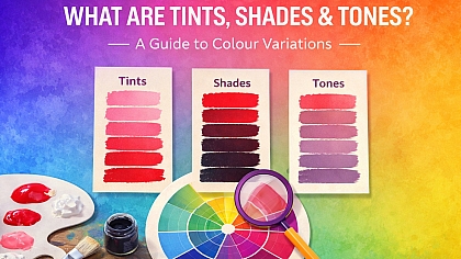
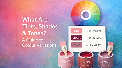
What Are Tints, Shades & Tones? A Guide to Colour VariationsLearn the difference between tints, shades, and tones. This guide explains how...
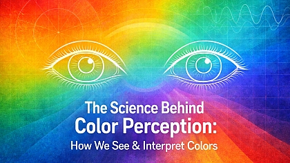
The Science Behind Color Perception: How We See & Interpret ColorsHow do we see color? Learn how light, eyes, and brain work together to create...
How to Use Tetradic Color Schemes for Bold DesignsLearn how to use tetradic (double-complementary) color schemes. This guide...
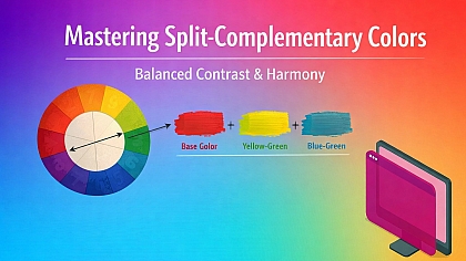
What Are Split-Complementary Colors & How Do They Work?Learn what a split-complementary color scheme is, how it works, and how to use...
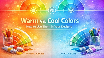
Warm vs. Cool Colors: How to Use Them in Your DesignsLearn the difference between warm and cool colors, their psychological effects,...
Accessible Color Palettes: Tools & Techniques for Inclusive DesignLearn how to create accessible color palettes for inclusive design. Discover...
How to Export and Implement Color Palettes in Adobe Photoshop & IllustratorLearn how to save, export, and implement consistent colour palettes in Adobe...
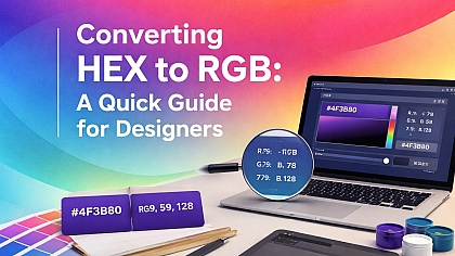
Converting HEX to RGB: A Quick Guide for DesignersA simple guide for designers on how to convert HEX color codes to RGB values...
How to Create a Mood Board with the Right Color PaletteLearn how to build a visual mood board to define your project's color palette,...
5 Common Color Mistakes Designers Make & How to Avoid ThemAvoid these 5 common color mistakes in your designs. Learn how to fix poor...
Using Color to Improve User Experience in Web DesignLearn how to use color strategically in web design to guide users, improve...
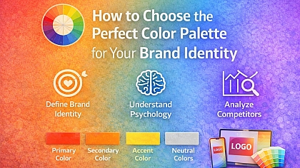
How to Choose the Perfect Color Palette for Your Brand IdentityA practical guide to selecting a brand color palette that reflects your values,...
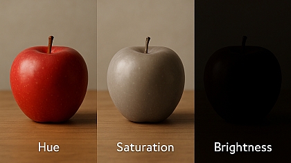
The Basics of Hue, Saturation & Brightness in Color DesignMaster the basics of Hue, Saturation, and Brightness (HSB) to create powerful...
How to Create a Balanced Color Palette Using the 60-30-10 RuleLearn how to use the 60-30-10 rule to create balanced color palettes for your...
What is Color Theory? Basics for Designers and CreativesLearn what color theory is, how the color wheel works, and how to use color...
Understanding the Color Wheel: Basics for Designers & ArtistsLearn how the color wheel works, including primary, secondary, and tertiary...
What is Color Psychology? How Colors Influence Design and EmotionsUnderstand color psychology and how different hues shape feelings and user...
Complementary vs. Analogous Colors: Which Should You Use?Learn the difference between complementary and analogous color schemes. See...
How to Create a Balanced Color Palette Using the 60-30-10 RuleLearn how to use the 60-30-10 rule to create balanced color palettes for your...
The Basics of Hue, Saturation & Brightness in Color DesignMaster the basics of Hue, Saturation, and Brightness (HSB) to create powerful...
How to Choose the Perfect Color Palette for Your Brand IdentityA practical guide to selecting a brand color palette that reflects your values,...
Using Color to Improve User Experience in Web DesignLearn how to use color strategically in web design to guide users, improve...
5 Common Color Mistakes Designers Make & How to Avoid ThemAvoid these 5 common color mistakes in your designs. Learn how to fix poor...
How to Create a Mood Board with the Right Color PaletteLearn how to build a visual mood board to define your project's color palette,...
Converting HEX to RGB: A Quick Guide for DesignersA simple guide for designers on how to convert HEX color codes to RGB values...
How to Export and Implement Color Palettes in Adobe Photoshop & IllustratorLearn how to save, export, and implement consistent colour palettes in Adobe...
Accessible Color Palettes: Tools & Techniques for Inclusive DesignLearn how to create accessible color palettes for inclusive design. Discover...
Warm vs. Cool Colors: How to Use Them in Your DesignsLearn the difference between warm and cool colors, their psychological effects,...
What Are Split-Complementary Colors & How Do They Work?Learn what a split-complementary color scheme is, how it works, and how to use...
How to Use Tetradic Color Schemes for Bold DesignsLearn how to use tetradic (double-complementary) color schemes. This guide...
The Science Behind Color Perception: How We See & Interpret ColorsHow do we see color? Learn how light, eyes, and brain work together to create...
What Are Tints, Shades & Tones? A Guide to Colour VariationsLearn the difference between tints, shades, and tones. This guide explains how...
Why Colour Temperature Matters in Design & ArtLearn how warm and cool colour temperatures create mood, depth, and light in...
Colorik: Your Tool for Creating and Refining Color Palettes
Colorik is a color palette generator built to help you create, refine, and save harmonious color combinations. A precise tool with intuitive controls, it simplifies the process of finding the right colors for your projects.
Whether you're designing a website, crafting a brand identity, or experimenting with color theory, Colorik provides the functionality and clarity you need to work efficiently. It’s a practical resource for anyone looking to streamline their color selection process.
0.0554
