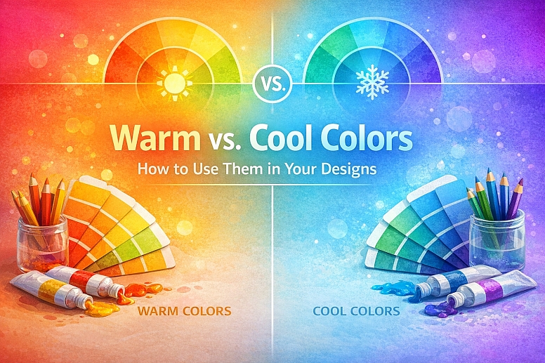
Warm vs. Cool Colors: How to Use Them in Your Designs
Color is more than decoration. It is a language that speaks directly to our emotions. Before we process shapes or words, we react to color. This reaction is deeply rooted in psychology and biology, and much of it is governed by a simple but powerful divide: warm colors versus cool colors.
Understanding this fundamental split is not just an art theory exercise; it is a practical tool every designer can use to create more effective, engaging, and emotionally resonant work. This guide will explore the science and psychology behind warm and cool colors and provide actionable strategies for using them in your designs.
Warm and Cool Colors at a Glance
- Warm Colors: Reds, oranges, yellows, and their derivatives. They are associated with fire, the sun, and heat. They evoke emotions like energy, passion, happiness, excitement, and also aggression and urgency.
- Cool Colors: Blues, greens, purples, and their derivatives. They are associated with water, sky, ice, and nature. They evoke emotions like calm, peace, trust, serenity, and also sadness or aloofness.
- Spatial Properties: Warm colors appear to advance, making them feel closer and more dominant. Cool colors appear to recede, making them feel farther away and more passive.
- Balance is Key: Successful designs often use both warm and cool colors to create visual interest, hierarchy, and emotional balance.
- Context is Everything: The specific shade, saturation, and amount of a color drastically alter its perceived temperature and emotional impact.
The Science of Temperature: Why We Feel Color
Our association of color with temperature is not arbitrary; it is primal.
- Biological Programming: For millennia, humans have gathered around warm, fiery light for safety, community, and warmth. We associate red, orange, and yellow with this life-sustaining heat. Conversely, cool blue light from the moon and stars signaled night, a time for rest and caution. Shade and water (blue, green) offered relief from heat but could also represent danger or the unknown.
- Cultural Reinforcement: These biological responses are reinforced by culture. Red taps mean hot water; blue taps mean cold. Red warning signs signal danger and heat; blue signs often indicate information or cold hazards.
This deep-seated programming means our reaction to color temperature is often immediate and subconscious, making it an incredibly powerful design tool.
The Warm Color Palette: Energy and Action
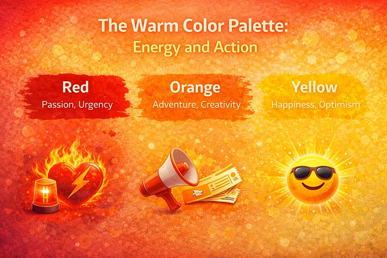
The warm side of the color wheel is active and stimulating.
Key Warm Colors and Their Associations:
- Red: The most intense and visceral warm color. It raises pulse rates and signifies passion, love, danger, anger, and urgency. It is extremely effective for grabbing attention.
- Orange: Combines the energy of red and the friendliness of yellow. It feels enthusiastic, creative, adventurous, and affordable. It is less aggressive than red but still highly visible.
- Yellow: The brightest color to the human eye. It screams optimism, happiness, intellect, and energy. However, it can also be associated with caution and anxiety, especially in its brighter forms.
How to Use Warm Colors in Design:
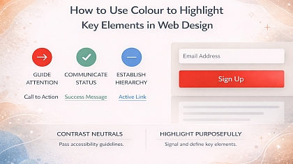
- Grab Attention: Use warm colors for call-to-action buttons, sale tags, and important alerts. They naturally draw the eye first.
- Create Excitement: For brands that want to feel energetic, fun, and youthful (e.g., entertainment, food, sports), warm palettes are ideal.
- Simulate Warmth: Use reds, oranges, and ambers to create a sense of warmth and comfort in designs for cafes, bakeries, or home goods.
- Advance Elements: Because they appear to come forward, use warm colors to highlight key elements you want to emphasize, making them feel closer to the viewer.
A Warning: Overusing warm colors, especially highly saturated ones, can feel overwhelming, aggressive, or stressful. They are powerful and are best used with intention.
The Cool Color Palette: Calm and Trust
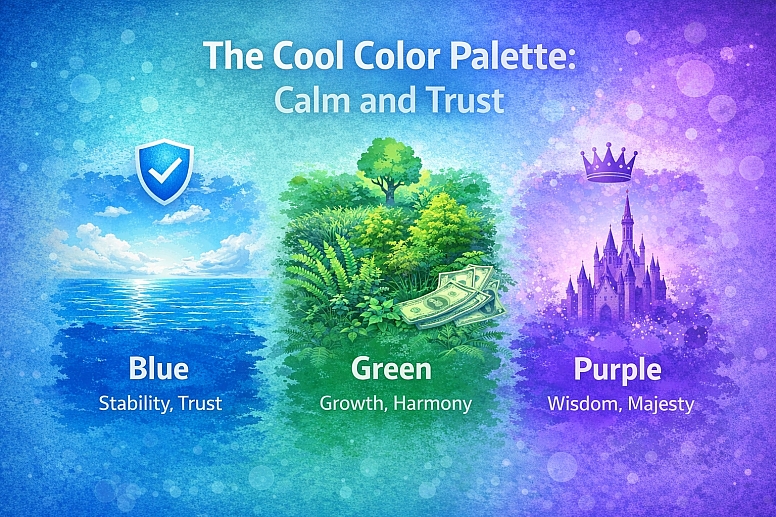
The cool side of the color wheel is passive and calming.
Key Cool Colors and Their Associations:
- Blue: The world's favorite color. It is consistently linked to stability, trust, security, calm, and intelligence. It is the color of the sky and sea, conveying a sense of depth and reliability.
- Green: Sitting between warm yellow and cool blue, green is the color of nature. It represents growth, harmony, freshness, safety, and money. It is the most restful color for the human eye.
- Purple: Historically associated with royalty and luxury due to the rarity of purple dye. It combines the stability of blue and the energy of red, often representing creativity, wisdom, mystery, and magic.
How to Use Cool Colors in Design:
- Build Trust: This is why blue is the default color for banks, tech companies, healthcare, and social media platforms. It projects professionalism and reliability.
- Promote Relaxation: Use greens and blues for spas, wellness brands, environmental causes, and anything where the goal is to create a peaceful, serene mood.
- Recede Elements: Use cool colors for backgrounds, large text blocks, and secondary elements. They create a sense of space and help more important warm elements pop.
- Suggest Coolness: Greens, blues, and icy purples are perfect for products related to water, ice, air, and technology.
A Warning: Overusing cool colors can make a design feel cold, impersonal, sterile, or even sad. It is important to add warmth to create balance.
The Magic of Spatial Effects: Advancing and Receding
This is one of the most practical applications of color temperature. Warm colors advance, and cool colors recede. This is not an illusion; it is how our eyes process different wavelengths of light.
How to Leverage This in Your Designs:
- Web & UI Design: Use warm colors for primary buttons you want users to click. Use cooler colors for passive background elements. This creates a clear visual hierarchy without relying solely on size.
- Graphic Design & Posters: Make a headline pop by setting it in a warm color against a cooler background. This creates instant depth on a flat page.
- Interior Design: Paint a wall a warm color to make a large, empty room feel more cozy and intimate. Paint a wall a cool color to make a small room feel more spacious and airy.
- Data Visualization: Use a warm color to highlight the most important data point in a chart, making it jump out from the cooler-colored secondary data.
Achieving Balance: Using Warm and Cool Together
Masterful design is rarely purely warm or purely cool. It is the interplay between the two that creates dynamism and balance.
1. Using a Dominant Temperature with an Accent: Choose one temperature as your dominant theme and use the other as an accent.
- Example 1: A website for a financial institution (cool/trust) might use a blue and gray palette but have a warm orange "Contact Us" button to draw attention.
- Example 2: A restaurant website (warm/energy) might use terracotta and cream but have cool green accents to suggest fresh, natural ingredients.
2. Creating Depth with Temperature Shifts: This is a classic technique in painting and photography that works in all design. To create realistic light and form, use warm lights and cool shadows, or vice versa.
- Warm Light, Cool Shadows: Imagine sunlight (warm yellow) hitting an object. The shadows are not gray; they are filled with reflected light from the cool blue sky. Adding a hint of cool blue to shadows makes the warm light feel brighter.
- Cool Light, Warm Shadows: An object under a cool, fluorescent light will often have warmer, duller shadows. This is a more advanced but powerful way to set a specific mood.
3. The Role of Neutrals: Neutrals (white, black, gray, brown, tan) are essential for balancing warm and cool palettes. However, neutrals themselves can have temperature.
- Warm Neutrals: Cream, beige, tan, brown, and warm grays (with a brown or yellow undertone).
- Cool Neutrals: Pure white, charcoal, and cool grays (with a blue or purple undertone). Using a warm neutral with a cool color scheme can make it feel less sterile. Using a cool neutral with a warm color scheme can make it feel less overwhelming.
Beyond the Basics: Relative Temperature and Context
The temperature of a color is not absolute; it is relative to the colors surrounding it.
- A blue can look warm if placed next to a much cooler blue. For example, a cerulean blue appears warm next to a deep ultramarine blue.
- A red can look cool if surrounded by warmer reds and oranges. A crimson red can appear cool next to a blazing scarlet red.
This is why color theory requires practice and a good eye. Always consider the context of the entire palette.
Your Design Toolkit
Think of warm and cool colors as essential tools in your kit. They are not about strict rules but about understanding the emotional and visual weight of your choices.
The next time you start a project, ask yourself:
- What is the primary emotion I need to convey? (Energy → Warm, Calm → Cool)
- What needs to stand out? (Key elements → Warm, Backgrounds → Cool)
- How can I create balance? (Does my warm scheme need a cool neutral? Does my cool scheme need a warm accent?)
By consciously choosing your color temperature, you move beyond simply making things look good. You start designing how things feel. And that is the mark of a truly skilled designer.
Answers to Common Questions
Is green a warm or cool color? Green is unique because it is a secondary color made by mixing warm (yellow) and cool (blue). Its temperature depends on its bias. A yellow-green (lime) is a warm green. A blue-green (teal) is a cool green. This makes green incredibly versatile for bridging warm and cool palettes.
Can a color be both warm and cool? Absolutely. Many colors sit on the spectrum between warm and cool. Purple (red + blue) and green (yellow + blue) are the primary examples. A red-violet leans warm, while a blue-violet leans cool. This is why looking at a color in isolation is less important than seeing it in the context of its palette.
What is the best way to choose a color temperature for a logo? Start with your brand personality. A law firm or tech company likely wants to project trust and stability (cool blues, greens). A children's toy company or restaurant might want to project energy and fun (warm reds, oranges, yellows). Your industry, target audience, and brand values should dictate the temperature, not personal preference.
How does color temperature affect accessibility? Temperature itself doesn't directly affect accessibility, but the contrast between warm and cool colors does. A warm color and a cool color can have similar lightness (value), resulting in poor contrast. Always check the contrast ratio between foreground and background colors, regardless of their temperature, to ensure readability.
