

How to Use Colour to Highlight Key Elements in Web Design
Colour is a functional tool, not just a decorative one. Its primary role in an effective user interface is to guide attention, communicate status, and establish a clear visual hierarchy. Used strategically, colour directs users to key actions and information without a word of instruction. Used poorly, it creates confusion, reduces accessibility, and undermines usability.
This approach explains the principles behind using colour as a highlighting mechanism, focusing on the intersection of visual perception, psychology, and functional design requirements.
- Core Function: Colour highlights by creating visual contrast against a neutral foundation.
- Primary Rule: Highlighting colour must be used sparingly, consistently, and deliberately.
- Non-Negotiable Foundation: All applications must pass WCAG contrast guidelines for accessibility.
- Strategic Outcome: Effective colour highlighting reduces cognitive load and increases task completion rates.
Colour’s Role in Visual Hierarchy and User Guidance
Every element on a screen competes for attention. Visual hierarchy is the system that controls this competition, signaling importance and sequence. Colour is one of the most potent tools in this system, stronger than size or placement for immediate, pre-attentive processing.
The human visual system is wired to notice anomalies. A single saturated colour element in a field of muted tones or neutrals acts as a visual anomaly, instantly pulling the eye. This is why a red "Submit" button on a grey form works. The goal is not to make a page colourful, but to use colour as a deliberate signal against a controlled, restrained background. The effectiveness of a highlighting colour is directly proportional to its scarcity. If everything is highlighted, nothing is.
This guidance system directly impacts user efficiency and satisfaction. When key elements—primary calls-to-action (CTAs), error states, success messages, or active navigation items—are clearly defined by colour, users make fewer errors, navigate faster, and experience less frustration. The interface feels intuitive because its signalling is aligned with human perception.
The Mechanics of Colour Contrast and Signal Integrity
Effective highlighting relies on more than just picking a "bright" colour. It is a technical exercise in managing contrast, meaning, and context.
1. Contrast is Calculated, Not Guessed: Visual prominence is determined by luminance contrast—the difference in light between a foreground element and its background. This is measured using the Web Content Accessibility Guidelines (WCAG) contrast ratio. For standard text, a ratio of 4.5:1 is required. For large text or graphical components like buttons, 3:1 is the minimum. A highlighting colour that fails these ratios is invisible to users with low vision or colour vision deficiencies (CVD) and is often weak for all users. Tools like the Colour Contrast Analyzer are non-negotiable for verification.
2. Colour Serves a Semantic Purpose: Highlighting colours must be assigned a consistent, logical meaning within the interface's "language."
- Primary Action: A single, distinctive colour (e.g., a solid blue or green) used exclusively for the most important action on any screen (e.g., "Buy Now," "Sign Up").
- Positive/Success: Green, signalling confirmation, completion, or a safe state.
- Warning/Error: Orange or red, signalling a problem, required action, or deletion.
- Informational/Neutral: Blue, signalling a link, neutral status, or additional information.
- Active State: A distinct colour or tint shift to indicate the currently selected navigation item or form field.
Using the same red for both a "Delete Account" button and a "New Message" notification creates semantic chaos and user anxiety.
3. The 60-30-10 Framework as a Discipline: This classic design principle provides a quantitative guardrail for colour application:
- 60%: Dominant Neutral. The background colour (white, light grey, soft beige). This is the canvas.
- 30%: Secondary Neutral/Supporting Colour. Used for main content areas, secondary backgrounds, and borders.
- 10%: Accent/Highlighting Colour. This is your strategic reserve—the single, bold colour reserved exclusively for interactive elements, key CTAs, and critical alerts.
This framework enforces scarcity, ensuring the 10% truly pops.
4. Context Changes Perception: A colour's perceived vibrancy and effectiveness change based on its surroundings—a principle known as simultaneous contrast. A medium orange will appear more vivid against a cool grey than against a warm beige. A colour intended for highlighting must be tested in its actual context, not in isolation on a colour picker.
Five Contexts for Colour Highlighting
1. E-commerce Checkout Flow
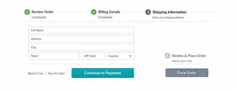
- Constraints: Must guide a user through a multi-step, high-stakes process with minimal distraction and maximum clarity.
- Common Mistakes: Using multiple highlight colours for different steps or buttons (e.g., a green "Continue" and a blue "Save Cart"). Highlighting non-essential elements like promotional banners within the flow.
- Practical Advice: Use a single, high-contrast brand colour exclusively for the progressive action button ("Continue to Shipping," "Proceed to Payment"). Render all secondary actions (like "Back" or "Save for Later") as low-contrast text links or greyed-out buttons. At the final step, the "Place Order" button can be intensified with a slight darkening of the hue or a subtle animation pulse only at this point, creating a clear climax in the visual journey.
2. Data-Dense Dashboard and Analytics Interface
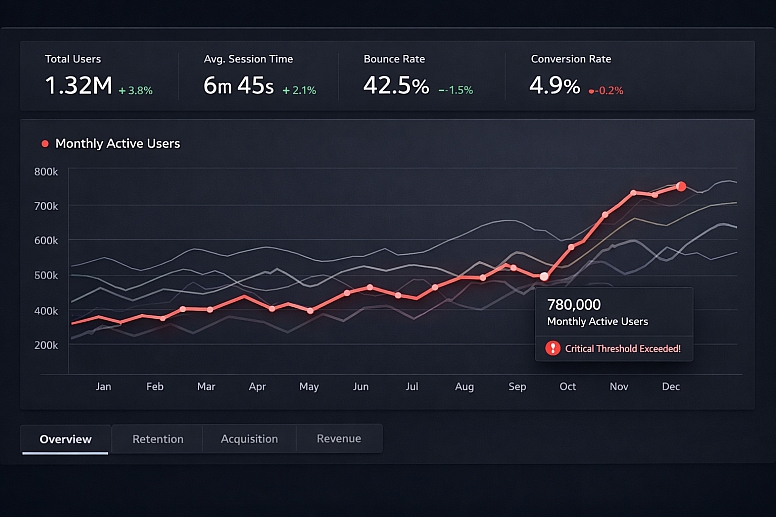
- Constraints: Must present complex information where key metrics, trends, or outliers need immediate visibility.
- Common Mistakes: Using colour inconsistently across different charts (e.g., "Revenue" is blue in one chart, green in another). Overusing colour for categorical distinction when position or shape could suffice.
- Practical Advice: Establish a strict colour key. Use the primary highlight colour only for the most critical KPI or the data series a user is most likely to adjust. In a line chart with five lines, keep four in shades of grey and highlight the key metric in the accent colour. For alerting, use a small, bright colour badge (red/orange) only when a metric crosses a critical threshold, making it an immediate visual anchor.
3. SaaS Application Primary Navigation and Active States
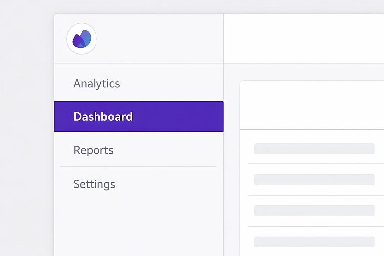
- Constraints: Must communicate location within a complex application and signal the active module or page clearly.
- Common Mistakes: Underlining or bolding the active link instead of using a distinct colour block. Using a highlight that lacks sufficient contrast with the navigation background.
- Practical Advice: Implement a left-hand vertical navigation. Use a solid, high-contrast coloured background (or a prominent left-border) on the currently active navigation item. The text colour for this item should be white or a very light tint to ensure maximum contrast against the coloured background. Hover states for inactive items should use a much subtler colour shift (e.g., a light grey background) to distinguish them from the definitive active state.
4. Long-Form Content or Blog Layout

- Constraints: Must improve readability, allow for content skimming, and highlight interactive elements without disrupting the reading experience.
- Common Mistakes: Colouring inline links the same as body text until hovered. Using coloured text highlights for quotes or keywords that compete with link colours.
- Practical Advice: Style all inline text links in a consistent, bold accent colour with an underline for redundancy. This creates predictable, scannable "jump points" in the text. Use a distinct, contrasting background colour block (e.g., a light yellow tint) only for highly critical pull quotes or summaries, not for decorative emphasis. Ensure any "Subscribe" or "Download" CTAs within the content use the same primary action button styling.
5. User Account and Form Feedback Messages
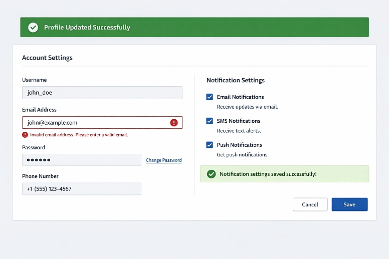
- Constraints: Must communicate success, error, or informational states instantly and unambiguously after a user action.
- Common Mistakes: Generic messages placed at the top of the page, far from the relevant input field. Using only colour to denote an error in a form field (e.g., a red border without an icon or text).
- Practical Advice: Place feedback messages in context. A success message upon saving settings should appear near the save button. For form errors, pair a red border on the specific input field with a red icon and descriptive text in red placed directly below that field. For a system-wide success (e.g., "Profile Updated"), use a green banner at the top with an icon, ensuring the green is distinct from the primary action colour.
Comparison of Highlighting Techniques
| Technique | Mechanism | Best For | Key Consideration |
|---|---|---|---|
| Saturated Colour Fill | A solid block of high-saturation accent colour. | Primary buttons, critical alerts. | Must pass contrast ratios for any overlaid text/icon. |
| Colour Border & Outline | A bold coloured line around an element. | Active form fields, selected cards. | Can be combined with a subtle fill. Risk of looking like an error. |
| Coloured Text or Icon | Changing the colour of text or an icon itself. | Links, status icons (e.g., a green check). | Text must maintain 4.5:1 contrast. Icons need 3:1 against the background. |
| Background Tint Shift | Applying a light tint of the accent colour as a background. | Table row hover states, active nav items. | The tint must be distinct enough from the neutral background to be perceptible. |
| Subtle Motion (Microanimation) | A brief, non-looping colour pulse or shift. | Confirming an action, drawing eye to new content. | Must be subtle and brief. Cannot be the only highlighting method due to accessibility. |
Advanced Considerations for Colour Implementation
Beyond basic contrast, expert implementation involves managing perception across devices and user populations. Colour Management across different screens (calibrated desktop monitors vs. mobile OLED displays) is a factor. A colour specified as#FF5733can appear significantly more vibrant on an OLED screen, potentially making a highlight feel garish. Testing on multiple device types is crucial.
For users with Colour Vision Deficiency (CVD), which affects roughly 1 in 12 men, red/green differentiation is a common issue. A "green for good, red for bad" system fails if both appear as similar browns. The solution is not to avoid these colours, but to add a secondary, non-colour cue. Pair the green success with a checkmark icon (✓). Pair the red error with an exclamation icon (!) and bolded text. This ensures the signal is communicated through shape and contrast as well as hue.
Psychological Saturation is another nuanced factor. A user exposed to the same highlight colour for hundreds of interactions may become desensitised to it—a form of "banner blindness" within an app. For products requiring extreme habitual use, some expert designers implement a subtle, seasonal rotation of the secondary supporting colours (the 30%) while keeping the core highlight and neutrals constant. This provides enough visual refreshment to keep the interface feeling alive without breaking semantic consistency.
Common Pitfalls and Misconceptions
Misconception: "More colour equals more emphasis." Overusing highlight colours creates visual noise, forcing the user to decipher what is truly important. Emphasis is created by contrast against a field of restraint. If four elements are bright blue, none stand out.
Pitfall: Ignoring colour psychology in functional contexts. While cultural associations vary, some connotations are strong in digital interfaces. Using a bright orange or red for a "Save" or "Confirm" button can induce subconscious anxiety, as those colours are strongly tied to warnings and deletions in UI language.
Misconception: "Our brand colour is our highlight colour." This is often true, but not always. If your brand colour is a dark burgundy or a pastel yellow, it may fail WCAG contrast ratios on common backgrounds. In these cases, you must define a supplementary UI accent colour from your brand palette that meets technical requirements, even if it's not the primary logo colour.
Pitfall: Highlighting non-interactive elements. Colouring static headings or decorative graphics with the accent colour trains users to associate that colour with non-actionable items, diluting its power for CTAs. The highlight colour should be sacred to interactive or state-indicating elements.
A Framework for Establishing a Highlight System

- Audit Your Canvas. Define your neutral foundation (60% and 30%). This is typically a near-white background and a range of greys for borders, secondary backgrounds, and body text.
- Define the Semantic Roles. List every element that needs signalling: Primary Action, Success, Warning, Error, Active State, and Hyperlink.
- Select the Hue Family. Choose your primary accent hue (e.g., blue). For a complementary warning, choose a hue sufficiently distant on the colour wheel (e.g., orange/red). Use a tool to ensure these hues are distinguishable for common CVD types.
- Build Accessible Colour Steps. For each semantic role, define a base colour. Then, create a minimum of two accessible variants: a lighter tint for large backgrounds or hover states, and a darker shade for pressed states. Verify all variants pass contrast guidelines.
- Document the Rules. Create a UI colour style guide that specifies exactly where each colour is used. E.g., "Primary Blue (#007AFF) is used exclusively for: Filled Primary Buttons, Active Navigation Background, Selected Radio Button Dots."
- Implement and Test Relentlessly. Apply the system. Conduct greyscale tests to check hierarchy. Use CVD simulation tools. Watch real users interact; if they hesitate to find a primary button, the highlighting has failed.
Questions on Colour Highlighting
How many highlight colours should a website use? For core functionality, stick to one primary highlight colour. You will need a separate colour for errors/warnings (typically red/orange) and one for positives (typically green). This creates a total of 3 functional colours, used with extreme consistency. Decorative colours for illustrations do not count toward this limit.
Does colour highlighting work for colour-blind users? Yes, but only when implemented with redundant cues. The contrast in lightness (luminance) between the highlight colour and its background is what matters most for many CVD users. Always pair colour with another indicator like an icon, text label, pattern, or change in size/boldness.
What is the best colour for a call-to-action button? There is no universal "best" colour. The best colour is the one that has the highest contrast against your specific page background while aligning with your brand. Research suggests green ("go") and red ("stop") have strong innate associations, but their effectiveness is 90% determined by contrast and context. A/B test your specific colour against your neutral palette.
Can I use gradient fills for highlighted elements? Use gradients with caution. They can make text contrast difficult to guarantee (the text colour may pass contrast on one part of the gradient but not another). If used, ensure the gradient is subtle and that any overlaid text meets contrast requirements against the darkest part of the gradient.
LEAVE A COMMENT
Recent Posts


0.0443