

How to Use the Colour Wheel to Fix Common Design Problems
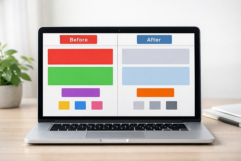
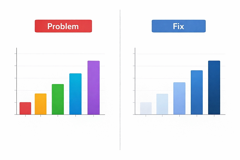
A color wheel is a tool. It shows the basic relationships between colors. People think it’s only for choosing a starting palette. It’s much more useful than that. You can use it to diagnose and fix common, frustrating problems in your designs. When colors feel wrong—too dull, too clashy, too boring—the color wheel gives you a logical way to find a solution.
Think of it like a map for a road trip. You don’t just look at it once at the start. You check it when you’re lost, when you need a detour, or when you want a more scenic route. The color wheel works the same way. It helps you get back on track when your design feels off. This isn’t about abstract art theory. It’s about practical fixes for everyday work.
When to Reach for the Color Wheel
Keep it open when you run into these specific issues:
- Your design looks chaotic or unbalanced.
- Everything feels flat and lacks depth.
- The most important element doesn’t stand out.
- The colors just feel “dirty” or muddy together.
- You need to add a color but don’t know which one to choose.
The Mechanics of the Color Wheel: What You Really Need to Know
Forget memorizing complex terms. You need to understand three core relationships. These are your primary tools for fixing problems.
1. Complementary Colors (The Contrast Fix) These are colors directly opposite each other on the wheel. Red and green. Blue and orange. Purple and yellow.
- What They Do: They create maximum contrast. This makes each color appear brighter and more intense when placed side-by-side.
- How to Use It for Fixes:
- Problem: Your call-to-action button doesn’t grab attention.
- Fix: Find the color of your page background on the wheel. Use its complement for the button. A blue background gets an orange button.
- The Catch: Pure complements at full strength can vibrate and be hard to look at. The fix is to adjust the value (lightness/darkness) or saturation (intensity). Don’t use fire-engine red on bright green. Try a deep burgundy on a sage green.
2. Analogous Colors (The Harmony Fix) These are colors next to each other on the wheel. Blue, blue-green, and green. Red, red-orange, and orange.
- What They Do: They create harmony and unity. Because they share a common base hue, they always look good together.
- How to Use It for Fixes:
- Problem: Your design looks messy because you used too many unrelated colors.
- Fix: Pick one main color you must keep. Find it on the wheel. Then, only use the colors directly to its left and right. This instantly creates a cohesive, professional look.
- The Catch: It can be monotonous. The fix is to vary the value and saturation wildly within the analogous group. Use a pale yellow, a deep gold, and a dark olive, for example.
3. Triadic Colors (The Balance Fix) These are three colors evenly spaced around the wheel, forming a triangle. The classic triad is red, yellow, and blue.
- What They Do: They offer strong visual contrast while maintaining a rich, balanced feel. It’s more vibrant than analogous but more stable than pure complement.
- How to Use It for Fixes:
- Problem: Your design feels childish or simplistic (like a primary school poster).
- Fix: Shift your triadic colors. Instead of pure red, yellow, and blue, use a more sophisticated triad: magenta, teal, and golden yellow. The balanced relationship stays, but the mood matures instantly.
The Secret Lever: Value and Saturation The wheel shows hue (the color family). Value (lightness) and saturation (purity) are your adjustment dials.
- A muddy design often has colors with similar, mid-range values and low saturation. The fix is to expand the value range. Add something very light and something very dark.
- A clashy design often has colors at full, equal saturation. The fix is to lower the saturation of one or two colors. Let one color be the star, and let the others be supporting players.
Fixing Five Common Design Problems
Problem 1: Your Design Lacks a Clear Focal Point
Everything is competing for attention. The viewer’s eye jumps around and doesn’t know where to look.
- Specific Constraint: You have multiple important elements (headline, image, button, icon) that all need to exist, but one must be primary.
- Common Mistake: Making everything bold or bright. If everything is loud, nothing is heard.
- The Color Wheel Fix: Use Complementary Isolation.
- Identify the single most important element on the page.
- Look at the dominant color of the rest of the design. Find it on the wheel.
- Use the complement of that dominant color for your key element.
- Crucially: Mute, darken, or lighten all the other colors. Let the complement sing. For example, if your page is mostly desaturated blues, make your primary button a soft, warm orange. It will pop without screaming.
Problem 2: The Colors Look Dull and Lifeless
The design feels flat, boring, or washed out. It doesn’t engage anyone.
- Specific Constraint: The brand colors or subject matter might be inherently muted (e.g., corporate blues, natural greens).
- Common Mistake: Adding random bright colors, which creates chaos instead of energy.
- The Color Wheel Fix: Add a Complementary Accent for Spark.
- Don’t change your main colors. Accept your palette of blues and grays.
- Find the central hue of your palette on the wheel. For blue, look at orange.
- Choose a tiny, high-saturation dose of the complement. Use it for hyperlinks on a website, a thin border on a graph, or a small icon. A single spot of bright orange in a field of blue instantly adds visual energy and depth. The small scale prevents clash.
Problem 3: New Elements You Add Look “Wrong” or Clash
You have a working design, but when you add a new graph, icon, or section, it feels like it’s from a different project.
- Specific Constraint: You must integrate something new without redoing the entire color scheme.
- Common Mistake: Picking a new color you “like” instead of one that relates to the existing structure.
- The Color Wheel Fix: Use an Analogous or Split-Complementary Hook.
- Place your existing color scheme on the wheel. Identify its “home base.” Is it mostly warm (reds, oranges) or cool (blues, greens)?
- To add a new color, stay on the same side of the wheel. If your scheme is blue and green, look at blue-green or teal for the new element. This guarantees harmony.
- For more distinctness, try a split-complementary approach. Find the complement of your main color, then use the colors next to that complement. If your main color is blue, its complement is orange. Use red-orange and yellow-orange instead. It’s vibrant but less direct.
Problem 4: The Overall Mood Doesn’t Match the Purpose
A serious financial report looks like a birthday party invite. A yoga studio flyer looks cold and clinical.
- Specific Constraint: You have client or brand colors that might not intuitively fit the desired emotion.
- Common Mistake: Ignoring temperature and value, which are the primary drivers of mood.
- The Color Wheel Fix: Control Temperature and Saturation.
- For a Calmer, More Serious Mood: Shift your colors toward the blue/green (cool) side of their hue. Lower the saturation significantly. Use a narrower range of values, avoiding pure black and white. A warm red can become a muted burgundy.
- For a Warmer, More Energetic Mood: Shift your colors toward the red/yellow (warm) side. Increase the saturation of your main accent. Use a broader value contrast (deep darks and bright lights). A cool blue can become a vibrant turquoise.
Problem 5: Visual Hierarchy is Unclear in Complex Data
In an infographic or dashboard, it’s not clear which data is most important or how groups are related.
- Specific Constraint: You must color-code categories while showing order (like high-to-low) or group relationships.
- Common Mistake: Using completely different, unrelated hues for every category, which creates a confusing rainbow effect.
- The Color Wheel Fix: Use a Monochromatic or Analogous Sequence.
- For showing a sequence (low to high, bad to good), use a monochromatic scale. Pick one hue. Use very light, low-saturation versions for low values, and deep, high-saturation versions for high values. This is instantly understandable.
- For showing distinct but related groups, use an analogous palette. Pick three colors next to each other on the wheel. Group A is blue, Group B is blue-green, Group C is green. They are distinct but visually related, telling the viewer the groups are part of a larger system.
Choosing Your Tool: Physical vs. Digital Wheels
A basic color wheel is a simple circle. But the tool you use changes your process.
-
A Physical, Printed Color Wheel
- Best for: Learning, quick brainstorming, team meetings, getting away from the screen.
- How it Helps Fix Problems: The tactile nature can spark different connections. You can point, draw lines, and see the whole system at once without digital menus. It forces you to think in broad relationships first.
- Limitation: It shows generic hues. You must then translate that hue into a specific, usable digital color (like a HEX or RGB code).
-
Digital Color Wheel Tools (like Adobe Color or Coolors)
- Best for: Digital design work, extracting palettes from images, precise adjustments.
- How it Helps Fix Problems: These tools lock colors into a chosen rule (complementary, triadic, etc.). You can drag one point around the wheel and see the entire palette update in real time, maintaining the relationship. You can instantly adjust saturation and sliders and copy the color codes directly into your project.
- Limitation: They can feel prescriptive and might limit happy accidents. It’s easy to get a “perfect” but sterile palette.
An expert often uses both: a physical wheel for the initial diagnostic and big-picture fix, then a digital tool to implement it precisely.
Advanced Considerations for Practical Use
These are the details that move a theoretical fix into a working design.
- Surface and Light Change Everything. A color chosen on your calibrated monitor will look different on a smartphone screen, a printed matte paper, and a glossy banner under fluorescent lights. The fix from the wheel is the relationship. After you choose your complementary accent, you may need to tweak its specific shade for the final medium. Always test in context.
- The Dominant Color is Often Not What You Think. You might say your design is “blue.” But if that blue is a light background covering 80% of the space, the visual dominant might be a smaller area of a much more saturated color. When looking for complements, consider the color that has the most visual weight, not just the most surface area.
- Accounting for Color Blindness. Red-green color blindness is common. If your critical hierarchy relies solely on differentiating a red from a green (like “bad” vs. “good” in a chart), you have a problem. The color wheel fix must be supported by a value contrast fix. Ensure the red and green you choose have a clear difference in lightness/darkness. Tools like Sim Daltonism can simulate this.
- Cultural Color Associations Override Theory. In some contexts, the “correct” color wheel fix might send the wrong message. Using green as a complement to red in a financial report might be perfect for contrast, but if red means “loss,” using green for a key element could be confusing. The practical purpose always trumps the theoretical fix.
Why Color Wheel Fixes Sometimes Fail
Understanding the failure helps you apply the tool correctly.
- Ignoring Value Contrast. This is the number one reason. You pick the perfect complementary orange for your blue, but you make them the same medium-gray value. The result is a muddy, low-contrast blob. The relationship is right, but without value separation, it’s useless. Always check your fix in grayscale.
- Forgetting About Saturation Volume. A little high-saturation color goes a long way. Using a fully saturated complement across 50% of your design will create vibration and discomfort. The fix is a spice, not a main ingredient. Use saturation strategically in tiny doses or use large areas of desaturated complements.
- Applying Theory Too Rigidly. The wheel suggests relationships, not laws. A slight deviation from perfect complementarity is often more pleasing. Don’t be a slave to the exact opposite point. Allow for aesthetic tweaking after the logical fix is in place.
- Fixing the Wrong Problem. If the core issue is a cluttered layout or poor typography, a new color scheme is a band-aid. Use the color wheel when the problem is specifically about the color relationships. Diagnose first.
A Step-by-Step Framework for Problem-Solving
Follow this sequence when something feels off.
- Convert to Grayscale. Take a screenshot of your design and remove all color. This isolates the problem. Is the focal point still clear? Does the hierarchy work? If it fails in grayscale, your problem is value, not hue. Go back and fix light/dark contrast first.
- Name the Specific Problem. Write one sentence. “The headline doesn’t stand out from the image.” Not just “it looks bad.”
- Locate Your Colors on the Wheel. Identify the main 2-3 colors you’re already using. Where do they sit? Are they analogous? Near complements? Unrelated?
- Select a Fixing Relationship.
- Need POP & Focus? -> Use Complementary.
- Need CALM & Cohesion? -> Use Analogous.
- Need RICH & Balanced? -> Use Triadic (but mute one color).
- Adjust Value and Saturation. Once you have your new hue from the wheel relationship, immediately play with its lightness and intensity. Make it darker or lighter than its partner. Turn the saturation down on all but your key element.
- Test in Context. Apply the color to the actual design file. Look away for a minute, then look back. Does it solve the sentence you wrote in Step 2? If not, iterate on value and saturation before abandoning the hue choice.
Keep a digital color wheel tab open whenever you design. When you hit a snag, don’t just guess. Use the map. Start by asking what relationship your current colors have, and what relationship they need.
Frequently Asked Questions
What’s the difference between a complementary color and a contrasting color? “Contrasting” is a general term for things that are different. In design, contrast can be size, shape, or texture. Complementary is a specific, technical color relationship defined by opposite positions on the wheel. It’s the strongest form of hue contrast.
My brand only uses one color. How can the wheel help? Use a monochromatic scheme based on that color. The wheel shows you your one hue. Your fixes come from manipulating value (lightness/darkness) and saturation (intensity). Create contrast by using a very light tint of your brand color for backgrounds and a very dark shade for text.
What is a split-complementary scheme? It’s a variation of complementary that’s less intense. You pick a base color. Instead of using its direct opposite, you use the two colors adjacent to its opposite. If your base is blue, the complement is orange. A split-complementary scheme would be blue, red-orange, and yellow-orange. It offers contrast with more nuance.
How do I use the wheel to make a design accessible? Focus on the value contrast between foreground (text, icons) and background. The wheel helps you choose hues that are distinct, but you must then check the lightness difference between them. A dark purple and a dark red might be different hues but have the same value, making them hard to distinguish for many.
Are there different types of color wheels? Yes. The most common is the RGB wheel (Red, Green, Blue) used for light (screens). The RYB wheel (Red, Yellow, Blue) is a traditional artist’s model. For most digital and print design today, the RGB/CMY model is standard. The core relationships (complementary, analogous) function similarly in both.
LEAVE A COMMENT
Recent Posts


0.0484