

The Role of Neutrals in Color Design: Why Black, White & Gray Matter
Color design isn't just about bright reds, blues, and yellows. It’s also about the colors that sit quietly in the background, holding everything together.
How to Use Black, White, and Gray in Your Designs
Black, white, and gray are called neutrals. They don’t appear on the color wheel with the others. Their role is different. They provide the structure, balance, and clarity that allow all other colors—and your entire design—to work.
Think of building with blocks. Your bright colors are the special-shaped blocks—the arches and cylinders. Neutrals are the simple, solid rectangles. You need both to build something stable and interesting.
Without neutrals, a design can feel chaotic, overwhelming, or hard to understand. With them, you create space, guide the eye, and establish a mood. Learning to use neutrals well is a fundamental skill. It turns a messy splash of color into a clear, effective piece of work.
What Neutrals Do for a Design
- They create rest and space. Bright colors demand attention. Neutrals give your eyes a place to pause. This "visual rest" prevents people from feeling tired when they look at your work.
- They make other colors stand out. A single red circle on a white page looks vivid and important. That same red circle on a busy, multi-colored background might get lost. Neutrals provide a simple stage.
- They establish tone. A design using light gray and white often feels clean, modern, and open. A design using deep charcoal and black can feel strong, serious, or luxurious.
- They connect different elements. If you have a blue section and a green section in a design, using the same neutral gray in both areas helps them feel like they belong together.
- They improve readability. This is the most practical job. Black or very dark gray text on a white or light gray background is the easiest to read for almost everyone.
Understanding the Different Neutrals
Calling something "gray" isn't specific enough. Neutrals have their own full range, and their exact qualities change everything. Two main factors define a neutral: temperature and value.
Temperature: Is it Warm or Cool? Even neutrals aren't truly colorless. They have subtle hints of other colors in them, which gives them a temperature.
- Warm Neutrals: These have hints of yellow, red, or brown. Think of the color of unbleached paper, oatmeal, or a brownish-gray stone. They feel cozy, traditional, or organic.
- Cool Neutrals: These have hints of blue, green, or purple. Think of the gray of a polished stainless steel appliance, a shadow on snow, or a bluish charcoal. They feel modern, crisp, or technical.
Using a warm gray with beige undertones against a cool blue will create a softer, more blended look. Using a cool, blue-gray against that same blue might look too similar and flat. You must pay attention to these undertones to make colors work in harmony.
Value: How Light or Dark Is It? Value is how much light a color reflects. White has the highest value. Black has the lowest. Gray is all the steps in between. Value is more important than the actual hue for creating clear layouts.
- High-Value Neutrals: Whites and very light grays. They feel open and airy.
- Mid-Value Neutrals: Medium grays. These are often used as secondary backgrounds or for less important text.
- Low-Value Neutrals: Dark grays and blacks. They feel solid and grounded.
A design with only high-value colors will feel faint and lack impact. One with only low-value colors can feel heavy and dark. Successful design uses a range of values to create contrast and visual interest. Pure black (#000000) and pure white (#FFFFFF) are the extremes. In practice, many designers use very dark gray (like #121212) instead of pure black for screens, as it's easier on the eyes, and off-whites (like #FAFAFA) to reduce harsh glare.
Where and How to Use Neutrals: Five Common Situations

1. Designing a Website or App Interface
This is about function and clarity above all else. People need to find information and click buttons without confusion.
- Constraints: You must ensure enough contrast for accessibility. People with low vision must be able to read your text. There are official guidelines (like the Web Content Accessibility Guidelines, or WCAG) that define minimum contrast ratios between text and its background.
- Common Mistakes:
- Using light gray text on a white background. It looks stylish but is often unreadable.
- Using pure black backgrounds with pure white text. This can cause a harsh "halo" effect for some readers and is prone to straining in dark rooms.
- Forgetting to define interactive elements. A button needs to look different from plain text.
- Practical Advice:
- Choose your background first. Will it be light mode (white/light gray) or dark mode (black/dark gray)? This is a foundational choice.
- For text, use very dark gray on light backgrounds and light gray (but not white) on dark backgrounds. Avoid pure opposites.
- Use a single, consistent mid-gray for secondary text (like captions or timestamps).
- Use a distinct, brighter accent color only for primary buttons and key links. The neutrals do the rest of the work, making that one color shout, "click here."
2. Creating a Brand Identity (Logo, Business Cards)
Here, neutrals set the professional tone and let the brand's core color shine.
- Constraints: The design must work in one color (like a fax or an embossed stamp) and at very small sizes. It also needs to feel appropriate for the industry—a law firm and a toy company will use neutrals differently.
- Common Mistakes:
- Using too many colors plus complex neutrals. A logo with two bright colors, black, and gray can become messy when printed small.
- Picking a neutral that clashes with the primary color. A warm, creamy paper stock will make a cool, blue logo look dull.
- Practical Advice:
- Start by designing the logo in solid black on white. If it's strong and recognizable like this, it will work anywhere.
- Choose your paper or material early. Its natural color (white, cream, gray) becomes part of your neutral palette.
- For a sophisticated look, use a dark charcoal instead of black. It’s less severe.
- Often, the best approach is one brand color, plus a carefully chosen neutral (like a specific warm gray), plus white space.
3. Laying Out a Presentation or Report
The goal is to communicate information clearly and keep the audience focused on your message, not the decoration.
- Constraints: You have many pieces of information—text, charts, images, headers. Consistency across dozens of slides or pages is critical.
- Common Mistakes:
- Using a different, brightly colored background on every slide. This is distracting and tiring.
- Not creating a clear visual hierarchy. All text looks the same, so the audience doesn't know what's most important.
- Practical Advice:
- Use a neutral background (white, light gray, or very dark gray) on every slide. This creates a consistent frame.
- Use a bold, dark neutral (like a deep blue-gray) for all slide titles. Use a lighter, mid-gray for sub-headers or body text.
- Employ thick white or light gray lines (rules) and shapes to create clean zones on the slide, separating the title area from the content area.
- Let your data or images provide the color. A bar chart with colored bars will pop powerfully against a neutral slide. A photo will stand out without competition.
4. Styling a Photograph for Print or Social Media
This involves photo editing and composition. Neutrals here affect the mood and balance of the image itself.
- Constraints: You must work with the existing colors and light in the photo. You can't always add a neutral that isn't already there.
- Common Mistakes:
- Incorrect white balance. This makes whites look blue (cool) or yellow (warm), which skews all other colors in the photo.
- Over-editing shadows and highlights until they become pure black or pure white, losing all detail.
- Practical Advice:
- First, correct the white balance. Find something in the photo that should be a true neutral white or gray and adjust the color temperature until it looks correct.
- Use the "levels" or "curves" tool in your editing software. Ensure the shadows are dark but not completely black (they should still show some detail) and the highlights are bright but not completely blown-out white.
- A classic technique is to add a slight, subtle vignette—darkening the edges of the frame with a soft, neutral shadow—to naturally draw the viewer's eye toward the center of the image.
5. Planning a Room's Interior Design
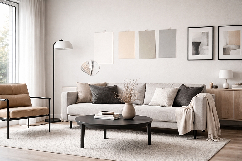
In a physical space, neutrals form the lasting foundation. Furniture and paint are harder to change than a website color.
- Constraints: You must consider natural light, artificial light, and the colors of fixed elements (like flooring or countertops).
- Common Mistakes:
- Assuming "white paint" is one color. Choosing the wrong white (too cool for a north-facing room, too warm under certain bulbs) can make a room feel cold or dirty.
- Using only mid-tone neutrals. A room with all beige and medium gray needs the contrast of very dark (charcoal sofa, dark wood) and very light (white trim, light rug) elements to feel alive.
- Practical Advice:
- Test large paint samples on the wall. Look at them at different times of day. The color will change with the light.
- Start with the largest, most permanent items first: the wall color (often a neutral) and the big-ticket furniture (like a sofa in gray or beige). These are your anchor neutrals.
- Then, layer in textures within that neutral palette: a nubby cream rug, a smooth leather chair, a black metal lamp. This adds interest without adding color.
- Finally, add your accents—pillows, art, a vase—in the colors you love. The neutral base lets you change these accents easily with the season or your mood.
Comparing a Neutral-Dominant vs. Color-Dominant Approach
It’s helpful to see these as two different strategies, not right or wrong, but for different purposes.
A Neutral-Dominant Palette (e.g., 80% Neutrals, 20% Color)
- Character: Calm, sophisticated, focused, spacious.
- Best For: Professional settings, minimalist aesthetics, highlighting key content (like a product or artwork), and creating a relaxing environment.
- How it Works: The neutrals—whites, grays, taupes, blacks—form the entire environment. Color is used sparingly as a deliberate accent. A single red painting on a white wall. A blue "subscribe" button on a gray webpage. The color acts as a target for attention.
- Risk: It can feel cold, sterile, or boring if not executed with care through texture and subtle value variation.
A Color-Dominant Palette (e.g., 60% Color, 40% Neutrals)
- Character: Energetic, expressive, playful, stimulating.
- Best For: Children's brands, entertainment, creative industries, and festive occasions.
- How it Works: Multiple colors interact as the main feature. Neutrals here play a crucial role in separating and defining colours to prevent visual chaos. A white line (a neutral) between two bright color blocks. A charcoal gray text label on a colorful poster. The neutrals provide the essential breathing room and legibility.
- Risk: It can become overwhelming, confusing, or "cheap" looking without enough neutral space to balance the energy.

The expert choice is knowing which strategy serves your specific goal. A corporate annual report should likely be neutral-dominant. A music festival poster can be color-dominant, with neutrals ensuring the information is still clear.
Details Experts Pay Attention To
Beginners pick a gray from a dropdown menu. Experts consider its source and context.
- The Neutrals in Your Materials: On screen, you specify a gray with a hex code. In the physical world, a gray exists in a material. The same gray paint will look utterly different on rough plaster, smooth wood, and sleek metal. The material's texture and sheen are part of the color. An expert specifies not just "gray" but "matte gray plaster" or "satin gray oak stain."
- Lighting is Everything: A neutral color is a chameleon under different lights. The warm gray wall in your lamp's warm glow will look much cooler and greener in daylight. Experts always view color swatches and material samples under the lighting that will be used in the final space.
- Cultural and Subjective Meaning: While black is often formal and white is clean in many Western cultures, this is not universal. In some cultures, white is the color of mourning. An expert designing for a global audience is aware of these connotations and researches the target market.
- The Psychology of Density: Not all whites are equal. A bright, reflective white in a small, windowless room can feel clinical and oppressive. In the same room, a softer, off-white with a slight warmth can feel cozy and enclosing in a good way. Experts understand that the feeling of a color is tied to how it fills a space.
Where Things Go Wrong and What People Get Wrong
Common Failure Modes:
- Muddy Colors: This happens when you mix too many colors and neutrals without a plan. Adding gray to a bright yellow can make it look dull and sickly, not sophisticated. It often comes from trying to "tone down" a color but using the wrong neutral.
- No Focal Point: When everything is given equal weight with color, or when neutrals are used without any variation in value, the viewer's eye has nowhere to land. The design feels flat and unimportant.
- Accessibility Failures: The most serious practical error. Light gray text (#CCCCCC) on a white background fails accessibility standards. It excludes people. This isn't just a style mistake; it's a functional one that can have legal implications for websites and public documents.
Widespread Misconceptions:
- "Neutrals are boring." In truth, a neutral palette is the hardest to do well because there's nowhere to hide. Every detail of contrast, texture, and proportion becomes visible. It requires more skill, not less.
- "White space is wasted space." White space (or negative space) is the unmarked area between elements. It is not empty. It is active. It groups related items, separates unrelated ones, and guides the reader through the layout. Crowding a design because you're afraid of white space destroys its clarity.
- "Black and white is just the absence of color." When used intentionally, a black-and-white (or grayscale) scheme is a powerful stylistic choice. It focuses entirely on form, light, shadow, and texture. It’s not a default; it's a deliberate filter that changes how we perceive the subject.
A Method for Choosing Your Neutrals
Follow this sequence to make deliberate choices.
- Define the Primary Goal. Is it maximum readability? A feeling of luxury? Making a photograph look natural? Write down the single most important job for this design. This decides your starting point.
- Pick Your Dominant Neutral First. Based on your goal, choose your main background "stage."
- For clarity/readability: Start with White or Very Light Gray.
- For drama/emphasis: Start with Black or Very Dark Gray.
- For warmth/approachability: Start with a Warm Off-White or Light Beige.
- Check the Temperature. Look at any other colors or materials you must use. Do they have a warm or cool bias? Choose a neutral with a similar temperature to create harmony, or a slightly contrasting one for more vibrancy.
- Build a Value Range. Ensure you have at least three distinct values ready to use: a light (for backgrounds), a mid-tone (for secondary elements), and a dark (for primary text and key lines). This creates a necessary contrast.
- Apply and Test.
- For digital work, check color contrast ratios using a free online tool.
- For physical work, get real samples and look at them in the actual environment under real lighting.
- Squint at your design. If everything blurs together, you need more value contrast. If one or two elements violently pop out, your neutrals are doing their job.
Your neutrals are the team players. They don’t seek applause, but the project fails without them. Start your next design by giving it the first and most careful consideration. See how it changes the strength and clarity of your work.
Frequently Asked Questions
Can I use brown as a neutral? Yes. Browns, tans, and beiges are often considered warm neutrals. They function exactly like grays—they create space, ground brighter colors, and set a tone. They tend to feel more natural, earthy, or traditional than cool grays.
What is the difference between gray and silver? Silver is essentially a gray with high reflectivity or a metallic sheen. In design terms, it acts as a neutral but adds a glamorous, technological, or futuristic feel due to its shine. Matte gray is more subdued and organic.
How many neutrals should I use in one project? It's best to limit your defined neutrals to a short palette. A classic trio is a Dark Neutral (for text), a Mid-Tone Neutral (for secondary elements), and a Light Neutral (for backgrounds). You can have variations (lighter/darker tints) of these, but having too many distinct grays and beiges can look disorganized.
Is it okay to use pure black (#000000)? For large backgrounds in dark-mode interfaces, many designers prefer a very dark gray (like #121212) as it's less harsh on the eyes and makes other dark elements on screen easier to see. For small text on a light background, a very dark gray (like #212121) is often preferable. Pure black can be used for print or for maximum graphic impact, but test it—it can sometimes look flat.
Why does my gray look blue (or green, or purple) on screen? This is likely due to your screen's color calibration or the surrounding colors. A gray will appear to take on the hue of its complementary color. If you place a true gray next to a yellow object, it may look slightly purplish. Always check colors in their final context.
LEAVE A COMMENT
Recent Posts


0.0372