

What Are Tints, Shades & Tones? A Guide to Colour Variations
When you talk about a colour, you're often only naming the hue. Red, blue, yellow. But in practice, you hardly ever use a hue straight from the tube. You mix it with something else. Tints, shades, and tones are the three fundamental ways of changing a pure colour. They are the building blocks of contrast, depth, and mood in any visual work.
Understanding the difference between them is not just vocabulary. It’s a practical skill. It lets you create palettes that are subtle, sophisticated, and visually coherent.
Core Definitions at a Glance
- Hue: The pure colour itself, like the ones you see on a basic colour wheel.
- Tint: A hue mixed with white. This makes the colour lighter and less intense. Pink is a tint of red.
- Shade: A hue mixed with black. This makes the colour darker and can make it feel richer or more sombre. Maroon is a shade of red.
- Tone: A hue mixed with both black and white (grey). This desaturates the colour, making it more muted, subtle, and complex. Dusty rose is a tone of red.
The Core Principles
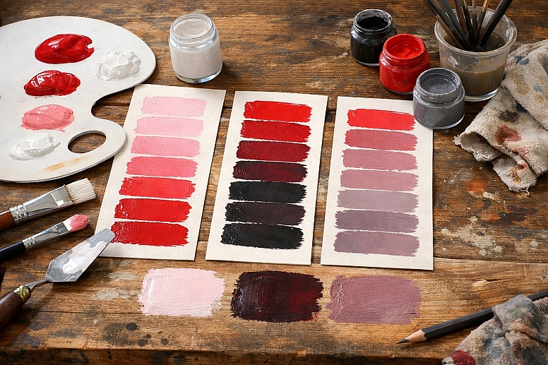
The concept is rooted in practical mixing. Think of a pot of pure red paint. If you add a dollop of white paint and stir, you create a tint. Add more white, and you get a lighter tint. The original hue is still recognisable, but it’s been lightened. The process reduces the colour’s saturation, or intensity.
Now, start again with the pure red. Add a small amount of black paint instead. You’ve created a shade. It’s a darker version of that red. Adding black also subdues the colour’s brightness. It can create depth and shadow. If you add too much black, the original hue can become difficult to see.
Finally, take your pure red. This time, add a grey paint, which is a mixture of black and white. You are creating a tone. You are simultaneously changing the colour’s lightness and draining its pure saturation. The result is a more muted, sophisticated, and often more natural-looking version of the hue. Most colours we see in the natural world—stone, foliage, weathered wood—are tones.
These three variations give you an expansive palette from a single starting hue. This is called a monochromatic colour scheme. It’s harmonious because all colours share the same base hue. The visual interest comes from the contrast between the lights (tints), darks (shades), and muted mid-tones.
The Mechanics of Mixing
The way you create these variations changes slightly depending on your medium. The mental model stays the same, but the execution differs.
In Traditional Paint and Pigment (Subtractive Colour): This is the most intuitive model. You physically mix pigments.
- Tint: Add titanium white to your colour. The more white, the paler and less saturated the tint becomes.
- Shade: Add mars black or a similar black pigment. Be cautious, as black can quickly overpower a hue and make it look muddy. Some artists mix a hue with its complementary colour to create a darker, more vibrant shade instead of using pure black.
- Tone: Add grey, or add both white and black incrementally. This is how you create those complex, "dirty" colours that feel rich and realistic.
In Digital Design (Additive Light): On a screen, you mix light, not pigment. You use values in software like Photoshop or Figma.
- Tint: You increase the Lightness (in HSL sliders) while keeping the Hue and Saturation roughly the same. In practice, increasing lightness often desaturates a colour automatically, mimicking the effect of adding white.
- Shade: You decrease the Lightness value. This darkens the colour. You may also need to slightly decrease the Saturation to prevent it from becoming an overly intense, dark colour.
- Tone: The most direct method is to decrease the Saturation slider. This pulls colour towards grey. You can then adjust the Lightness up or down to get the exact muted colour you want. This is often labelled as "Saturation" or "Vibrance."
The Critical Role of Saturation Saturation is the key variable that tints, shades, and tones all affect. It measures the purity or intensity of a colour.
- A pure hue has maximum saturation.
- A tint has lower saturation—the white dilutes the purity.
- A shade also has lower saturation—the black muddies the purity.
- A tone has the lowest saturation of the three, as grey directly neutralises the colour.
You can visualise this on a colour picker. The pure hue is on the outer edge of the wheel. Move towards the centre, and you decrease saturation, creating tones. Move upwards (towards white) to create tints, and downwards (towards black) to create shades.
Where You’ll Use These Variations
These concepts are not theoretical. They are applied constantly across different fields.
Creating Visual Hierarchy in UI Design: A user interface needs clear focal points. Tints, shades, and tones create this structure without introducing new colours.
- How it’s used: The primary brand colour might be a bright blue. Buttons use this pure hue. Backgrounds use a very light tint of that blue. Borders or divider lines use a subtle tone (a greyish blue). Error states might use a dark shade of the brand’s red. This creates a unified, professional look where everything belongs together.
Painting with Depth and Light: An artist uses these variations to create the illusion of three dimensions on a flat canvas.
- How it’s used: Imagine painting a red apple. The area facing the light isn’t just pure red; it’s a series of warm tints (red mixed with white and a touch of yellow). The shadow side isn’t just red with black; it’s a shade that might lean towards a deeper, cooler red-violet. The transition areas are rich tones. This use of value (light/dark) is what makes an object look solid.
Developing a Cohesive Brand Identity: A strong brand uses a limited colour palette effectively. Mastering tints, shades, and tones expands that palette functionally.
- How it’s used: A brand’s guideline might list “Primary Blue: Pantone 300 C.” It will then also specify: “Light Background: Tint 10% of Primary Blue,” “Dark Text: Shade 60% of Primary Blue,” and “Accent Border: Tone at 40% Saturation.” This ensures every designer, anywhere, creates materials that look like they belong to the same family.
Photography and Colour Grading Colour grading in photos and film often involves shifting the tones of an image to create a specific mood.
- How it’s used: A “muted” film look is achieved by pulling saturation down from the highlights and shadows—essentially, toning down the colours. A bright, airy lifestyle photo might have its shadows lifted with a light tint, reducing contrast. Understanding these terms helps you articulate and achieve these looks deliberately.
Choosing Paint for Interiors: Selecting paint colours is a direct exercise in choosing tones.
- How it’s used: You might love a bold green hue. For a whole room, that would be overwhelming. Instead, you choose a tone of that green—a greyed-down, softer version like sage. For trim, you might pick a light tint of the same base colour. For an accent wall, you could use a deeper shade. This creates a layered, intentional space.
Comparing the Effects on Mood and Perception
Each type of variation carries a different psychological weight and serves a different purpose.
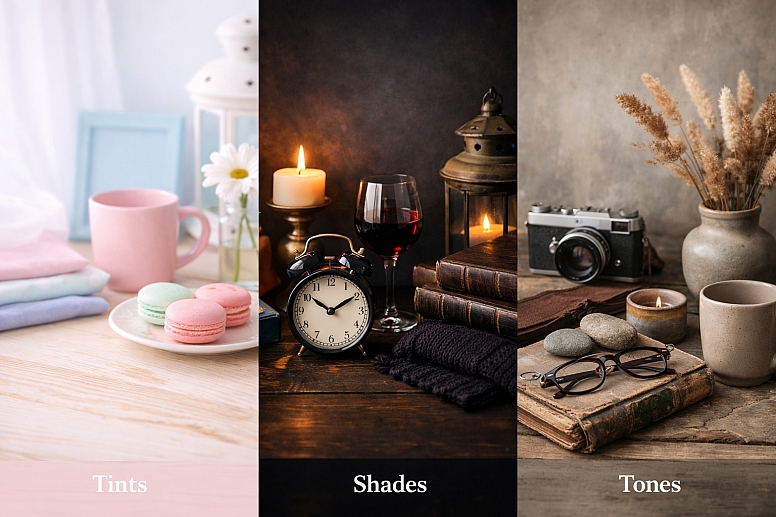
Tints (Hue + White)
- Feelings they evoke: Light, airy, soft, calming, delicate, youthful, ethereal.
- Common associations: Spring, pastels, infancy, cleanliness, softness.
- Best for: Backgrounds, spacious elements, creating a sense of openness, softening a design. Overuse can feel insubstantial or childish.
Shades (Hue + Black)
- Feelings they evoke: Dark, heavy, serious, formal, powerful, sombre, rich, cosy.
- Common associations: Night, shadow, luxury (when used with rich materials), autumn, depth.
- Best for: Text, borders, creating weight and grounding a composition, and adding dramatic contrast. Overuse can feel oppressive, gloomy, or heavy.
Tones (Hue + Grey)
- Feelings they evoke: Muted, sophisticated, subtle, natural, timeless, mature, dusty, complex.
- Common associations: Weathered objects, stone, earth, fog, nostalgia, understated elegance.
- Best for: Primary colours in “mature” designs, creating harmony, backgrounds that aren’t sterile, evoking a vintage or natural feel. Overuse can feel dull, lifeless, or washed-out if not balanced with points of higher saturation.
A successful palette uses a combination. A design might use tones for most of the layout (sophistication), a shade for text (readability), and a pure hue or bright tint for critical interactive elements (attention).
Insights from Professional Practice
Professionals don’t just use sliders randomly. They have specific reasons for their choices.
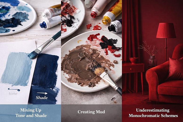
Black is often a Problem in Mixing Shades: In traditional painting, using pure black to make a shade can “kill” a colour, making it look flat and dead. Experienced painters often create a “shadow colour” by mixing the hue with its complementary colour or a cooler, darker version of a nearby hue. For a red apple’s shade, they might add some green or blue to the red. This creates a darker colour that remains vibrant and interesting. In digital work, simply dragging the lightness down can have a similar dulling effect. Try adding a hint of a complementary colour in the colour picker as you darken it.
Tints Don’t Just Come from White: A “tint” in advanced colour theory isn’t only white. It’s any colour that makes another lighter. For a warmer, more vibrant light effect, you can tint a colour with a small amount of a lighter, warmer hue. For instance, to lighten a blue for a sunny sky, tint it with a touch of white and a tiny bit of yellow, not just white alone. This keeps the colour feeling alive.
The Power of Chromatic Greys: A pure tone is a hue mixed with a neutral grey. But not all greys are neutral. A “chromatic grey” is a grey that has a hint of colour in it—like a grey that leans slightly blue or warm beige. Toning a hue with a chromatic grey (e.g., toning a red with a blue-grey) creates far more complex and interesting colours than toning it with a flat neutral grey. This is a hallmark of sophisticated interior design and painting.
Consistency Across Media is Hard: A tint you create on screen will not match a tint mixed in paint, which will not match a tint printed on paper. The “white” of a screen is RGB light. The white of paint is titanium dioxide pigment. The white of paper is its own specific shade. Professionals know they must specify colours for each medium separately (RGB values for web, CMYK/Pantone for print, physical swatches for paint) and accept they will be siblings, not twins.
Common Errors and Misunderstandings
Beginners often stumble on a few key points.
Confusing Tone with Shade: The most frequent error. Someone will say “use a darker tone of blue” when they mean a “darker shade of blue.” A tone is defined by its lowered saturation, not its darkness. You can have a light tone (a pastel that’s been greyed down) and a dark tone (a deep, muted colour). Remember: shade = darkness, tone = muted/greyed.
Creating Mud: “Mud” is the dull, lifeless brown/grey that happens when colours are mixed without a plan. It often occurs when too many hues are combined with black and white haphazardly. To avoid it, be intentional. Mix tones by adding a pre-mixed grey to your hue, not by adding black and white separately while guessing. In digital work, use the Saturation slider for tones instead of manually adding grey RGB values.
Thinking Monochromatic is Boring: Because a monochromatic scheme uses tints, shades, and tones of one hue, people assume it will be flat. The opposite is true. A monochromatic scheme with strong value contrast (very light tints against very dark shades) can be extremely dramatic and effective. The lack of hue contrast focuses the eye on form, light, and texture.
Ignoring the Base Hue’s Properties: Not all hues behave the same when tinted, shaded, or toned. Yellows become creams very quickly when white is added. Yellows also turn greenish when black is added (because most black pigments have a blue base). Reds can become pink (tint) or a rich brown (shade). You must get to know the personality of your base colour.
A Method for Building Palettes
Here is a straightforward way to apply this knowledge.
- Choose Your Anchor Hue. Pick the one pure colour that is essential to your project. This is your foundation.
- Define Your Extremes. Decide on your lightest point (often a near-white tint) and your darkest point (a deep shade). This sets your value range.
- Build Your Mid-Range with Tones. Create 2-3 key tones of your anchor hue. Use the saturation slider or add grey. Aim for a light tone, a medium tone, and a rich, darker tone. These will be your workhorse colours.
- Add a Pure Hue for Impact. Reserve a small area of your pure, saturated anchor hue. This will be your point of maximum colour intensity.
- Assign Roles. Before designing, label your colours: Background (light tint), Text (dark shade), Primary Surface (mid-tone), Secondary Surface (other tone), Accent (pure hue).
- Test for Contrast. Place your text colour over your background colour. Use a contrast checker tool to ensure it meets accessibility standards (a minimum contrast ratio of 4.5:1 for normal text). Do the same for any critical interactive elements.
- Introduce a Neutral. Almost every palette benefits from a true neutral that exists outside your hue family—a warm white, a cool grey, or a deep charcoal. This gives the eye a rest and can make your chosen colours look more intentional.
By following these steps, you move from arbitrary colour picking to structured colour system design.
Questions You Might Have
Can a colour be both a tint and a tone? Technically, these are distinct processes. A colour is a tint if white is added to a hue. A colour is a tone if grey is added. However, in the real world of mixing, adding white often introduces a slight greying effect, so the lines can blur. For clarity, define it by your intent and the primary characteristic: is it primarily lighter (tint) or primarily desaturated (tone)?
What’s the difference between tone and saturation? Tone is the result of changing saturation when grey is involved. Saturation is the measure of a colour’s purity. When you lower the saturation of a hue, you are creating a tone of that hue. They are directly linked concepts.
Why do my digital tints look chalky? This happens when you take a vibrant hue and increase its lightness slider to maximum. This often pushes the colour to a pure, cold white too quickly, losing all character. Instead, try a two-step process: first, slightly decrease the saturation. Then, increase the lightness. This creates a more pleasant, sophisticated tint.
How many tints/shades/tones should I use in one design? There’s no fixed number. A simple design might use just a pure hue, a tint for the background, and a shade for text (three variations). A complex illustration might use dozens of subtle shifts. Start with 3-5 key variations and add more only if you need them for detail or gradient effects.
Are these terms used the same way in light (RGB) and paint (CMYK)? The core concept is universal, but the physical mixing is different. In light, you are adding wavelengths. Adding white light (all wavelengths) to a coloured light desaturates it towards white—that’s a tint. The mental model of “adding white to lighten” translates perfectly, even though the physics differ.
What’s the quickest way to see these differences? Open any digital colour picker. Find a vibrant hue. Drag the picker straight up towards white (tint). Drag it straight down towards black (shade). Drag it horizontally inwards towards the centre grey (tone). Observing this on a wheel or slider cements the relationship.
LEAVE A COMMENT
Recent Posts


0.0317