

How to Build a Color Style Guide for Consistent Branding
A color style guide is the definitive operational manual for a brand's visual identity. It moves beyond a simple palette to establish clear rules, roles, and rationales for every color, ensuring that anyone who applies the brand—from in-house designers to external agencies—achieves consistent, professional results.
A comprehensive guide eliminates guesswork, prevents brand dilution, and scales the brand's visual equity across every touchpoint.
- Core Purpose: To serve as the single source of truth for all brand color application.
- Foundational Structure: Built on semantic naming, defined use cases, and accessibility standards.
- Key Deliverables: A documented system covering primary, secondary, and neutral palettes with explicit usage and prohibition rules.
- Strategic Outcome: Cohesive brand expression that builds recognition and trust across all media and platforms.
The Strategic Imperative of a Formalized Color System
A brand's colors are among its most valuable assets. Without a formal guide, these assets depreciate through inconsistent application—a phenomenon known as "brand drift." A logo may appear in slightly different blues across social media, print, and merchandise, while marketing materials might introduce unapproved accent colors that clash with the core identity. This inconsistency erodes consumer trust and professional credibility.
A well-built style guide transforms colors from a subjective choice into a systematic component of brand architecture. It provides actionable governance, empowering team members to make correct decisions independently. It streamlines production by reducing rounds of revision for color correction.
Most critically, it future-proofs the brand by establishing a framework that can accommodate new products, campaigns, and platforms without losing visual coherence. The guide is not a restrictive cage, but the guardrails that allow for confident, creative expression within the brand's defined universe.
The Architecture of a Comprehensive Color Style Guide
An effective guide is modular, clear, and rationale-driven. It consists of the following mandatory sections.
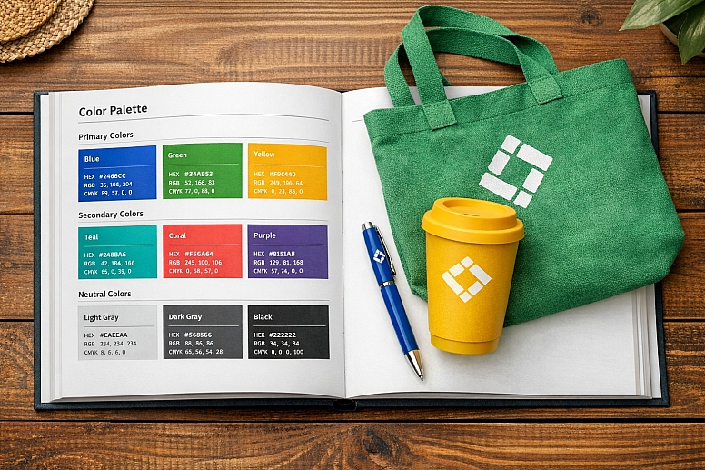
1. The Core Color Palette: Semantic Definition: Colors must be named and organized by their function, not just their appearance. This semantic structure ensures the system remains logical even if specific hues change during a rebrand.
- Primary Palette: The 1-3 colors that are the unequivocal face of the brand. This almost always includes the main brand color.
- Naming Example:
Brand Primary,Brand Secondary,Brand Tertiary. - Rationale Statement: "Brand Primary Blue (
#0056CC) is the cornerstone of our identity. It represents our core values of trust, reliability, and professionalism."
- Naming Example:
- Secondary/Accent Palette: Supporting colors used for highlights, illustrations, data visualization, and to provide creative flexibility.
- Naming Example:
Accent Success,Accent Warning,Accent Energy. - Rationale: "Accent Energy (
#FF6B35) is used sparingly to draw attention to key calls-to-action and to denote positive, dynamic movement."
- Naming Example:
- Neutral Palette: A scale of grays, whites, and blacks used for backgrounds, text, borders, and UI elements.
- Naming Example:
Neutral-900(Text) throughNeutral-50(Backgrounds). - Rationale: "The neutral palette provides the essential framework for our content, ensuring supreme readability and a clean, uncluttered aesthetic."
- Naming Example:
2. The Tint/Shade System: Scalable Application: A single swatch of a primary color is insufficient. For each core color, the guide must provide a perceptually uniform scale of tints (lighter) and shades (darker).
- Standard Scale: A 10-step scale from 50 (lightest) to 900 (darkest), with the base color typically at 500.
- Use Case Mapping:
Primary-50: Subtle page backgrounds.Primary-100: Hover states for white-background elements.Primary-500: The pure brand color for logos and large graphics.Primary-700: Primary buttons and key headlines.Primary-900: Dark mode primary elements.
- Benefit: This scale provides designers with a finite, harmonious set of options for creating contrast, depth, and interaction states without ever using an unapproved color.
3. Usage Guidelines: Explicit Rules and Examples: This is the most critical instructional part of the guide. It moves from what the colors are to how and when to use them.
- Logo Applications: Specify exact color treatments: full-color, one-color (black or white), and reversed (white) versions. State clear background color restrictions.
- Typography: Define the exact colors for headers (H1-H6), body text, and link states (default, hover, visited). Mandate WCAG contrast ratios (e.g., "All body text must maintain a minimum 4.5:1 contrast against its background.").
- UI/Interactive Components: Specify colors for primary buttons, secondary buttons, success alerts, error states, and form fields.
- Data Visualization: Provide a specific sub-palette for charts and graphs, ensuring colors are distinguishable for all users.
- Photography & Overlays: Guide the use of color overlays on imagery and specify approved background colors for product photography.
4. Accessibility Standards: Non-Negotiable Compliance Accessibility must be baked into the guide, not added as an afterthought.
- Contrast Compliance Table: Provide a ready-reference table showing approved text/background pairings and their WCAG rating (AA/AAA).
- Color Vision Deficiency (CVD) Considerations: Include a statement prohibiting the use of color as the sole means of conveying information (e.g., "The 'active' state must be indicated by color and a bolded font."). Show simulations of key color combinations under common CVD conditions.
5. "Do Not Use" Section: Preventing Common Errors A strong guide explicitly states what is forbidden. This prevents well-intentioned misuse.
- Examples: "Do not use the primary color at opacity to create a tint; always use the defined
Primary-100swatch." "Do not use the accent colors for body text." "Do not place the logo on any background where contrast falls below 3:1."
A Comparative Analysis of Color Guide Components
| Guide Section | Core Content | Purpose | Example Output |
|---|---|---|---|
| Palette Definition | Semantic names, HEX, RGB, CMYK, Pantone values. | To provide the absolute technical specifications for color reproduction. | Brand Primary: #0056CC | RGB: 0 86 204 | CMYK: 100 75 0 0 | Pantone: 286 C |
| Tint/Shade System | A visual scale (50-900) for each core color with values. | To enable flexible, yet controlled, application across UI and marketing materials. | A graphic showingPrimary-50throughPrimary-900as clear swatches with their HEX codes. |
| Usage Rules: Typography | Specific color assignments for all text elements and contrast mandates. | To guarantee readability and hierarchical consistency in all communications. | "H1 Headlines:Neutral-900. Body Text:Neutral-800. All text must meet WCAG AA (4.5:1) minimum." |
| Accessibility Table | A matrix of approved background/text color combinations with contrast ratios. | To make accessibility an easy, default choice for designers and developers. | A table showingNeutral-800text onPrimary-50background = 7.2:1 (AAA Pass). |
| "Do Not Use" Examples | Visual mockups of incorrect applications with explanations. | To prevent common misinterpretations and brand dilution through visual education. | A side-by-side showing a correct high-contrast button vs. an incorrect low-contrast version with a red "X." |
Building the Guide: A Step-by-Step Method
- Audit and Consolidate. Gather every existing brand asset. Use a tool like Adobe Color Extract or a plugin like Image Palette to identify the most commonly used colors. Consolidate duplicates and note any inconsistencies.
- Define Semantic Roles. With stakeholders, decide on the core functions of your color system. What is the primary brand message? What emotions should secondary colors evoke? Assign your audited colors to these roles (Primary, Secondary, Neutral).
- Build the Scales. Use a professional plugin like Supa Palette (Figma) or Color Designer to generate clean, perceptually uniform tint/shade scales (50-900) for your primary and secondary colors. Manually curate a neutral gray scale.
- Establish Rules Through Use Cases. Apply your new systematic palette to real-world components: design a key marketing banner, a web form, a product card, and a data chart. The decisions you make during this exercise become your foundational usage rules.
- Test for Accessibility. Use plugins like Contrast (Figma) or Stark (Sketch) to check every text/background pairing in your use cases. Adjust shades in your scale until all core combinations pass WCAG AA. Document these approved pairings in a table.
- Design the Guide Document. Structure the findings clearly. Use a clean, template-driven layout. Prominently display color swatches with codes. Use abundant visual examples of correct application.
- Publish and Socialize. Host the guide in a central, accessible location (e.g., a dedicated website, a company intranet, a shared Figma file). Conduct a rollout workshop with all creative and marketing teams to explain the rationale and importance of adherence.
- Govern and Update. Assign a brand custodian. Establish a process for requesting additions or changes (e.g., for a new product line). Version the guide and maintain a changelog.
Common Pitfalls and Misconceptions
Misconception: "Our logo colors are our style guide." A logo palette is a starting point, not a guide. A guide defines how those colors scale, interact with other elements, and are used in contexts the logo never encounters (e.g., a dashboard UI or a long-form report).
Pitfall: Creating a Guide Without Developer Input. If the guide's naming and structure don't align with how developers build systems, it will fail in implementation. Collaborate early to adopt a naming convention (likeprimary-500) that works for both design and code, facilitating the use of design tokens.
Misconception: "The guide must include every possible color scenario." The goal is to provide a strong framework, not to predict every future need. Focus on nailing the fundamentals (primary, secondary, neutrals, typography, accessibility). A well-built system can be logically extended by designers for new use cases.
Pitfall: Building a Guide That is Ignored. A guide that is difficult to access, understand, or use will be bypassed. Ensure it is living, digital, and practical. Integrate it directly into design tools via shared libraries in Figma/Sketch. Its value is in its daily use, not its perfection.
Questions on Building Color Style Guides
What digital tool is best for creating and hosting the guide? The most effective modern approach is a hybrid model:
- Design Tool as Source: Build the color system as a shared library in Figma (using Variables and Styles). This is the working source.
- Static Documentation for Context: Use a tool like Notion, Confluence, or a dedicated brand website (often built with tools like Zeroheight or Frontitude) to host the rationale, usage rules, "do not use" examples, and broader brand context. This site should link to or embed the live Figma library.
How specific should we get with print specifications (CMYK, Pantone)? For any brand that produces physical materials (business cards, packaging, swag), print specs are mandatory. Provide spot color references (Pantone Coated & Uncoated) for key brand colors to ensure perfect fidelity in high-value print jobs. Always provide accurate CMYK builds for four-color process printing.
How do we handle colors for social media and digital ads? The core guide applies. Social media templates should be created using the guide's defined colors and type styles. For platforms with specific aesthetic pressures (e.g., Instagram), you can create a sub-guide that shows how the core brand palette is best adapted for that medium's format and audience, without breaking the foundational rules.
What's the role of "brand gradients" or duotones in a guide? If used, they must be systematically defined. A gradient is not a freeform blend; it is a specific asset. The guide should specify: "Brand Gradient: Linear, 45°, fromPrimary-500toAccent Energy-500." Provide the exact angle, type, and color stops. This turns a trendy effect into a reproducible brand asset.
LEAVE A COMMENT
Recent Posts


0.0191