

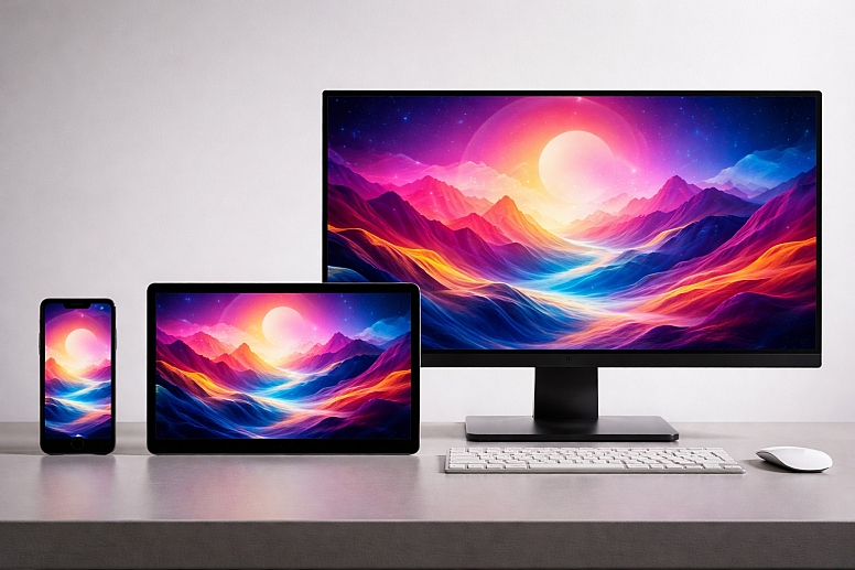
How to Match Colours Across Different Devices & Screens
Achieving perfect colour consistency across every screen is a technical impossibility due to the fundamental physics of different display technologies. However, the goal of professional colour management is not absolute perfection, but predictable, controlled consistency.
This process involves understanding the sources of variance, calibrating your authoritative devices, embedding colour metadata in files, and making intelligent compromises for different display types to ensure the designed intent is preserved as closely as possible for the end-user.
- Core Challenge: Different screens (LCD, OLED, e-ink) create colour using fundamentally different technologies with varying colour gamuts and luminance.
- Primary Tool: A calibrated reference monitor and the use of standardised colour spaces (sRGB, Display P3, Adobe RGB) within design files.
- Strategic Goal: To minimise surprises and ensure the colour seen during design is a reliable predictor of the colour seen in the final, targeted context.
- Critical Acceptance: Some variance is inevitable; the objective is to manage it within acceptable tolerances.
The Inherent Variability of Display Technology
Colour on a screen is an illusion created by blending light. The type of light source, its intensity, and the filters in front of it differ drastically between devices, leading to unavoidable variance.
1. The Gamut Divide: sRGB vs. P3 vs. Adobe RGB A colour gamut is the total range of colours a device can produce. Most web content and standard monitors operate within the sRGB colour space. Modern high-end smartphones, tablets, and Apple computers use the wider Display P3 gamut, which can produce more vibrant greens and reds. Professional photography and print work often use Adobe RGB, which has an even wider gamut in the cyan-green range.
- Problem: A P3-green that is stunning on a new iPhone will be "clipped" or dulled to the nearest sRGB green on a standard monitor, losing its vibrancy. Designing in P3 for a primarily sRGB audience guarantees inconsistency.
2. The Technology Gap: LCD vs. OLED
- LCD (Liquid Crystal Display): Uses a white LED backlight and colour filters. Can struggle with true blacks (appearing as dark grey) and has limited contrast.
- OLED (Organic Light-Emitting Diode): Each pixel emits its own light and can turn off completely for perfect blacks and infinite contrast. Colours, especially saturated ones, appear more intense. A deep navy blue with subtle shadow detail may appear as a flat, murky black on an LCD but will reveal its nuances on a high-quality OLED.
3. Environmental and Manufacturing Variables
- Factory Calibration: Most consumer monitors and phones have poor or inconsistent calibration from the factory, often with a strong blue (cool) tint for a "brighter" perceived look.
- Ambient Light: The colour temperature of room lighting (warm incandescent vs. cool fluorescent) dramatically affects perceived screen colour.
- Screen Settings: A user's "Vivid," "Natural," or "Night Shift" mode overrides any colour management.
The consequence is that a single HEX code,#FF6B6B, will render as a range of reds across the ecosystem. Colour management is the system of constraints and corrections applied to narrow this range.
The Technical Framework for Colour Management
Professional matching is a workflow, not a single action.
1. Establishing a Calibrated Reference Point: You cannot manage what you cannot measure. The first step is to calibrate your primary design monitor.
- Tool: A hardware colorimeter (e.g., from X-Rite or Datacolor).
- Process: The device sits on your screen, reads the output, and creates a custom ICC profile that corrects the display's output to a standard (like sRGB or DCI-P3) at a specific luminance (e.g., 120 cd/m²) and white point (e.g., D65, 6500K, standard daylight).
- Outcome: Your design monitor becomes the "source of truth." All decisions made on it are based on accurate colour data. This is non-negotiable for any professional visual work.
2. Working in the Appropriate Colour Space: The colour space must be chosen based on the final output medium and embedded in the file metadata.
- For Web and Standard Digital Products: sRGB. This is the lowest common denominator and the safest choice. It ensures your colours do not shift unpredictably on the vast majority of devices. All modern browsers assume sRGB unless told otherwise.
- For High-End Mobile/Video Apps Targeting Modern Apple Devices: Display P3. This allows for more vibrant colours where the hardware supports it. Critical: You must provide sRGB fallbacks, as P3 colours will be misinterpreted on non-P3 screens.
- For Print and Photography Workflows: Adobe RGB or ProPhoto RGB. These are used for asset creation and editing, but must be converted to the printer/paper's specific profile for output.
In Figma or Sketch, ensure your document colour profile is set correctly. In Adobe apps, this is managed inEdit > Color Settings.
3. Using Relative and Absolute Colour Values: Understand how colour is interpreted in code:
- HSL (Hue, Saturation, Lightness): Is a relative model.
hsl(0, 100%, 50%)is "red at full saturation and middle lightness." How this renders depends entirely on the device's colour gamut. It can shift. - HEX and RGB: Are absolute values within a colour space.
#<a title="<a title="FF0000" href="https://www.colorik.com/converting-hex-to-rgb">FF0000</a>" href="https://www.colorik.com/converting-hex-to-rgb">FF0000</a>in an sRGB document is a specific, measurable red. This is more predictable for UI design.
For CSS, using HEX orrgb()is generally safer for consistency. Modern CSS now supportscolor(display-p3 1 0 0)for specifying P3 colours directly with fallbacks.
4. Soft-Proofing for Target Devices: Soft-proofing simulates how your design will look on a different device or under specific conditions.
- In Adobe Photoshop/Illustrator:
View > Proof Setup > Customallows you to simulate a different device's profile (e.g., an uncalibrated monitor) or a condition like colour blindness. - Practical Workflow: After designing on your calibrated sRGB monitor, soft-proof to "Monitor RGB" to see how it might look on a typical, uncalibrated office monitor with a blue bias. This allows you to make compensatory adjustments (e.g., slightly warming the colours) to ensure the design remains acceptable in sub-optimal viewing conditions.
A Practical Comparison of Device-Variance Strategies
| Scenario | Primary Challenge | Best Practice Strategy | Compromise & Outcome |
|---|---|---|---|
| Designing a B2B Web Dashboard | Viewed on a wide range of uncalibrated office monitors (often low-gamut, cool-tinted LCDs). | Design in sRGB on a calibrated monitor. Use a limited, high-contrast palette that is robust under poor conditions. | Accept that colours will look slightly cooler/bluer on most end-user screens. Focus on luminosity contrast for readability. |
| Creating a Brand Identity for a Fashion App | Must look vibrant on modern iPhones (P3) but not broken on Android/web (sRGB). | Create core brand colours in sRGB. Develop P3-enhanced versions of key colours for use in iOS-specific assets. | The brand feels standard everywhere and "pops" as a bonus on P3 devices, without being dependent on it. |
| Producing Digital Art for NFT/High-Resolution Display | Art viewed on everything from phones to professional HDR reference monitors. | Work in Display P3 or Adobe RGB to capture full creative intent. Deliver final files with embedded profile. Provide a converted sRGB version for universal web preview. | The art displays fully for those with capable hardware; others see a faithful, if slightly less vibrant, sRGB conversion. |
| Developing a Cross-Platform Mobile App (iOS/Android) | Different default colour rendering and gamma on iOS vs. Android. | Use absolute colour values (HEX) from a shared design system. Test on physical device simulators and actual hardware during QA. | Implement subtle platform-specific colour adjustments in code if testing shows a specific colour fails on one platform (e.g., an iOS blue appearing dull on a specific Android model). |
Advanced Techniques for High-Fidelity Matching
For mission-critical colour (e.g., product photography for e-commerce), more advanced steps are required.
1. Device Testing and Profiling Create a "device library" of common targets: a recent iPhone, an older Android, a budget LCD monitor, a premium laptop. Use your calibrated monitor as the baseline to visually audit your key designs on these devices under standard lighting. Note consistent shifts (e.g., "all devices make our red slightly orange") and adjust the master design accordingly. This is empirical, practical colour management.
2. Using CSS Media Queries for Colour Gamut Modern CSS allows you to serve better colours to devices that can display them:
.button {
  background-color: #FF4757; /* Fallback sRGB red */
}

@media (color-gamut: p3) {
  .button {
    background-color: color(display-p3 1 0.3 0.3); /* Enhanced P3 red */
  }
}
This progressively enhances the experience without breaking it for others.
3. Managing Colour in Dynamic/User-Generated Content When your interface must display unpredictable images or user-uploaded content, consistency is harder. Implement client-side colour profile stripping or conversion in your upload pipeline to convert all assets to a standard sRGB profile, preventing one oddly-profiled image from appearing wildly different in a gallery.
Common Pitfalls and Misconceptions
Misconception: "If I use the same HEX code, it will look the same everywhere." This is the most pervasive and dangerous false belief. A HEX code is an address within a colour space. If two devices interpret that colour space (sRGB) differently—which they do—the rendered colour will differ. The HEX code ensures you are pointing to the same intended colour, but the displayed colour is at the mercy of the screen.
Pitfall: Designing on a Laptop with an Uncalibrated, Glossy Screen. Laptop screens are often highly saturated and contrasty for marketing appeal. Designing on one will produce colours that appear dull and flat on standard desktop monitors. This leads to over-saturating designs in a futile attempt to make them "pop" on the laptop, which then garishly oversaturates on other screens.
Misconception: "OLED screens are always better for accuracy." OLEDs can be more accurate, but out-of-the-box consumer phones and TVs are often set to "Vivid" modes that oversaturate colours for visual impact. An uncalibrated OLED can be less accurate than a calibrated mid-range LCD.
Pitfall: Ignoring the Operating System's Colour Pipeline. macOS and Windows handle colour management differently. macOS generally has robust system-wide colour management. Windows' management can be application-dependent. A colour-managed app like Photoshop will look consistent across OSes, while a non-colour-managed app may not.
A Step-by-Step Method for a Cross-Device Colour Workflow
- Calibrate Your Primary Monitor. Use a hardware colorimeter. This is the single most important step. Re-calibrate monthly.
- Set Your Document Colour Space. Based on your project's primary delivery medium (95% of digital projects: sRGB), configure this in your design software's document settings.
- Design with a Restricted, Robust Palette. Choose colours that have good luminosity contrast and avoid extremely saturated hues at the very edge of the sRGB gamut, as these are most likely to shift.
- Soft-Proof on Your Calibrated Monitor. Use proofing profiles to simulate a typical uncalibrated monitor. Adjust your palette if key colours become unacceptable.
- Test on Real Target Devices. Export key screens (login, dashboard, product page) and view them on 2-3 physical target devices (e.g., an iPhone, a standard office monitor, a budget Android tablet). Look for hue shifts or loss of detail.
- Document with Colour Space in Mind. When handing off to developers, specify the colour space (e.g., "All colours are sRGB"). For P3 projects, provide both sRGB and P3 values.
- Implement with Progressive Enhancement. Use CSS
color-gamutmedia queries to serve P3 colours where supported, with sRGB fallbacks.
Questions on Cross-Device Colour Matching
Can software calibration (like macOS Display Calibrator Assistant) achieve good results? Software-only calibration can adjust gamma and white point based on your eye's perception, which is better than nothing. However, it cannot accurately measure the screen's actual output. A hardware colorimeter is objectively superior and necessary for professional precision. Software calibration is a consumer-grade improvement; hardware calibration is a professional requirement.
How do I match colours between my designer's calibrated monitor and my client's uncalibrated laptop? This is a communication challenge. First, educate the client that screens vary. Share screenshots viewed on your calibrated system as PNGs with embedded profiles. Encourage them to view the proof on a neutral background and, if possible, on a phone as a secondary reference. Ultimately, you must design to look good on your calibrated reference, trusting it represents the most accurate middle ground.
What about matching to physical brand colours (Pantone, print)? This is a separate, complex process called cross-media colour matching. It involves creating a device link profile between your specific monitor/print setup. The general workflow is: 1) Use a calibrated monitor, 2) Work in Adobe RGB, 3) Soft-proof using the specific ICC profile of your printer and paper, 4) Adjust colours until the soft-proof matches your physical Pantone swatch under a standardised D50 viewing light. This often requires expert consultation.
Is HDR (High Dynamic Range) the next big challenge for colour matching? Yes. HDR displays (like those on newer phones, TVs, and MacBooks) can produce much brighter highlights and a wider range of colours and contrast. CSS now has@media (dynamic-range: high). The core principle remains: design for a standard dynamic range (SDR) baseline using sRGB/Rec.709, and use media queries to enhance with HDR where available, ensuring a graceful fallback. Managing for HDR requires new tools and workflows that are still emerging.
LEAVE A COMMENT
Recent Posts


0.0363