

How to Use Color to Create Dynamic Infographics
Color in an infographic is a functional tool for logic, hierarchy, and narrative. It transforms raw data into an intuitive visual argument, guiding the viewer's eye and mind through a structured sequence of information.
A dynamic infographic uses color not for decoration, but to encode categories, signify magnitude, highlight relationships, and drive comprehension with efficiency and impact.
- Core Function: Color categorizes, sequences, and highlights data to reveal patterns and tell a story.
- Primary Rule: Color choice must be dictated by data type (categorical, sequential, divergent) and the specific story being told.
- Critical Constraint: Palettes must be perceptually uniform and accessible, avoiding common pitfalls like the misleading rainbow spectrum.
- Strategic Outcome: A self-explanatory visual where color reduces cognitive load and makes complex information immediately graspable.
Color as the Syntax of Data Visualization
An infographic is a form of visual communication where every element must justify its presence. Color is the primary syntax that gives this communication structure. It allows the viewer to group related items, understand order and magnitude, and instantly identify key takeaways without reading a single word.
The effectiveness of this syntax is measurable. Research in data visualization consistently shows that well-chosen, perceptually uniform color schemes lead to faster and more accurate data interpretation. Conversely, poor color choices—such as using a rainbow palette for sequential data—introduce visual noise, create false perceptual boundaries, and can actively mislead the viewer. The goal is to use color to make the data's inherent structure visible, not to superimpose an arbitrary or aesthetically driven structure upon it.
The Technical Framework: Data Types and Color Schemes
Selecting the right color scheme is a technical decision based on the nature of your data. There are three fundamental types.
1. Categorical Data (Qualitative) This data represents distinct groups or categories with no inherent order (e.g., product types, departments, countries).
- Color Scheme Goal: Maximize distinction between hues.
- Best Practice: Use a set of distinctly different hues with similar perceived brightness and saturation to avoid implying importance. Limit the palette to 6-8 colors; beyond that, distinction becomes difficult. If you have more categories, use patterns, labels, or interactive filtering instead of more colors.
- Tools & Palettes: Use trusted categorical palettes from ColorBrewer or Adobe Color. Avoid spectral (rainbow) order.
2. Sequential Data (Ordered) This data represents values that progress from low to high (e.g., temperature, revenue, population density).
- Color Scheme Goal: Show progression through a perceptually uniform change in lightness.
- Best Practice: Use a single-hue palette that moves from a light tint (for low values) to a dark shade (for high values). Alternatively, use a multi-hue sequential palette (e.g., light yellow to dark blue) which can depict a wider range with greater visual interest while maintaining the light-to-dark progression.
- Critical Avoidance: Never use a spectral (rainbow) palette for sequential data. The arbitrary hue changes imply categorical boundaries where none exist.
3. Divergent Data (Emphasizing Deviation) This data shows deviation from a meaningful midpoint, often zero or an average (e.g., profit/loss, temperature change from baseline, voter sentiment).
- Color Scheme Goal: Highlight the two extremes and the neutral center.
- Best Practice: Use two contrasting hues that meet at a light, neutral color. For example, blue (for negative/cold) → light gray or white (for neutral/midpoint) → red (for positive/hot). The saturation and lightness should increase symmetrically from the midpoint.
- Application: Ideal for highlighting correlation, polarization, or any "above/below" comparison.
Five Infographic Contexts for Strategic Color Application
1. The Corporate Annual Report "Key Metrics" Dashboard
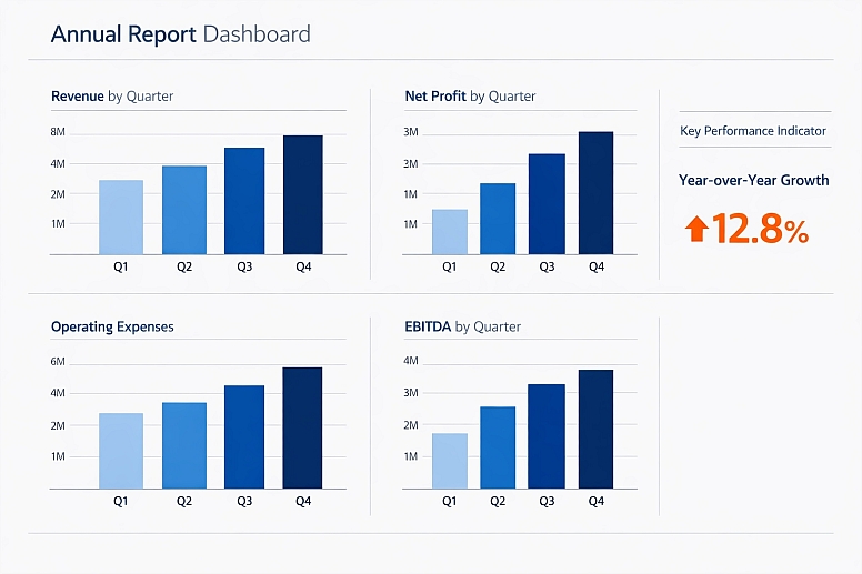
- Constraints: Must communicate financial and operational performance to a mixed audience (experts and general shareholders) with authority and clarity.
- Common Mistakes: Using the corporate brand color for all data series, making comparisons impossible. Overloading with too many categorical colors.
- Practical Application: Use a monochromatic sequential palette of the brand's primary color for all revenue/profit charts (light tint for Q1, dark shade for Q4). Use a single, contrasting categorical color (e.g., a bold orange) exclusively to highlight the single most important KPI or to draw attention to a year-over-year growth callout. Neutral grays for gridlines and secondary context.
2. Public Health Awareness Campaign (e.g., Disease Prevalence Map)
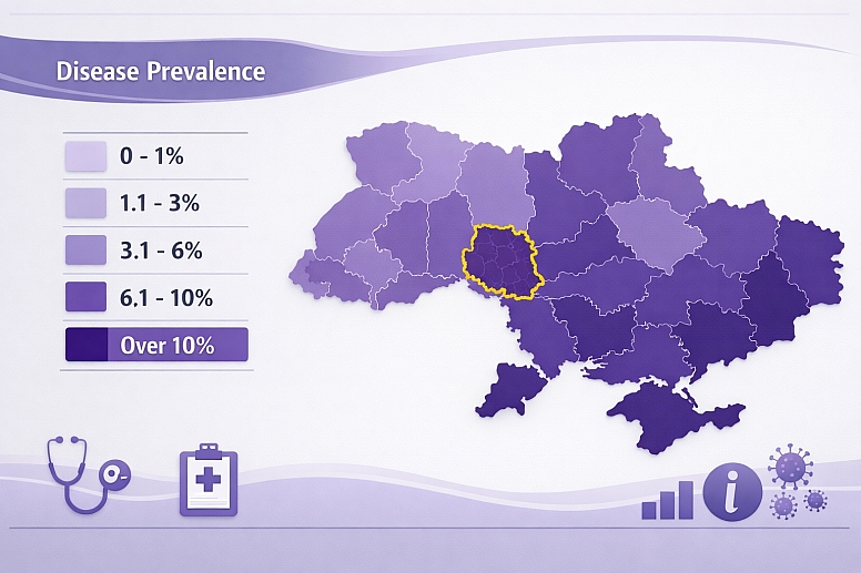
- Constraints: Must be instantly understandable to the general public, accessible to those with color vision deficiencies, and convey urgency without causing unnecessary alarm.
- Common Mistakes: Using a red-to-green sequential palette ("choropleth") which is unreadable for 5% of the population.
- Practical Application: For a prevalence rate map, use a single-hue sequential palette of purple (from light lavender to deep violet). Purple is generally CVD-safe and avoids the cultural baggage of red/green. Pair this with a clearly labeled legend showing the numeric range for each color step. Use a bright, fully saturated accent color (like yellow) with a bold outline only to highlight specific regions mentioned in the accompanying narrative.
3. Comparative Product Feature Breakdown
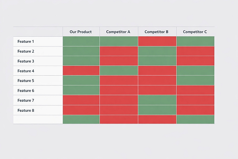
- Constraints: Must allow for quick comparison across multiple competitors and numerous features in a limited space.
- Common Mistakes: Using a checkmark/X in varying colors, which is slow to parse. Coloring every cell in a table creates visual chaos.
- Practical Application: Use a simple, binary divergent palette. Apply a consistent, muted green fill to cells where a feature is present/positive. Apply a consistent, muted red fill to cells where a feature is absent/negative. Use a neutral white or light gray for all other cells. This allows the viewer's eye to scan for patterns of green (strengths) and red (weaknesses) across rows and columns instantly.
4. Timeline Showing Historical Progression or Process Flow
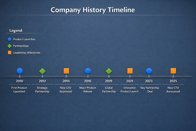
- Constraints: Must show chronological sequence and potentially different phases or types of events within that sequence.
- Common Mistakes: Using different colors for each year or segment, which breaks the visual flow of the timeline.
- Practical Application: Use a single, strong color for the timeline track itself (e.g., a dark gray line). Then, use a categorical palette to color-code the events or phases that sit on this track. For example, in a company history timeline, use blue for "Product Launches," green for "Partnerships," and orange for "Leadership Milestones." The consistent track color maintains the sequence, while the event colors enable categorization.
5. Interactive "State of the Industry" Survey Results
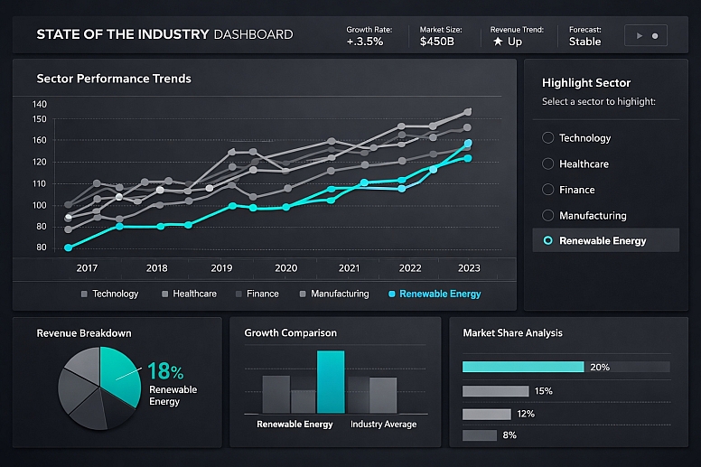
- Constraints: Data is multi-dimensional; the infographic may need to allow users to filter and explore.
- Common Mistakes: Attempting to show all dimensions at once with color, resulting in an unreadable "rainbow" chart.
- Practical Application: Design with layered interactivity in mind. Use a consistent, accessible categorical palette for the primary dimension (e.g., industry sectors). Initially, use neutral grays for other data series. The interactive controls then allow the user to highlight a specific series (e.g., "show only growth projections"), which changes from gray to a bold, focused color. This keeps the static view clean and uses color as a dynamic highlighting tool upon user engagement.
A Comparative Analysis of Infographic Color Strategies
| Data Type & Goal | Recommended Color Scheme | Visual Mechanism | Example Palette (Light to Dark) | Best Use Case |
|---|---|---|---|---|
| Categorical Distinction | Qualitative / Set of Distinct Hues | Hue variation at similar lightness/saturation. | Set2 from ColorBrewer:#66C2A5,#FC8D62,#8DA0CB,#E78AC3. |
Pie chart segments, grouped bar charts, and distinguishing product lines. |
| Sequential (Single Hue) | Monochromatic Lightness Ramp | Lightness variation of a single base hue. | Blues:#EFF3FF→#BDD7E7→#6BAED6→#3182BD→#08519C. |
Population density map, revenue over time, and any "low-to-high" metric. |
| Sequential (Multi-Hue) | Light Yellow to Dark Blue | Combined hue shift and lightness increase. | Viridis:#FDE725→#5DC863→#21918C→#3B528B→#440154. |
Enhancing visual interest in a long sequential scale, like elevation or scientific measurement. |
| Divergent (Emphasis on Midpoint) | Two Hues Meeting at a Neutral | Symmetrical lightness ramps in two opposing directions. | Red-Gray-Blue:#CA0020→#F4A582→#F7F7F7→#92C5DE→#0571B0. |
Temperature anomaly (above/below average), profit/loss statement, sentiment analysis. |
| Highlighting & Focus | Neutral Background + Single Accent | Maximum contrast between a dominant neutral field and a lone saturated color. | Grays (#F0F0F0,#BDBDBD,#636363) with one highlight (#E31A1C). |
Drawing the eye to a key data point, trend line, or conclusion within a complex chart. |
Advanced Techniques for Clarity and Impact
Beyond basic schemes, expert design involves managing perception and narrative.
Perceptual Uniformity and Color Vision Deficiency (CVD): A palette must be chosen so that the order or grouping is preserved when viewed by someone with CVD. Tools like ColorBrewer are designed for this. Always simulate your final palette with a CVD simulator (like the Stark plugin). A sequential palette should maintain a monotonic luminance ramp even in grayscale.
Layering and Typographic Color: The infographic's text is part of the data layer. Use your established color scheme to color-code labels directly, matching the label to the data element it describes. Use a high-contrast, neutral dark gray for all other explanatory text and titles to ensure readability.
Thematic and Metaphorical Color: When appropriate, color can reinforce the subject matter. A climate change graphic might use a blue-to-red divergent scheme intuitively linked to cold and hot. A financial graphic might use green and red with extreme care (and alternative indicators like +/− signs) due to their strong cultural associations. The metaphor must support, not confuse, the data.
Common Pitfalls and Misconceptions
Misconception: "The rainbow (spectral) palette is vibrant and engaging for data." This is the most harmful and persistent error in data visualization. The spectral palette is not perceptually uniform—it has bright and dark bands that imply false boundaries. It is problematic for CVD viewers. It should never be used for ordered data. Its use is a hallmark of amateur design.
Pitfall: Letting Charting Software Defaults Dictate Your Palette. Software like Excel or basic chart generators often default to poorly chosen, inaccessible palettes. The first step in creating a professional infographic is to override all defaults and manually apply a structured, intentional color scheme based on your data type.
Misconception: "More colors mean more information." Cognitive overload occurs when too many colors are used. The human working memory can comfortably track 5-7 distinct categories. If your data has more, it is a sign you need to aggregate, group, or use an interactive filtering method rather than expanding the palette.
Pitfall: Ignoring the Background and Surrounding Context. A light sequential palette will disappear on a white background. A dark palette will vanish on black. Always ensure sufficient contrast between your data layers and the background. The background should be a neutral, non-competitive surface.
A Method for Building a Color-Driven Infographic

- Audit Your Data and Define the Story. List all variables. Determine which are categorical, sequential, or divergent. Write a one-sentence headline for the story the graphic must tell (e.g., "Company X's market share grew dramatically in Asia while declining in Europe.").
- Assign Color Schemes Based on Data Type. For your key story variables, select the appropriate scheme from the framework above. Use tools like ColorBrewer or Adobe Color to generate accessible palettes.
- Establish a Visual Hierarchy with Color. Decide which data is primary (use strongest, most distinct colors) and which is secondary/context (use muted or neutral colors). The headline story should be visually dominant.
- Apply and Test in Grayscale. Apply your colors to a draft layout. Then, convert the entire graphic to grayscale. If the narrative, sequence, and groupings are still clear, your color choices are working on a perceptual level. If not, adjust the lightness values of your colors.
- Simulate for Color Vision Deficiency. Run your colored draft through a CVD simulator. Ensure that all categorical distinctions and sequential orders are still perceptible. Adjust hues if necessary (often, moving away from red-green contrasts is key).
- Integrate Typography and Linework. Color-code labels to match their data elements. Use consistent colors for arrows, connecting lines, and annotations to tie the narrative together.
- Add a Legend and Source. Every color must be explicitly defined in a legend. Place it prominently. Include a data source citation for credibility.
Questions on Color in Infographics
How do you choose a color palette for a multi-variable, complex infographic? Use a layered approach. Pick one primary data dimension (e.g., region) and assign it your strongest categorical palette. Use a sequential palette within each category for a secondary variable (e.g., growth rate within each region). Use neutral grays for tertiary context (e.g., baseline values). The key is to not encode every variable with a unique hue; use other visual channels like position, length, and size.
What are the best tools for generating accessible color palettes?
- ColorBrewer 2.0: The academic standard for cartography, offering safe sequential, divergent, and categorical palettes with CVD filters.
- Adobe Color: Excellent for creating and testing custom palettes, with accessibility tools built in.
- Viz Palette: A tool by Elijah Meeks and Susie Lu that allows you to test a palette across chart types and for CVD.
- Chroma.js Color Palette Helper: For creating advanced perceptual scales.
Can I use my brand colors in an infographic? Yes, but with discipline. Your brand's primary color can often serve excellently as the basis for a monochromatic sequential palette. Secondary brand colors can be used as categorical accents. However, you must never let brand guidelines force you into an inappropriate or inaccessible scheme (e.g., using two brand colors with similar lightness for categorical data). Create accessible tints and shades of your brand colors specifically for data visualization purposes.
How important are cultural connotations of color in global infographics? Very important for divergent or semantically loaded data. While blue/red for cold/hot is widely understood, green/red for good/bad is not universal and is problematic for accessibility. The safest approach for global work is to use a sequential scheme (light to dark) for value and to pair color with clear icons (+/−, ↑/↓) and labels to convey meaning, rather than relying on color symbolism alone.
LEAVE A COMMENT
Recent Posts


0.045