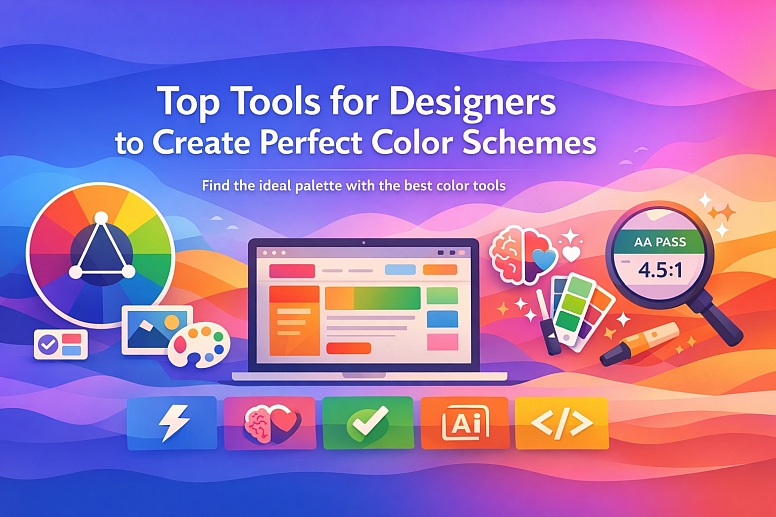
Top 5 Tools for Designers to Create Perfect Colour Scheme
Finding the perfect color scheme can feel like a challenge, but the right tools can make it fast, intuitive, and precise.
Here are the top five tools that go beyond simple generation to give you control, harmony, and accessibility from the start. Each one excels at a different part of the design process.
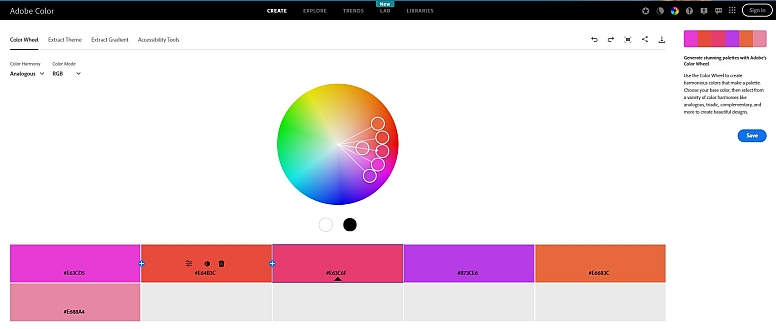
1. Adobe Color: The Definitive Color Theory Powerhouse
When you need to build a palette based on classic design principles or match an existing visual, Adobe Color is the definitive professional tool.
What it does best:
- Master Color Harmony: Generate palettes using nine different rules like analogous, complementary, and triadic, all from a color wheel interface.
- Extract Colors from Images: Upload any photo, and the tool will intelligently create a balanced palette from its most prominent colors.
- Integrated Workflow: If you use Adobe Creative Cloud, you can save your palettes and access them directly in Photoshop, Illustrator, or other Adobe apps.
- Trend & Accessibility Tools: Explore color trends from Behance and Adobe Stock, and use tools to check contrast and simulate color blindness.
Best for: Professional designers and anyone looking to apply precise color theory, especially within the Adobe ecosystem.
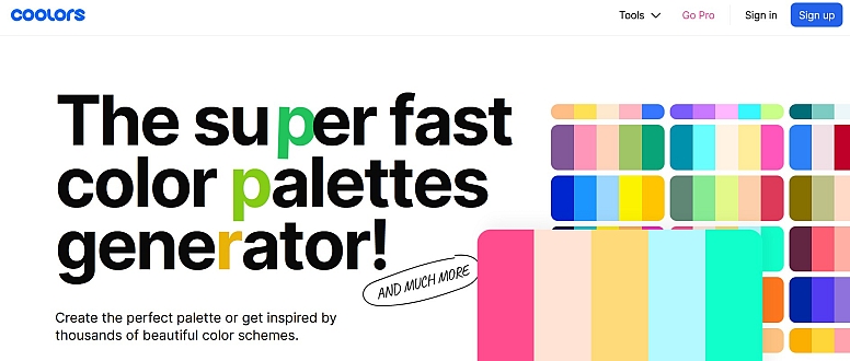
2. Coolors: The Lightning-Fast Idea Generator
For generating endless inspiration with minimal effort, Coolors is famously fast and fun. It’s perfect for breaking creative block and exploring a world of color combinations.
What it does best:
- Instant Generation: Press the spacebar to instantly cycle through a new, harmonious five-color palette.
- Easy Lock & Refine: Found a color you love? Lock it in and keep pressing the spacebar to see what works with it.
- Discover & Browse: Explore millions of palettes created by other designers, searchable by color, mood, or style.
- Full Toolkit: It also includes an image palette extractor, contrast checker, and offers plugins for design tools like Figma.
Best for: Quickly brainstorming ideas, finding trending combinations, and getting unstuck in the early stages of a project.
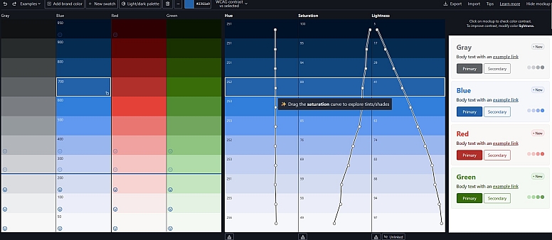
3. Inclusive Colors: The Accessibility-First Builder
This modern tool puts accessibility at the core of the palette creation process. It helps you build color schemes that are beautiful and compliant from the very beginning.
What it does best:
- Real-Time Contrast Feedback: As you edit, the tool visually shows which color pairs pass WCAG accessibility rules for text and background combinations.
- Stable Color Science: Uses the HSLuv color space, which keeps brightness stable when you adjust hue or saturation. This makes designing accessible palettes more predictable.
- Theme-Ready: You can switch between checking contrast for WCAG 2 and the newer APCA (Accessible Perceptual Contrast Algorithm) standard, which is useful for modern light and dark themes.
- Developer-Friendly Export: Exports palettes to formats like Tailwind config files, CSS variables, and design tool files, making handoff seamless.
Best for: Designers building websites, apps, or design systems where accessibility is a non-negotiable priority.
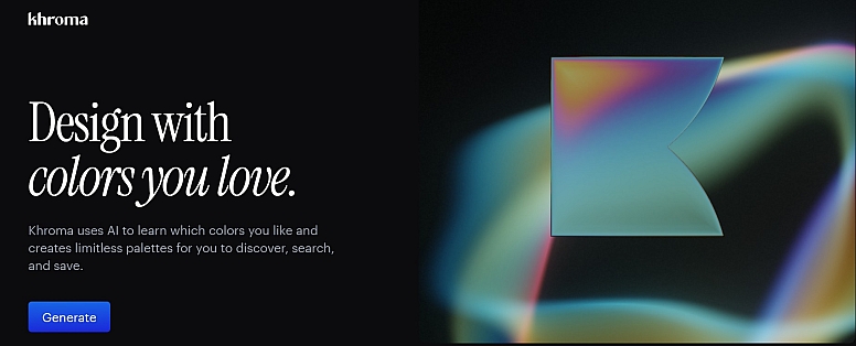
4. Khroma: The AI-Powered Personal Designer
Khroma uses artificial intelligence to learn your personal color preferences and generate palettes and gradients tailored specifically to your taste.
What it does best:
- Trains on Your Taste: You start by choosing 50 colors you like. An AI algorithm trains on these to generate thousands of palettes and gradients it predicts you'll love.
- Intelligent Search & Browsing: Search the AI's generated colors using descriptive terms like "muted," "dark," or "bright," or filter by hue and value.
- Practical Previews: View your colors in useful contexts like typography, gradients, or image overlays to see how they work in practice.
- Build Your Library: Save your favorite combinations and get detailed info like color names, codes, and WCAG ratings for each pair.
Best for: Designers looking for a unique, personalized color direction that moves beyond common trends.
5. Realtime Colors: The Context & Confidence Checker
This simple but powerful tool solves a common problem: you can't tell how a palette will feel until you see it in context. Realtime Colors lets you apply your colors to a realistic website layout in real-time.
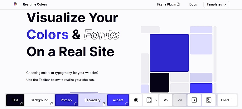
What it does best:
- See Colors in Action: Instantly apply your palette to a mockup website with text, buttons, cards, and sections. Adjust any color and watch the entire layout update live.
- Perfect for Web Design: Makes it incredibly easy to judge visual hierarchy, contrast, and overall feel for a website without building a single mockup.
- Simple & Fast: The interface is straightforward—choose background, text, primary, and accent colors and see them work together immediately.
- Easy Export: You can export your finalized palette as CSS, SCSS, or image files for direct use.
Best for: Web designers, UI designers, and founders who want to make confident color decisions and see the final vibe before development begins.
How to Pick the Right Tool for You
The "perfect" tool depends on your immediate goal:
- For pure inspiration and speed: Start with Coolors.
- To apply professional color theory or match a photo: Use Adobe Color.
- To build an accessible system from scratch: Inclusive Colors is your best choice.
- To get a unique, AI-curated direction: Train Khroma.
- To visualize a palette in a real layout: Test it in Realtime Colors.
Most professional workflows involve using two or more of these tools in sequence—for example, generating ideas with Coolors, refining harmony with Adobe Color, and finally checking accessibility with Inclusive Colors.
