

What Are Split-Complementary Colors & How Do They Work?
Color harmony is the cornerstone of compelling design. While complementary color schemes offer high contrast and energy, they can sometimes be too jarring for a balanced composition. This is where the split-complementary color scheme emerges as a designer's secret weapon. It retains much of the vibrant energy of a complementary scheme but introduces more nuance, variety, and harmony, making it far more versatile and easier to work with.
This guide will deconstruct the split-complementary scheme, explore the theory behind it, and provide a practical roadmap for using it effectively in your design work.
Understanding Split-Complementary Colors at a Glance
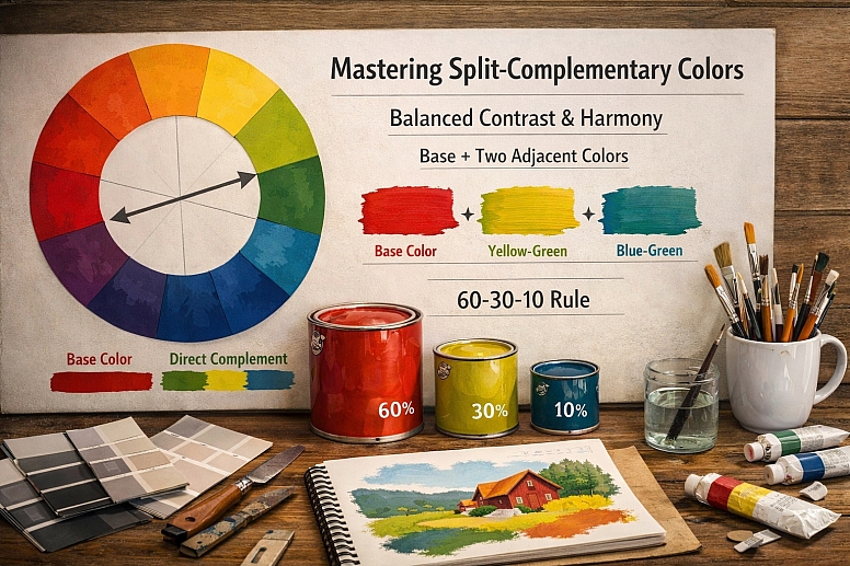
- Definition: A split-complementary color scheme uses a base color plus the two colors adjacent to its direct complement on the color wheel.
- Structure: It consists of three colors, creating a nuanced and sophisticated triad that is less tense than a straight complementary pair.
- Key Benefit: It offers strong visual contrast and vibrancy while being more harmonious and less aggressive than a standard complementary scheme.
- Versatility: This scheme is exceptionally versatile, suitable for everything from bold graphics to serene interiors.
- Process: The scheme is built by first choosing a base hue, then finding its direct complement, and finally selecting the two hues on either side of that complement.
Deconstructing the Color Wheel: The Foundation of Harmony
To grasp the split-complementary scheme, one must first be familiar with the standard color wheel, a circular diagram of colors organized by their chromatic relationship.
- Primary Colors: Red, yellow, and blue. These are the foundational colors that cannot be created by mixing other hues.
- Secondary Colors: Green, orange, and purple. Each is created by mixing two primary colors.
- Tertiary Colors: These are the intermediate colors formed by mixing a primary color with an adjacent secondary color, such as red-orange, blue-green, or yellow-green.
The relationship between colors on this wheel determines the type of scheme. Complementary colors sit directly opposite each other, creating the highest possible contrast. The split-complementary variation introduces a sophisticated twist on this classic opposition.
The Step-by-Step Construction of a Split-Complementary Scheme
Building this scheme is a simple, mechanical process rooted in the geometry of the color wheel.
-
Choose Your Dominant Base Color: This is the starting point and will be the dominant hue in your design. This choice is crucial and should be informed by the psychological associations and context of your project. For example, a health brand might start with a calming blue-green.
-
Locate Its Direct Complement: Find the color that sits directly opposite your base color on the wheel.
- If your base color is Red, its complement is Green.
- If your base color is Blue-Violet, its complement is Yellow-Orange.
-
Identify the Two Adjacent Colors: Instead of using the direct complement, you will use the two colors immediately on either side of it.
- If your base color is Red, its complement is Green. The two colors adjacent to Green are Yellow-Green and Blue-Green.
- Therefore, the full split-complementary scheme for Red is: Red + Yellow-Green + Blue-Green.
This process ensures that the two supporting colors are analogous to each other (sitting next to each other on the wheel), which creates inherent harmony, while they both still maintain a strong contrasting relationship with the base color.
The Psychology and Visual Impact: Why This Scheme Works
The genius of the split-complementary scheme lies in its psychological balance. It masterfully negotiates the tension between contrast and harmony.
-
Reduced Visual Tension: A straight complementary pair, like red and green, creates a powerful but potentially overwhelming vibration where the edges seem to clash. The split-complementary scheme diffuses this tension. The base color (red) still has a strong contrasting relationship with the two analogous colors (blue-green and yellow-green), but because these two are not a single, direct opposite, the effect is more dynamic and less aggressive.
-
Increased Sophistication and Nuance: By introducing two related but distinct hues instead of one, the palette immediately becomes more complex and interesting. It avoids the sometimes simplistic feel of a straight complementary scheme and offers more tonal variety for creating hierarchy and emphasis within a design.
-
Inherent Balance: The scheme naturally creates a balanced composition. The two analogous colors provide a harmonious foundation that supports and plays against the bold statement of the base color. This makes it much easier to achieve a visually stable design compared to a standard complementary pair, which can be harder to balance.
Practical Application: Using Split-Complementary Colors in Design
Knowing the theory is one thing; applying it is another. Here’s how to implement this scheme across various design disciplines.

1. Establishing Hierarchy and Dominance: The most effective way to use this scheme is to allow one color to dominate.
- 60-30-10 Rule: Apply this classic rule for balance.
- Use your base color for 60% of the design (e.g., a website background, a wall color).
- Use one of the two split complements for 30% (e.g., furniture, main visual elements).
- Use the other split complement for the remaining 10% as an accent (e.g., throw pillows, call-to-action buttons, highlights).
2. Creating Depth and Dimension: Leverage the advancing and receding properties of warm and cool colors within your scheme.
- If your base color is warm (e.g., red), it will naturally appear to advance. You can use the cooler split complements (e.g., blue-green and yellow-green) to create receding backgrounds or shadows, adding depth to a flat layout.
3. Mastering Digital Design and UI: In user interface design, clarity and action are paramount.
- Base Color: Use for primary brand elements and main headers.
- First Split Complement: Use for secondary information, backgrounds, or inactive states.
- Second Split Complement: Reserve this, often the most contrasting hue, for primary call-to-action buttons, key icons, or alerts. This draws the user’s eye directly to the most important interactive element.
4. Achieving Harmony in Interior Design: This scheme is a favorite among interior designers for creating vibrant yet livable spaces.
- Base Color: Choose a color you love for large, statement pieces like a sofa or wall color.
- Split Complements: Use these for complementary elements like curtains, rugs, and artwork. For example, a room with a violet sofa (base) could be accented with yellow-orange and yellow-green pillows and decor. The result is energetic but not overwhelming.
Advanced Techniques and Considerations
To truly master this scheme, consider these nuanced approaches.
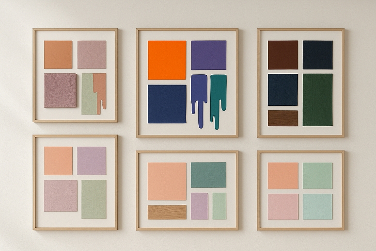
Playing with Saturation and Value: The initial scheme uses pure hues, but this is often too loud for practical use. The real artistry comes in adjusting the saturation (intensity) and value (lightness/darkness) of your chosen colors.
-
- For a Subtle Look: Mute all three colors by reducing their saturation and/or shifting their value toward pastels or shades. A scheme of muted sage green, dusty peach, and soft slate blue is more serene than its vibrant counterparts.
- For a Bold Look: Use the pure, saturated hues for a high-energy, graphic effect. This is excellent for posters, media kits, or targeting a youthful audience.
The Power of Neutrals: Neutrals are your best friend in any color scheme. They provide visual breathing room and prevent color fatigue.
-
- Use whites, blacks, grays, beiges, and browns for text, backgrounds, and structural elements. This allows your split-complementary colors to shine without competing for attention.
Choosing the Right Base: The entire mood of your design hinges on your base color choice.
-
- A blue base will create a cool, trustworthy foundation, accented by warm split-complements (red-orange and yellow-orange), offering a balanced yet dynamic feel.
- An orange base feels friendly and energetic, balanced by cooler blue-based split-complements (blue-violet and blue-green).
A Comparative Analysis: Split-Complementary vs. Other Schemes
Understanding how this scheme fits into the broader landscape of color theory is helpful.
- Vs. Complementary: Offers more nuance and is easier to balance. It has lower contrast but higher harmony.
- Vs. Analogous: Offers significantly more contrast and visual excitement. An analogous scheme (3-4 adjacent colors) is very harmonious but can lack dynamism.
- Vs. Triadic: A triadic scheme uses three colors equally spaced on the wheel (e.g., red, yellow, blue). It is very vibrant and balanced but can feel overly bold or childish if not carefully managed. The split-complementary scheme is generally more sophisticated and easier to control.
Implementing Your Scheme: A Step-by-Step Workflow
- Define the Project's Mood: Is it energetic? Calm? Luxurious? This will guide your base color choice.
- Choose a Base Hue: Select your dominant color based on the desired mood.
- Use a Tool to Find Splits: Use a digital color wheel tool like Adobe Color to instantly find your two split-complementary colors. Select the "Split Complementary" rule from the menu.
- Refine Your Palette: Adjust the saturation and value of your three colors to achieve the right tone. Create tints (add white), tones (add gray), and shades (add black).
- Select Your Neutrals: Choose warm or cool neutrals that complement your palette.
- Apply with Hierarchy: Use the 60-30-10 rule to apply your colors, ensuring the base dominates and the accents pop.
- Test for Accessibility: Always check the contrast ratios between your colors, especially if used for text and background, to ensure readability.
The Designer's Strategic Advantage
The split-complementary color scheme is more than a theoretical concept; it is a practical framework for making intelligent color choices. It provides a reliable recipe for creating designs that are both visually engaging and harmoniously balanced. By offering a sophisticated alternative to the high-stakes contrast of direct complements, it empowers designers to work with bold colors confidently, knowing the result will be dynamic yet refined.
Embrace this scheme as a go-to tool in your creative process. The next time you face a blank canvas, start with a color you love, find its split complements, and experiment. You will discover a world of vibrant, balanced, and professional-looking palettes at your fingertips.
Answers to Common Questions
What is the difference between complementary and split-complementary? A complementary scheme uses two colors directly opposite each other on the color wheel (e.g., red and green). A split-complementary scheme uses a base color and the two colors adjacent to its direct complement (e.g., red, blue-green, and yellow-green). The split-complementary offers a similar level of contrast but is more nuanced and easier to balance than the sometimes jarring effect of a direct complementary pair.
Can a split-complementary scheme have more than three colors? The core definition of the scheme is three colors: one base and two splits. However, in practice, designers almost always expand the palette by using various tints, tones, and shades of those three core hues. For example, a palette might include a dark shade of the base color, a light tint of one split, and a muted tone of the other. This creates a more versatile palette while maintaining the harmonic structure of the scheme.
Is the split-complementary scheme good for beginners? Absolutely. It is arguably one of the best schemes for beginners to experiment with after mastering analogous schemes. It provides a clear, formulaic approach to creating contrast without the high risk of clashing that comes with a direct complementary scheme. The results are almost always harmonious and visually appealing, making it a confidence-building tool.
How do I avoid my design looking too busy with three strong colors? The key is hierarchy and neutrals. Do not use the three colors at full saturation in equal amounts. Let one color dominate (60%), use another for support (30%), and the third as a minimal accent (10%). Furthermore, use plenty of neutral space (whites, grays, blacks) to separate the colors and give the viewer’s eye a place to rest. This prevents visual overload and creates a more sophisticated composition.
LEAVE A COMMENT
Recent Posts


0.0272