Complementary vs. Analogous Colors: Which Should You Use?
Have you ever looked at a painting and felt happy? Or seen a poster that made you stop and stare? Colors can make us feel things. They are a powerful tool. Artists and designers use color schemes to create these feelings.
Two of the most popular schemes are complementary and analogous colors. But which one should you use? The answer depends on what you want to make and how you want people to feel.
What You Need to Know First
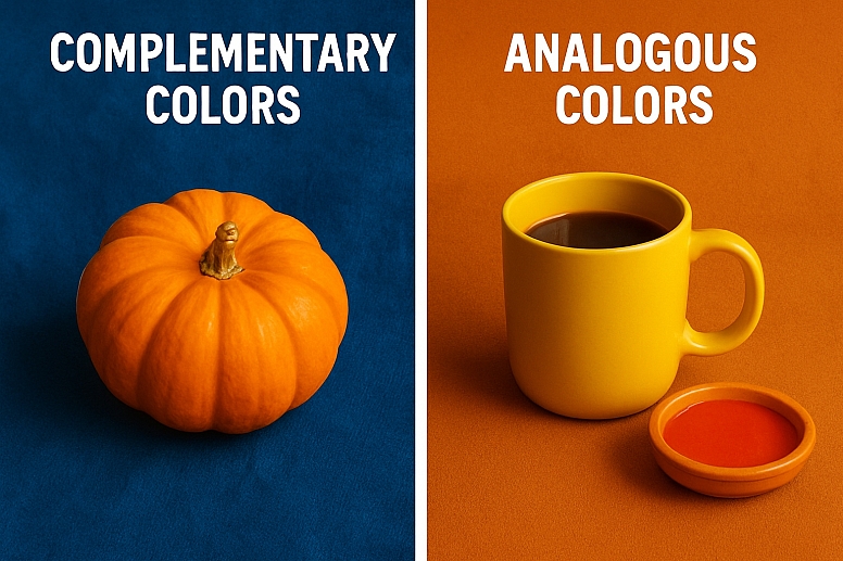
- Complementary colors sit opposite each other on the color wheel. They create high contrast and make things stand out. Think of a bright orange pumpkin on a blue cloth.
- Analogous colors sit next to each other on the color wheel. They are harmonious and peaceful to look at. Think of a sunset with red, orange, and yellow.
- Use complementary colors when you want to grab attention or create excitement.
- Use analogous colors when you want a calm, relaxing mood.
- You do not have to choose just one. Many great designs use both schemes together.
The Color Wheel: Your Best Tool
Every color journey starts with the color wheel. Sir Isaac Newton made the first color wheel in 1666. We still use it today. It organizes colors in a circle to show how they relate to each other.
The wheel has three types of colors:
- Primary Colors: Red, yellow, and blue. You cannot make these colors by mixing others.
- Secondary Colors: Orange, green, and purple. You make these by mixing two primary colors.
- Tertiary Colors: These have names like red-orange or blue-green. You make them by mixing a primary color with a secondary color.
This wheel is your map for finding complementary and analogous colors.
What Are Complementary Colors?
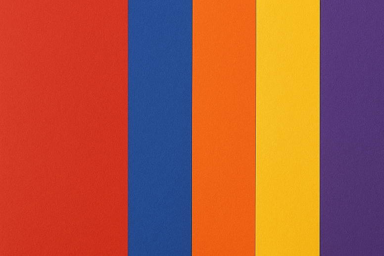
Complementary colors are pairs that live directly across from each other on the color wheel. The most common pairs are:
- Red and Green
- Blue and Orange
- Yellow and Purple
When you place two complementary colors next to each other, they both look brighter and more intense. They create a vibrant energy. This is because our eyes have special cells that process color in opposites. When you see a lot of red, your eyes crave green, and vice versa.
When to Use Complementary Colors
Use this scheme when you need something to pop. It is perfect for:
- Call-to-Action Buttons: A green "Buy Now" button on a red background is hard to miss.
- Sports Logos and Uniforms: Many teams use this for a bold, energetic look.
- Posters and Advertisements: It grabs attention from across a room.
- Highlighting Important Information: In a presentation, use complementary colors to make key points stand out.
A little goes a long way. Using 100% equal amounts of two complements can be jarring. It is often better to let one color dominate and use its complement as an accent.
A Challenge with Complementary Colors
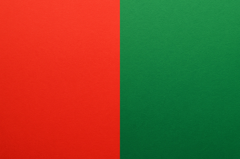
Be careful with text. Putting bright red text on a bright green background is very difficult to read. It can cause a vibrating effect that strains the eyes. If you use complements for text and background, try using a softer version of one color. For example, use a pale blue background with a dark orange text.
What Are Analogous Colors?
Analogous colors are families of three or four colors that sit side-by-side on the wheel. They usually share a common color. For example:
- Blue, Blue-Green, and Green
- Red, Red-Orange, and Orange
- Yellow-Green, Green, and Blue-Green
These colors get along very well. They create designs that feel comfortable, serene, and natural. Think of the colors of a forest: different greens, browns, and blues. Or the colors of a desert: tans, oranges, and reds.
When to Use Analogous Colors
Use this scheme when you want to create a specific mood. It is excellent for:
- Bedrooms and Spa Websites: Creating a calm and relaxing atmosphere.
- Nature Photography and Landscapes: Enhancing the natural harmony of a scene.
- Backgrounds and Wallpaper: Providing a gentle, non-distracting base.
- Branding for Wellness and Eco Products: Communicating peace and harmony.
How to Make Analogous Schemes Work Well
While harmonious, analogous schemes can sometimes lack contrast and look a bit flat. To avoid this, follow a simple formula:
- Rule of 60-30-10: Use one dominant color (60% of the design). Use a second color to support (30%). Use a third color (and sometimes a complementary color) as an accent (10%). This adds a tiny bit of excitement.
Complementary vs. Analogous: A Side-by-Side Look
This table shows the main differences quickly.
| Feature | Complementary Colors | Analogous Colors |
|---|---|---|
| Placement on Wheel | Opposite sides | Next to each other |
| Contrast | Very high, bold | Very low, gentle |
| Mood Created | Energetic, exciting, vibrant | Calm, peaceful, harmonious |
| Best For | Grabbing attention, highlights | Creating a mood, backgrounds |
| Ease of Use | It can be tricky to balance | Easier to work with |
Which Color Scheme Should You Choose?
So, do you want complementary or analogous colors? Ask yourself these questions:
1. What is the goal?
- Do you need people to see a "Submit" button immediately? Choose Complementary.
- Do you want visitors to feel relaxed on your website? Choose Analogous.
2. What is the feeling?
- Is the feeling excitement, energy, or fun? (e.g., a party invitation, a video game) Choose Complementary.
- Is the feeling calm, peaceful, or natural? (e.g., a yoga studio logo, a nature blog) Choose Analogous.
3. Who is it for?
- Is it for children's toys or a summer sale? Complementary colors often work well.
- Is it for a luxury brand or a medical site? Analogous colors often feel more sophisticated and soothing.
You Can Break the Rules
The best artists and designers know the rules so they can break them. You do not have to pick only one scheme. Many beautiful things use both.
Imagine a painting of a peaceful green forest (analogous colors of greens and yellows). Now, imagine a beautiful red cardinal sitting on a branch. That tiny bit of red, which is the complement to green, makes the entire painting come alive. The analogous colors create the mood, and the complementary color creates the focus.
Your Color Adventure Starts Now
The best way to learn about color is to play with it. You do not need expensive software. You can start with colored pencils, paint, or free online tools like Adobe Color.
Look at the world around you. Notice the colors on your favorite cereal box. Are they complementary to make it fun? Look at the app on your phone. Does it use analogous colors to feel easy to use? Every design you see is a lesson. So go ahead, open a blank page, and see what you can create.
Answers to Common Questions
What is a split-complementary color scheme? It is a version of a complementary scheme. Instead of using one direct complement, you use the two colors next to the complement. For example, instead of just red and green, you might use red, blue-green, and yellow-green. It gives contrast but is less intense.
Can I use more than three colors in an analogous scheme? Yes, but it works best if you stick to a narrow range. Using five colors that spread too far around the wheel can start to look messy. Three to four neighboring colors is a safe rule.
Why do my complementary colors look muddy when I mix them? This is a classic art lesson. Complementary colors are opposites. When you mix opposites, they cancel each other out and create a gray or brown color. This is useful for making shadows! To keep colors bright, place them next to each other, don't mix them.
Are black and white considered colors in these schemes? In design, black, white, and gray are called "neutrals." You can always use them with any color scheme. They are great for toning down a bright complementary scheme or adding contrast to a soft analogous one.


