

Understanding the Color Wheel: Basics for Designers & Artists
The color wheel is a simple tool that helps you understand how colors work together. It’s like a map for colors, showing how they relate to each other and how you can mix them to create new ones.
Whether you’re painting, designing a website, or picking out clothes, the color wheel can help you make better color choices.
What You’ll Learn About the Color Wheel
- Primary colors: Red, blue, and yellow—the building blocks of all colors.
- Secondary colors: Green, orange, and purple—made by mixing primary colors.
- Tertiary colors: Colors like red-orange or blue-green—made by mixing primary and secondary colors.
- Color harmony: How to combine colors to create balanced designs.
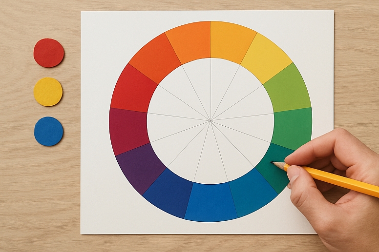
The Basics of the Color Wheel
The color wheel is a circle divided into sections, each representing a different color. Here’s how it’s organized:
Primary Colors
-
- Red, blue, and yellow are the primary colors.
- You can’t make these colors by mixing others—they’re the starting point for all other colors.
Secondary Colors
-
- Green, orange, and purple are secondary colors.
- You make them by mixing two primary colors:
- Red + Blue = Purple
- Blue + Yellow = Green
- Red + Yellow = Orange
Tertiary Colors
-
- These are colors like red-orange, blue-green, and yellow-green.
- You make them by mixing a primary color with a secondary color.
How to Use the Color Wheel
The color wheel isn’t just for showing colors—it’s a tool to help you create color combinations that look good together. Here’s how it works:
1. Complementary Colors
- Complementary colors are opposite each other on the wheel, like red and green or blue and orange.
- They create a strong contrast and make each other stand out.
2. Analogous Colors
- Analogous colors are next to each other on the wheel, like blue, blue-green, and green.
- They create a calm, cohesive look.
3. Triadic Colors
- Triadic colors are evenly spaced around the wheel, like red, yellow, and blue.
- They create a vibrant, balanced combination.
4. Monochromatic Colors
- Monochromatic colors are different shades of the same color, like light blue, blue, and dark blue.
- They create a simple, elegant look.
Why the Color Wheel Matters
The color wheel helps you make smart color choices. For example:
- In Art: Painters use the color wheel to mix colors and create mood.
- In Design: Graphic designers use it to pick colors for logos, websites, and posters.
- In Fashion: Stylists use it to put together outfits that look good.
Here’s a real-world example: Imagine you’re designing a logo for a coffee shop. You might choose warm browns and creams (analogous colors) to reflect the cozy feeling of drinking coffee.
Tips for Using the Color Wheel
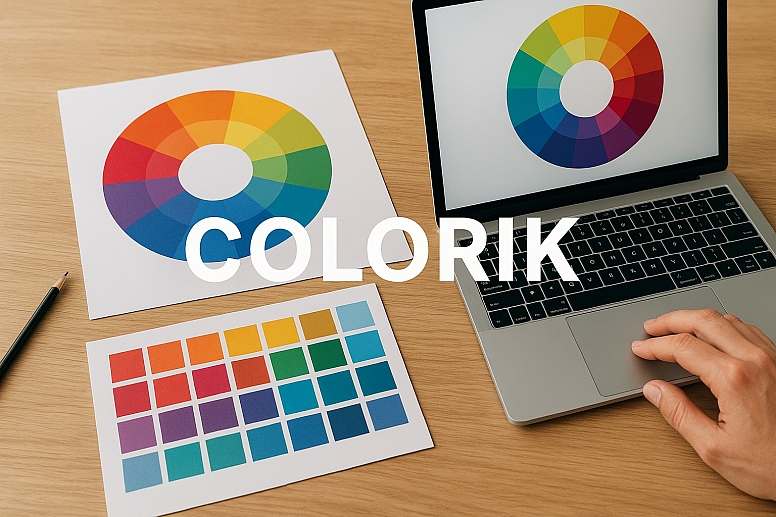
- Start with the color wheel to find combinations that work.
- Use tools like Colorik to test and refine your palettes.
- Think about the mood you want to create. Bright colors feel energetic, while muted colors feel calm.
- Don’t be afraid to experiment. Sometimes, unexpected combinations work best.
Common Mistakes to Avoid
- Using Too Many Colors: Stick to a few main colors to keep your design clean.
- Ignoring Contrast: Make sure your colors stand out from each other.
- Forgetting About Mood: Colors can change how people feel about your work. Choose wisely.
Why the Color Wheel is Your Best Friend
The color wheel is a simple but powerful tool. It helps you understand how colors work together and how to use them effectively. Whether you’re a beginner or an expert, the color wheel can make your work better.
Ready to Try It Out?
Grab a color wheel or use an online tool to start experimenting with colors. The more you practice, the better you’ll get at creating beautiful, balanced designs.
Frequently Asked Questions
1. What are the primary colors?
The primary colors are red, blue, and yellow. They can’t be made by mixing other colors.
2. What’s the difference between complementary and analogous colors?
Complementary colors are opposite on the color wheel and create contrast. Analogous colors are next to each other and feel harmonious.
3. How do I choose colors for a logo?
Think about the emotions you want to convey. For example, blue feels trustworthy, while yellow feels cheerful.
4. Can I use more than three colors in a design?
Yes, but it’s best to stick to a few main colors to keep your design balanced.
5. What’s the best way to learn color theory?
Start with the color wheel and experiment with different combinations.
By understanding the color wheel, you can create designs that are not only beautiful but also meaningful. So grab your colors and start creating!
LEAVE A COMMENT
Recent Posts


0.0582
COMMENTS
Very beautifully explained!