What is Color Psychology? How Colors Influence Design and Emotions
Look at the color of the walls in your room. Now, think about the logo of your favorite brand. Why did they choose those specific colors? It is likely not an accident.
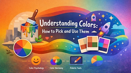
Color is a silent language. It speaks to our brains and influences our feelings, choices, and actions without us even realizing it. This powerful effect is the heart of color psychology. It is the study of how colors shape human behavior and emotion. For anyone creating anything—from a website to a product package—understanding this language is essential. This guide will explain what color psychology is and how you can use it to make more effective and engaging designs.
The Core Concepts at a Glance
- Color psychology is the science of how color affects human mood and behavior.
- Colors trigger automatic associations and emotional responses rooted in both culture and biology.
- Context is everything; the same color can have very different meanings based on its use and the surrounding colors.
- Effective design uses color psychology to guide user attention, shape perception, and evoke specific feelings.
- There are no universally "good" or "bad" colors, only appropriate and inappropriate applications for a specific goal.
What is Color Psychology? Beyond Just a Feeling
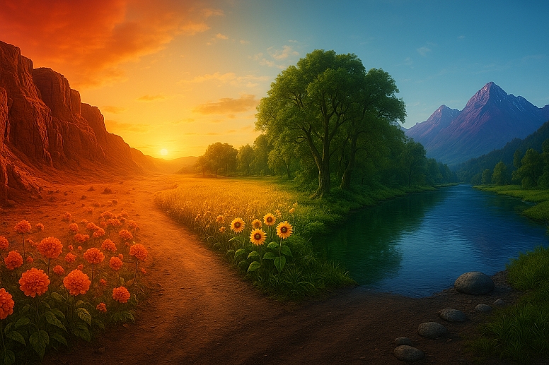
Color psychology is a field of study that looks at the emotional and mental effects colors have on people. It is not about saying "blue is happy" as a fixed rule. It is far more nuanced. It explores how a specific shade of blue can feel calming in one context but cold and corporate in another.
These reactions come from a mix of sources:
- Biological Instinct: Some responses may be innate. For example, the color red is found in nature in blood and ripe fruit. This may trigger a deep, primal response linked to danger, energy, or attraction.
- Cultural Learning: We are taught what colors mean. In Western cultures, white is for weddings and purity. In many East Asian cultures, white is traditionally worn for funerals and symbolizes mourning. These learned associations are powerful.
- Personal Experience: Your own history shapes your feelings about color. A specific shade of green might remind you of your grandmother's house, making you feel comforted and safe.
For designers and marketers, the goal is to understand the most common associations and use them to communicate effectively with a large audience.
The Emotional Palette: A Breakdown of Key Colors
While individual reactions vary, decades of research and cultural observation have established common emotional associations for colors. It is critical to remember that shades and tones matter deeply. A neon yellow and a soft, buttery pale yellow evoke entirely different feelings.
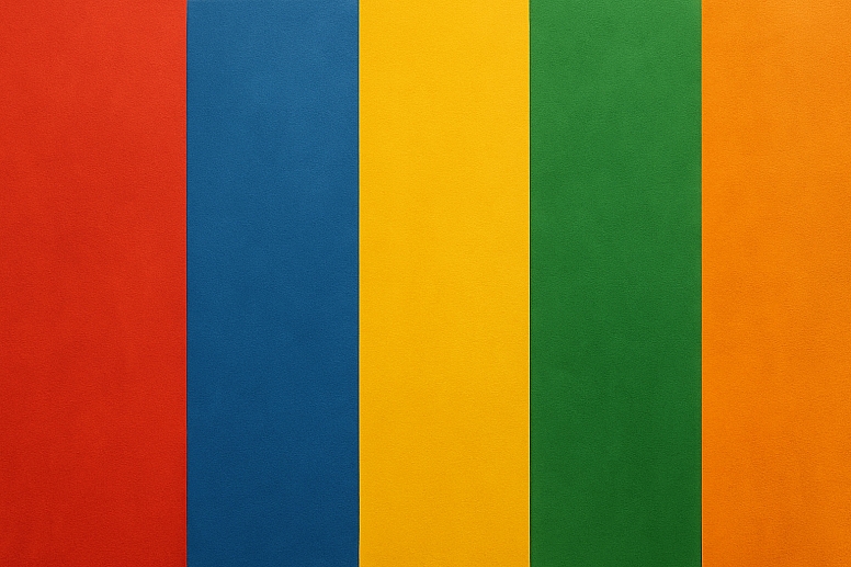
Here is a detailed look at the psychology of common color families.
Red: The Color of Energy
Red is the most intense and visceral color. It commands attention immediately.
- Common Associations: Energy, excitement, passion, danger, urgency, love, aggression, appetite.
- Why it works: Red physically raises heart rate and blood pressure. It creates a sense of immediacy.
Use in Design:
-
- Marketing: Creates urgency for clearance sales ("SALE" signs are often red). Used in food logos (Coca-Cola, Netflix) to stimulate appetite and excitement.
- UI/UX Design: Used for error messages and important warning buttons because it demands action. However, overuse can feel aggressive.
- A expert note: Never use red for a positive action button like "Proceed" or "Submit" if you can avoid it. Its strong association with "stop" and "warning" can create subconscious anxiety for users.
Blue: The Color of Trust
Blue is overwhelmingly the world's favorite color. It is consistently linked to stability and calm.
- Common Associations: Trust, security, peace, calmness, logic, reliability, professionalism, sadness (e.g., "feeling blue").
- Why it works: Blue is pervasive in our environment (sky, water) and is often associated with constancy and dependability.
Use in Design:
-
- Marketing: Used extensively by financial institutions (JPMorgan Chase, American Express), tech companies (Facebook, LinkedIn, Twitter), and healthcare companies to project trust, security, and reliability.
- UI/UX Design: Excellent for backgrounds and primary branding as it is non-invasive and calming. Darker blues convey strength, lighter blues are more peaceful.
- A expert note: Blue is also known to be an appetite suppressant. It is rarely used in food branding for this reason, as there are very few blue foods in nature.
Yellow: The Color of Optimism
Yellow is the brightest color on the spectrum. It captures joy and intellect but can also be straining.
- Common Associations: Happiness, optimism, warmth, creativity, caution, anxiety.
- Why it works: It is the color of sunlight. It stimulates mental activity and grabs the eye faster than any other color.
Use in Design:
-
- Marketing: Used to grab attention in store windows and for brands that want to feel friendly and accessible (Best Buy, Nikon, McDonald's arches).
- UI/UX Design: Effective for highlighting key features or calls to action. Must be used sparingly, as bright yellows can be hard to look at on a screen for long periods and can easily create visual fatigue.
- A expert note: The tone is everything. Golden yellows feel warm and vintage. Lemon yellows feel fresh and clean. Dull, greenish yellows can quickly feel sickly or signify caution.
Green: The Color of Harmony
Sitting in the center of the spectrum, green is the easiest color for the human eye to process. It is inherently balanced.
- Common Associations: Growth, health, nature, money, tranquility, freshness, envy.
- Why it works: Its strongest connection is to the natural world. It signifies "go" and permission.
Use in Design:
-
- Marketing: The default color for organic, natural, and eco-friendly products (Whole Foods, Animal Planet). Used in finance to represent wealth and prosperity (Mint, Shopify).
- UI/UX Design: The perfect color for positive action buttons like "Go," "Submit," or "Success." It is much less stressful than red and implies a safe, correct action.
- A expert note: In video editing and theater, "green rooms" are where performers relax because the color is so calming to the nervous system.
Orange: The Color of Enthusiasm
Orange combines the energy of red and the friendliness of yellow. It is less aggressive than red but still highly visible.
- Common Associations: Enthusiasm, creativity, fun, affordability, adventure.
- Why it works: It feels vibrant and social. It is seen as confident and friendly.
Use in Design:
-
- Marketing: Often used by brands that want to appear innovative, creative, and affordable (Amazon, Fanta, Nickelodeon). It appeals to a youthful, energetic audience.
- UI/UX Design: Excellent for secondary calls to action, like "Learn More" or "Add to Cart," as it feels less committed than a red button but more energetic than a blue one.
- A expert note: Because it is highly visible, orange is used for safety equipment and traffic cones. This association with caution can sometimes linger in its use.
Purple: The Color of Luxury
Historically, purple dye was extremely rare and expensive, made from sea snails. This history gives it a lasting association with royalty and wealth.
- Common Associations: Luxury, wisdom, spirituality, creativity, mystery, magic.
- Why it works: Its rarity in nature makes it feel exotic and special.
Use in Design:
-
- Marketing: Used by premium brands to signify quality and luxury (Cadbury, Hallmark, Crown Royal). Also associated with creativity and imagination (Yahoo!, Twitch).
- UI/UX Design: Lighter lavenders can feel nostalgic and feminine. Dark purples make for rich, luxurious-looking backgrounds.
- A expert note: Purple has a unique ability to feel both traditional (royalty) and futuristic (cyberpunk), depending on the shade and its application.
Neutrals: The Supporting Cast (Black, White, Gray, Brown)
Neutrals are the foundation of most designs. They provide balance, contrast, and let other colors shine.
- Black: Association with power, elegance, formality, death, and mystery. It is a staple for luxury goods and typography because it creates high contrast and is extremely readable.
- White: Association with purity, cleanliness, simplicity, and minimalism. In design, white space (or negative space) is critical for reducing clutter and improving readability.
- Gray: Association with neutrality, balance, sophistication, and practicality. It is a great background color that conveys a sense of calm and professionalism.
- Brown: Association with earth, reliability, stability, and warmth. It is used for natural products, and its warmth can make a design feel comfortable and grounded.
How Context Changes Everything
A color never exists in a vacuum. Its meaning is dramatically altered by context:
- Industry: Green means "nature" in the organic food industry but "money" in the finance industry.
- Surrounding Colors: A red button on a blue background will stand out sharply. A red button on an orange background will blend in and lose its impact.
- Cultural Audience: A website designed for a global audience must consider color meanings in different cultures. For instance, while white means purity in the U.S., it would be a poor choice for a wedding website aimed at a Chinese or Indian audience, where red is the traditional color of celebration.
Applying Color Psychology to Design
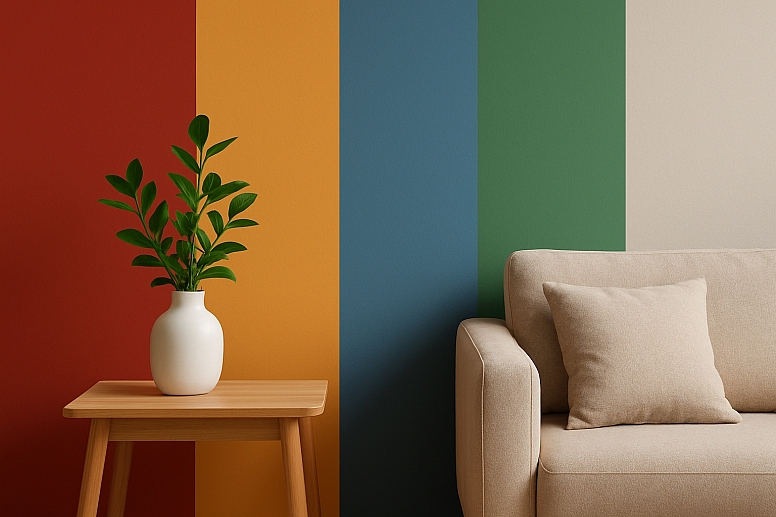
Understanding theory is one thing; applying it is another. Here is how to put color psychology into practice.
1. Define Your Goal and Audience. Before choosing a single color, ask: What is the primary goal of this design? What emotion do I want to evoke? Who am I trying to reach? A children's toy brand will use bright primaries (yellow, blue, red) for energy and fun. A meditation app will use muted tones of blue and green for calm.
2. Choose a Dominant Color Based on Your Brand Personality. Your dominant color will set the overall tone. Choose one that aligns with the core emotion you want your brand to project. Is it trustworthy (blue)? eco-friendly (green)? luxurious (purple)? innovative (orange)?
3. Build a Palette with a Purpose. Use a tool like Adobe Color to build a harmonious palette. Use the 60-30-10 rule to balance your dominant color with secondary and accent colors. Your accent color is often a contrasting color (like a complementary color) used strategically to draw the eye to the most important elements.
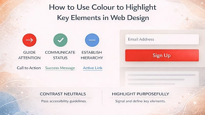
4. Test for Accessibility. Color choices are not just about emotion; they are about function. Millions of people have color vision deficiencies (color blindness). Red/green is a common problem area. Always use an online contrast checker to ensure your text is readable against its background and that you are not relying solely on color to convey information (e.g., use an icon as well as color to show "success" or "error").
The Science and The Nuance
It is important to note that color psychology is not an exact science like physics. Many early studies on color's effects were inconclusive or have been oversimplified by popular culture. The effect of color is highly dependent on personal experience, cultural background, and context. The goal is not to control emotions but to guide them, to create a visual language that supports your message and resonates with your intended audience on a deeper level.
Start Seeing the World in Color
Now that you know the basics, you will start to see color psychology everywhere. Analyze the apps on your phone. Why is your banking app blue? Why is the "delete" button red? Walk down the grocery store aisle. Notice how organic products use greens and browns, while candy packages use vibrant reds and yellows.
This awareness is your most powerful tool. The next time you start a project—whether it is a presentation, a personal website, or a painting—start by asking what you want people to feel. Then, let color do the talking.
Answers to Common Questions
Is there a scientifically proven link between color and emotion? While specific claims like "blue lowers blood pressure by X percent" are often debated, there is a broad scientific consensus that color can influence psychophysiological processes, including arousal and mood. The field is interdisciplinary, blending optics, biology, neuroscience, and psychology.
How does color psychology differ across cultures? Dramatically. For example:
- Red: In China, it is lucky and celebratory. In South Africa, it is the color of mourning.
- White: In Western cultures, it is for weddings. In many Eastern cultures, it is for funerals. Always research your target audience's cultural associations with color.
What is the best color for a "Buy Now" button? There is no single "best" color. It depends on your overall palette. However, colors that create high contrast against the background and align with the action are best. Green often works well as it signifies "go," while red can create anxiety. The only way to know for sure is to A/B test different options with your users.
Can color really increase conversions? Yes, but not in a vacuum. A poorly designed website with a perfectly colored button will still fail. Color is one part of a larger user experience that includes copy, usability, load speed, and trust signals. However, using color to draw attention to a call-to-action and reduce visual friction can significantly impact conversion rates.
