How to Create a Balanced Color Palette Using the 60-30-10 Rule
Have you ever seen a room or a website that just felt right? The colors worked together perfectly, creating a feeling that was both put-together and comfortable. Often, this sense of balance comes from using a simple, classic formula called the 60-30-10 rule.
This rule is a secret tool for many designers. It helps them divide colours in a visually pleasing way. You do not need to be a professional to use it. This guide will show you how the 60-30-10 rule works and how you can use it anywhere.
The Big Idea in a Nutshell
- The 60-30-10 rule is a simple formula for balancing three colors in a space.
- 60% is your dominant, main color. It covers most of the area.
- 30% is your secondary color. It supports the main color and adds interest.
- 10% is your accent color. It adds a small pop of energy and excitement.
- This rule works for interior design, graphic design, web design, and even fashion.
- It provides a framework for balance, but you can adapt it to your own taste.
What is the 60-30-10 Rule?
Imagine you are decorating a room. You would not paint every wall a different bright color. That would feel chaotic and messy. Instead, you would probably choose one main color for the walls and carpet. Then, you might pick a second color for the curtains and the sofa. Finally, you could add a third color in small doses with pillows, vases, and picture frames.

This natural way of thinking is exactly what the 60-30-10 rule does. It gives you a clear formula to follow:
- 60% - The Dominant Color: This is the main color that sets the overall mood. It is the backdrop for everything else. In a room, this is usually the wall color and perhaps a large rug. On a website, it is the background color.
- 30% - The Secondary Color: This color supports the main color. It provides visual relief and helps break up the space. In a room, this could be your upholstery, curtains, or an accent wall. On a website, it might be the color for sidebar backgrounds or large text boxes.
- 10% - The Accent Color: This is the spice. It is a color that contrasts with the first two and draws the eye to important details. In a room, these are your throw pillows, artwork, lamps, and small decorations. On a website, it is your buttons, links, and icons.
Why This Rule Works So Well
Our brains like order and balance. The 60-30-10 rule creates a clear hierarchy, which means it tells your eyes what is most important and where to look. The large amount of the dominant color makes a space feel stable and grounded. The secondary color breaks up the space without competing for attention. The small dose of an accent color creates a focal point without overwhelming the senses. This balance makes any design feel intentional and complete.
How to Build Your Own 60-30-10 Palette
You can start from scratch or use an existing color scheme you love, like complementary or analogous colors.
Step 1: Choose Your Three Colors: First, pick a color you love. This will likely be your 60% dominant color or your 10% accent color. Then, use the color wheel to find its partners.
- For a harmonious look, choose analogous colors (colors next to each other on the wheel).
- For a bold look, choose a complementary color (the color directly opposite) as your accent.
Step 2: Assign the Percentages: Once you have three colors, assign them their jobs. Which color is the calmest and most neutral? That should probably be your 60%. Which color is the most exciting and bold? That is your perfect 10% accent.
Step 3: Apply the Colors: This is the fun part. Start applying your colors to your project. Remember, the percentages are a guide, not a strict law. You are aiming for a general feeling of balance.
| Percentage | Role | Application Examples |
|---|---|---|
| 60% (Dominant) | Sets the tone, creates the base | Walls, large area rugs, website background, suit jacket. |
| 30% (Secondary) | Adds depth and support | Furniture, curtains, bedding, secondary website elements, a shirt. |
| 10% (Accent) | Adds spark and focus | Throw pillows, artwork, small decor, buttons & links, a tie or scarf. |
Seeing the Rule in Action: An Example
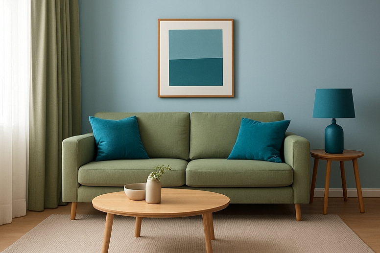
Let us imagine a living room with an analogous color scheme of blues and greens.
- 60% - Dominant Color: A soft, light blue-gray is painted on all the walls. This creates a calm, airy feeling as soon as you walk in.
- 30% - Secondary Color: A mid-tone sage green is used for the large sofa and the curtains. This adds a natural, supportive element that works with the blue walls.
- 10% - Accent Color: A vibrant teal blue is used for throw pillows on the sofa, the lampshade on a side table, and in a piece of art on the wall. This pop of brighter color adds energy and makes the room feel designed.
Without the teal accent, the room would be peaceful but might feel a little flat. The 10% accent color completes the look.
Adapting the Rule for Your Projects

The 60-30-10 rule is flexible. Here is how to use it in different areas:
- Graphic Design & Websites: Your 60% is likely a neutral white, off-white, or light gray. Your 30% could be a brand color used for headers. Your 10% accent is a call-to-action color for buttons you want people to click.
- Fashion: An outfit can follow this rule. Your 60% could be your pants and jacket (e.g., navy blue). Your 30% could be your shirt (e.g., light blue). Your 10% accent could be your shoes, belt, or jewelry (e.g., a red handbag or a patterned pocket square).
- Art Projects: When painting, your 60% might be the background color. Your 30% could be the main subject. Your 10% accent could be a small, bright detail that draws the viewer’s eye.
What If You Have More Than Three Colors?
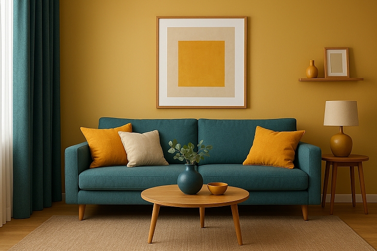
The rule is a foundation. You can absolutely have more colors. The easiest way to do this is to treat a "color" as a group. For example, your 60% dominant color could be a range of light beiges and creams. Your 30% secondary color could be several shades of blue. Your 10% accent could still be one bold pop of mustard yellow. The idea is to maintain the balance of visual weight.
Your Turn to Create Balance
The best way to understand the 60-30-10 rule is to try it. Look around your room. Can you identify the 60, 30, and 10? Look at your favorite websites. Notice how they use color.
Now, start a small project. Redecorate a shelf using the rule. Design a single web page. Or, plan an outfit. Choose three colors and assign them their jobs. See how this simple formula transforms your design from a guess into something balanced and professional. Grab a color wheel and start experimenting.
Answers to Common Questions
What if my main color is a pattern? If your dominant 60% is a patterned wallpaper that contains multiple colors, that is okay. The colors in the pattern together form your dominant "family." You would then pull your 30% and 10% colors directly from that pattern to ensure everything matches.
Can I use neutrals in the 60-30-10 rule? Absolutely. In fact, neutrals like white, black, grey, beige, and tan are most commonly used as the dominant colour, typically accounting for 60% of the palette. They create a perfect, calm backdrop that lets your 30% and 10% colors shine.
What is the difference between the 30% and 10% colors? The 30% color is still a supporting character. It is used in larger blocks and items. The 10% color is the star. It is used sparingly to create high contrast and draw immediate attention. It is the difference between a green sofa (30%) and a bright yellow pillow on that sofa (10%).
Do I have to follow this rule exactly? No. It is a guideline, not a strict law. It is a fantastic starting point for beginners and a great check for professionals. Once you understand the rule, you can creatively break it to achieve specific effects. But you have to know the rules before you can break them well.


