

The Psychology of Monochrome: Why Single-Colour Designs Work
A monochrome palette, the use of a single colour in varying tones, shades, and tints, remains a powerful tool in design. Its persistence is not a fleeting trend but a calculated application of visual psychology.
This approach reduces cognitive load, directs attention with precision, and evokes specific emotional states with clarity. For designers, marketers, and architects, understanding why this restriction works is essential for creating effective, resonant environments and experiences.
- Core Principle: Monochrome design focuses on composition, light, and form by removing the complexity of colour relationships.
- Psychological Impact: It reduces visual noise, accelerates processing, and can heighten emotional resonance through tonal contrast.
- Functional Benefit: It inherently creates visual hierarchy and cohesion, simplifying user decisions in digital and physical spaces.
- Common Application: From brand identity and data visualization to interior design and photography, monochrome solves problems of clarity and focus.
The Cognitive Efficiency of a Single Hue
Visual perception is a competitive process. The brain must constantly filter and prioritize information. Introducing multiple colours creates additional work; each new hue requires processing for its emotional connotation, cultural association, and relationship to surrounding colours. A monochrome scheme eliminates this competition.
By stripping away hue variation, the design forces the viewer to engage with other fundamental elements: contrast, shape, texture, space, and luminosity. This reduction directs attention intentionally. In a user interface, a monochrome button in a darker shade against a lighter background requires no colour-coding to be understood as interactive; its visual weight alone signals its function. This leverages the brain's innate sensitivity to light and dark, one of our most primal visual cues. The result is faster comprehension and less user error, a critical advantage in functional design.

This efficiency translates to memorability. A cohesive single-colour presentation is processed as a unified visual chunk, making it easier to recall than a multi-hued design where elements might be remembered separately. A brand that consistently uses a distinctive monochrome palette, like a specific charcoal grey and off-white scheme, builds a strong, clean mental imprint distinct from competitors relying on complex colour combinations.
Mechanics: Building Depth Without Spectrum
A successful monochrome design is not flat or monotonous. Its depth is constructed through meticulous manipulation of a colour's three core properties: tint (adding white), shade (adding black), and tone (adding grey). This creates a tonal scale, a spectrum of lightness to darkness within one hue.
The foundational tool is the tonal contrast ratio. This measurable difference in luminance between foreground and background elements is non-negotiable for readability and accessibility, especially in digital contexts. High-contrast pairings (e.g., a very dark shade against a very light tint) define primary actions and key content. Medium and low-contrast relationships establish secondary information and subtle atmospheric depth.
Texture and material become paramount. In the absence of colour difference, a smooth, polished surface next to a rough, matte texture in the same hue creates visual interest and hierarchy. In digital design, this is simulated through subtle gradients, shadows, and simulated textures like frosted glass effects.
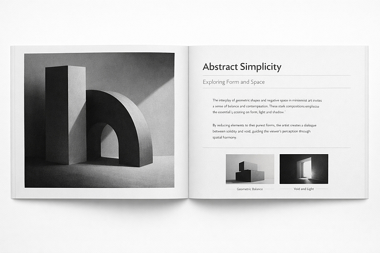
Spatial composition, the arrangement and negative space between elements, is also heightened. The eye follows contrasts in value and the flow of space, not jumps in hue.
Finally, a singular accent, often pure white, black, or metallic, is frequently employed not as a second colour, but as a neutral punctuation mark. It acts as a spotlight, drawing the eye to a critical detail, piece of text, or interactive element without breaking the monochromatic rule.
Applying Monochrome Design: Five Specific Contexts
Digital Dashboard and Data Visualization

- Constraints: Must present complex, multivariate data without confusion. Colour cannot be the primary differentiator.
- Common Mistakes: Using a tonal range that is too narrow, resulting in indistinguishable data series. Over-relying on iconography or shape alone when value contrast could clarify.
- Practical Advice: Establish a strict 7-step tonal scale from lightest background to darkest data point. Assign the darkest tones to the most critical KPIs. Use varying line weights, dot densities, and pattern fills (e.g., striped, dotted) in conjunction with tone to differentiate data layers. Ensure all interactive elements (hover states, selected filters) are indicated by a clear shift in tone or the introduction of an accent neutral.
Minimalist Brand Identity System

- Constraints: Must create distinctive recognition and emotional appeal across diverse media (print, web, physical) while forgoing a colourful palette.
- Common Mistakes: Choosing a base hue with poor tonal range or one that fails photocopying in greyscale. Allowing typography and imagery styles to become inconsistent, leaving the monochrome palette as the only unifying feature.
- Practical Advice: Select a base colour with strong cultural and psychological alignment to the brand’s core values. Develop a comprehensive style guide that dictates exact tonal percentages for primary logo, secondary patterns, typographic hierarchy (e.g., 100% for headers, 60% for body), and image treatment filters. Mandate the use of high-quality paper stock or screen finishes, as material texture will carry significant brand weight.
Architectural Interior Spaces

- Constraints: Must define zones, influence spatial perception, and create an atmosphere for human habitation within physical dimensions.
- Common Mistakes: Ignoring the impact of natural and artificial light, which dramatically alters the appearance of tones throughout the day. Using a single flat paint finish throughout, which deadens the space.
- Practical Advice: Use darker shades on floor planes and lighter tints on ceilings to visually "lift" a space. Employ a mid-tone on a focal wall to define an area without physical partitions. Specify varied materials (wood, stone, fabric, plaster) within the chosen hue to create tactile richness. Carefully plan lighting to accentuate textural differences and create dynamic shadows that become part of the design.
Product Photography and E-commerce

- Constraints: Must highlight product details, form, and quality, often on a pure white background mandated by platform guidelines.
- Common Mistakes: Harsh shadows that obscure details or create a "cheap" look. Poor reflection management on glossy products, resulting in blown-out highlights.
- Practical Advice: Utilize a "grease pencil" test in lighting setup: if you can draw a continuous line of light and shadow along the product's contours, the lighting defines form effectively. For white-background isolation, use seamless cove lighting and post-processing to achieve a clean, high-value (#F9F9F9) background that makes the product’s tonal subtleties stand out. Focus on capturing the texture and finish as the primary selling point.
Editorial Layout and Typographic Systems
- Constraints: Must establish a clear reading hierarchy and visual rhythm over many pages using only text, image, and space.
- Common Mistakes: Excessive use of border lines and rules instead of spatial separation. Poorly calibrated imagery that clashes because its black point or contrast range differs from the layout's established tones.
- Practical Advice: Define a typographic scale where each level (H1, H2, body, caption) has a designated tone (e.g., 100% black, 80%, 60%, 40%). Use generous negative space as the primary organizing tool. Treat all photographic and illustrative content with a consistent duotone or tonal adjustment filter to unify it with the typographic palette.
Monochrome Versus Related Design Approaches
| Design Approach | Core Principle | Best Use Case | Key Differentiator |
|---|---|---|---|
| Monochrome | One hue, plus its tints, tones, and shades. | Projects requiring focus, sophistication, and reduced cognitive strain. | Unmatched cohesion and clarity; emotion derived from value and contrast. |
| Greyscale | Strictly black, white, and intermediate greys. | Testing functional layout, accessibility, and form; classic, authoritative tone. | Removes hue psychology entirely; purely about luminance and form. |
| Limited Palette | Two to three distinct, carefully chosen hues. | Adding specific, strategic emphasis while maintaining overall harmony. | Allows for categorical differentiation (e.g., warning vs. info) within a controlled system. |
| Achromatic | No true hue; uses whites, blacks, and beiges/taupes. | Creating calm, organic, and timeless environments; focus on materiality. | Often incorporates the natural, unsaturated colours of raw materials like stone, wood, and linen. |
Advanced Nuances in Perception and Implementation
The psychological effect of a monochrome scheme is not static; it is modulated by the chosen base hue’s inherent properties. A monochrome blue scheme feels cool and expansive, but its darkest shades can read as authoritative and corporate, while its lightest tints feel ethereal. A monochrome red scheme is intense and activating, but its mid-tones (maroons, burgundies) introduce luxury and warmth, diffusing the primary red’s aggression.
For experts, managing colour constancy, the brain's tendency to perceive an object's colour as constant under different lighting conditions, becomes critical. A monochrome olive-green interior will feel radically different under warm incandescent light (pulling yellow/brown) versus cool north-facing daylight (pulling blue/grey). Advanced implementation involves designing for the specific light sources that will illuminate the final work.
Furthermore, cultural encoding of value must be considered. In some East Asian aesthetic traditions, a masterful monochrome ink painting uses the range from black to white to represent the entire visible world, where the "emptiness" (white space) is as charged as the ink. This philosophical layer adds depth beyond Western minimalist principles.
Common Pitfalls and Misconceptions
Misconception 1: Monochrome is easy because it limits choices. The opposite is true. With colour removed, every other decision, composition, contrast, texture, typography, becomes exponentially more critical and exposed. A poor layout in colour can be masked; in monochrome, it fails utterly.
Misconception 2: Monochrome is always "modern" or "minimalist." While often associated with these styles, monochrome palettes can be baroque, gothic, or brutalist depending on the hue, tonal contrast, and application. A deep burgundy monochrome scheme with velvet and brocade textures is classic and opulent.
Pitfall: Ignoring Accessibility. A low-contrast monochrome scheme (light grey text on a medium grey background) is a common failure. WCAG (Web Content Accessibility Guidelines) standards for contrast must be rigorously applied. Colour cannot be the sole means of conveying information, but tone must be sufficient for readability.
Pitfall: Forgetting the Emotional Weight of the Base Hue. Choosing a hue solely for aesthetic preference without considering its psychological baggage is a mistake. A monochrome scheme built on a hue like sickly green or dull orange may create cohesion, but also an unintended feeling of unease or stagnation.
A Method for Selecting a Monochrome Palette
- Define the Primary Objective. Is it focus (digital tool), calm (spa interior), authority (financial report), or drama (photography)? The objective points to a family of hues.
- Audit the Context and Constraints. What are the lighting conditions (screen, print, daylight)? What are the platform or material limitations? What existing brand elements must be accommodated?
- Select the Base Hue. Based on steps 1 and 2, choose a single hue that aligns with the required emotion and functions within the constraints. Test it in greyscale to ensure its tonal range is viable.
- Build a 9-Step Tonal Scale. Using your design software, create a scale from 10% (lightest tint) to 90% (darkest shade) of your base hue, plus pure white and pure black as your neutral accents. This is your foundational palette.
- Assign Roles. Designate specific tones from your scale to specific roles: background (10-20%), primary text (90% or black), secondary text (70%), interactive elements (80%), borders/dividers (40%).
- Stress-Test with Content. Apply the palette to a realistic block of content containing text, images, and interactive elements. Check for sufficient contrast, hierarchy, and legibility. Adjust the tonal assignments if necessary.
- Validate for Accessibility. Use a contrast checker tool on all text/background pairings to meet at least WCAG AA standards.
Specific Questions on Monochrome Design
Does monochrome design negatively impact user engagement on websites? No, when executed correctly, it improves engagement by reducing distractions and making calls-to-action clearer through tonal contrast. High engagement is driven by ease of use and clear information architecture, which monochrome can enhance.
Can a monochrome brand be perceived as "cheap"? Only if executed poorly with low-quality materials, inconsistent application, or poor contrast that suggests a lack of care. A meticulously applied monochrome palette using high-quality substrates and finishes is universally perceived as premium and considered.
How do you make a monochrome design feel "warm" or "cool"? Temperature is dictated by the base hue. Yellows, reds, and oranges create warm monochrome schemes. Blues, blue-greens, and blue-purples create cool ones. Neutrals like beige (warm) and pure grey (cool) also set the temperature.
Is monochrome a good choice for data-heavy design? It is an excellent choice for a foundational structure and hierarchy. However, for complex multivariate charts where categorical distinction is paramount, a limited palette may be more effective. Monochrome excels at showing quantity and hierarchy through tone, while limited colour excels at showing difference in kind
LEAVE A COMMENT
Recent Posts


0.0518