

How to Use Gradient Tools to Enhance Your Color Palettes
Gradient tools transform static color palettes into dynamic, dimensional systems. A gradient is not merely a fading blend between two colors; it is a method for generating intermediate hues, expanding tonal range, and creating visual depth that flat colors cannot achieve.
When applied systematically, gradients can enrich data visualization, modernize interface design, and add sophisticated texture to branding, all while maintaining strict harmony with the core palette.
- Core Function: Gradients algorithmically generate intermediate colors to create smooth transitions.
- Primary Benefit: They expand a limited palette into a vast, harmonious spectrum of usable shades.
- Technical Foundation: Controlled by color stops, midpoint bias, and linear/radial/angular methods.
- Strategic Outcome: Visual depth, modern aesthetic cues, and enhanced data communication without adding new base colors.
The Functional Expansion of a Limited Palette
A designer's primary palette may contain 5-7 base colors. This limitation is strategic for brand cohesion but can become a constraint for complex layouts, data visualizations, or creating visual interest. Gradient tools solve this by creating an almost infinite number of derivative colors that are guaranteed to harmonize, as they exist on a mathematically defined path between two approved swatches.
This expansion serves multiple purposes. It creates visual depth and realism, mimicking how light falls on a curved surface or fades into the horizon. It establishes a clear visual hierarchy by drawing the eye to the point of highest contrast within the gradient. In data visualization, it provides a continuous, intuitive scale for representing ordered data, where the shift from light blue to dark blue can intuitively represent a change from low to high values. Critically, it achieves this without introducing a single new, unapproved color to the system, maintaining palette integrity.
The Technical Mechanics of Gradient Construction
Understanding the underlying controls is essential for moving beyond default effects.
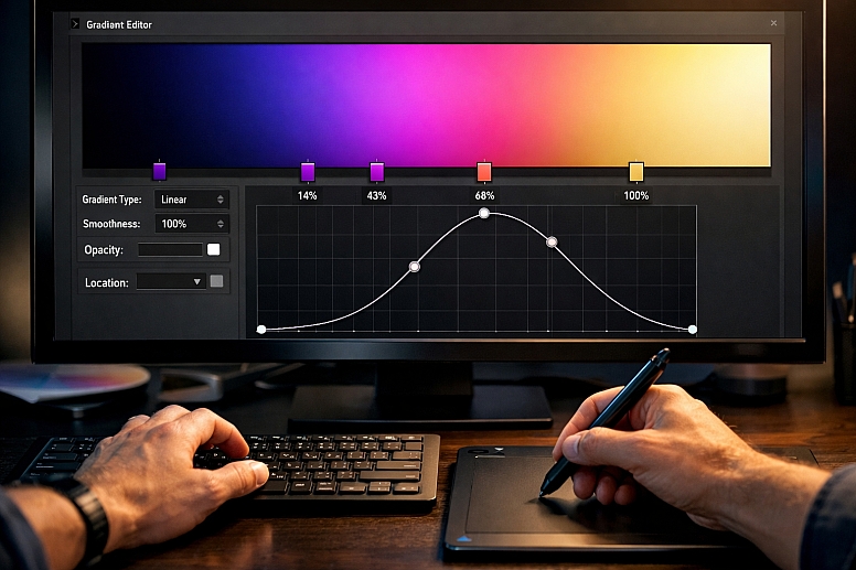
1. Color Stops and Interpolation: The foundation of any gradient is its color stops. These are the anchor points defining which colors blend. A basic two-stop gradient blends directly from Color A to Color B. Advanced gradients use three or more stops (e.g., Color A → Color B → Color C). The software interpolates the colors between these stops, calculating every intermediate hue, saturation, and brightness value.
- Critical Control: The position of a stop (0% to 100%) dictates where a pure color appears. A stop at 50% means that the exact color appears halfway through the gradient.
2. Midpoint Bias (or "Smoothness" Control): Between any two color stops lies a midpoint slider. This controls the bias of the transition.
- Centered (50%): The blend is perfectly even.
- Biased toward Stop A (e.g., 25%): Color A dominates more of the transition before shifting rapidly to Color B. This creates a more abrupt or "pushed" effect.
- Biased toward Stop B (e.g., 75%): The opposite occurs.
Manipulating midpoints allows you to control the "weight" of each color in the blend, which is crucial for creating natural-looking light effects.
3. Gradient Types and Their Application: The path of the blend defines its type and use case.
- Linear Gradient: Colors blend along a straight axis. The angle of this axis is a primary control (0° = left to right, 90° = bottom to top).
- Radial Gradient: Colors blend outward in a circular pattern from a central point. Controls include the center point and the shape (circle or ellipse).
- Angular (Conic) Gradient: Colors blend in a sweeping arc around a center point, like a pie chart. Essential for circular data visualizations and stylized circular elements.
- Freeform Gradient (Adobe Illustrator/Photoshop): Allows color stops to be placed anywhere on a mesh, creating complex, painterly blends impossible with linear or radial methods. Ideal for abstract backgrounds.
4. Blending Color Models: RGB vs. HSB Interpolation: Software can interpolate colors in different mathematical models, yielding different intermediate hues.
- RGB Interpolation (Default): Blends the Red, Green, and Blue channels independently. This often passes through muddy, desaturated midpoints, especially when blending complementary colors.
- HSB Interpolation (Superior for Harmony): Blends the Hue, Saturation, and Brightness channels independently. By locking Saturation and Brightness and only interpolating Hue, you create a clean, vibrant spectrum. This is the preferred method for creating cohesive, colorful gradients from a palette.
Five Contexts for Strategic Gradient Application
1. Modernizing a Corporate Brand Identity
- Constraints: Must feel innovative and dynamic while retaining professional trust; cannot deviate from core brand colors.
- Common Mistakes: Applying a garish, full-spectrum rainbow gradient that feels unprofessional. Using gradients in the logo itself, which reduces versatility.
- Practical Application: Use a subtle linear gradient on the brand's primary color for digital backgrounds. For example, a 5° angle gradient from
Brand Blueto a 10% lighter tint of the same blue. Apply this to website header backgrounds or presentation slides. For accent elements, a tight radial gradient from the brand's accent color to a lighter tint can make buttons feel more tactile and "pressable" without introducing new hues.
2. Enhancing Data Visualization Dashboards
- Constraints: Must represent quantitative data with immediate, intuitive clarity.
- Common Mistakes: Using a rainbow (spectral) gradient for sequential data, which creates false perceptual boundaries. Using gradients with poor luminance variation makes them inaccessible.
- Practical Application: For sequential data (low to high), use a single-hue luminance gradient. Create a gradient from a light tint to a dark shade of the same brand color (e.g., light blue to dark blue). This creates a perfect perceptual scale. For divergent data (low, mid, high), use a divergent gradient: Dark Color A → Light Neutral → Dark Color B (e.g., brand blue to white to brand orange). The midpoint neutral clearly represents a central baseline (like zero or average).
3. Creating Depth in UI Components
- Constraints: Must enhance usability and visual hierarchy within a flat or minimalist design system.
- Common Mistakes: Applying heavy gradients that make text illegible. Using gradients that conflict with the established lighting direction of the UI.
- Practical Application: Apply a subtle vertical linear gradient to card components: a near-white at the top (
#FFFFFF) fading to a very light grey at the bottom (#F5F5F5). This mimics overhead lighting and makes cards feel lifted off the page. For active or selected states, use a gentle radial gradient emanating from the user's interaction point (e.g., where a button is pressed), providing micro-feedback.
4. Designing Impactful Marketing Hero Graphics
- Constraints: Must capture attention and communicate energy or premium quality quickly.
- Common Mistakes: Using default gradient presets that look generic. Creating gradients with colors that clash or produce dull midpoints.
- Practical Application: Use an angular gradient as a dynamic background for a headline. Blend from a deep brand color at one corner to a vibrant complementary accent at the opposite corner. Employ HSB interpolation to ensure the midpoints remain vibrant. For a premium feel, create a metallic gradient by blending two close tones of a desaturated color (e.g., a light warm grey to a slightly darker cool grey) and applying a subtle grain texture over it.
5. Generating Abstract Textures and Backgrounds
- Constraints: Need a unique, non-repetitive visual texture that aligns with the brand mood.
- Common Mistakes: Using stock photo textures that break color harmony. Creating gradients that are too busy for content overlays.
- Practical Application: Use a freeform gradient tool to create organic, fluid backgrounds. Place 4-5 color stops from your brand's analogous palette (e.g., blues and blue-greens) in a loose cluster. Use a large blur radius to create soft, ethereal color clouds. This generates a completely custom, on-brand texture impossible to achieve with standard gradients or stock assets.
A Comparative Analysis of Gradient Types and Uses
| Gradient Type | Visual Mechanism | Best For | Technical Control Points |
|---|---|---|---|
| Linear | A straight-line blend between two or more points. | UI backgrounds, buttons, creating directional light/shadow, and simple overlays. | Angle, color stop positions, and midpoint bias between each stop. |
| Radial | A circular blend emanating from a central point. | Highlighting focal points, creating "spotlight" effects, tactile buttons, and icons. | Center point, radius, shape (circle/ellipse), and color stop positions. |
| Angular (Conic) | A circular sweep of color around a center point. | Data pie charts, color wheels, dynamic circular elements, stylized loaders. | Center point, starting angle, and color stop positions. |
| Freeform / Mesh | Color stops are placed freely on a plane, blended organically. | Abstract art, unique textures, natural-looking color fields, complex backgrounds. | Placement of each stop in 2D space, color, blur/radius of each stop. |
| Dithering / Noise | Simulates a gradient through dispersed pixels or grain. | Avoiding color banding on older screens, adding gritty texture, and retro aesthetics. | Noise type (perlin, simplex), scale, intensity, and blending mode. |
Advanced Nuances: Avoiding Banding and Controlling Perception
On digital displays, a smooth gradient can display color banding—visible stripes where the color jumps between values instead of transitioning smoothly. This occurs due to the limitations of 8-bit color depth. Solutions include:
- Adding Subtle Noise: A 1-2% monochromatic noise overlay over the gradient breaks up the hard edges between bands.
- Using Dithering: Some tools (like Photoshop's "Diffusion Dither" option) or CSS (
image-rendering: pixelatedin specific contexts) can simulate intermediate colors. - Working in 16-bit/32-bit: For critical print or animation work, creating gradients in a higher bit-depth project file prevents banding at the source.
Perceptual Uniformity is crucial in data visualization. A gradient may be mathematically linear in RGB values, but the human eye does not perceive lightness linearly. Tools like ColorBrewer or Adobe's Vision Simulator can help evaluate and create perceptually uniform gradients, ensuring that a step from 20 to 30 on the scale looks the same as a step from 70 to 80.
Common Pitfalls and Misconceptions
Misconception: "More colors in a gradient make it better." A gradient blending 5 vibrant colors often becomes muddy and chaotic. The most sophisticated gradients typically use 2-3 colors, often tints and shades of the same hue, or closely related analogous colors. Restraint is key.
Pitfall: Using Gradients That Harm Readability. Placing body text over a complex, multi-stop gradient is a severe usability error. Text areas must have a solid, high-contrast background. Gradients should be used in backgrounds behind solid content containers or in non-text elements.
Misconception: "Gradients are a trend." While specific styles (e.g., "Instagram gradients") trend, the use of gradients as a tool for creating light, depth, and scale is a timeless graphic design technique. The application style evolves, but the functional utility does not.
Pitfall: Ignoring the Gradient's Directional Light Source. In a cohesive interface, all gradients should imply a consistent light source (typically from above). If some buttons appear lit from the top and others from the left, the design feels unsettled. Standardize gradient angles across similar elements.
A Method for Systematically Implementing Gradients
- Define the Purpose. Is it for visual depth, data encoding, attention-grabbing, or texture? This dictates the gradient type.
- Select Colors from Your Approved Palette. Choose your start and end colors. For harmony, select either:
- Monochromatic: A tint and shade of the same base color.
- Analogous: Two neighboring colors on the wheel (e.g., blue and blue-green).
- Branded: Two of your defined brand colors.
- Choose the Tool and Interpolation Method. In your design software, create the gradient. If possible, switch the interpolation to HSB for cleaner blends, especially when using different hues.
- Adjust Stops and Midpoints. Place the color stops. Then, fine-tune the midpoint bias to control the transition's character—smooth and even or sharp and dramatic.
- Apply and Test in Context. Apply the gradient to the intended element. Overlay any text or UI components. Check for contrast and legibility. View it on different screen types to check for banding.
- Document the Gradient as Part of the System. In your design system, don't just document solid colors. Create a "Gradient" section showing approved gradients (e.g., "Primary Subtle Lift: Linear, 90°, #007AFF to #0056CC").
- Implement with Code (for Developers). Use CSS linear-gradient() or radial-gradient() functions with the exact stop percentages and colors from the design spec to ensure pixel-perfect implementation.
Questions on Using Gradient Tools
What's the difference between a gradient and a blend mode? A gradient is a specific fill type consisting of interpolated colors. A blend mode (e.g., Multiply, Overlay, Screen) is a mathematical operation that dictates how two overlapping layers of color interact. They are often used together—a gradient layer set to "Overlay" can tint an image beneath it.
How can I create a gradient that looks metallic or glossy? A metallic effect requires a specific luminance profile. Create a narrow, high-contrast gradient within a tight band. For example, on a grey button: a very light grey at the very top (highlight), a rapid transition to the mid-grey base, and a slightly darker grey at the very bottom (shadow). The sharp contrast in a small area simulates reflective gloss.
Are gradients accessible? They can be, if used carefully. The primary rule: any informational contrast must exist without color. A gradient should not be the sole differentiator for a chart element or button state. Ensure text on any gradient background has a sufficient contrast ratio (4.5:1) against the darkest part of the gradient it touches. Adding a solid background behind text that overlaps a gradient is a safe practice.
What are mesh gradients, and how are they different? Mesh gradients (or freeform gradients) use a flexible grid of color points, each with its own color and influence radius. Unlike linear/radial gradients defined by a simple path, mesh gradients allow for complex, multi-directional, and organic color blends, similar to airbrushing. They are more complex to control but allow for highly custom, naturalistic color transitions.
LEAVE A COMMENT
Recent Posts


0.0382