

How to Use Colour to Create Depth & Dimension in Your Work
Effective use of colour does more than decorate a surface. It creates the illusion of three-dimensional space on a two-dimensional plane, guiding a viewer’s eye and establishing a tangible sense of form. This process is fundamental to visual communication, whether in painting, digital design, photography, or illustration.
We will go over the details of the systematic colour principles for creating depth and dimension in your work.
Core Summary
- Aerial Perspective: Colours appear less saturated, cooler, and lower in contrast as they recede into the distance due to atmospheric interference.
- Warm & Cool Contrast: Warm colours (reds, oranges, yellows) naturally appear to advance toward the viewer, while cool colours (blues, greens, purples) appear to recede.
- Value and Contrast: Strong value contrast (light vs. dark) brings elements forward; reduced contrast pushes them back. This defines form through light and shadow.
- Saturation and Focus: High-saturation colours attract attention and feel closer. Desaturated colours appear more distant and are used for background elements.
- Edge Control: Sharp, hard edges advance; soft, blurred edges recede. This applies to both colour transitions and line work.
Why Colour Defines Space
The human visual system interprets colour cues to understand spatial relationships. In the physical world, several phenomena dictate how we perceive colour over distance. Replicating these phenomena artificially is the key to creating depth.
The primary mechanism is atmospheric perspective, also called aerial perspective. Between the viewer and any distant object lies atmosphere—tiny particles of dust, moisture, and gases. This atmosphere scatters light, particularly shorter blue wavelengths. Consequently, as an object recedes:
- Its overall colour saturation decreases.
- Its hue shifts toward the cooler, bluer end of the spectrum.
- Its value contrast with surrounding elements diminishes.
- Its detail and edge definition soften.
A second foundational principle is the advancing and receding nature of hues. This is a psychological and physiological effect. Longer wavelength colours (reds, oranges) stimulate our eyes in a way that makes them feel closer and more active. Shorter wavelength colours (blues, violets) have the opposite effect, feeling calm and distant. This principle operates independently of value and saturation.
The real-world impact is significant. Without deliberate colour manipulation for depth, a scene or design appears flat, confusing, and visually inert. It fails to communicate hierarchy, importance, or a believable environment. Applying these principles creates immediate spatial structure, directing focus, establishing mood, and enhancing realism or intentional stylization.
The Four Colour Variables for Depth
Creating depth isn't about one colour trick; it's the orchestration of four interrelated colour variables: Hue, Value, Saturation, and Edge.
1. Hue Temperature for Spatial Placement:
- Warm Hues (Advancing): Reds, oranges, yellows, and warm browns. Use these to highlight focal points, bring objects forward, or add points of emphasis in a foreground.
- Cool Hues (Receding): Blues, blue-greens, blue-purples, and cool grays. Use these for backgrounds, shadows on receding planes, and to establish environmental distance.
- Application: A warm, red apple on a cool, blue-gray table will appear to sit on the table, not within it. Placing a cool blue in the shadows of a foreground object anchors it and increases its three-dimensionality.
2. Value Contrast for Form and Separation: Value (lightness/darkness) is arguably the most powerful tool for defining form and depth.
- Form Modelling: A sphere becomes three-dimensional through a gradient of value from highlight to mid-tone to core shadow. The strongest value contrast defines the nearest point of the form.
- Spatial Layering: Elements with high value contrast against their immediate background (e.g., a dark tree against a light sky) will advance. Elements with low value contrast (e.g., a gray mountain against a hazy gray sky) will recede into the distance.
- The Value Structure: Successful works often have a structured value plan: a light foreground, a mid-tone middle ground, and a dark background, or vice-versa. This clear separation instantly creates layers of space.
3. Saturation for Focus and Atmospheric Effect: Saturation (colour intensity) directly manipulates visual attention and perceived distance.
- High Saturation acts as a visual magnet. A single saturated colour in an otherwise muted field will become the undeniable focal point and appear closest.
- Progressive Desaturation is the technical application of aerial perspective. As elements are meant to be farther away, systematically reduce their saturation. This is not just adding gray; it often involves shifting the hue slightly cooler as well.
- Background Management: Backgrounds and secondary elements are typically desaturated to prevent them from competing with the focal point. This pushes them back spatially.
4. Edge Control and Colour Transitions: How colours meet defines their spatial relationship.
- Hard, Sharp Edges indicate a clear, sudden change in plane. They attract the eye and bring an element forward. Use them for defining the crisp edges of a foreground object.
- Soft, Blurred, or Lost Edges occur where forms turn away, or objects are far off. They suggest an atmosphere between the viewer and the object. Blending colours softly into one another (colour gradation) is essential for modelling rounded forms and creating seamless atmospheric recession.
Strategic Application in Specific Contexts
1. Landscape Painting & Illustration
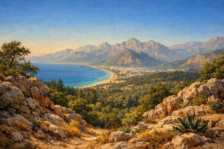
- Specific Constraints: Must simulate vast, natural space under consistent light. Colour harmony across the entire scene is critical.
- Common Mistakes: Using the same green for foreground grass and distant trees; making sky colours too saturated at the zenith; neglecting the warm, saturated colours in immediate foreground shadows.
- Practical Advice: Establish a strict saturation gradient. Mix foreground colours with local pigments. Mix distant colours using a base of your sky or atmospheric colour (e.g., a blue-gray) plus a tiny amount of the local colour. Shadows are not just darker; they are cooler and often slightly more saturated than sunlit areas of the same object.
2. Digital UI/UX & Web Design

- Specific Constraints: Depth must be functional, not just aesthetic, guiding user interaction on a flat screen. Accessibility (colour contrast) is paramount.
- Common Mistakes: Using pure black shadows on interfaces, which look flat and harsh; overusing drop shadows, creating visual noise; lacking a consistent "light source" for shadows across all elements.
- Practical Advice: Use saturated, slightly warm colours for primary buttons (advancing). Use desaturated, cool greys for background and secondary elements (receding). For shadows, use a dark, desaturated version of the background colour, not black. A consistent 45-degree "light source" for all shadows unifies the spatial metaphor. For a detailed application of these principles, see our foundation on accessible colour palettes for interactive design.
3. Portrait & Figure Painting
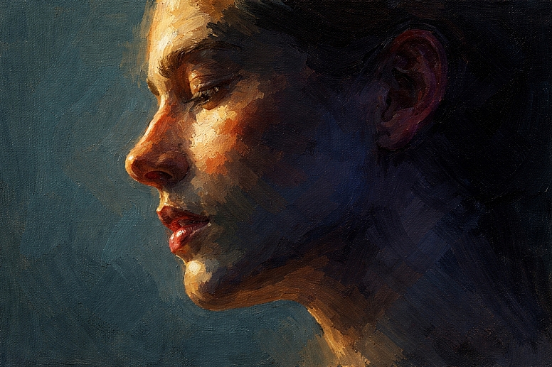
- Specific Constraints: Depth must describe complex organic form under specific lighting. Skin tones are subtle mixes of warm and cool, not a single flat colour.
- Common Mistakes: Rendering faces with only brown and white, creating a muddy, flat mask; ignoring reflected light in shadows; making highlights pure white.
- Practical Advice: Map the temperature shifts on the face. The light side is warm (yellows, reds). The core shadow is cool (blues, purples, greens). Reflected light within the shadow is warm but desaturated. Ears and nostrils, where blood vessels are close, can have more saturated reds. Background colour should be chosen to contrast in temperature with the figure's main light side.
4. Product & Still Life Photography
- Specific Constraints: Depth must be created within a controlled set, often with artificial lighting. The goal is to make an object feel tangible.
- Common Mistakes: Using a single, harsh light source that flattens form; choosing a background colour that clashes or matches the product's saturation level.
- Practical Advice: Use a three-point lighting setup (key, fill, back) to model form with value. Employ colour gels strategically: a warm gel on the backlight to separate the product from a cool-toned background. For food, a slightly saturated, warm-toned side light makes surfaces appear more appetizing and textured.
5. Architectural Visualization & Environment Design
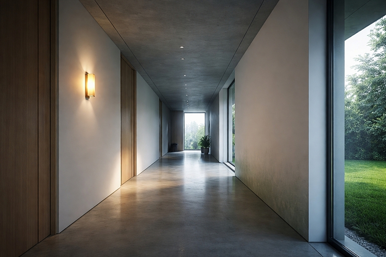
- Specific Constraints: Must communicate scale, material, and accurate lighting in a constructed space.
- Common Mistakes: Over-lighting every surface, eliminating natural value contrast and shadow; making interior light sources (lamps) the same brightness as windows; neglecting colour bounce (the green from grass on a white wall).
- Practical Advice: Define a clear light path. The strongest, most saturated colours and contrasts are at the primary light source/interaction. Use global illumination principles: colours from surfaces "bounce" and tint adjacent surfaces. Depth in a corridor is created by darkening and desaturating the end wall while ensuring the floor and walls show a gradient to that point.
Warm vs. Cool Colour Strategies
The choice between a warm-dominant or cool-dominant palette is a foundational decision that dictates spatial mood and perception.
| Evaluation Criteria | Warm-Dominant Palette (e.g., Sunset, Desert, Interior Firelight) | Cool-Dominant Palette (e.g., Foggy Morning, Moonlit Night, Underwater) |
|---|---|---|
| Primary Spatial Effect | Creates a feeling of enclosed, intimate, or advancing space. Can feel energetic, pressing, or inviting. | Creates a feeling of expansive, open, or receding space. Can feel calm, distant, or melancholic. |
| Depth Creation Method | Depth is often defined by value contrast (strong darks) and a shift toward neutralized cools in shadows/recesses. The warm colours dominate but recede through desaturation. | Depth is created through atmospheric perspective and saturation gradients. Distant elements quickly lose saturation and become lighter or merge with a cool haze. |
| Focal Point Strategy | The focal point is often a spot of highest saturation (intense red/orange) or the lightest value (bright yellow/white). Cool accents are used strategically for rest points. | The focal point is typically an area of relative warmth (a lit window in a blue night) or the highest value contrast. Warm accents advance dramatically. |
| Common Applications | Interiors, historical drama, action scenes, food imagery, and brands wanting to evoke energy and closeness. | Landscapes, sci-fi, medical/tech aesthetics, corporate serenity, scenes implying distance or detachment. |
| Key Risk | Can become visually overwhelming, flat ("all mid-tones"), or lacking in clear spatial recession if cools are not integrated. | Can become visually cold, empty, or lacking a clear focal point if warmth and contrast are not used purposefully. |
Expert-Level Considerations
Experienced practitioners move beyond basic warm/cool rules to manipulate depth for specific psychological and compositional effects.
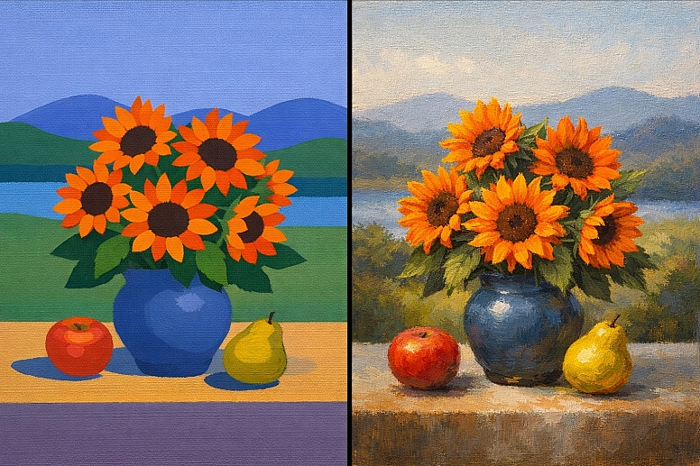
Simultaneous Contrast & Colour Relativity: A colour's perceived temperature, saturation, and value—and thus its spatial position—is entirely dependent on its surrounding colours. A mid-tone gray will appear to advance next to a pale blue but recede next to a deep black. An expert places colours to exploit this, making a colour "pop" forward or sink back without changing its intrinsic properties.
Optical Mixing for Luminous Depth: Instead of mixing colours physically on a palette, placing small strokes of pure colour side-by-side (e.g., blue and yellow) allows the viewer's eye to mix them at a distance, creating a more vibrant, luminous effect that appears to have depth of light. This technique, used by Impressionists and in pixel-based digital art, prevents the muddiness that kills spatial clarity.
Chromatic Greys and Spatial Vibration: Neutrals are never just black and white. Mixing chromatic greys (e.g., a grey made from violet and green) for shadows and backgrounds creates a more complex, alive space. These greys can be tuned to be slightly warm or cool to enhance spatial relationships and make adjacent pure colours appear more vibrant by contrast.
Managing Depth in Limited Palettes: A restricted palette (e.g., two colours plus black and white) forces sophisticated use of value and temperature shifts. An expert might use a single blue pigment, undiluted in the foreground shadows, and progressively dilute it with white and a touch of a contrasting colour (like an earth tone) for the distance, creating a full range of space through manipulation of a single hue's properties.
Failure Modes & Common Misconceptions
Misconception 1: "To make something recede, just make it darker."
- Reality: A small, dark object on a light background will advance due to high contrast. Recession is better achieved by reducing contrast and shifting colour temperature cooler. A dark, warm brown tree will still feel foreground compared to a lighter, cool blue-gray mountain.
Misconception 2: "Shadows are black or gray."
- Consequence: This flattens the image and kills form. Shadows contain colour. They are typically a cooler, and often more saturated, version of the local colour, influenced by reflected light and ambient sky light. A shadow on a red apple is not gray; it's a darker, cooler red-violet.
Misconception 3: "Using more saturated colours makes the work more vibrant."
- Consequence: If everything is saturated, nothing stands out. The work becomes visually chaotic with no clear spatial hierarchy or focal point. Strategic desaturation is what gives the saturated points their power and spatial dominance.
Failure Mode: The "Cut-Out" Effect - This occurs when foreground objects look pasted onto a background because:
- The object's shadows are the wrong temperature for the scene's light.
- No atmospheric haze or colour bounce connects the object to its environment.
- The edges are uniformly sharp all around the object.
Failure Mode: Confused Light Source - When highlights and shadows imply different light directions or colour temperatures, the brain cannot resolve the spatial information, causing the form to look flat and unreal. Consistency in light direction and colour is non-negotiable for credible depth.
A Decision Framework for Applying Colour Depth
Follow this sequence to build depth systematically in any new project.
-
Define the Light Source.
- Identify its direction (top-left, frontal, etc.).
- Define its colour temperature (warm sunlight, cool moonlight, neutral studio light).
- This decision dictates everything that follows.
-
Establish the Value Structure.
- Create a quick grayscale sketch or mental map. Assign clear value groups: foreground (highest contrast), middle ground (mid-contrast), background (lowest contrast).
- Ensure your focal point resides in an area of strong value contrast.
-
Assign Base Hue Temperatures.
- Based on your light source, assign warm hues to advancing/lit planes and cool hues to receding/shadow planes at the local level.
- Based on an aerial perspective, assign warmer, more saturated hues to the foreground and cooler, desaturated hues to the background at the global level.
-
Modulate Saturation for Focus.
- Identify the primary focal point. Allow it to have the highest saturation in the piece.
- Systematically reduce saturation as you move away from the focal point and into the distance. Check that backgrounds are significantly less saturated than foregrounds.
-
Integrate with Edge Control.
- Render edges sharply on foreground elements and where planes meet at sharp angles.
- Soften edges on turning forms, in shadows, and for all elements in the middle-to-far distance.
-
Unify with Ambient Colour.
- Add a faint glaze or overlay of an ambient colour (e.g., sky blue, sunset orange) to all elements in a given spatial plane to tie them together. This is often most noticeable in shadows and distant elements.
Frequently Asked Questions
Q: Can I create depth in a monochromatic (single hue) piece? A: Yes, absolutely. Depth in monochrome is created entirely through value contrast and edge control. The lightest values with the hardest edges will advance, while mid-to-dark values with soft transitions will recede. You lose the temperature tool but retain the most powerful one: value.
Q: How do I choose a background colour to make my subject pop forward? A: Use contrast in two of the three colour variables. If your subject is warm, use a cool background. If your subject is light, use a dark background. If your subject is saturated, use a desaturated background. The strongest pop comes from contrasting all three (e.g., a warm, light, saturated subject on a cool, dark, desaturated background).
Q: What's the biggest beginner mistake when painting shadows for depth? A: Making shadows merely a darker version of the local colour. This creates flat, dead shadows. Instead, mix shadows by shifting the hue cooler (often adding a blue, purple, or green influence) and sometimes even increasing the saturation slightly, while darkening the value.
Q: How important is colour theory versus just observing from life? A: They are inseparable. Theory (e.g., "shadows are cool") provides a framework for understanding what you are observing. Direct observation ("the shadow on this apple in morning light is a deep blue-red") trains you to apply the theory correctly under infinite specific conditions. Use theory to guide your observation, not replace it.
Q: In digital design, does the "advancing warm colours" rule still apply for call-to-action buttons? A: Convention often overrides pure colour theory for immediate recognition. A saturated, cool blue is a deeply ingrained "clickable" link colour in UX. However, the principle holds: the button must advance. This is achieved through high value/saturation contrast against its immediate container, and often a warm accent colour on hover state to increase the advancing effect on interaction.
LEAVE A COMMENT
Recent Posts


0.0607