

How to Create a Mood Board with the Right Color Palette
Every great creative project begins with a feeling. A mood. Before a single pixel is placed or a line is drawn, this intangible sense of what the project should be needs to be captured and defined.
This is the purpose of a mood board. It is a visual blueprint, a collection of images, materials, and color swatches that communicates the essence of your idea. And at the heart of every effective mood board lies a powerful, evocative color palette. Learning to build a mood board that successfully hones in on the right colors is a fundamental skill for any designer, artist, or creative.
This guide will walk you through the process, turning abstract inspiration into a concrete color direction.
The Purpose of a Color Mood Board at a Glance
- It translates abstract ideas into a visual language. It turns words like "serene," "energetic," or "luxurious" into a tangible color story.
- It establishes a consistent tone across all aspects of a project, from design to marketing.
- It serves as a crucial communication tool to align everyone on a team or with a client, ensuring everyone shares the same vision.
- It saves time and prevents revisions by solidifying the creative direction before the detailed work begins.
- The process of curation helps you discover your palette organically, rather than forcing one from scratch.
Step 1: Define Your Core Concept and Keywords
You cannot gather visuals if you do not know what you are looking for. Before opening a single browser tab, start with words.
- Ask Fundamental Questions: What is the project? Who is it for? What is the primary message or emotion it needs to convey? Is it for a sophisticated tech startup, a playful children's brand, or a rustic wedding?
- Brainstorm Descriptive Keywords: Based on your answers, generate a list of 5-10 adjectives. Go beyond simple color words. Think about texture, emotion, and atmosphere.
- Examples: Serene, calm, misty, organic, flowing vs. Bold, energetic, gritty, urban, vibrant vs. Luxurious, elegant, timeless, opulent, dark.
- This word list is your compass. Every image you collect should reflect one or more of these keywords. This step ensures your mood board has a clear focus and isn't just a collection of pretty pictures.
Step 2: Gather Inspiration (The Wide Net)
Now, with your keywords in mind, begin collecting anything and everything that resonates. At this stage, do not overthink it or self-edit. The goal is volume and variety.
Where to Look:
-
- Pinterest: The quintessential tool for this phase. Create a secret board and start pinning wildly.
- Design Galleries: Sites like Behance and Dribbble are excellent for seeing applied design.
- Photography Sites: Unsplash, Pexels, and Getty Images offer high-quality photography that evokes strong moods.
- The Real World: Take photos of textures (peeling paint, marble, fabric), architecture, nature, and fashion. Look at the packaging in stores.
What to Capture: Don't just look for full scenes. Zoom in on details.
-
- Color: A close-up of rust, the gradient of a sunset, the specific green of moss on a stone.
- Texture: Rough concrete, smooth silk, crinkled paper, glossy glass.
- Typography: A vintage sign, a modern magazine headline, handwritten script.
- Patterns: Geometric tiles, floral prints, organic shapes.
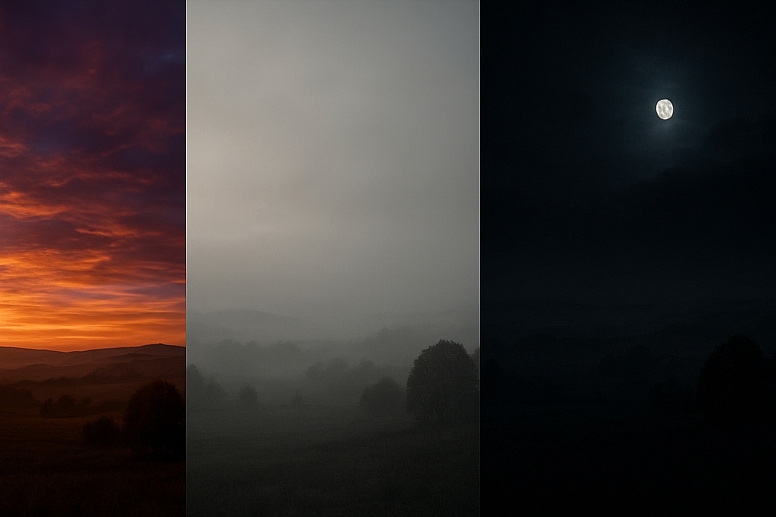
- Overall Atmosphere: A foggy landscape, a bustling night market, a quiet, sunlit room.
Step 3: Identify Patterns and Refine (The Culling)
After gathering 50-100 images, take a step back. This is where the magic happens. Look for patterns that emerge naturally from your collection.
- Group Similar Images: Look for commonalities. Do you see a lot of misty blues and grays? Are there recurring earthy browns and greens? Is there a surprising pop of a particular color that appears in multiple images?
- Revisit Your Keywords: Does your collection reflect your original words? If not, your direction may have evolved, which is fine. Refine your keyword list based on what you actually gathered.
- The Edit: This is the hardest part. Be ruthless. Remove images that are off-concept, even if they are beautiful. A focused mood board is a strong mood board. Aim to refine your collection down to 15-25 of the strongest, most representative images.
Step 4: Extract Your Color Palette
Your color palette has been hiding within your images all along. Now it is time to pull it out.
Use Digital Tools: This is the most efficient method. Several websites and apps can generate a palette from an uploaded image.
-
- Adobe Color: (https://color.adobe.com/) is a powerhouse. You can upload an image and extract a 5-color palette from it. You can also explore color rules (analogous, complementary, etc.) to refine the palette further.
- Colorik.com: Allows you to generate palettes from an image and is excellent for quick experimentation.
- Manual Extraction: For a more tactile approach, use the eyedropper tool in Photoshop, Figma, or Procreate to sample colors directly from your images. Create swatches of these colors.
What to Look For:
-
- Dominant Colors: The main colors that appear in your background or large areas.
- Accent Colors: The smaller pops of color that provide energy and interest.
- Neutrals: The blacks, whites, grays, creams, and beiges that provide balance and breathing room.
A typical palette might include:
- 1-2 Dominant Colors
- 1-2 Secondary/Support Colors
- 1 Accent Color
- 2-3 Neutral Colors
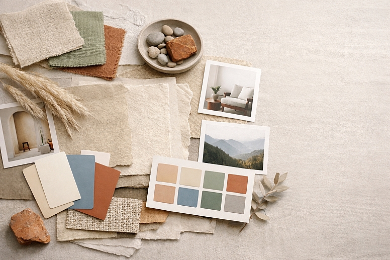
Step 5: Assemble Your Mood Board
Now, bring it all together. Your mood board should tell a story at a glance.
Choose Your Format:
-
- Digital: Tools like Canva, Milanote, or even a simple Figma or Photoshop document are perfect. They offer flexibility and easy sharing.
- Physical: For a hands-on approach, create a physical board using printed images, fabric swatches, paint chips, and found objects. This is excellent for capturing texture.
Composition and Layout:
-
- Create a Focal Point: Place your strongest, most defining image in the center or at the top.
- Group by Theme: Cluster images that share a common color or texture.
- Showcase Your Palette: Prominently display your extracted color swatches on the board. Often, placing them along the bottom or side creates a clean, professional look.
- Include Typography & UI Examples: If applicable, add examples of fonts and interface elements that match the mood.
- Leave Some Space: Don't cram every inch. Negative space (breathing room) makes the board easier to digest.
Step 6: Apply and Test Your Palette
A mood board is not the final product; it is the launchpad. The final test is to see how your colors work in practice.
- Create Mock-ups: Apply your new color palette to simple mock-ups of your project. This could be a website header, a book cover, or a product label.
- Check for Accessibility: Run your color combinations through a contrast checker to ensure text is readable. A beautiful palette is useless if it is not functional.
- Refine: You may find that a color that looked great in a photograph needs a slight adjustment to work well in a UI or logo. Tweak the saturation or brightness as needed. Your mood board provides the direction, not unbreakable rules.
The Unspoken Rule: It's a Guide, Not a Cage
A mood board establishes a vibe and a direction. It is not a strict set of commands that must be followed literally in every single element. It is there to ensure consistency of feeling. The specific shade of blue you use in a button might be slightly different from the one sampled from a photo of the ocean, and that is okay. As long as it evokes the same serene feeling, it is fulfilling its purpose.
Your Blueprint for Success
Creating a mood board is an act of discovery. It is a process that takes you from a vague notion to a clear, visual strategy. By starting with words, gathering widely, refining thoughtfully, and extracting your palette from the world itself, you ensure that your colors have meaning and context. This process prevents the common mistake of choosing colors in a vacuum based on personal taste.
A well-crafted color mood board becomes your project's North Star. Whenever you feel lost during the design process, you can refer back to it to recenter your decisions on the core mood and message. It is the foundation upon which compelling and cohesive visual experiences are built. Now, open a new tab, and start pinning. Your next great color story is waiting to be found.
Answers to Common Questions
What is the ideal number of images for a mood board? There is no magic number, but a good range is between 15 and 25 images. Fewer than 10 might not fully convey the concept, while more than 30 can become overwhelming and dilute the focus. The key is that each image must earn its place by strongly supporting the core keywords.
Can I use a mood board for a client who doesn't know what they want? Absolutely. In fact, this is one of its best uses. The process is collaborative. Have the client provide their own keywords and even do their own initial pinning. The mood board then becomes a tool to visually clarify their often-abstract desires and ensures you are both aligned before you begin the expensive work of actual design.
My extracted colors look muddy or don't work well together. What went wrong? This often happens if the source images are too complex or low-contrast. Go back to your curated images and choose ones with clearer color stories. Instead of extracting from a busy photo, try extracting from a simpler detail within a photo. You can also use the color harmony tools in Adobe Color to adjust the extracted palette into a more harmonious combination (e.g., shifting colors to an analogous scheme).
LEAVE A COMMENT
Recent Posts


0.0479