

Using Color to Improve User Experience in Web Design
You click on a website and know instantly what to do. A button stands out, links are clear, and the information feels organized. This is no accident. It is the result of strategic User Experience (UX) design, and color is one of its most powerful tools.
Color in UX is not about making a site "pretty." It is a functional, essential component that guides behavior, communicates meaning, and makes digital interactions intuitive and accessible. When used correctly, color reduces frustration, builds trust, and helps users achieve their goals with ease.
This guide breaks down how to harness the power of color to create web experiences that are not only beautiful but also effortless to use.
The Role of Color in UX at a Glance
- Color is a functional guide. It directs attention, signifies interactivity, and indicates status.
- Accessibility is non-negotiable. Color choices must provide sufficient contrast for readability and should not be the sole method of conveying information.
- Consistency creates intuition. Using color consistently across your site teaches users how to interact with it, building a sense of familiarity and trust.
- Emotion influences action. The psychological impact of your color palette can affect a user's mood and their willingness to engage or convert.
- Hierarchy is visual. Color creates a visual structure, helping users prioritize information and understand relationships between elements.
Color as a Functional Guide: Beyond Decoration
Every color choice on a page should have a job. Its primary role is to help users navigate and understand the interface.
1. Signaling Interactivity Users have learned to associate certain colors with clickable elements. The most important job of color is to answer the user's silent question: "What can I click on?"
- Links: Hyperlinks must be noticeably different from body text. While blue is the web standard, any consistent, contrasting color works. The key is that it must be distinct and used only for links.
- Buttons: Buttons call for action. Their color should make them stand out from the background and other elements. A high-contrast, bold color (often a brand's primary or accent color) is typically reserved for primary buttons (e.g., "Sign Up," "Buy Now"). Secondary buttons (e.g., "Learn More") might have a lighter fill or an outline, using a less prominent color.
2. Communicating Status and Feedback Color provides immediate, at-a-glance feedback on system status.
- Errors: Red is universally used to signal a problem, an error message, or a required field that was missed.
- Success: Green confirms that an action was completed successfully, like a form submission or a positive notification.
- Warnings: Yellow or orange often indicates a caution or a temporary state of alert.
- Information: Blue can denote neutral, informative messages.
This use of color is a universal language that requires no translation, making interfaces faster and easier to understand.
3. Establishing Information Hierarchy A page without color hierarchy is a wall of text. Color helps create visual weight, drawing the eye to the most important elements first.
- Headings vs. Body Text: A darker or bolder color for headings establishes them as more important than the lighter body text.
- Key Metrics: On a dashboard, a key performance indicator (KPI) might be displayed in a large, bold color, while supporting data is in a neutral gray.
- Visual Scanning: Users scan pages; they don't read them line-by-line. Strategic color highlights help them find the information they need quickly.
The Absolute Necessity of Color Accessibility
Designing without considering accessibility excludes a significant portion of your audience. Color accessibility ensures that people with visual impairments, including color vision deficiencies (color blindness), can use your website effectively.
1. Color Contrast Ratio: This is the most critical accessibility rule. It measures the difference in light between text (or graphical elements) and its background. The Web Content Accessibility Guidelines (WCAG) set clear standards:
- AA (Minimum Compliance): A contrast ratio of at least 4.5:1 for normal text and 3:1 for large text.
- AAA (Enhanced Compliance): A contrast ratio of at least 7:1 for normal text and 4.5:1 for large text.
Low contrast, like light gray text on a white background, is a common design trend that creates a terrible user experience for everyone, especially those with low vision. Always use tools like a Contrast Checker to test your combinations.
2. Don’t Rely on Color Alone: Color should be one of multiple cues used to convey information. For example:
- Links: An underline should accompany a color change to indicate a link for those who cannot perceive the color difference.
- Forms: An error message should not only be red but should also include an icon (like an "!") and clear text instructions.
- Graphs and Charts: Use patterns, textures, or direct labels in addition to color to differentiate data points.
This ensures that the information is communicated to all users, regardless of their ability to perceive color.
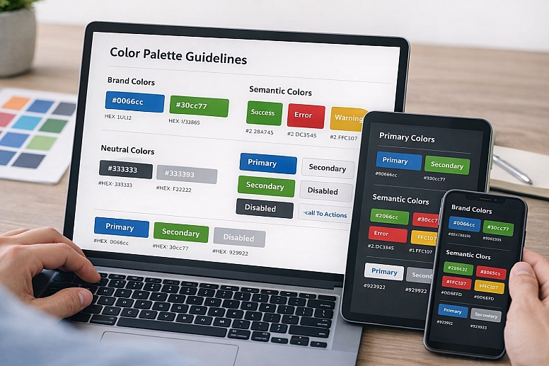
Building a Functional UX Color Palette

A UX color palette is a system, not a collection of favorite colors. It should be simple, purposeful, and scalable.
1. Primary Color: This is your brand's main color. In UX, it is most often used for your primary calls-to-action—the most important buttons you want users to click. It should be a color with enough contrast against your background to be easily visible.
2. Secondary Color: This color supports the primary. It can be used for secondary buttons, active states, or to highlight less critical information. It should be distinct from the primary color.
3. Neutral Colors: These are the backbone of your design. A sophisticated neutral palette is crucial for readability and hierarchy.
- Text Gray: A very dark gray (e.g., #333333) is often more comfortable to read than pure black (#000000) on white backgrounds.
- Background & Border Grays: A range of light to medium grays is essential for creating separation, defining boxes, and building layout structure without adding visual noise.
4. Semantic Colors: These are colors reserved for specific system states. Their meaning should be consistent across the entire site.
- Success (Green): For positive actions, confirmations, and successes.
- Error (Red): For errors, destructive actions, and warnings.
- Warning (Yellow/Orange): For cautions and pending states.
- Information (Blue): For neutral informative messages.
The Psychology of Color in User Behavior
While functionality is paramount, the emotional impact of color subtly influences how users feel about your site and whether they trust it enough to take action.
- Trust and Security: Blues are overwhelmingly used by financial and tech institutions (Bank of America, PayPal, Facebook) because they project stability, trust, and security. For a site handling sensitive data, this association is invaluable.
- Energy and Urgency: Reds and oranges are attention-grabbing and can create a sense of excitement or urgency. This is why they are often used for "Sale" tags and clearance notices. However, use them sparingly to avoid creating anxiety.
- Calm and Clarity: Greens and soft blues can have a calming effect. This is useful for sites in the health, wellness, or environmental sectors, or any interface where the goal is to reduce user stress.
- Neutrality and Focus: A background of white or light gray feels clean and puts the focus squarely on the content, reducing cognitive load for the user. This is a cornerstone of minimalist design.
The key is alignment. The emotional message of your color palette must align with your brand and the purpose of the site. A calming green palette would be misaligned for an extreme sports brand, just as a high-energy red would be misaligned for a meditation app.
Implementing Color: Consistency and Context
A perfect palette is useless if applied inconsistently.
1. Create and Use a Design System: Document your color system. Define the exact use case for every color:
- When to use the primary blue.
- Which gray is for subheadings and which is for disabled buttons?
- What is the exact shade of red for errors?
This ensures that every designer and developer on the team uses the colors the same way, creating a cohesive experience. Tools like Figma are excellent for building and sharing design systems.
2. Test in Real Environments Colors look different on various screens and under different lighting. Always test your palette on multiple devices—laptop, phone, tablet—and in both light and dark mode if your site supports it. A color that has sufficient contrast in light mode might disappear in dark mode and require adjustment.
A Practical Checklist for UX Color Implementation
Before launching, run through this list:
- Contrast: Have I checked all text and interactive elements for WCAG AA compliance?
- Function: Does my color scheme clearly indicate what is clickable?
- Consistency: Are my semantic colors (error, success, etc.) used the same way everywhere?
- Reliance: Is color the only way critical information is conveyed? If yes, add icons or text labels.
- Hierarchy: Does the color guide the eye to the most important elements on the page?
- Emotion: Does the mood of the color palette match the purpose of my website and brand?
- Focus: Is the palette simple and focused, or cluttered with too many competing colors?
Designing for Clarity and Confidence
Ultimately, using color in UX is about reducing the user's cognitive load. Every time a user has to stop and think—"Is this a button?", "Where do I click next?", "Is this text a link?"—you have created a point of friction. Strategic color removes these points of friction. It creates a silent, intuitive guide that leads the user effortlessly through their journey.
The goal is for the user to not even notice the color itself, but to feel the seamless, confident experience it creates. They leave the site having accomplished their task, and that positive feeling becomes associated with your brand. That is the true power of color in UX.
Now, open your latest design project. Zoom out and squint your eyes. Where does your eye go first? Is it the right place? Check your contrast. Test your links. Refine your system. Your users will thank you for it.
Answers to Common Questions
What is the best color for a call-to-action (CTA) button? There is no single "best" color. The most effective color is the one that has the highest contrast against your background and is distinct from other colors on the page. While red and orange often test well for grabbing attention, a green button might perform better on a site where green is already associated with "go" and positive action. The only way to know is to A/B test different options with your specific audience.
How many colors should I use in my web design? Aim for a limited palette to avoid visual chaos. A strong starting point is the 60-30-10 rule: 60% a dominant neutral (e.g., white/light gray), 30% a secondary neutral (e.g., dark gray), and 10% your primary brand color for accents and CTAs. You will also need your semantic colors (red, green, etc.), but these should be used sparingly for specific feedback.
How do I handle color in dark mode? Dark mode is not simply about inverting colors. You need a separate color palette. Pure white text on pure black (#000000) can cause a "halation" effect, making it hard to read. Instead, use a very dark gray (e.g., #121212) for the background and an off-white (e.g., #E6E6E6) for text. Your accent colors may also need to be lightened or softened to maintain accessibility and visual comfort against a dark background.
My client wants to use a low-contrast design because it looks "modern." What should I do? Educate them. Explain that modern design is not just about aesthetics; it is about inclusive, functional design that works for everyone. Show them the WCAG guidelines and explain that low contrast can alienate users, harm SEO, and even have legal ramifications for accessibility compliance. Propose a compromise: use low-contrast aesthetics for large, decorative text but maintain high contrast for all body text and interactive elements.
LEAVE A COMMENT
Recent Posts


0.0484