

The Role of Color in Minimalist Design: Less is More
Minimalist design is an exercise in rigorous reduction, where every element must justify its presence. In this constrained context, color ceases to be mere decoration and becomes a primary tool for establishing hierarchy, defining space, and evoking emotion.
The strategic use of color in minimalist design focuses on achieving maximum communicative effect with the fewest possible variables, relying on precision, contrast, and intentional restraint.
- Core Principle: Color in minimalism is functional, not decorative. Each hue and tone must have a deliberate purpose.
- Critical Constraint: The color palette is severely limited, often to 1-3 colors plus neutrals.
- Primary Function: It creates visual interest, defines structure, and guides attention in the absence of ornamental detail.
- Common Misstep: Equating "minimalist color" with only black and white, overlooking the power of a single, strategic accent.
Color as a Structural and Functional Element
In ornate or complex designs, color can be part of a broad palette of visual stimuli. In minimalism, with textures simplified, lines reduced, and decorative elements removed, color carries a disproportionate load. Its primary role shifts from embellishment to architecture.
A single bold color on a neutral field doesn't just add "interest"; it acts as a visual anchor. It can define a key interactive element, terminate a sight line in a spatial composition, or establish a brand presence without a logo. In digital interfaces, a solitary accent color against a monochrome background creates an immediate and unambiguous hierarchy, telling the user where to look and what to do next without competing visual noise. In physical spaces, a painted wall in a restrained hue defines a zone and creates atmosphere without requiring physical partitions or complex millwork.
The real-world impact is measurable: interfaces with minimalist color schemes often show higher task-completion rates because distractions are eliminated. Architectural spaces feel larger, calmer, and more focused. Brand materials become more memorable due to consistent, stark visual repetition. The effectiveness of this approach hinges on understanding that in a quiet composition, even a whisper of color can sound like a shout.
The Mechanics of a Minimalist Color Palette
Building a minimalist color system is a technical process of selection, relationship, and restriction.
1. The Foundation: The Neutral Base: The neutral base—typically whites, blacks, grays, and beiges—forms the canvas. This is not a single color but a carefully calibrated spectrum of tones. The choice between a warm white (e.g.,#F8F5F0) and a cool white (e.g.,#FFFFFF) sets the entire emotional temperature of the design. This base provides the contrast needed to make any accent visible and establishes the tonal range for the space or layout. The texture of these neutrals (matte vs. gloss, smooth plaster vs. rough concrete) becomes a critical source of visual depth.
2. The Accent: Justification and Precision: The selection of an accent color is the most critical decision. It must be justified by a clear function: to indicate interactivity, to highlight key information, or to embody a brand attribute. The process is highly intentional:
- Psychology & Context: A healthcare app might use a calm, trustworthy blue, while a sustainability brand might opt for an organic, muted green.
- Contrast & Accessibility: The accent must have sufficient luminance contrast against its neutral background to be legible and accessible, meeting WCAG guidelines. A pale yellow on white fails functionally.
- Spatial Weight: The color's visual weight is considered. A dark, saturated color feels heavy and grounded; a light tint feels ethereal and spacious.
3. The 60-30-10 Rule in Minimalist Application: This classic rule is adapted with even stricter discipline:
- 60% Dominant Neutral: The primary background (walls, screen canvas).
- 30% Secondary Neutral: A contrasting tone for large secondary surfaces (flooring, content panels, furniture).
- 10% Accent Color: The single, reserved hue for highlights, actions, and key focal points. In strict minimalism, the "10%" may be further reduced to 5% or less, making its appearances even more potent and significant.
4. Systems for Expansion: Tints, Tones, and Shades: A minimalist palette is not necessarily flat. Using a single accent hue, a functional system can be built through:
- Tints: Adding white creates lighter variations for hover states or secondary highlights.
- Shades: Adding black creates darker variations for pressed states or borders.
- Tones: Adding gray creates muted, desaturated versions for backgrounds or de-emphasized elements. This creates a harmonious and scalable system from one color, ensuring cohesion without adding new hues.
Five Contexts for Minimalist Color Application
1. Brand Identity for a Premium Technology Company
- Constraints: Must convey innovation, precision, and trust across digital and print touchpoints without appearing sterile or generic.
- Common Mistakes: Using a cold, pure gray scale that feels impersonal. Adding a second accent color for "vibrancy" dilutes the minimalist impact.
- Practical Advice: Choose a deep, complex neutral as the base—a charcoal with a subtle blue undertone (
#2A2D34), not pure black. Select a single, luminous accent color like an electric cyan (#00EEFF) used exclusively for interactive elements in the UI and as a tiny foil-stamped detail on printed business cards. The contrast between the warm, rich dark and the cool, bright accent conveys cutting-edge sophistication.
2. Mobile Application for Mindfulness and Meditation
- Constraints: Must create a calm, focused, and distraction-free user experience that itself feels tranquil.
- Common Mistakes: Using overly stimulating natural colors (like bright green leaves). Relying on iconography that is too detailed, forcing color to fill small, complex shapes.
- Practical Advice: Employ a base of soft, warm off-whites and light grays (
#FAF9F7). Use a single, muted natural accent derived from clay or stone, such as a dusky terracotta (#CC7357). Apply this color only to the primary action button ("Start Session") and the progress indicator. Use ample white space and allow the accent to appear sparingly, making the act of beginning a meditation feel intentional and serene.
3. Architectural Interior for a Small Urban Apartment
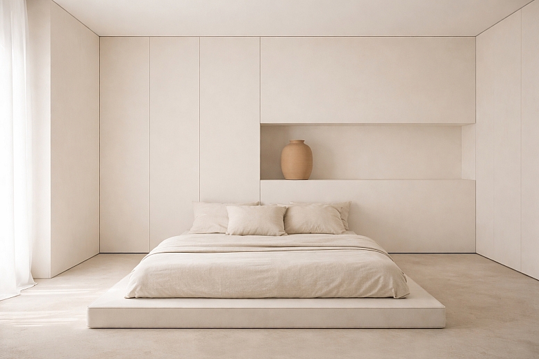
- Constraints: Must enhance the perception of space, light, and airiness in a limited square footage, while providing visual definition.
- Common Mistakes: Painting all walls the same white, which can feel clinical and dimensionless. Introducing color through many small decor items, creating visual clutter.
- Practical Advice: Use a monolithic neutral color on walls, ceilings, and millwork to blur boundaries and expand the sense of space. Introduce a single, bold color on a built-in element that spans floor to ceiling—such as a library wall, kitchen cabinetry, or a soffit. This creates a powerful, architectural focal point without consuming physical space. The color should be matte to absorb light and feel integrated, not applied.
4. Editorial Website for Long-Form Journalism
- Constraints: Must prioritize supreme readability and content focus over visual flair, while still establishing brand character.
- Common Mistakes: Using colored backgrounds for text blocks or multiple highlight colors for quotes, which disrupts reading flow.
- Practical Advice: Use a near-black text (
#333333) on a warm off-white background for optimal reading comfort. Choose a single, strong color for the website's header and all inline text links. This creates a consistent, predictable interactive cue. Use large, monochrome imagery. The only blocks of accent color should be small, bold subject tags or chapter dividers, framing the content without interrupting it.
5. Packaging for a Sustainable Consumer Product
- Constraints: Must communicate eco-friendliness, purity, and quality with minimal ink usage and recyclable materials.
- Common Mistakes: Using clichéd "natural" imagery or excessive green hues. Adding metallic inks or plastic coatings that contradict the sustainable message.
- Practical Advice: Let the material (unbleached cardboard, molded pulp, clear glass) provide most of the color and texture. Use a single color of vegetable-based ink for all necessary information: logo, product name, and essential descriptors. A deep, earthy green or blue printed on raw cardboard feels authentic and honest. Embossing or debossing can add tactile detail without color, reinforcing the "less is more" ethos physically.
A Comparative Analysis of Minimalist Color Philosophies
| Philosophy | Color Palette Approach | Typical Neutrals | Accent Strategy | Best Suited For |
|---|---|---|---|---|
| Monochromatic Minimalism | A single hue plus its tints, tones, and shades. | White, Black, Grays. | Uses value contrast within the hue for depth. | Digital UI, photography portfolios, where harmony is paramount. |
| Achromatic Minimalism | Strictly black, white, and gray. No true hue. | The entire palette. | Texture, light, shadow, and form provide interest. | Architecture, high-contrast branding, and conceptual art. |
| Natural Material Minimalism | Colors are derived from raw materials: wood, stone, linen, metal. | Beiges, Taupes, Grays, Off-Whites. | The inherent color of a material (e.g., oak, brass) acts as the accent. | Interior design, product design, and brands emphasizing craftsmanship. |
| Bold Accent Minimalism | Vast neutral field with one isolated, high-saturation color. | White, Light Gray. | A single, potent color used with extreme scarcity for maximum focus. | Call-to-action design, wayfinding, and impactful marketing assets. |
Advanced Nuances in Perception and Implementation
For experts, managing color in minimalism involves controlling subtle interactions that the average viewer feels but does not see. Simultaneous contrast is heightened in a sparse layout. A mid-tone gray will appear cooler against a warm beige wall and warmer against a blue-gray wall. The precise undertone of every neutral must be curated to achieve the desired effect for the accent color.
Cultural and Contextual Color Meaning must be considered at a granular level. While white often signifies purity and space in Western minimalism, it can have very different connotations elsewhere. An expert designer doesn't just pick "a white," but chooses a specific white that aligns with the cultural context of the audience—perhaps a softer, creamier white for a more accessible, warm feel.
The concept of Visual Weight Distribution is critical. In a minimalist composition, color carries mass. A small, dark-colored object in the corner of a white room can feel unbalanced, creating psychological tension. Experts use color to visually "anchor" a space or layout, placing heavier (darker, more saturated) colors lower or in positions that stabilize the composition.
Finally, Maintaining Cohesion Across Media is a technical challenge. A Pantone color on matte paper, an RGB color on a glossy screen, and a paint color on a textured wall are three different physical phenomena. Expert implementation involves creating a cross-media color bridge, specifying colors not just by hex code, but by their closest reproducible equivalents in each medium, accepting that a perfect match is less important than a consistent perceptual experience.
Common Pitfalls and Misconceptions
Misconception: Minimalist means using no color. This is the most common error. True minimalism is about purposeful reduction, not elimination. The strategic addition of a single color is often what makes a minimalist design successful and memorable, providing the necessary focal point.
Pitfall: Creating a sterile or cold environment. An all-white, achromatic palette can feel inhuman and clinical if not handled with care. The solution lies in the careful selection of neutrals with subtle warmth and the incorporation of natural materials (wood, wool, leather) whose inherent color and texture provide organic warmth without adding a new color to the palette.
Misconception: Minimalist color schemes are easy to design. The extreme constraint makes color choice more difficult, not less. With fewer elements, each decision is magnified in importance. A poor color choice in a complex design can be lost; in a minimalist design, it is the entire visual statement.
Pitfall: Ignoring the role of light as color. In physical spaces, light has temperature and color. A cool-white accent wall under warm incandescent lighting will appear gray-green. A minimalist color scheme must be designed in tandem with the lighting plan, as light is the medium that reveals all other colors.
A Method for Developing a Minimalist Color Scheme
- Define the Core Emotional and Functional Goal. Start with words, not colors. Is the goal "calm," "energizing," "authoritative," or "inviting"? This list dictates the color attributes you will later select.
- Establish the Neutral Foundation First. Select your primary and secondary neutrals. Test them in the actual medium (on screen, as paint swatches in the room's light). Ensure they provide the desired sense of space and baseline emotion (warm vs. cool).
- Identify the Single Necessary Function for Color. What is the one thing color must do? Is it to draw the eye to a button, define a zone, or convey the brand? Answer this with one sentence.
- Select the Accent Hue Based on Steps 1 & 3. Choose a hue that aligns with the emotional goal and fulfills the stated function. Test its contrast against your chosen neutrals for accessibility.
- Build a Strict Usage Protocol. Document exactly where the accent color can and cannot be used. For example: "Accent Blue (#2A5CFF) is used ONLY for: Primary button fills, Active navigation underline, Headline text on hero images. It is NEVER used for: Body text, borders, icons, or secondary buttons."
- Prototype and Test in Context. Apply the palette to a real screen, a mockup of the space, or a packaging dummy. View it in its intended environment and lighting. Does the accent achieve its purpose instantly? Does the overall feel match the goal?
- Enforce Ruthlessly. The system only works through consistent discipline. Any deviation dilutes the minimalist effect and introduces visual noise.
Questions on Minimalist Color Use
What is the maximum number of colors in a minimalist palette? For the core functional and brand palette, 2-3 is the absolute maximum: one or two neutrals and one accent. This does not include imagery, data visualizations, or user-generated content, which may contain multicolored elements that exist within the structured framework of the minimalist layout.
Can you use patterns with minimalist color? Yes, but the patterns must be simple, geometric, and executed in the colors of the defined palette. A subtle grid, stripe, or dot pattern in a light tint of the accent color can add texture without complexity. The pattern should feel like a texture, not a decorative addition.
How do you make a minimalist design accessible? Accessibility is non-negotiable. The high contrast required by WCAG guidelines is inherently aligned with minimalist principles. Ensure text has a minimum 4.5:1 contrast ratio against its background. Use your accent color not as the sole indicator of interactivity (e.g., a colored link), but in combination with an underline or icon. Test your palette with color blindness simulators.
Is black-and-white always a safe minimalist choice? It is a common choice, but not inherently "safe." Pure black-on-white can create extreme, fatiguing contrast for reading. Using a very dark gray (#333) on off-white (#FAFAFA) is often more comfortable. Furthermore, a pure achromatic scheme can lack emotional resonance unless supplemented by exceptional typography, imagery, or material texture.
LEAVE A COMMENT
Recent Posts


0.0465