

5 Common Color Mistakes Designers Make & How to Avoid Them
Color is one of the most powerful tools a designer has. It can attract attention, set a mood, and guide a user's eye. But with great power comes great responsibility. A few simple color mistakes can undermine your entire design, making it hard to read, unpleasant to look at, or completely ineffective at communicating its message. These errors are common, from beginners to seasoned pros. The good news is they are also easy to fix once you know what to look for.
This guide walks through five of the most frequent color mistakes and provides clear, actionable advice on how to avoid them.
The Mistakes and Their Solutions at a Glance
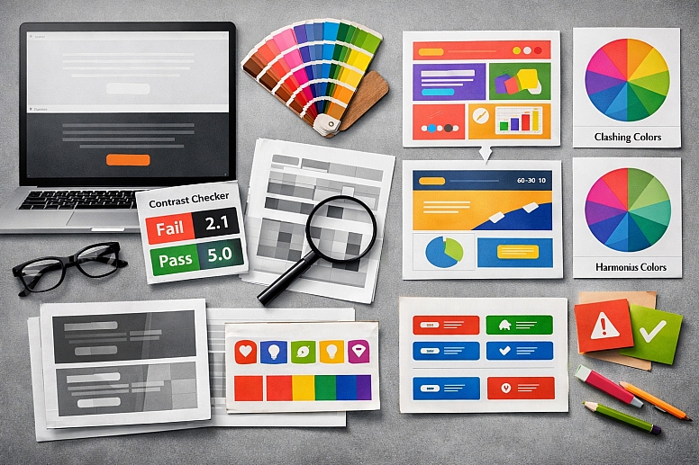
Poor Contrast: Text that blends into the background is the number one offender for killing readability and accessibility.
-
- Fix: Always test color combinations with a contrast checker tool to meet WCAG guidelines.
Too Many Colors: A chaotic palette with no hierarchy confuses the viewer and dilutes your message.
-
- Fix: Use a limited palette based on a proven formula like the 60-30-10 rule.
Ignoring Color Psychology: Choosing colors based solely on personal taste instead of their cultural and psychological meaning.
-
- Fix: Research color associations and align your palette with your brand's personality and goals.
Clashing Colors: Combining hues that vibrate or fight each other creates visual noise and discomfort.
-
- Fix: Use a color wheel to choose harmonious combinations like analogous or complementary pairs.
Inconsistent Color Application: Using the same color for different purposes, or different colors for the same purpose, across a project.
-
- Fix: Build and strictly adhere to a simple design system or style guide.
Mistake 1: Poor Contrast
The Problem: This is the most critical and unfortunately common mistake. Low contrast between text and its background is a major barrier to readability and accessibility. It forces users to strain their eyes, creates a frustrating experience, and excludes people with visual impairments or color vision deficiencies. A stylish light gray font on a white background might look "minimal," but it is fundamentally broken if people cannot read it.
How to Avoid It:
- Embrace Contrast Checkers: Never guess. Use free online tools like the WebAIM Contrast Checker to test your foreground and background color combinations. Aim for a contrast ratio that meets at least the WCAG AA standard (4.5:1 for normal text).
- The Squint Test: A quick and easy method is to squint your eyes while looking at your design. If the text elements blur into the background, your contrast is too low.
- Test in Grayscale: Convert your design to black and white. This removes the distraction of hue and shows you purely the value (lightness/darkness) contrast. If everything blends together, you know you have a problem.
Mistake 2: Using Too Many Colors
The Problem: A design that uses a rainbow of colors with no clear structure feels chaotic and amateurish. It lacks visual hierarchy, meaning the viewer's eye doesn't know where to look first. This dilutes the importance of key elements like calls-to-action and makes the overall piece feel messy and overwhelming.
How to Avoid It:
- Follow the 60-30-10 Rule: This classic interior design principle works perfectly for graphics and web design.
- 60%: Your dominant color (usually a neutral for backgrounds).
- 30%: Your secondary color (often a brand color for supporting elements).
- 10%: Your accent color (a bold or contrasting color for highlights and CTAs).
- Start with a Base and an Accent: A great starting point is to choose one primary color and a neutral (like black, white, or gray). Use the neutral for 80-90% of the design and use the color for accenting the 10-20% that is most important. You can always add a second color later if needed.
- Limit Your Palette: For most projects, a palette of 3-5 colors total (including neutrals) is more than enough to create variety and interest without causing chaos.
Mistake 3: Ignoring Color Psychology
The Problem: Choosing a color because "it's my favorite" or because "it's trendy" is a strategic misstep. Colors carry deep psychological and cultural meanings. Using a color that conflicts with your message can create subconscious confusion or distrust in your audience. For example, a bright, playful orange might be a poor fit for a law firm that needs to project trust and stability.
How to Avoid It:
Define Your Message First: Before choosing colors, define the core personality of the brand or project. Is it reliable? energetic? luxurious? calming?
Research Color Meanings: Match your brand attributes to common color associations.
-
- Trust & Security: Blue
- Energy & Urgency: Red, Orange
- Nature & Growth: Green
- Luxury & Creativity: Purple
- Optimism & Warmth: Yellow
Know Your Audience: Cultural context is everything. Research how your target audience perceives colors. The same color can have opposite meanings in different parts of the world.
Mistake 4: Clashing Colors
The Problem: While high contrast is good, certain color combinations literally vibrate against each other when placed side-by-side. This is often due to them having similar saturation or value levels. This visual vibration is jarring and uncomfortable to look at, causing eye strain and making your design feel unprofessional.
How to Avoid It:
Use a Color Wheel: Understand basic color harmonies.
-
- Analogous: Colors next to each other on the wheel (e.g., blue, blue-green, green). These are harmonious and safe.
- Complementary: Colors opposite each other (e.g., blue and orange). These create high contrast and energy but need to be balanced carefully.
Adjust Saturation and Value: Two highly saturated complementary colors will clash violently. To make them work together, try making one color darker, lighter, or less saturated. For example, use a deep navy blue with a soft, muted peach instead of pure blue and pure orange.
Add a Buffer: Separate clashing colors with a neutral border (white, black, or gray) to reduce the vibrating effect.
Mistake 5: Inconsistent Color Application
The Problem: Using different shades of blue for every button or using red for both errors and headlines teaches your user nothing. Inconsistency destroys the functional utility of color. If a color doesn't have a consistent meaning, it becomes meaningless noise, and users can no longer navigate your design intuitively.
How to Avoid It:
Create a Simple Style Guide: Even for a small project, document your color choices and their roles.
-
- Primary Color: Used for [X] (e.g., main headlines, primary buttons).
- Secondary Color: Used for [Y] (e.g., subheads, secondary buttons).
- Error Color: Only used for [Z] (e.g., error messages, warning icons).
Use Global Styles: In design software like Figma or Adobe XD, set up Color Styles. This allows you to apply a color from a central source. If you need to change it later, you can update it in one place and it changes everywhere in the design.
Audit Your Work: Before finalizing a project, do a quick scan. Are all the interactive elements the same color? Are all the warnings the same red? Consistency is what makes a design feel polished and professional.
A Final Check Before You Finish
Before you call any design done, run it through this quick checklist:
- Readability: Can I easily read all the text? (Test contrast!)
- Hierarchy: Does my eye go to the most important thing first?
- Harmony: Do the colors work together, or do any fight or vibrate?
- Meaning: Do the colors fit the message and the audience?
- Consistency: Are the same colors used for the same things everywhere?
Fixing these five common mistakes will immediately elevate the quality, clarity, and effectiveness of your designs. Color is a language. Learn its rules, and you can use it to communicate with power and precision.
Answers to Common Questions
What is the biggest color mistake you see most often? Poor contrast is the most frequent and damaging mistake. It directly impacts usability and accessibility, affecting the largest number of users. A beautiful design that can't be read is a failed design.
How can I check if my design is accessible for colorblind users? Most design software now includes colorblind simulation tools. You can also use online tools like Toptal's Colorblind Filter to upload an image and see how it looks with various color vision deficiencies. The best practice is to ensure information is not conveyed by color alone (use icons, patterns, or text labels too).
I've followed the rules, but my design still looks dull. What can I do? Rules are a foundation, not a cage. Once you have a harmonious and accessible base, you can experiment. Try introducing a small, unexpected accent color. Play with gradients that use your brand colors. Use photography with vibrant colors to add life, while keeping your UI elements consistent and clean. Sometimes, dullness comes from a lack of bold contrast—don't be afraid to use pure black and white.
LEAVE A COMMENT
Recent Posts


0.05