

How to Create a Custom Colour Palette from a Photo
Creating a custom colour palette from a photo is a process of extraction and refinement. It transforms an existing visual harmony—whether from nature, architecture, or art—into a functional, structured system for design.
This method guarantees cohesion and evokes a specific mood or environment, but the raw colours extracted require systematic adjustment to become a viable palette for typography, interfaces, and branding.
- Core Principle: A photo provides a harmonious starting point, not a final palette.
- Critical Step: Extracted colours must be adapted for contrast, balance, and digital use.
- Primary Outcome: A unique, emotionally resonant colour system with defined roles for each swatch.
- Key Tools: Colour pickers, palette generators, and manual adjustment in design software.
The Strategic Value of a Photographic Palette
A colour palette created in isolation can feel arbitrary or disconnected. Deriving it from a photograph anchors it in a pre-existing reality that the human eye perceives as naturally harmonious. This is because the photo—a sunset, a forest floor, a weathered wall—already embodies balanced relationships of light, shadow, and hue formed by physics or artistry.
The value is two-fold: unique emotional resonance and inherent harmony. The palette carries the mood of its source image. A palette from a misty mountain lake evokes tranquility; one from a vibrant street market suggests energy and culture. Furthermore, the colours already coexist pleasingly, solving the initial challenge of colour relationship. However, photographs provide raw material, not a finished product. A dominant brown from tree bark may need to be lightened for use as a background; a vibrant splash of paint may need to be desaturated to serve as a functional accent. The process is one of translation from image to system.
The Technical Process: Extraction, Analysis, and Systematization
The transition from pixel to palette is a structured, three-phase operation.
Phase 1: Source Image Selection and Preparation The quality of the input dictates the quality of the output.
- Criteria for a Good Source Image:
- Strong Mood: The image should evoke the specific feeling you want the palette to communicate.
- Varied Tones: Look for a range of lights, darks, and mid-tones, not just different hues.
- Cohesive Colour Story: The image should have a dominant colour atmosphere (e.g., cool blues, warm golden hour tones).
- Preparation: Crop to the most representative area. Slightly blurring the image (a 2-3px Gaussian blur) can help eliminate noise and isolate broader colour fields, making extraction cleaner.
Phase 2: Colour Extraction and Initial Sorting This is the mechanical gathering of swatches.
- Method A: Manual Picking with a Tool.
- Process: Use the eyedropper tool (
Iin Photoshop, Figma, etc.) to sample 10-15 points from key areas: the dominant background, a mid-tone subject, a shadow, a highlight, and any small, vibrant accents. - Result: A disorganized set of raw colour values.
- Process: Use the eyedropper tool (
- Method B: Automated Palette Generator.
- Process: Upload the image to a tool like Adobe Color, Coolors, or Canva's palette generator. These use algorithms to identify the most representative colours.
- Result: A generated, often more cohesive starting palette of 5-6 colours. This is typically faster and provides a better foundation than fully manual picking.
Phase 3: The Essential Refinement into a Functional System - Raw extracted colours are rarely usable. They must be engineered into roles.
Step 1: Identify the Anchor Neutrals. From your extracted swatches, find the colours closest to black, a white, and a mid-tone grey or beige. These will form the foundation of your palette. Adjust them to be true neutrals if needed—e.g., darken a near-black to#1A1A1A, lighten a near-white to#F8F9FA.
Step 2: Establish the Primary and Secondary Hues - Choose the 1-2 most dominant colours from the photo as your primary brand hues. Then, select 1-2 supporting colours as secondary.
Crucially, you must now adjust these for use:
-
- Check Contrast: Ensure your primary colour has sufficient contrast (at least 4.5:1) against your chosen neutral background for text or key shapes.
- Adjust Saturation and Value: A colour straight from a shadow may be too dark. Lighten it (increase value) to create a tint for backgrounds. A colour from a bright accent may be too vibrant. Desaturate it slightly to make it more versatile and less overwhelming.
Step 3: Define the Palette Roles - Assign every colour a specific job. A standard 6-colour palette structure might be:
-
- Dark Neutral: For body text (
#2C3E50). - Light Neutral: For backgrounds (
#FDFDFD). - Mid-Tone Neutral: For borders, secondary text (
#95A5A6). - Primary Colour: For primary buttons, key headlines (
#E74C3C). - Secondary Colour: For secondary buttons, highlights (
#3498DB). - Accent Colour: For alerts, success states, or sparing decorative highlights (
#F1C40F).
- Dark Neutral: For body text (
Five Contexts for Palette Extraction
1. Brand Identity for an Artisanal Coffee Roastery
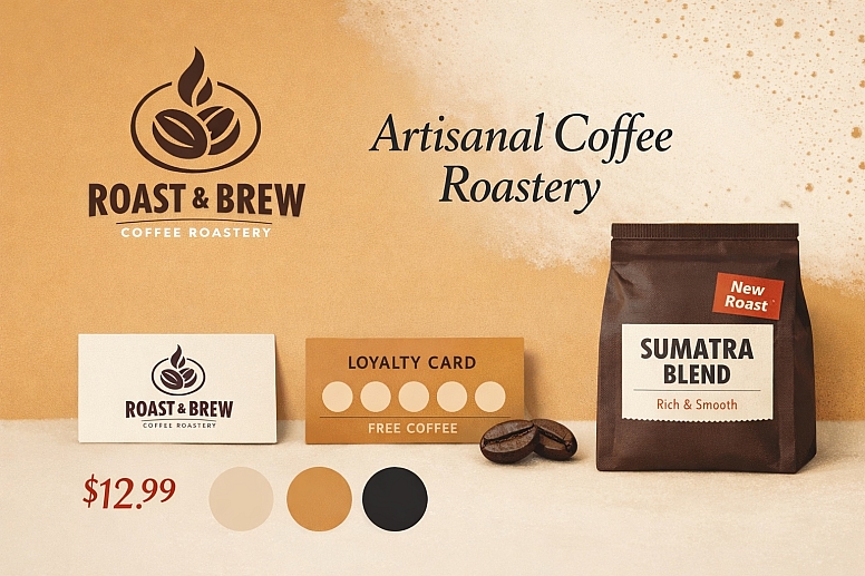
- Source Image: A close-up photo of roasted coffee beans, showing deep browns, a reddish highlight, and the creamy colour of crema.
- Raw Extraction: Dark brown, reddish-brown, mid-tan, beige.
- Common Mistake: Using dark brown for body text, making it unreadable.
- Refinement Process: The dark brown becomes the primary brand colour for logos. It is lightened 40% to create a warm tan for backgrounds. The crema beige becomes the light neutral. A deep near-black is introduced for text. The reddish highlight is sampled, desaturated, and used as a warm accent for prices or "New Roast" tags.
2. Website Design for a Luxury Travel Company
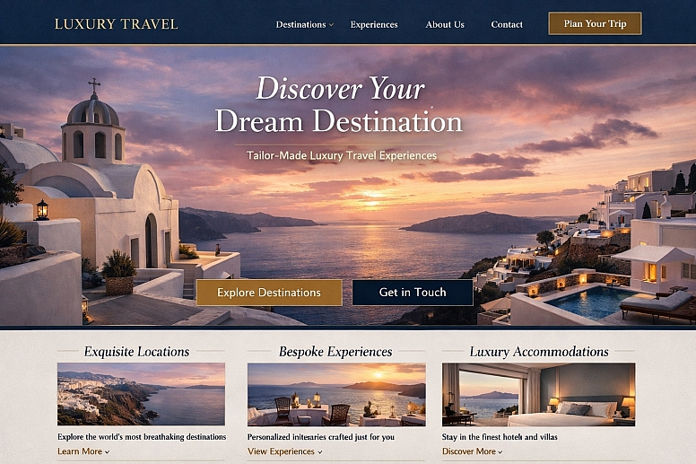
- Source Image: A photograph of a sunset over a Greek island: deep blue sea, white architecture, golden sky, pinkish-purple clouds.
- Raw Extraction: Navy blue, white, golden yellow, dusky pink, stone grey.
- Common Mistake: Using the golden yellow at full saturation for large areas, which is garish and inaccessible.
- Refinement Process: The navy blue becomes the trustworthy primary. The golden yellow is dramatically desaturated and darkened into a rich, mustard gold for accents and borders. The dusky pink is muted further for subtle highlights. The white and stone grey become the core neutrals. The palette feels luxurious, Mediterranean, and cohesive.
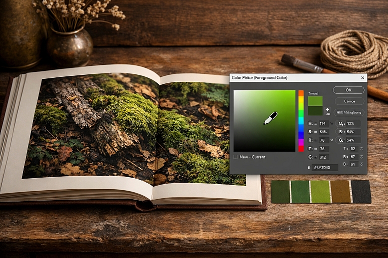
3. Mobile App for a Mindfulness and Meditation Service
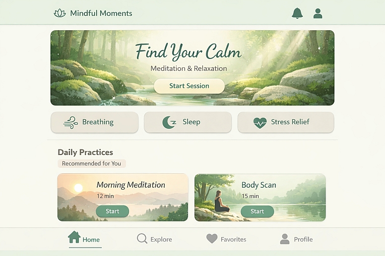
- Source Image: A serene forest scene with moss, soft grey rocks, and filtered green light.
- Raw Extraction: Dark green, moss green, grey-green, stone grey, near-black shadow.
- Common Mistake: Creating a palette that is too dark and monochromatic, feeling heavy rather than calm.
- Refinement Process: The moss green becomes the primary calming colour. It is lightened into a soft mint tint for app backgrounds. The stone grey is warmed slightly to a gentle beige-grey for secondary elements. The dark green is used sparingly for text. A very pale, warm off-white is introduced to open up the space. A sampled highlight from a sunbeam is used as a soft, creamy accent.
4. Packaging Design for a Sustainable Skincare Line
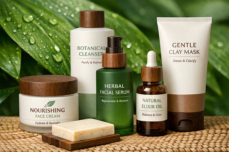
- Source Image: A detail of a green leaf with water droplets, showing multiple greens and the transparent water.
- Raw Extraction: Forest green, lime green, yellow-green, white from water highlight.
- Common Mistake: Assuming the greens provide enough range, leading to a flat design without a clear hierarchy.
- Refinement Process: The forest green becomes the primary, representing the brand's natural ethos. The lime green is desaturated into a soft sage for secondary typography. The white highlight becomes the base. A rich, earthy brown (not from the leaf) is introduced from the brand's conceptual "soil" to ground the palette and provide a warm, trustworthy neutral for text. The final palette is natural but structured.
5. Key Visuals for a Music Festival Campaign

- Source Image: A dynamic, neon-lit concert photo with purples, electric blues, and dark shadows.
- Raw Extraction: Deep purple, electric blue, hot pink, black.
- Common Mistake: Using all colours at full saturation and equal weight, creating visual chaos.
- Refinement Process: The deep purple becomes the dominant dark mode background. The electric blue is the primary action colour. The hot pink is used as a high-energy accent for limited-time offers. A pure white is introduced for essential information. The palette is structured so that the black and purple provide a dramatic stage, allowing the blue and pink to truly "pop" as intended, mirroring the concert experience.
A Comparison of Palette Extraction and Refinement Techniques
| Technique | Process Description | Best For | Key Consideration |
|---|---|---|---|
| Manual Eyedropper Sampling | Directly picking colours from specific pixels in an image. | Experienced designers who need precise control over which exact colours are captured. | Prone to capturing atypical pixels (noise, dust). Requires the most refinement. |
| Automated Palette Generator | Using an algorithm to analyze the image and output dominant colours. | Speed, beginners, or finding a harmonious starting point you wouldn't have manually chosen. | You surrender some control; the algorithm may miss small but important accent colours. |
| Gradient Map Extraction | In Photoshop, applying a gradient map adjustment to see the core tonal range as colours. | Understanding the fundamental light-to-dark structure of an image in a specific hue. | More of an analytical technique than a direct extraction method for a full palette. |
| Mood Board Aggregation | Extracting palettes from multiple photos in a shared theme and blending them. | Building a complex, nuanced palette that represents a broad concept (e.g., "Nordic Winter"). | Requires skill in synthesis to combine multiple palettes into one coherent system. |
Advanced Refinement: Creating Tints, Shades, and Accessibility
For a professional system, the 5-6 base colours are just the beginning. Each should be expanded into a swatch family.
- Create a Tint/Shade Ramp: For your primary colour, use a tool or manually create 3-5 lighter tints (add white) and 3-5 darker shades (add black). This gives you
Primary-100(lightest) throughPrimary-900(darkest) for flexible use. - Enforce Accessibility: Use the tint/shade ramps to guarantee contrast. If your
Primary-500button on a white background fails contrast, you can instantly selectPrimary-700from its shade family to meet WCAG guidelines without breaking palette harmony. - Test in UI Context: Place your colours immediately into a standard UI mockup with headers, body text, buttons, and cards. This real-world test is the fastest way to see if a colour is too weak for a button or too strong for a background.
Common Pitfalls and Misconceptions
Misconception: "The colours from the generator are ready to use." This is the most frequent error. Generator colours are often too saturated, too close in luminance, or lack a true neutral. They are a first draft, not a final product.
Pitfall: Creating a palette without a true neutral range. A palette of only hues (blues, greens, reds) will fail in practice because design requires blacks, whites, and grays for structure, text, and backgrounds. You must deliberately define or introduce these.
Misconception: "I must use every colour I extract." Editing is essential. An image may have seven beautiful colours, but a functional palette rarely needs more than five, plus neutrals. Choose the most representative and discard the outliers, or blend them into a more average tone.
Pitfall: Ignoring the final application medium. A palette extracted from a glossy product photo may rely on specular highlights that cannot be reproduced in matte print. Always refine colours with the final output (screen, print, fabric) in mind, adjusting saturation and brightness accordingly.
A Step-by-Step Method for Creating a Custom Palette
- Select and Prepare the Source Image. Choose a high-quality image with a clear mood. Crop and apply a minor blur to simplify colour data.
- Extract Raw Colours. Use an automated generator (recommended) for a base, then manually sample any missing but critical accent colours with an eyedropper.
- Identify and Set Your Neutrals. From the extracted swatches, pick or adjust colours to be your Dark Neutral (for text), Light Neutral (for backgrounds), and a Mid-Tone Neutral.
- Choose and Refine Your Hero Hues. Select 1-3 colours to be your primary/secondary hues. Adjust their lightness/saturation to ensure they are functional and have good contrast against your neutrals.
- Define Roles and Create Swatch Families. Assign each colour a job (Primary, Secondary, Accent). Then, for each, create a ramp of 3-5 tints and shades.
- Test in a Realistic Context. Apply the palette to a UI frame or a sample branding block (logo, headline, paragraph, button). Check contrast and visual balance.
- Document the System. In your design software, create a styled colour page that shows the base palette, the tint/shade ramps, and clear usage rules (e.g., "Primary-700 is for button fills on light backgrounds").
Questions on Creating Palettes from Photos
What if my photo is mostly one colour? A monochromatic image is an excellent start. Extract the range from the lightest tint to the darkest shade of that hue. This becomes your core monochromatic palette. You will then need to introduce a contrasting accent colour from outside the photo (e.g., a complementary colour) for interactive elements, and define your neutrals.
How do I name the colours in my custom palette? Avoid generic names like "blue" or "dark grey." Use names that reflect the source and role. For a palette from a forest image:Forest Deep(primary dark green),Moss Light(background tint),Canopy Shadow(text black),Sunbeam(accent yellow). This reinforces the palette's story and makes it easier for teams to use correctly.
Can this process work for a black and white photo? Yes. A black and white photo provides a perfect, nuanced tonal range. Extract the values from near-white to near-black. This becomes your foundational neutral palette. You would then add 1-2 strategic hues (based on your brand or emotional goal) to complete the system. The B&W image ensures your neutrals are perfectly balanced.
What tools are best for this process?
- Extraction: Adobe Color, Coolors.co, Canva Color Palette Generator.
- Refinement & Testing: Figma, Sketch, or Adobe XD for building swatch libraries and testing in UI. Stark plugin for contrast checking.
- Advanced Adjustment: Adobe Photoshop for fine-tuned colour correction and gradient map analysis.
LEAVE A COMMENT
Recent Posts


0.03