

How to Use Tetradic Color Schemes for Bold Designs
Color can make a design feel calm or exciting. A tetradic color scheme is one of the most vibrant tools you can use. It involves four colors arranged into two complementary pairs. This structure creates a rich, complex, and often bold look. When used well, it feels energetic and balanced. When used poorly, it can become chaotic and overwhelming. This is not a scheme for subtle backgrounds. It’s for making a statement. Understanding how to control it lets you harness its power without letting it dominate your work.
Core Principles of the Scheme
- A tetradic scheme uses four colors from the color wheel.
- These four colors form two pairs of direct complements—colors opposite each other on the wheel.
- The scheme is also called a double-complementary scheme.
- It offers high contrast and maximum color variety.
- Success depends heavily on managing the balance between the four hues.
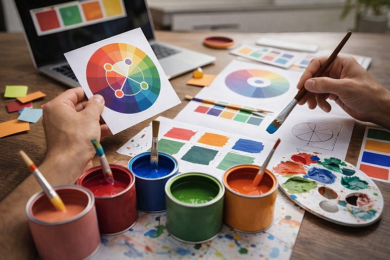
A tetradic color scheme is built on a simple rule: pick two pairs of opposite colors. On a standard 12-part color wheel, complementary pairs are directly across from each other. Red is opposite green. Blue is opposite orange. Yellow is opposite violet. If you pick red and green as your first pair, you then pick another complementary pair, like blue and orange. Your four-color tetrad is now red, green, blue, and orange.
This creates a rectangle or square on the color wheel. A rectangular tetrad uses two pairs that are not next to each other, like red/green and blue/orange. A square tetrad uses four colors evenly spaced around the wheel, like red, yellow-green, blue-violet, and orange. The square version is a specific subset where the two complementary pairs are also spaced at 90-degree angles. Both types fall under the tetradic umbrella, but the rectangular version is more common and often easier to balance.
The result is a palette with tremendous potential for contrast and vibrancy. You have both warm and cool colors present. You have multiple points of high visual tension because of the complementary pairs. This is why it feels bold. Your eye is drawn to several different color relationships at once.
The main challenge is harmony. With four strong hues competing for attention, a design can easily become jarring. The goal is not to use all four colors at equal strength. The goal is to use the full palette to create a dynamic, but controlled, visual experience. This requires you to think about dominance, saturation, and area from the very start.
Technical or Structural Breakdown
To use this scheme effectively, you must understand its mechanical parts and how they interact.
The Geometry of Selection: Your starting point is the color wheel. The specific distance between your chosen hues defines the scheme’s character.
- Rectangular Tetrad (the most common): Visualize a rectangle on the wheel. You select two complementary pairs that are spaced apart. For example, red and green are one pair. The other pair might be yellow-orange and blue-violet. This creates a versatile palette with a mix of warm and cool tones. It offers strong contrast but allows for some harmony because the colors are not perfectly evenly spaced.
- Square Tetrad: Visualize a square on the wheel. All four colors are evenly spaced at 90-degree intervals. An example is red, yellow, green, and blue. This creates a very vibrant, energetic, and equally weighted palette. It can be harder to balance because no two colors are adjacent (which creates natural harmony), and all contrasts are high.
The Role of Neutrals and Value: Pure hue-based tetrads are almost always too intense to use directly. This is where value (lightness/darkness) and saturation become your essential tools.
- Value is your anchor. By shifting your chosen hues to different values, you create a hierarchy. You may decide your main background color is a very pale, desaturated version of one hue. Your primary accent is a mid-tone, saturated version of a second hue. Your boldest call-to-action might be a dark, saturated version of a third. This creates order.
- Saturation controls intensity. You rarely use all four colors at maximum saturation. Try using one or two highly saturated colors for focal points. Use the other two or three at lower saturation for supporting roles or backgrounds. A muted olive green and a dusty terracotta can support a vibrant cobalt blue and a bright golden yellow.
- Neutrals are not a cheat. Using black, white, and gray is critical. They give the eye a place to rest. A bold tetradic palette often works best when the colors occupy less than 50% of the total visual area, with neutrals making up the rest.
The 60-30-10 Rule as a Starting Framework: This common design principle is especially useful here. It suggests dividing your color use into percentages.
- 60% Dominant Color: This should be the most neutral, quietest, or most expansive color. Often, this is a desaturated or very light version of one of your four hues, or a true neutral like white, gray, or beige.
- 30% Secondary Color: This is your supporting hue. It creates visual interest but doesn’t overpower. This could be a mid-tone from your tetrad.
- 10% Accent Color(s): This is where your boldest, most saturated colors from the tetrad live. This 10% can be split between your two remaining vibrant hues. This framework prevents the "equal strength" problem that causes chaos.
Use-Case Analysis
Use Case 1: Brand Identity for a Creative Business
Specific Constraints: The identity must feel energetic and memorable across digital and print materials, appealing to a young, design-aware audience.
Common Mistakes: Using all four colors with equal prominence on a business card or letterhead, making it impossible to know where to look. Choosing saturated versions that clash and feel juvenile rather than creatively bold.
Practical Selection Advice: Choose one color as your primary brand color (e.g., a saturated cyan). Use its direct complement (a warm orange) as a key accent. Let the other complementary pair be much more subtle—use them as muted tints for backgrounds or detailed patterns. For example, a very pale pink (from a red hue) and a soft sage green. Your brand guideline should specify that neutrals (white, dark gray) form the bulk of layouts.
Use Case 2: Event Promotion Poster
Specific Constraints: The poster must grab attention instantly in a crowded physical and digital space, conveying excitement and key information clearly.
Common Mistakes: Placing bright complementary colors (like pure red and pure green) next to each other in text, causing vibrating edges that are painful to read. Filling every square inch with color, leaving no breathing room.
Practical Selection Advice: Start with a dark or neutral background (60%). Use your boldest tetrad color for the main event title (10%). Use a second, contrasting tetrad color for key details like date or location (another 10%). Use the remaining two colors sparingly—perhaps as small graphic elements or in a supporting illustration. Ensure all text has severe contrast against its background; never place light text on a light color.
Use Case 3: Dashboard Data Visualization
Specific Constraints: Colors must clearly differentiate 4 distinct data categories at a glance, without misleading the viewer or creating a hierarchy where none exists.
Common Mistakes: Using four fully saturated, equally bright hues, making the chart look like confetti and obscuring the data. Choosing colors that are not perceptually distinct for users with color vision deficiencies.
Practical Selection Advice: Select a rectangular tetrad. Significantly vary the lightness and saturation of the four hues. For instance: a dark navy blue, a medium sage green, a bright coral, and a light butter yellow. This creates distinction through value, not just hue. Test the palette in a grayscale conversion to ensure the categories are still distinguishable. Use these colors only for the data points, keeping the UI itself neutral.
Use Case 4: Interior Design Accent Wall
Specific Constraints: The goal is to create a bold, artistic focal point in a room without making the space feel small, chaotic, or overwhelming to live in.
Common Mistakes: Painting the entire room in four bold colors. Using colors of equal intensity and value creates a flat, confusing surface with no depth.
Practical Selection Advice: Choose one wall for the tetradic treatment. Use a large-scale geometric or organic pattern. Let one color dominate the pattern (e.g., a deep teal covering 50% of the wall). Use its complement (a burnt orange) as a secondary pattern color. Use the other two colors as tiny, precise accents—like thin lines or small shapes. The other three walls should be painted a very quiet, neutral version of one of the tetrad’s colors or a plain white.
Use Case 5: Product Packaging for a Premium Item
Specific Constraints: The packaging must stand out on a shelf but also communicate quality and sophistication. It must work at small sizes (like a logo) and large ones.
Common Mistakes: Printing all four colors over the entire package, which can look cheap and messy. Using colors that reproduce inconsistently across different materials (e.g., paper vs. foil stamping).
Practical Selection Advice: Use a luxurious neutral as the base—deep charcoal, cream, or uncoated white. Employ two of your tetrad colors in a refined, minimalist illustration or logo. Use the most metallic or special ink from your palette for a single, impactful detail, like a foil-stamped word. The fourth color might only appear on the inside of the box or on a small seal. This approach feels deliberate and expensive, not just loud.
Comparative Evaluation Section
Tetradic schemes are one of several advanced color relationships. Knowing when to choose it over others is key.
Tetradic vs. Complementary (2 colors)
- Complementary: Uses two opposite colors. Offers the highest possible contrast with just two hues. It’s simpler, more direct, and easier to balance. It can feel stark or aggressive if not softened with tints and shades.
- Tetradic: Uses two complementary pairs. Offers more variety and complexity. Can feel more energetic and festive. It’s harder to control but allows for more nuanced designs. Choose tetradic when a two-color scheme feels too simple or limiting for the energy you want to convey.
Tetradic vs. Triadic (3 colors)
- Triadic: Uses three colors evenly spaced around the wheel (like red, yellow, blue). Feels inherently balanced and vibrant. It’s often perceived as joyful and dynamic but slightly more stable than a tetradic scheme.
- Tetradic: Adds a fourth color. This increases the potential for visual tension and activity. A triadic scheme might suit a children’s brand, while a tetradic scheme might better fit an avant-garde arts festival. Choose triadic for reliable vibrancy; choose tetradic for maximum complexity and boldness.
Tetradic vs. Analogous (3-5 adjacent colors)
- Analogous: Uses colors next to each other on the wheel (like blue, blue-green, green). Creates serene, comfortable, and harmonious designs. Offers very low hue contrast but can have high value contrast.
- Tetradic: Is its opposite in feeling. Where analogous is unified, tetradic is diverse. Where analogous is calming, tetradic is stimulating. They solve different problems. You would never use a tetradic scheme for a spa logo or a meditation app background.
Tetradic vs. Monochromatic (1 color in different values)
- Monochromatic: Uses tints, tones, and shades of a single hue. Creates a sophisticated, cohesive, and focused look. It’s easy to manage but can risk feeling boring or flat.
- Tetradic: Is the antidote to monotony. If a monochromatic scheme isn’t creating the needed impact or distinction, introducing a tetradic accent (using just one of the four colors powerfully) can be a brilliant strategy. This is often more successful than jumping to a full tetradic palette.
Expert-Level Considerations
Experienced designers use tetradic schemes with specific advanced techniques in mind.
Managing Perceptual Weight: Not all colors carry the same visual weight, even at the same saturation and size. A fully saturated yellow screams for attention and feels “lighter.” A deep blue feels “heavier” and more recessive. In a tetradic scheme, you must compensate for this. The area covered by a luminous yellow should likely be smaller than the area covered by a deep violet to achieve balance. Use your eye: squint at the design. Does one color jump out and dominate? Adjust its area or saturation.
The Critical Role of Texture and Separation: Placing two vibrant complements directly next to each other creates optical vibration, a blurry, uncomfortable edge. Experts avoid this by using separation techniques. Put a thin white or black border between them. Separate them with a textured pattern. Overlap them with transparency so they mix into a new color where they meet. This reduces eye strain and increases sophistication.
Digital-Only vs. Print-Ready Palettes: A vibrant tetradic scheme you create on screen may use RGB colors that are outside the CMYK printing gamut. That electric cyan and bright magenta will print duller. An expert selects the final tetrad within the CMYK gamut from the start if print is the final output, or uses a specialized print process (like Pantone spot colors) to achieve the vibrancy. Always check your palette with a CMYK preview.
Cultural Context of Color Pairs: A tetradic scheme combines two complementary meanings. Red/Green might evoke holidays in one culture, while Blue/Orange might evoke sports teams. An expert considers the combined cultural message. For a global audience, this requires research. A palette of red/green and purple/yellow might feel playful in one region but carry unintended religious or political connotations in another.
Using it for Layering, Not Flattening: Beginners often apply the four colors to flat shapes on a single plane. Experts use the color relationships to imply depth. A warm, saturated tetrad color (like orange) can appear to advance toward the viewer, while a cool, desaturated one (like a blue-gray) can recede. This lets you create a sense of space and layering even in a two-dimensional layout.
Failure Modes & Misconceptions
These are the most common ways tetradic schemes go wrong.
The Rainbow Effect: Using the four colors at full, equal strength across a design makes it look like a child’s toy or a generic “rainbow” graphic. It lacks sophistication and purpose. The fix is to immediately establish a hierarchy using the 60-30-10 rule and value adjustments.
Ignoring Value Contrast: Relying solely on hue contrast. If your four colors are all mid-tone values (not too light, not too dark), the design will feel flat and lack legibility, especially for text. You must have a clear range from light to dark within your palette to create focus and readability.
Complementary Vibration: Placing pure, saturated complements (like red and cyan) directly side-by-side, especially in text or fine lines. This causes an uncomfortable optical “buzz” that is physically hard to look at. Always separate them with space, a neutral border, or by adjusting one to be much less saturated.
Forgetting the Background: Treating all four colors as “foreground” colors. One of these colors, or a neutral, must serve as the foundational background field. Without a calm background, the entire composition has no rest area and feels claustrophobic.
Misapplying the Scheme: Using a bold tetradic palette for a project that requires trust, calm, or subtlety (like a medical brochure or a legal firm’s website). This is a fundamental mismatch of tool to task. The scheme itself isn’t bad, but it’s being used in the wrong context.
Decision Framework
Follow this process to implement a tetradic scheme successfully.
-
Define the Dominant Mood. Is the goal energetic, playful, luxurious, or avant-garde? Your mood will guide how you adjust saturation and value. Playful might use brighter tones; luxurious might use deeper, muted ones with metallic accents.
-
Select Your Base Complementary Pair. Start with the two colors that best represent your core message. If it’s a tech brand, maybe blue and orange. This is your foundational contrast.
-
Choose the Second Pair with Intent. Don’t pick randomly. Use a color wheel tool. For a rectangular tetrad, decide if you want the other pair to be warmer or cooler to shift the overall temperature. For a square tetrad, accept the even spacing and plan to control it heavily with value.
-
Immediately Establish Value and Saturation Hierarchy. Before you design anything, assign roles in a digital document. Label them: Dominant Background (light/low saturation), Secondary Support (mid-tone/mid-saturation), Accent 1 (dark or bright/high saturation), Accent 2 (dark or bright/high saturation). Plug your chosen hues into these roles and adjust their sliders in your design software to fit.
-
Apply the 60-30-10 Rule to a Layout. Start with a neutral canvas. Apply your 60% color (or a neutral) to the largest area. Add your 30% color to a major secondary element. Use your two accent colors for small, critical details like buttons, icons, or highlights.
-
Test for Function and Accessibility. Overlay text. Is it readable? Convert your design to grayscale. Does the visual hierarchy hold without color? Run your palette through a color blindness simulator. Do the key distinctions remain clear?
-
Edit Ruthlessly. If a color feels unnecessary, remove it or mute it further. The power of a tetradic scheme often lies in the implied potential of four colors, even if only two are used boldly. Less is usually more.
This framework forces you to make strategic choices upfront, turning a potentially chaotic palette into a structured design system.
Frequently Asked Questions
What’s the difference between tetradic and double-complementary? They are the same thing. “Tetradic” is the more general term meaning “four-color.” “Double-complementary” specifically describes how the four colors are chosen: by picking two sets of complements.
Can I use more than four colors in a tetradic scheme? No, by definition, it is a four-color scheme. However, you can use many tints (add white), tones (add gray), and shades (add black) of those four base hues. This gives you a wide range of related colors to work with while maintaining the core harmonic structure.
Is a square color scheme always tetradic? Yes, a square scheme is a specific, symmetrical type of tetradic scheme where the four colors are evenly spaced. All square schemes are tetradic, but not all tetradic schemes are square (many are rectangular).
What software tools help create these schemes? Most design software has a color wheel tool. Adobe Color is a free, excellent web-based tool. You can select the “Double Complementary” rule and move the points on the wheel to generate your palette. It also lets you adjust the palette’s color blindness preview and export the values.
Are tetradic schemes good for websites? They can be, but with caution. They are excellent for marketing or portfolio sites where bold impact is needed. They are poor for text-heavy content sites or complex web apps where too much color can be distracting and hurt usability. Use them for key landing pages, not necessarily for an entire multi-page site.
How do I know if my palette is balanced? Squint at your design until the colors blur. What shape or element do you see first? That’s your focal point. If it’s where you want attention, you’re balanced. If an unintended element jumps out, the color weighting is off. Also, walk away and look from a distance. A balanced design should have a clear point of entry for the eye.
LEAVE A COMMENT
Recent Posts


0.0568