

How to Use Colour to Enhance Video & Motion Graphics
Colour in motion design is a dynamic language of time. It is not a static layer but a variable that can signal transition, shift emotion, focus attention, and construct narrative logic across a sequence of frames.
Used strategically, colour enhances storytelling, guides the viewer's eye through complex information, and creates a cohesive visual signature that separates professional work from the amateur. This is the application of colour theory as a kinetic art form.
- Core Principle: Colour in motion is a tool for temporal hierarchy, narrative pacing, and emotional modulation.
- Critical Distinction: It involves managing colour relationships over time, not just within a single frame.
- Strategic Application: Colour directs attention, builds visual continuity, and creates meaning through change and contrast.
- Key Outcome: A video where colour is an active participant in the story, enhancing comprehension, emotional impact, and memorability.
The Kinetic Language of Colour in Time
In a static image, colour establishes hierarchy and mood within a fixed composition. In motion, it acquires the dimension of duration and transition. A colour change can act as a visual beat, punctuating a reveal. A gradual desaturation can signal a flashback or a shift in emotional tone. The movement from a cool, analytical colour palette to a warm, energetic one can visually represent a solution being found or a protagonist's change of heart.
This temporal application has direct, measurable effects on viewer perception. In explainer videos, a consistent colour used to "highlight" key terms or objects as they appear on screen creates a through-line that helps viewers connect concepts. In narrative film, the strategic use of colour grading—applying a unified colour treatment across scenes—can subliminally tie locations to characters or themes (e.g., using cyan tones for flashbacks, amber for present-day).
In data visualization, animated colour transitions can make a complex graph intelligible by sequentially introducing data series. Colour in motion doesn't just show; it tells, explains, and persuades across time.
The Technical Framework: Colour Properties in Motion
Manipulating colour for motion involves controlling its core properties across keyframes.
1. Hue Shifts for Narrative and Categorical Changes: Changing the dominant hue of a scene or element is a powerful narrative signal.
- Application: A character's world might be desaturated blue while they are sad, slowly warming to golden hues as they find happiness. In an infographic, different data categories can be introduced with distinct hues, creating immediate visual separation.
- Technical Execution: This is achieved through colour correction and grading in post-production (using tools like DaVinci Resolve's Color Page or Adobe After Effects' Lumetri Color) or by animating fill/stroke colours of vector layers within motion graphics software.
2. Saturation Animation for Emotional Emphasis and Focus: Saturation controls the intensity or purity of a colour. Animating it is a direct tool for emotional modulation and attention management.
- Pulling Focus: A common technique is to desaturate background elements while a key character or piece of information remains in full colour. This mimics how the human eye focuses and tells the viewer unequivocally where to look.
- Emotional Drain or Intensity: Draining colour (reducing saturation) can signify a memory, loss, or a sterile environment. Boosting saturation can heighten sensation, signify a fantasy sequence, or indicate heightened reality.
3. Luminance/Value Changes for Depth, Reveal, and Rhythm: The lightness or darkness of a colour (its value) is fundamental to creating the illusion of depth and form in motion.
- Creating Depth: Animating luminance gradients can make a shape appear to inflate, recede, or be lit from a moving light source.
- Strobing and Rhythm: Rapid, high-contrast changes in luminance (e.g., white flashes on a beat) create energetic strobing effects for music videos or high-impact titles.
- Reveals: A common motion graphic technique is to use an animated shape whose fill is a luminance gradient to "wipe" or reveal underlying content.
4. The Master Tool - Colour Grading for Cohesion and Style: Colour grading is the process of creating a consistent, stylized colour look across an entire video project. It is the single most important step in achieving a professional, cinematic result.
- Process: Using scopes (waveform, vectorscope, histogram), a colourist adjusts shadows, midtones, and highlights across all clips to ensure visual continuity and apply a creative "look."
- Common Techniques:
- Teal and Orange: A high-contrast look that makes skin tones (oranges) pop against cooler backgrounds (teals), prevalent in blockbuster films.
- Bleach Bypass: A desaturated, high-contrast look that retains detail in highlights and shadows for a gritty, graphic feel.
- Film Emulation: Using LUTs (Look-Up Tables) or power grades to mimic the colour response of specific film stocks.
Five Contexts for Kinetic Colour Application
1. Explainer Video or Animated Infographic
- Constraints: Must simplify complex information and maintain viewer engagement over 60-90 seconds.
- Common Mistakes: Using a chaotic, unfocused palette that changes randomly, confusing rather than explaining. Lack of a consistent visual language for similar data types.
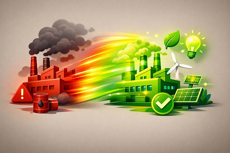
- Practical Application: Assign a semantic colour code. For example, all "problem" elements are in a muted red, and all "solution" elements are in a vibrant green. Use these colours consistently across characters, icons, and text. Animate transitions: a problem element can "morph" into its solution, changing colour from red to green as it transforms. Use a neutral, consistent background colour to keep the focus on the animated content.
2. Brand Identity Motion Graphics (Logo Sting, Social Media Bumpers)
![]()
- Constraints: Must be extremely brief (3-10 seconds), visually striking, and reinforce brand recognition.
- Common Mistakes: Using colours not in the brand palette. Overcomplicating the animation with too many colour changes.
- Practical Application: Animate the logo's colours themselves. A logo can be assembled from particles of its brand colours. A solid brand colour field can sweep across the screen to reveal the logo. Use secondary brand colours for supporting animated elements (particles, light flares, backgrounds). The motion should feel like an extension of the brand's static identity.
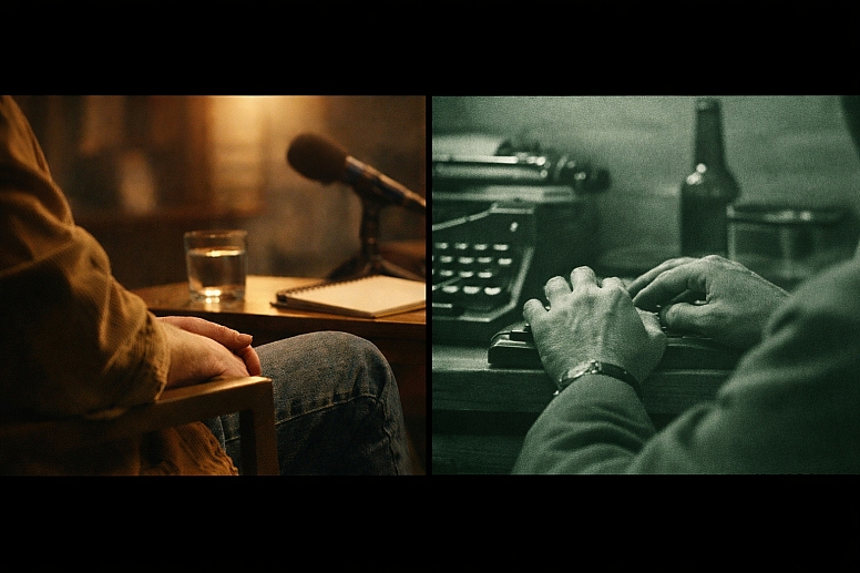
3. Narrative Short Film or Documentary Scene
- Constraints: Must support the story's emotional arc and maintain a believable, consistent world.
- Common Mistakes: Inconsistent colour temperature between shots in the same scene, breaking immersion. Over-grading that distracts from the story.
- Practical Application: Use colour to denote time, memory, or perspective. A documentary interview might be graded with a warm, slightly saturated look. Archival footage cut into it might be desaturated with a green tint to feel historical. In a narrative, a character's memory could have a distinct, stylized palette (e.g., high contrast, cyan shadows). The key is that colour changes must have a narrative justification.
4. Music Video or Lyric Video
- Constraints: Must synchronize precisely with the audio rhythm and enhance the song's mood.
- Common Mistakes: Colour changes that are out of sync with the beat. Overuse of intense, seizure-inducing strobe effects.
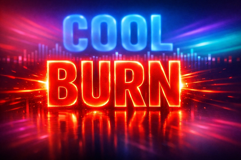
- Practical Application: Use audio-driven animation. Link colour properties (hue shift, saturation pulse) to the audio amplitude or frequency. A kick drum can trigger a white flash; a synth pad can drive a slow hue rotation across the background. For lyric videos, animate the colour of individual words or letters to emphasize meaning or rhythm ("burn" might glow red, "cool" might shift to blue).
5. UI/UX Animation for Apps and Websites (Micro-interactions)
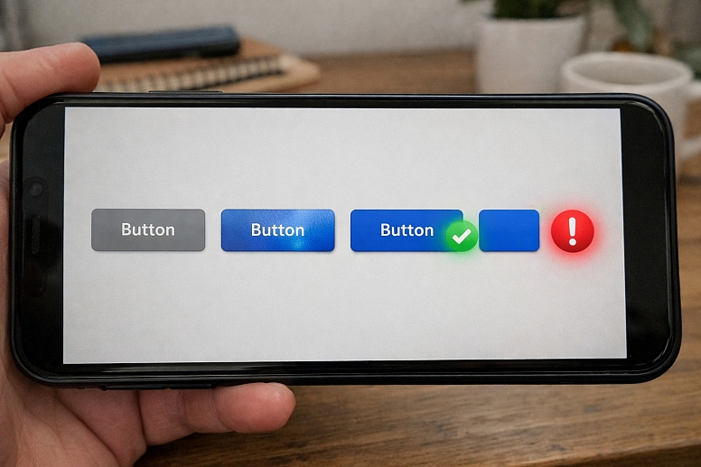
- Constraints: Must be functional, subtle, and enhance usability without slowing down performance.
- Common Mistakes: Using motion colours that violate the app's accessibility contrast standards. Animations that are distracting rather than guiding.
- Practical Application: Colour indicates state change and feedback. A button's fill can animate from a neutral grey to the brand's primary colour when it becomes active. A success notification can gently pulse green. An error state can use a brief, sharp red shake and colour flash. These animations should be fast, purposeful, and use the same colour system as the static UI.
A Comparative Analysis of Motion Colour Techniques
| Technique | Visual Mechanism | Primary Function | Example & Tool |
|---|---|---|---|
| Colour Transition (Hue/Saturation) | A smooth interpolation between two colour states over time. | To show transformation, state change, or passage of time. | A graph bar changing from red (deficit) to green (surplus) as data updates. (After Effects: Keyframe Fill Colour) |
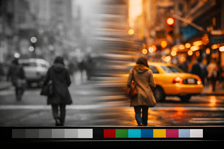
| Selective Desaturation | Reducing saturation in all but one key element in the frame. | To pull focus and create immediate, dramatic emphasis. | A wartime scene in monochrome with only the red of a rose in colour. (DaVinci Resolve: Power Window + Saturation Curve) |
| Colour Grading / LUT Application | Applying a mathematical colour transform to the entire image. | To establish mood, genre, time period, and visual continuity. | A "blockbuster" teal & orange look; a vintage '70s film emulation. (DaVinci Resolve, Premiere Pro: Creative LUTs) |
| Chromatic Aberration | Artificially creating RGB colour fringing, often animated. | To simulate a lens distortion, signal glitches, or add a gritty texture. | A quick, animated aberration on a camera shake or digital transition. (Red Giant Universe, Sapphire plugins) |
| Light Leak & Optical Effects | Animating semi-transparent washes of colour across the frame. | To add organic, cinematic texture and warmth, often for transitions. | An orange/yellow light leak is washing in from the side during a scene change. (Filmconvert, RocketStock assets) |
Advanced Considerations: Workflow and Perception
Professional motion colour work involves a disciplined pipeline and an understanding of perceptual limits.
The Non-Linear Colour Workflow: The highest quality results come from a colour-managed workflow. This means:
- Shooting in a Flat/Log Profile: Capturing maximum colour and dynamic range data from the camera.
- Colour Correction (Primary): Balancing shots for exposure, white balance, and contrast to achieve a neutral, consistent starting point across all clips.
- Colour Grading (Secondary): Applying the creative look, working on specific colours or areas of the image, and ensuring final output complies with broadcast standards (Rec.709, Rec.2020).
Managing Colour for Different Outputs: A video for Instagram, YouTube, and broadcast TV will have different technical colour requirements (gamut, brightness levels). Mastering for HDR (High Dynamic Range) is a separate, advanced process requiring specialized monitoring and grading tools to manage a much wider luminance and colour range.
Accessibility in Motion: Flashing or rapidly alternating colours at certain frequencies can pose a health risk to viewers with photosensitive epilepsy. Tools exist to analyze video for compliance with guidelines like the WCAG 2.3.1 Three Flashes or Below Threshold criterion. Furthermore, ensure any text overlays maintain sufficient colour contrast throughout their on-screen duration.
Common Pitfalls and Misconceptions
Misconception: "Colour grading can fix poorly shot footage." While grading is powerful, it cannot create information that isn't there. Poor white balance, overexposed highlights, or underexposed shadows limit a colourist's options. The mantra is "get it right in camera." Grading enhances; it does not rescue.
Pitfall: Using Default Transitions and Presets. The default "cross-dissolve" or garish transition presets in editing software often handle colour poorly, creating muddy midpoints. Custom transitions built using luminosity mattes, gradient wipes, or animated shapes that align with your colour palette are always superior.
Misconception: "More colour and more motion equals more engaging." This leads to visual overload, or "kitchen sink" design, where the viewer doesn't know where to look. Restraint is key. Establish a clear hierarchy: what is the primary action? Use colour and motion to support that, and let secondary elements be more subtle.
Pitfall: Ignoring the Psychology of Colour in Context. While red often signals danger or love, its meaning shifts in context. In a financial chart, red means "loss," but in a Chinese cultural context, it means "prosperity." Understand your audience. A colour's motion behaviour (e.g., a slow, pulsing blue vs. a frantic, flashing red) will compound its emotional meaning.
A Method for Implementing Kinetic Colour
- Define the Colour Script. Before animating, storyboard the colour progression. Map out key scenes or moments and note the dominant colour, saturation, and luminance. This is your temporal blueprint.
- Establish the Base Palette. Define a limited, cohesive colour palette for the project, just as you would for a static design. This includes primary, secondary, and accent colours, plus neutrals.
- Animate with Purpose. For every colour change, ask: "What is the narrative or functional reason?" Is it a state change? A focus pull? An emotional shift? Animate only for these reasons.
- Grade for Cohesion. After editing, move into dedicated grading software (DaVinci Resolve is the industry standard). Correct all shots to a neutral baseline first. Then, apply the creative grade to unify the piece and elevate its mood.
- Test on Multiple Screens. Export and view your work on different devices (phone, tablet, laptop, TV) to ensure colour holds up across various screens and brightness levels.
- Check for Accessibility. Use a tool like the PEAT (Photosensitive Epilepsy Analysis Tool) or built-in scopes to check for dangerous flashing sequences. Ensure text contrast is maintained.
Questions on Colour in Video & Motion
What's the difference between colour correction and colour grading? Colour Correction is the technical process of fixing issues and achieving a consistent, neutral starting point across all shots (fixing white balance, matching exposure between clips). Colour Grading is the creative, stylistic process of giving the video a distinct look or feel (applying a "film stock" LUT, creating a cold dystopian look, enhancing skin tones).
How do I ensure consistent colour from shoot to final export? Use a colour-managed workflow. Shoot in a flat/Log profile. Use a colour chart (like an X-Rite ColorChecker) on set for a reference. In post, transform the Log footage to your working colour space (e.g., DaVinci Wide Gamut), perform corrections and grading there, and then output to your delivery space (e.g., Rec.709 for HD).
What are LUTs, and should I use them? LUTs (Look-Up Tables) are preset colour transforms. They can be technical (to convert Log footage to Rec.709) or creative (to apply a film emulation look). They are excellent starting points and learning tools, but professional work involves customizing grades far beyond a simple LUT application. Never use a LUT as a final step without adjustment.
Can I do professional colour work in Adobe After Effects/Premiere Pro? Yes, for motion graphics and simpler projects, the Lumetri Color panel in Adobe's tools is capable. However, for complex narrative or commercial work involving many clips, DaVinci Resolve is the industry standard for grading due to its superior colour science, dedicated hardware panels, and node-based workflow, which offers far more power and flexibility for secondary corrections and effects.
LEAVE A COMMENT
Recent Posts


0.055