How to Use Color to Guide User Attention in Apps & Websites
Color is a direct tool for managing visual hierarchy. In digital interfaces, it functions not as decoration but as a system of signals that pre-attentively guides the eye, reduces cognitive load, and dictates task flow.
Effective color guidance accelerates user decisions, minimizes errors, and creates an intuitive experience by making important elements visually prominent and secondary elements recede.
- Core Principle: Color guides attention through calculated contrast against a controlled neutral field.
- Primary Mechanism: The strategic use of a single accent color against a background of grays, blacks, and whites.
- Non-Negotiable Rule: Color must be used sparingly and consistently to maintain its signaling power.
- Measurable Outcome: A clear visual path that leads users to complete key actions with efficiency.
The Visual Hierarchy Established by Color
Every pixel on a screen competes for a user's limited attention. Visual hierarchy is the system that resolves this competition, and color is one of its most potent components. The human visual system processes color, particularly a lone saturated hue in a muted field, before it processes shape or text. This is known as pre-attentive processing.
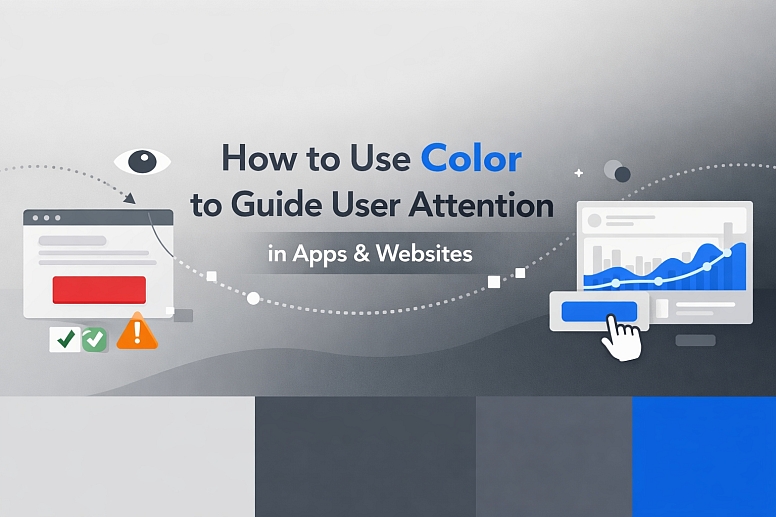
A user does not consciously decide to look at a red "Submit Order" button; their eye is drawn to it because it is the single most vivid anomaly in the visual field. This biological response is the foundation of color's guiding power. The goal is not to create a colorful interface, but to use color as a deliberate, high-signal element against a low-signal background. The guiding effectiveness of a color is inversely proportional to its frequency of use. If multiple elements scream for attention with different colors, the result is visual noise and user paralysis.
This systematic guidance directly impacts usability metrics. Interfaces with a clear color hierarchy demonstrate higher task-completion rates, lower time-on-task, and reduced user-reported frustration. The interface feels "intuitive" because its visual signaling is aligned with the user's natural perceptual tendencies, making the next step obvious.
The Technical System of Color Signaling
Implementing this guidance is a technical exercise in contrast, semantics, and proportion.
1. Contrast Ratio: The Foundation of Visibility Guidance cannot occur if an element is not seen. Luminance contrast—the difference in light between a foreground element and its background—is governed by the Web Content Accessibility Guidelines (WCAG). For standard text, a minimum ratio of 4.5:1 is required. For large text or UI components like buttons, 3:1 is the minimum. A "call-to-action" button that fails these ratios is invisible to users with low vision and optically weak for all users. Contrast must be verified with tools, not assumed.
2. Semantic Color Assignment: Color as a Consistent Language Colors must be assigned a fixed, logical meaning within the interface's system.
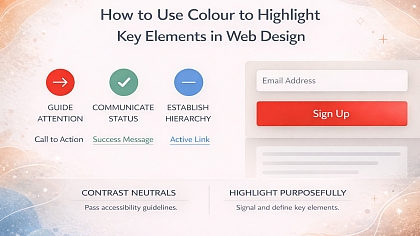
- Primary Action: One distinctive color reserved exclusively for the most important action on any screen (e.g., "Buy," "Sign Up," "Proceed").
- Positive/Success: Green, indicating confirmation, completion, or a safe state.
- Warning/Error: Orange or red, indicating a problem, required action, or destructive operation.
- Informational/Neutral: Blue, typically used for learnable links and neutral status indicators.
- Active State: A distinct color or tint applied to indicate the currently selected navigation item, filter, or form field.
Using orange for both a "high-priority alert" and a "new feature" badge creates semantic confusion and dilutes the urgency of the alert.
3. The 60-30-10 Framework for Digital Layouts This design principle provides a quantitative structure for color application:
- 60%: Dominant Neutral. The background color of the application (e.g., white,
#F8F9FA, dark mode gray). - 30%: Secondary Neutral. Used for content containers, secondary backgrounds, dividers, and body text.
- 10%: Accent/Guide Color. This is the strategic reserve—the single color used for primary buttons, key icons, and critical alerts.
Adhering to this framework ensures that the guiding 10% retains its visual potency.
4. Context and Surrounding Elements A color's effectiveness is changed by its context—a principle called simultaneous contrast. A medium blue will appear more vibrant against a light gray than against a darker blue. The guiding color must be tested within the actual interface layout. Furthermore, color should not be the sole guide; it works in concert with size, placement, and white space to create a clear path.
Five Interface Contexts for Color Guidance
1. E-commerce Checkout and Conversion Funnels
- Constraints: Must guide users through a multi-step, high-stakes process with absolute clarity and zero distraction.
- Common Mistakes: Using multiple accent colors for different buttons (e.g., a green "Continue" and a blue "Save Cart"). Highlighting promotional banners within the funnel flow.
- Practical Advice: Use a single, high-contrast brand color exclusively for the progressive action button ("Next Step," "Proceed to Payment"). Render all secondary actions ("Back," "Save for Later") as low-contrast text links or ghost buttons (outline only). On the final order confirmation screen, the "Place Order" button can be intensified with a slightly darker shade or a subtle, one-time animation pulse to signal the culmination of the process.
2. Data Dashboard and Analytics Platforms
- Constraints: Must present complex, multivariate data while directing attention to key metrics, trends, or outliers.
- Common Mistakes: Using color inconsistently across different charts. Overusing color for categorical distinction when position or shape could suffice.
- Practical Advice: Establish a strict color key. Use the primary accent color only for the most critical KPI or the single data series a user is most likely to adjust. In a line chart with five lines, render four in shades of gray and highlight the key metric in the accent color. For threshold alerts, use a small, bright badge (e.g., red) only when a metric crosses a critical boundary, making it an immediate visual anchor on the dashboard.
3. Primary Application Navigation and Workflow States
- Constraints: Must communicate location within a complex application and signal active, completed, and upcoming steps in a workflow.
- Common Mistakes: Underlining or bolding active navigation instead of using a distinct color block. Using a highlight color with insufficient contrast against the navigation background.
- Practical Advice: For a vertical navigation, use a solid, high-contrast colored background (or a prominent left-border) for the active module. The text should be white or a very light tint. For multi-step workflows (e.g., "Setup Wizard"), use a color progression: gray for upcoming steps, the accent color for the current step, and a darker shade or green for completed steps. This creates a clear, visual narrative of progress.
4. Form Design and Validation Feedback
- Constraints: Must facilitate accurate data entry and provide immediate, unambiguous feedback on success or error.
- Common Mistakes: Placing generic error messages at the top of a long form, far from the problematic field. Using only a red border to denote an error without supporting text.
- Practical Advice: Guide users through a form by using a subtle color (e.g., a light blue fill) to indicate the active field. Upon submission, invalid fields should receive a red border and a red icon with descriptive text in red placed directly beneath that specific field. A successful submission should trigger a green banner with a checkmark icon at the top of the view. The color provides the first, fast signal; the text provides the necessary detail.
5. Onboarding Tutorials and Feature Discovery
- Constraints: Must introduce new functionality without overwhelming the user or obstructing the core interface.
- Common Mistakes: Using highlighter-style overlays that are overly opaque and disruptive. Employing a garish color that feels patronizing.
- Practical Advice: Use a semi-transparent overlay with a dark tint to dim the background interface. Use the application's primary accent color to draw a subtle circle or halo around the new element being introduced. Pair this with a clear, concise tooltip that has a small arrow pointing from the tip to the highlighted element. The accent color acts as a spotlight, directly connecting the instructional text to the relevant UI component.

A Comparison of Attention-Guiding Color Techniques
| Technique | Visual Mechanism | Best For | Key Consideration |
|---|---|---|---|
| Saturated Fill Color | A solid block of high-saturation accent color. | Primary buttons, critical alerts, key status indicators. | Must pass WCAG contrast ratios for any overlaid text/icon. |
| Color Border & Outline | A bold colored line surrounding an element. | Active form fields, selected cards or items, focus states. | Can be combined with a subtle fill. Risk of mimicking error states if red is used. |
| Colored Text & Icon | Changing the color of the text or icon glyph itself. | Hyperlinks, status icons (success, warning), and interactive labels. | Text must maintain 4.5:1 contrast. Icons need 3:1 contrast against their background. |
| Background Tint Shift | Applying a light tint of the accent color as a background. | Table row hover states, active navigation items, selected list options. | The tint must be distinct enough from the neutral background to be perceptible. |
| Subtle Animation (Pulse/Flash) | A brief, one-to-two-cycle change in color or brightness. | Confirming an action (e.g., "Added to Cart"), drawing eye to new content. | Must be subtle, brief, and non-looping. Cannot be the only indicator due to accessibility concerns. |
Advanced Considerations for Expert Implementation
Beyond basic contrast, expert application involves managing perception across devices and user capabilities. Color Management across different screens—from a calibrated desktop monitor to a mobile OLED display—affects perceived vibrancy. A color specified as#FF6B6Bcan appear significantly more intense on an OLED screen, potentially making a guiding element feel aggressive. Testing on multiple device types is essential.
For users with Color Vision Deficiency (CVD), which affects approximately 1 in 12 men, red/green differentiation is a common challenge. A "green for success, red for error" system fails if both appear as similar browns. The solution is to add a non-color cue. Pair the green success state with a checkmark icon (✓). Pair the red error with an exclamation icon (!) and bolded text. This ensures the signal is communicated through shape and contrast as well as hue, making the guidance universal.
User Habituation and Color Blindness is another nuanced factor. A user exposed to the same guiding color for hundreds of interactions may become desensitized to it—a form of "banner blindness" within an app. For products requiring habitual, daily use, expert designers sometimes implement contextual variations, such as a slightly different secondary accent color for different modules, while keeping the core primary action color absolutely consistent. This maintains semantic clarity while providing slight perceptual refreshment.
Common Pitfalls and Misconceptions
Misconception: "More color equals more guidance." This is the fundamental error. Overusing accent colors creates a "Christmas tree" effect where everything is highlighted and therefore nothing is important. Guidance is created by contrast against restraint. A single colored element on a screen is a beacon; ten colored elements are noise.
Pitfall: Choosing a guiding color based on brand alone. If the primary brand color is a pastel yellow or a dark burgundy, it may fail WCAG contrast ratios on common backgrounds. In these cases, a supplementary UI accent color must be defined from the brand palette—a brighter or darker variant that meets technical requirements for visibility and guidance, even if it is not the logo's primary color.
Misconception: "Color can be the only differentiator." Accessibility standards (WCAG 2.2) explicitly state that color cannot be the sole means of conveying information, indicating an action, or prompting a response. A link must be underlined or have a non-color indicator in addition to its color. A required form field must have an asterisk or text label, not just a colored border.
Pitfall: Ignoring cultural connotations in global products. While the guiding principle of contrast is universal, the choice of hue can carry cultural baggage. Using red as a primary action color in a financial app might work in China (where red is auspicious), but could induce anxiety in other markets. For global products, the guiding color's function (high contrast) is more important than its specific hue, which may need regional adaptation.
A Framework for Implementing a Color Guidance System
- Define the User's Primary Objective. What is the single most important action on each key screen? (e.g., "Submit the form," "Play the video," "Confirm the purchase").
- Establish the Neutral Foundation. Define the 60% (background) and 30% (secondary surfaces, body text) using a strict grayscale or near-neutral palette.
- Select the Primary Guiding Hue. Choose one color with high contrast against your neutrals that aligns with the brand and has no severe negative cultural connotations in key markets.
- Build a Semantic Color Set. Using the primary hue, define a set for actions, success, warning, and information. Ensure each has a distinct lightness value for CVD clarity.
- Document the Rules Rigorously. Create a UI style guide that dictates: "Primary Blue (#007AFF) is used only for: Filled Primary Buttons, Active Navigation Background, and the 'New' badge. It is never used for: Body text, borders, secondary buttons, or decorative icons."
- Prototype and Test with a Grayscale Audit. Convert the design to grayscale. If the visual hierarchy and guiding path disappear, the system is relying on hue alone and will fail. Adjust contrast values until the hierarchy is clear without color.
- Validate for Accessibility and Implement. Use contrast checkers and CVD simulators. Then, implement the system across all components and screens.
Questions on Guiding Attention with Color
What is the best color for a call-to-action button? There is no universally "best" color. The most effective color is the one that has the highest luminance contrast against your specific background while aligning with your brand. Research on red vs. green is inconclusive and highly context-dependent. The critical factor is that it is the only element of that color intensity on the screen.
How many colors should be used to guide attention in one view? For core interactive guidance, use one primary color. You will also need a separate color for errors (red/orange) and one for positives (green), bringing the total to 3 functional colors. Decorative colors in illustrations or data visualizations are separate and should not compete with this functional palette.
Does this work for users with color blindness? Yes, but only when implemented with redundant cues. The contrast in lightness (luminance) between the guiding color and its background is what matters most for many users with CVD. Always pair color with another indicator like an icon, text label, or change in size/boldness.
Can gradients be used for guiding elements? Use gradients with extreme caution. They can make text contrast difficult to guarantee (the text may pass contrast on one part of the gradient but fail on another). If used, ensure the gradient is subtle and that any overlaid text meets contrast requirements against the darkest part of the gradient background.


