

The Science Behind Color Perception: How We See & Interpret Colors
Color is everywhere. It’s in the sky, in our clothes, and on our screens. But what we call "color" isn't really in the objects themselves. It's a sensation created by our brains. This process starts with light and ends with our mind’s interpretation.
Understanding how we see color explains a lot about our world. It affects how we design websites, choose paint, and even how we buy ripe fruit. This isn't just about art. It's about biology, physics, and psychology working together.
A Quick Summary of the Process
- Light is a form of energy we can see. White light, like sunlight, contains all the colors mixed together.
- Objects absorb some wavelengths of light and reflect others. A red apple reflects mostly red light.
- Our eyes catch this reflected light. Special cells in the back of the eye, called cones, react to different wavelengths.
- These cells send signals to the brain. The brain then processes these signals to create the sensation of color.
- Many things can change this sensation. The type of light, the colors nearby, and even our own biology all play a part.
To understand color perception, we need to start with light. Light travels in waves, like ripples in a pond. The distance between the peaks of these waves is called the wavelength. Our eyes can only see a small range of these wavelengths. We call this range the "visible spectrum." It runs from short wavelengths, which we see as violet and blue, to long wavelengths, which we see as red.
When light hits an object, the object’s surface interacts with the light. A green leaf absorbs most of the red and blue wavelengths. It reflects the green wavelengths back out. This reflected light is what enters our eyes. So, the color we perceive is actually the wavelength of light that an object doesn’t absorb.
The eye is like a camera. Light enters through the clear cornea and passes through the lens. The lens focuses the light onto the retina at the back of the eye. The retina is covered in millions of light-sensitive cells. There are two main types: rods and cones. Rods help us see in dim light, but they don't detect color. Cones are responsible for our color vision. They need more light to work.
Most people have three types of cones. Each type is most sensitive to a different range of wavelengths. We often call them short (S), medium (M), and long (L) cones. They are sometimes loosely referred to as blue, green, and red cones. When light hits these cones, they send electrical signals. These signals travel through the optic nerve to the brain.
The brain’s job is to make sense of these signals. It doesn’t get a neat message saying "green." It gets a set of numbers: how much the short, medium, and long cones were stimulated. The brain compares these signals. If the long cones are stimulated a lot and the short cones very little, the brain may interpret that as "red." This process happens instantly and without our conscious effort. The final sensation of color is constructed entirely in our mind. It is our personal experience of the light's wavelength.
Technical or Structural Breakdown
The system for seeing color has several key parts. Each part must work correctly for accurate color perception.
The Eye’s Hardware: Rods and Cones
- Rods: These cells are extremely sensitive to light. They allow us to see shapes and movement in near-darkness, like in a moonlit room. However, they provide only monochrome (black-and-white) vision. In bright light, rods are essentially "swamped" and inactive.
- Cones: Cones require bright light to function. They are concentrated in the very center of the retina, an area called the fovea. When you look directly at something to see its color, you are aiming its image onto your fovea. The three types of cones have overlapping sensitivity curves. This means a single wavelength of light will stimulate all three cone types to different degrees. For example, a pure yellow light will strongly stimulate both the long and medium cones, and weakly stimulate the short cones. The brain reads this specific pattern as "yellow."
The Brain’s Processing: Opponent Process Theory: The signals from the cones don't go straight to the brain’s visual cortex as raw data. First, they are organized in the retina and optic nerve using an "opponent process" system. This system pairs colors into opposing channels:
- Red vs. Green
- Blue vs. Yellow
- Black vs. White (for brightness)
This wiring explains why you never see a color that is reddish-green or bluish-yellow. It also explains afterimages. If you stare at a bright red square for 30 seconds and then look at a white wall, you will see a faint green square. This happens because the "red" part of your red-green channel gets tired. When you look at white light (which contains all colors), only the "green" opponent signal fires strongly, creating the ghostly green square.
The Influence of Context and Constancy: Your brain doesn’t just report cone signals. It actively interprets them based on context. Color constancy is a key example. A white piece of paper looks white to you whether you’re in bright sunlight, under a yellow incandescent bulb, or under a blue fluorescent light. Even though the wavelengths reflecting from the paper are very different in each case, your brain factors in the lighting and "discounts" it to perceive the object’s true color. This is why adjusting the "white balance" on a camera is so important—the camera doesn’t have a brain to make this automatic correction.
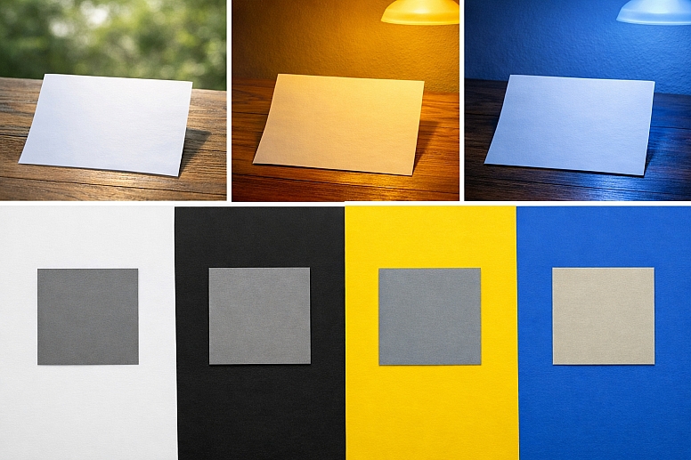
The colors surrounding an object also change how we see it. This is called simultaneous color contrast. A middle-gray square will look darker on a white background and lighter on a black background. The same principle works for hue. A gray square will look slightly blueish if placed on a yellow background, because the brain enhances the opposite color.
Use-Case Analysis
Use Case 1: Digital Screen Design
Specific Constraints: Designers must create graphics for screens that emit light (RGB—Red, Green, Blue). The final appearance depends heavily on the user's specific screen calibration, brightness, and ambient lighting, which the designer cannot control.
Common Mistakes: Using colors that are too saturated or that have very low contrast, making text hard to read. Assuming a graphic that looks perfect on a professional monitor will look the same on a typical laptop or phone. Forgetting to check color visibility for people with color vision deficiencies.
Practical Selection Advice: Start designs in a neutral, dim environment. Use established accessibility guidelines, like the Web Content Accessibility Guidelines (WCAG), to ensure sufficient contrast between text and background. Test designs on multiple devices. Use color pickers that show you the hex code, RGB values, and even simulate color blindness. Tools like the WebAIM Contrast Checker can help verify your choices.
Use Case 2: Print and Paint Selection
Specific Constraints: Print and paint work by subtracting color. Pigments absorb (subtract) some wavelengths and reflect others. This is the CMYK model (Cyan, Magenta, Yellow, Key/Black). The final color depends on the paper texture, whiteness, and the lighting in the room where it's viewed.
Common Mistakes: Choosing a paint color from a small swatch under store lighting and being surprised by how different it looks on a large wall at home. Expecting a vibrant color on screen to print exactly the same on paper, which is often physically impossible due to the limited "gamut" of printers.
Practical Selection Advice: Always view large paint samples on the wall at different times of day. For professional print work, use a standardized color matching system like Pantone. Create physical proofs and review them under the type of light where the final product will be seen. Understand that glossy paper will make colors look more vibrant than matte paper.
Use Case 3: Product Marketing and Branding
Specific Constraints: Colors must evoke specific emotions and associations consistently across cultures and materials, from plastic packaging to digital ads.
Common Mistakes: Choosing a color based solely on personal preference without researching its psychological and cultural connotations. Using a complex color that is difficult or expensive to reproduce consistently across different manufacturing processes.
Practical Selection Advice: Research color psychology for your target audience. For example, blue often conveys trust and security (common in finance and tech), while yellow can convey optimism and energy. Ensure your brand's core colors are defined in multiple color systems (Pantone for print, RGB for web, CMYK for standard print). Create a strict brand guideline that specifies exactly how and where each color should be used.
Use Case 4: Data Visualization
Specific Constraints: Colors must encode information clearly and accurately, allowing viewers to quickly differentiate between data sets and understand patterns.
Common Mistakes: Using a rainbow color scale for sequential data (like temperature), which can create false boundaries. Using colors that are not perceptually uniform, where one step in the data looks like a much bigger change than another step. Using too many colors creates a confusing "fruit salad" effect.
Practical Selection Advice: Use color palettes designed for data. For sequential data (low to high), use a single hue that varies smoothly from light to dark. For divergent data (with a meaningful midpoint, like profit/loss), use two contrasting hues that meet at a neutral color. For categorical data, choose colors that are easily distinguishable from each other. Resources like ColorBrewer provide scientifically designed color schemes for maps and charts.
Use Case 5: Photography and Filmmaking
Specific Constraints: The goal is to capture and present a scene with desired emotional impact, often needing to balance technical color accuracy with artistic color grading.
Common Mistakes: Not setting the correct white balance, leading to an overall unwanted color cast (e.g., everything looks too blue or orange). Over-saturating colors to make them "pop," which can look unnatural and strain the eyes. Not calibrating the monitor used for editing, so colors look wrong on other screens.
Practical Selection Advice: Always shoot in RAW format if possible, which gives you more data to adjust white balance and color in editing. Calibrate your editing monitor regularly with a hardware device like a colorimeter. Use scopes like waveform and vectorscope to make objective decisions about color balance, not just your eyes. Understand the purpose of the "color grade"—a teal and orange look creates a specific cinematic mood, but isn't appropriate for a product catalog photo.
Comparative Evaluation Section
Choosing a color model is a fundamental decision. The two primary models are additive (RGB) and subtractive (CMYK). Your choice depends entirely on whether you are working with light or with pigments.
Additive Color (RGB - Red, Green, Blue)
- Source: Emitted light. Starts with black (no light).
- How it works: Colors are created by adding different wavelengths of light together. Red, green, and blue light are the primary additives. Where all three overlap at full strength, you get white light.
- Best for: Anything that emits light. This includes computer monitors, television screens, smartphone displays, projectors, and stage lighting.
- Key Limitation: The range of colors (gamut) a screen can display is limited by its technology. A color you see in nature might be impossible to reproduce accurately on any screen.
Subtractive Color (CMYK - Cyan, Magenta, Yellow, Key/Black)
- Source: Reflected light. Starts with white (all wavelengths present).
- How it works: Colors are created by subtracting (absorbing) wavelengths from white light. Inks or pigments act as filters. Cyan ink absorbs red light, magenta absorbs green, and yellow absorbs blue. In theory, combining all three should make black, but in practice it makes a muddy brown, so pure black ink (Key) is added.
- Best for: Any physical object that doesn't produce its own light. This includes printed materials (books, magazines, packaging), photographs from an inkjet printer, and painted surfaces.
- Key Limitation: The gamut is often smaller than RGB, especially for bright, vibrant colors. It is also heavily influenced by the color of the paper itself.
A Third Important Model: HSL/HSV This is a digital model designed to be more intuitive for humans than raw RGB numbers.
- Hue: The actual color itself (red, orange, yellow, etc.), represented as a circle.
- Saturation: The intensity or purity of the color, from gray (0%) to fully vivid (100%).
- Lightness/Value: How light or dark the color is.
- Use Case: This is the model used in most color picker tools in software like Photoshop. It's easier to adjust a color logically—for example, keeping the same hue but making it less saturated and a bit darker.
Expert-Level Considerations
Professionals who work with color daily think about factors that go far beyond basic color wheels.
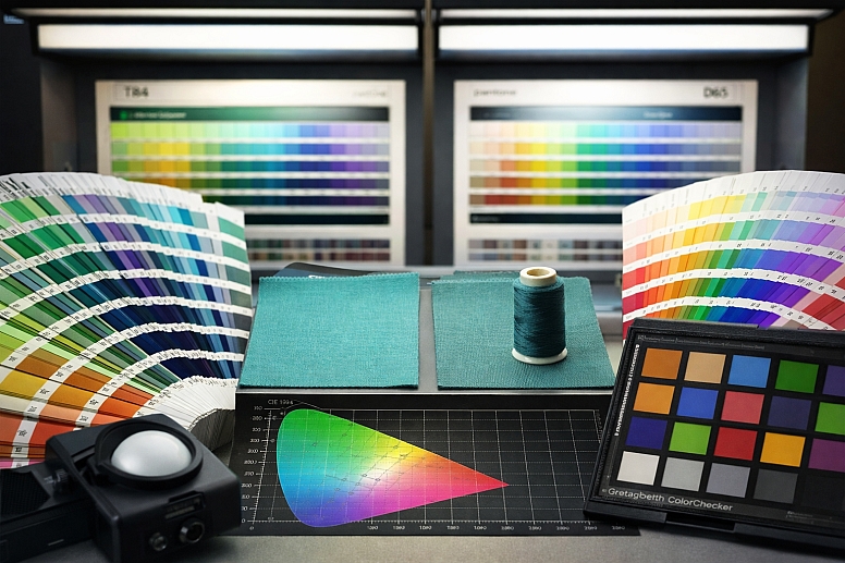
Metamerism: This is when two color samples match under one light source but not under another. It's a critical issue in manufacturing. You might choose a fabric and a thread that seem to be a perfect match in your studio's fluorescent light. But in sunlight, the thread might look noticeably different. Experts test color matches under multiple standard light sources, like daylight (D65) and store lighting (TL84), to avoid this problem.
Perceptual Uniformity: In color science, we ask: "Does a numerical change in color code match the perceived change by a human?" Often, it doesn't. Moving a certain distance in one part of a color model might create a barely noticeable shift. Moving the same numerical distance in another part might create a jarring change. Expert tools use perceptually uniform color spaces, like CIELAB, which are designed so that a mathematical distance corresponds closely to a perceived difference.
Cultural and Biological Variability: An expert knows there is no universal "red." The language you speak can influence how you categorize colors. Some cultures don't distinguish linguistically between blue and green. Furthermore, the lens in the human eye yellows with age, subtly changing color perception over a lifetime. A color chosen by a 25-year-old designer may not be perceived the same way by a 65-year-old client.
Device Calibration and Color Management: This is the unglamorous, essential work. To have colors translate predictably from a camera to a monitor to a printer, every device in the chain must be calibrated to a known standard. This involves using hardware tools to create profiles (ICC profiles) that tell your computer how to translate color data for that specific device. A professional photo editing studio will calibrate all its monitors monthly.
The Limits of Gamut: Every device—a camera sensor, a monitor, a printer—has a limited gamut, a three-dimensional volume of colors it can capture or reproduce. A major challenge, especially in print, is dealing with "out-of-gamut" colors. A vibrant sky blue on your screen may simply have no equivalent mixture of CMYK inks. Experts use soft-proofing (simulating the print output on screen) to see these issues and adjust colors into a printable range before sending the job to press.
Failure Modes & Misconceptions
Ignoring the science of color leads to predictable problems.
The "Perfect Monitor" Misconception: People often think buying an expensive monitor solves all color problems. But if that monitor isn't calibrated, it's just showing inaccurate colors very precisely. The most common failure is monitors set far too bright, which washes out colors and leads to prints that come out dark and dull.
Over-Reliance on Names: Calling a color "Sky Blue" or "Apple Red" is meaningless. Color names are not standardized. One company's "Sky Blue" can be another's "Azure." Failure occurs when people communicate about color using only names instead of specific codes (Pantone 300C, RGB 0, 114, 206).
Ignoring Ambient Light: Designing a room's colors under bright construction lights will lead to poor choices. Paint will look completely different when the room has warm, dimmable living room lighting. The failure is not testing colors in their final environment.
The "More Saturation is Better" Trap: Boosting the saturation slider makes colors seem vibrant at first glance, but it destroys subtlety and can create visual noise. Skin tones become orange and unnatural, and images lose their sense of depth. The mistake is confusing impact with quality.
Forgetting About Color Vision Deficiency: About 1 in 12 men and 1 in 200 women have some form of color vision deficiency, most commonly red-green confusion. A failure is creating a graph where the "good" data is in green and the "bad" data is in red. To these individuals, the graph may be unreadable. The solution is to use both color and another cue, like different shapes or patterns.
Decision Framework
Use this step-by-step method to make reliable color decisions.
-
Define the Medium First. Ask: Is the final output light-based (screen, video) or pigment-based (print, paint, physical product)? Your answer dictates whether you start in RGB or CMYK. This is the most important step.
-
Control Your Environment. Work in consistent, neutral lighting. Avoid brightly colored walls or strong sunlight on your screen. For critical work, use a dim, gray-walled room with a neutral light source around 5000K (known as D50, simulating daylight).
-
Establish Numerical Targets. Never work with "kinda blue." Use numbers. For digital, decide on RGB or HEX values. For professional print, select Pantone colors. For paint, use the manufacturer's specific formula number. Write these down.
-
Calibrate and Profile Your Tools. Use a hardware calibrator for your monitor. If you are printing, make sure your printer uses the correct profile for the specific paper you've chosen. This bridges the gap between what you see and the digital data.
-
Test in Context. View colors at their final size and in their final setting. For a website, look at it on a phone outdoors. For a paint color, put a large swatch on the wall and look at it for 24 hours. For packaging, print a mock-up.
-
Apply Accessibility Checks. Run your color combinations through a contrast checker. Use a simulator to see what your design looks like to someone with color vision deficiencies. Adjust as needed.
-
Validate Across the Process. If your work moves from screen to print, request a physical proof from the printer and approve it under standard viewing conditions. Don't just approve a PDF on screen.
Following this framework removes guesswork. It replaces personal opinion with a repeatable, technical process that yields consistent, predictable results.
Frequently Asked Questions
Is black a color? In terms of light, black is the absence of visible light. On a screen, it's RGB(0,0,0). With pigments, it's the presence of a substance that absorbs almost all light. So in physics, black isn't a color of light, but in practical everyday language and art, we treat it as a color.
Why are there primary colors? Primary colors are the set of basic colors that can be combined to make a wide range of other colors. The reason we have two sets (RGB and CMYK) is that one set is for adding light and the other is for subtracting (absorbing) light. They are the building blocks for their respective systems.
Do animals see color the same way we do? No. Most mammals see fewer colors than humans. Dogs, for example, are dichromats and see a world of blues and yellows, similar to red-green color blindness in humans. Many birds, fish, and insects see more colors than we do. Some can see ultraviolet light, which is invisible to us.
What is color blindness? It's usually a condition where one type of cone cell in the eye doesn't function normally. The most common type makes it hard to distinguish between red and green. It’s more accurate to call it "color vision deficiency," as the complete inability to see any color is extremely rare.
Why do my eyes adjust to darkness? In bright light, your color-sensitive cones are active. When you enter a dark room, it takes 20-30 minutes for your rod cells to fully activate. Rods are more sensitive but don't see color, which is why a dark room seems monochrome until your eyes adjust.
Can screens really hurt your eyes? The blue light from screens doesn't cause physical damage, but it can disrupt your sleep cycle and cause eye strain. The bigger issue is "digital eye strain" from focusing on a fixed distance for too long and reduced blinking. The 20-20-20 rule helps: every 20 minutes, look at something 20 feet away for 20 seconds.
LEAVE A COMMENT
Recent Posts


0.032