

How to Choose the Perfect Color Palette for Your Brand Identity
Your brand's colors are often the first thing a customer notices. In a split second, they make a subconscious judgment about who you are and what you stand for. Choosing these colors is not about personal preference; it is a strategic business decision. The right palette builds recognition, communicates your values, and connects with your ideal customer. The wrong one can send mixed messages and make you forgettable.
For example, if you are running a souvenir shop business in London, you might want to pick colours such as red, white, and blue to give off a patriotic image of your brand.
This guide will walk you through the process of selecting a powerful, purposeful color palette that forms the cornerstone of a strong brand identity.
The Foundation of Your Palette at a Glance
- Your colors are a shortcut to your brand's personality. They convey emotion and values faster than words can.
- Effective palettes are built for a target audience, not for the founder's personal taste. Cultural and psychological associations matter.
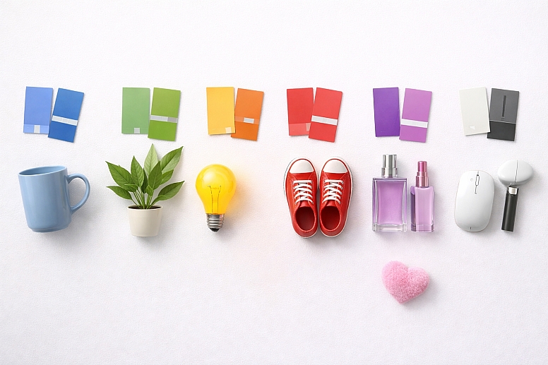
- Simplicity and contrast are key. A strong palette typically uses 1-3 main colors supported by neutrals, ensuring versatility and accessibility.
- Competitor analysis is non-negotiable. Your palette must help you stand out, not blend in with everyone else in your industry.
- The process is strategic, not artistic. Every color choice should be justified by your brand's strategy, not because it is "on trend."
Step 1: Define Your Brand's Core Identity
You cannot choose colors if you do not know what you are representing. Before looking at a single color, you must have absolute clarity on three things:
A. Your Brand Personality: If your brand were a person, how would you describe it? Is it:
- Modern and minimalist or classic and traditional?
- Playful and energetic or calm and reassuring?
- Luxurious and sophisticated or affordable and accessible?
- Innovative and tech-forward or organic and natural?
Choose 3-5 core personality traits. These adjectives will become your filter for every color decision.
B. Your Target Audience: Who are you selling to? Different demographics and cultures perceive colors differently.
- Age: A palette that resonates with Gen Z might feel overwhelming to Baby Boomers.
- Gender: While stereotypes should be avoided, market research shows trends in color preference exist.
- Culture: Colors have deep cultural meanings. For example, white signifies mourning in some Eastern cultures and purity in Western ones.
- Values: An audience that values sustainability may respond better to earthy greens and browns than to synthetic-looking neons.
Your colors must connect with your audience's aspirations and self-image.
C. Your Industry & Competitors: Analyze the brands in your space. What colors are they using?
- Finance: Dominated by blues (trust, security) and dark blues (professionalism).
- Health & Wellness: Filled with greens (nature, growth), blues (calm, trust), and soft neutrals.
- Tech: Often uses blues, but also blacks and grays for a sleek, modern feel.
The goal is not to copy them but to identify conventions. You can then choose to:
- Align with these conventions to immediately signal what you do (e.g., a new bank using blue).
- Differentiate by breaking away from them to stand out (e.g., a bank using a unexpected but trustworthy color like deep green or purple).
Step 2: Understand the Psychology of Your Choices
Color psychology provides a framework for how colors are commonly perceived. Use this as a guide, not a strict rulebook.
- Blue: Trust, security, calm, professionalism. (LinkedIn, Facebook, PayPal)
- Green: Growth, health, nature, sustainability. (Whole Foods, Spotify, Animal Planet)
- Yellow & Orange: Optimism, energy, creativity, friendliness. (Nickelodeon, Fanta, Harley-Davidson)
- Red: Energy, excitement, passion, urgency. (Netflix, Coca-Cola, YouTube)
- Purple: Luxury, creativity, wisdom, mystery. (Cadbury, Hallmark, Yahoo)
- Pink: Playfulness, compassion, femininity, warmth. (Barbie, Baskin-Robbins, Lyft)
- Black: Luxury, power, sophistication, modernity. (Chanel, Nike, Adobe)
- White & Gray: Simplicity, cleanliness, minimalism, neutrality. (Apple, Tesla, Wikipedia)
The specific shade (or saturation and brightness) drastically changes the meaning. A pastel mint green feels calming and organic, while a bright neon green feels energetic and artificial.
Step 3: Build the Structure of Your Palette
A functional brand palette is more than one color. It is a system with specific roles.
1. Primary Color: This is your hero color. It will be the most dominant and recognizable color associated with your brand. It should perfectly embody your core brand personality. Most strong brands can be identified by this color alone (e.g., Coca-Cola Red, Tiffany Blue). Choose one.
2. Secondary Color(s): These 1-2 colors support and complement the primary color. They provide visual interest and flexibility. They might be used for:
- Highlighting less important buttons or information.
- Backgrounds or design elements.
- Providing a contrasting color for your primary to work against.
3. Neutral Colors: These are the workhorses of your palette. They include whites, blacks, grays, beiges, and off-whites. They are essential for:
- Text and backgrounds: Ensuring maximum readability.
- Spacing and layout: Providing visual breathing room.
- Supporting the main colors: Letting your primary and secondary colors shine without competition.
4. Accent Color: This is a color used sparingly for emphasis. It is often a bright, contrasting color to your primary. Its job is to draw the eye to key actions like:
- "Buy Now" or "Subscribe" buttons.
- Important alerts or notifications.
- Key icons or hyperlinks.
A common mistake is building a palette with too many competing primary colors. Start simple. You can always expand later.
Step 4: Practical Application and Testing
A beautiful palette is useless if it does not work in the real world.
A. Check for Accessibility: This is critical. Your color choices must create sufficient contrast for people with visual impairments to read your text and interact with your buttons. Use online tools like the WebAIM Contrast Checker to test your color combinations. Your primary text color on its background should always meet at least WCAG AA guidelines.

B. See it in Context: Do not judge colors in isolation. Mock them up in real-world scenarios:
- Your website header and button.
- A social media post.
- A business card or product packaging.
- An app interface.
How do they look? Does the palette feel balanced? Is the hierarchy clear? Does the accent color effectively draw the eye?
C. Test in Black and White: Convert your mock-up to grayscale. This removes the emotional distraction of hue and shows you if your brightness (value) contrast is working. If everything blends together, your palette will fail in practical use, regardless of how pretty the colors are.
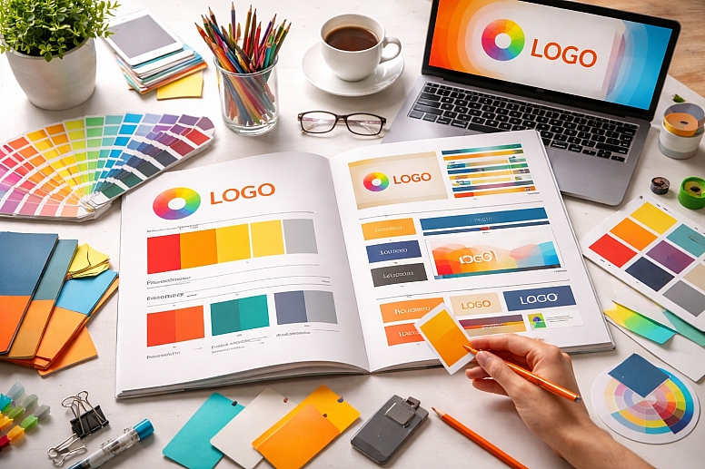
Step 5: Document Everything in a Brand Style Guide
Once finalized, your palette must be documented to ensure consistency. Anyone who creates content for your brand should have access to this guide. For each color, specify:
- Its Role: (e.g., Primary, Secondary Neutral, Accent)
- Color Values:
- HEX code (for web use: #FF0000)
- RGB values (for screen display: RGB(255, 0, 0))
- CMYK values (for print: C0 M100 Y100 K0)
- Pantone Matching System (PMS) number (for professional printing and branding materials).
- Usage Examples: Show how and where each color should be used.
Trust the Process, Not the Trend
Avoid choosing colors solely because they are trendy. Your brand identity needs to last for years, not just a season. A trend-based palette will look dated quickly. Instead, choose timeless colors rooted in your brand strategy. You can always incorporate subtle trend influences through photography or marketing campaigns without overhauling your core palette.
Bringing Your Brand to Life
Selecting your brand colors is a journey of strategic discovery, not a quick task. It requires deep thinking about who you are, who you serve, and how you want to be perceived. By following this process—defining your identity, understanding psychology, structuring your palette, and testing rigorously—you will move beyond arbitrary choice to a powerful, defensible brand asset.
Your colors will work for you every day, building recognition and communicating your message silently but effectively. Now, take your first step. Write down your three core brand personality words. That is your true north. Everything else will follow from there.
Answers to Common Questions
How many colors should be in my brand palette? Aim for 3-5 colors total, including your neutrals. A typical structure is: 1 Primary + 1-2 Secondary + 2 Neutrals (e.g., a dark gray for text and a light gray for backgrounds) + 1 Accent. This provides enough variety without becoming chaotic or difficult to manage.
What if my favorite color isn't right for my brand? This is a common hurdle for founders. You must separate personal preference from business strategy. Your brand is not about you; it is about your customer. If your favorite lime green does not align with your luxury brand's sophisticated personality, you must shelve it. The goal is to choose colors that resonate with your target audience and accurately represent your brand's values.
Should I use a color palette generator? Generators can be excellent for finding harmonious color combinations after you have chosen your primary color. They are a useful tool for exploration but a poor starting point. The strategy must come first. Input your primary color and see what suggestions the algorithm provides, but always evaluate them against your brand strategy and accessibility requirements.
How do I know if my palette is different enough from my competitors? Create a simple mood board with the logos and primary colors of your top 5 competitors. Then, place your proposed palette next to it. Does it get lost, or does it stand out? You want to be different enough to be memorable but not so different that you confuse customers about your industry. A tech company using brown might be too confusing, but one using a unique violet blue could be distinctive and ownable.
LEAVE A COMMENT
Recent Posts


0.0298