

How to Use Colour to Tell a Story in Your Designs
Colour is a foundational language in visual design, communicating meaning, guiding attention, and shaping emotional response before a single word is read. Using colour to tell a story moves beyond decoration; it creates a cohesive narrative that directs user perception and reinforces intent.
This approach systematically applies colour psychology, cultural context, and visual hierarchy to make a design’s purpose and message intuitively understood.
The strategic use of colour in storytelling hinges on several key principles:
- Narrative Arcs with Colour: Colour palettes can shift to mirror a story’s progression—introduction, conflict, and resolution.
- Emotional Anchoring: Specific hues cue emotional states, allowing you to set the underlying mood of a scene or interface.
- Character and Theme Signifiers: Consistent colour associations for characters, factions, or core themes build recognition and subtext.
- Spatial and Temporal Cues: Colour temperature and value can define spaces, indicate time of day, or signal flashbacks.
The Psychological and Cultural Language of Colour
Colour theory for storytelling extends far beyond basic colour wheels. It’s the applied study of how hues, saturation, and value subconsciously influence perception and emotion. Every colour choice carries weight, activating pre-existing associations in the viewer’s mind. These associations are a blend of universal psychological triggers and deeply learned cultural codes.
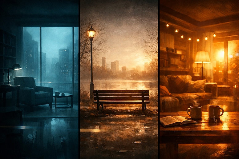
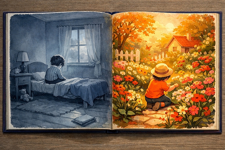
Warm colours—reds, oranges, yellows—generally advance in a composition, feeling active and present. They often correlate with high-energy states: red can signal passion, danger, or urgency; orange evokes warmth, enthusiasm, or caution; yellow suggests optimism, creativity, or anxiety at its extremes. Cool colours—blues, greens, purples—tend to recede, creating a sense of space, calm, or detachment. Blue communicates trust, stability, or melancholy; green represents nature, growth, or sometimes sickness; purple carries connotations of luxury, spirituality, or mystery.
However, cultural context overrides universalism. In Western cultures, white signifies purity and peace, while in many East Asian cultures, it is the traditional colour of mourning and loss. Red is the colour of luck and prosperity in China, but can signify debt or danger in financial contexts elsewhere. A story intended for a global audience must either use a culturally neutral palette or consciously research its primary audience’s symbolism to avoid unintended narratives
The real impact comes from the combination and contrast. A lone red element in a sea of grey tells a story of exception—a critical error, a call to action, a singular threat. A gradual shift from cool, desaturated blues to warm, vibrant golds visually narrates a journey from despair to hope.
Building a Narrative Colour Palette
A narrative palette is not a random collection of pleasing colours; it is a designed system with specific roles. This system typically includes a core colour, supporting colours, accent colours, and a range of neutrals.
The core colour is the dominant hue that represents the story’s central theme or emotional core. For a story about environmental renewal, this might be a certain shade of revitalizing green. For a corporate interface about security and trust, it could be a stable, deep blue. This colour appears most frequently and in key narrative moments.
Supporting colours create harmony and depth. They are often analogous to the core colour (neighbors on the colour wheel) or carefully chosen complements. In a story with a blue core representing loyalty, supporting teals and blue-greys can depict different facets of that loyalty, while a small amount of orange (blue’s complement) could visually represent betrayal or conflict.
Accent colours are used sparingly for maximum impact. They draw the eye to critical narrative elements: a vital clue in an interface, a pivotal character in a scene, or a crucial interactive button. An accent colour is often a complement or a high-contrast, saturated version of a supporting colour.
Neutrals (whites, blacks, greys, browns, beiges) form the canvas. They provide visual rest, define space, and let the strategic colours speak. The temperature of your neutrals is a subtle narrative tool. Warm greys and beiges feel organic, historical, or comfortable. Cool greys feel modern, technical, or impersonal.
The final step is defining colour relationships for states. How does your palette behave for flashbacks? A common technique is to desaturate the entire palette or shift it to sepia tones. For a "success state" in an app, you might introduce a new, celebratory accent colour not used elsewhere. For an "error" or "danger" state, a pre-defined accent takes over. This creates a visual grammar where the audience understands the story’s state through colour alone.
Five Applications of Narrative Colour
User Interface (UI) and User Experience (UX) Design

- Specific Constraints: Colour must serve both branding and functional clarity, adhering to accessibility standards (WCAG) for contrast. Space is often limited, and colour must work at small scales.
- Common Mistakes: Using colour as the only indicator of status (e.g., a red/green indicator without a label), creating insufficient contrast for text, or applying colours so decoratively that interactive elements are obscured.
- Practical Advice: Establish a semantic colour system. For example, map specific hues to user actions: blue for primary navigation, green for confirmation/success, yellow for warnings, red for destructive actions. Use desaturated backgrounds and reserve high saturation for primary buttons and alerts. A data dashboard might use a consistent blue-to-red gradient to tell the story of performance, from "cold" (low) to "hot" (high), with clear legends.
Brand Identity and Marketing Materials

- Specific Constraints: Colours must be reproducible across print, web, and physical products (PMS, CMYK, RGB). They must differentiate the brand from competitors while appealing to a target demographic.
- Common Mistakes: Choosing colours based solely on personal preference, failing to research competitor palettes, or using trendy colours that don’t align with the brand’s long-term story.
- Practical Advice: Build a brand colour story. A core colour embodies the brand’s primary value (e.g., a trustworthy navy for a bank). A secondary colour supports a secondary brand attribute (a dependable green for growth). An accent colour is for highlighting key calls-to-action. This palette should tell the brand’s story on a business card, website, and product packaging without a logo present.
Film, Animation, and Cinematography
- Specific Constraints: Colour is manipulated in production design, costume, lighting, and post-production grading. It must work dynamically across scenes and support the director’s vision.
- Common Mistakes: Inconsistent colour grading that breaks immersion, or overly literal colour symbolism that feels heavy-handed to the audience.
- Practical Advice: Develop a colour script—a scene-by-scene plan for the colour palette. In The Matrix, the harsh green tint of the simulated reality contrasts with the warmer, more authentic sepia tones of the real world. Colour grading can shift to reflect a character’s emotional arc: starting with a cold palette and gradually warming as they open up.
Illustration and Graphic Novels
- Specific Constraints: Colour sets the entire mood and era. It must guide the reader’s eye across panels and through the narrative sequence without the benefit of motion or sound.
- Common Mistakes: Palettes that are too busy, confusing the focal point, or a lack of consistent colour coding for characters and locations across pages.
- Practical Advice: Use limited palettes for clarity. Assign a specific colour to a key character or theme, and let that colour’s presence or absence tell part of the story. Changes in lighting (warm sunset vs. cool moonlight) should shift the entire palette of a panel consistently. A flashback sequence might be rendered in a monochromatic sepia or with significantly muted saturation compared to the present-day scenes.
Environmental and Spatial Design

- Specific Constraints: Colour is experienced at full scale and in three dimensions, affected by ambient light and materials. It influences wayfinding and behavior in real space.
- Common Mistakes: Ignoring how natural light changes a paint colour throughout the day, or using overly stimulating colours in spaces intended for calm (like hospitals or offices).
- Practical Advice: Use colour to create a narrative journey through a space. A museum might use a dark, dramatic hue in an introductory gallery to create focus, transition to neutral whites in informational sections to reduce fatigue, and employ a bright, uplifting colour in the final exhibition space. In an office, different department zones can be identified by subtle accent walls, telling the story of the company’s structure physically.
A Comparative Analysis of Colour Story Types
Different narratives call for different colour relationships. The table below compares four foundational approaches.
| Palette Type | Colour Relationship | Narrative Effect & Best Use | Potential Risk |
|---|---|---|---|
| Monochromatic | Tints, tones, and shades of a single base hue. | Creates a strong, unified, and often calming or focused mood. Excellent for minimalist branding, sombre or introspective stories, or establishing a singular environment. | Can become visually flat or boring if contrast in value (lightness/darkness) is not carefully managed. |
| Analogous | Colours adjacent on the colour wheel (e.g., blue, blue-green, green). | Feels harmonious, serene, and natural. Useful for stories about unity, growth, or specific settings (forest, ocean). Provides more variety than monochromatic while remaining cohesive. | Can lack visual excitement or critical differentiation if no contrast colour is introduced for key elements. |
| Complementary | Colours directly opposite on the colour wheel (e.g., red/cyan, blue/orange). | Creates maximum visual vibration and contrast. Narratively signals direct conflict, tension, or highlights stark opposites (good/evil, hot/cold, old/new). Excellent for calls-to-action. | Can be visually jarring and difficult to balance if used at full saturation in large quantities. Requires careful management of proportion. |
| Triadic | Three colours evenly spaced on the colour wheel (e.g., red, yellow, blue). | Feels vibrant, dynamic, and balanced. Useful for stories with three clear factions, pillars, or themes. Common in playful or child-focused designs. | Can appear chaotic or "cartoonish" if not skillfully balanced, with one colour clearly dominant and the others used as accents. |
Advanced Considerations for Coherent Colour Narratives
Expert implementation involves managing colour across time and context. Colour constancy is the brain’s tendency to perceive an object’s colour as constant under different lighting conditions. In design, you must simulate this. A white dress should feel "white" whether it’s under warm candlelight (which adds yellow) or cool moonlight (which adds blue). This is achieved not by using literal white, but by subtly shifting the dress’s colour in relation to its environment.
Simultaneous contrast means a colour appears different depending on its surroundings. A middle grey will look dark on a white background and light on a black background. This can be exploited. To make a heroic character’s emblem seem to glow, surround it with a darker, desaturated version of its own colour.
For digital products, consider the data narrative. A map showing population density uses a sequential colour scheme (light to dark blue) to tell a "more vs. less" story. A map showing political parties uses a qualitative scheme (distinct red, blue, green) to tell a "category" story. Using the wrong scheme misleads the audience.
Finally, accessibility is non-negotiable in ethical design. A colour narrative that 15% of your audience cannot perceive is a broken story. Ensure sufficient luminance contrast (a minimum 4.5:1 for normal text) and never rely on colour alone. Use patterns, labels, or icons to duplicate the information colour conveys.
Correcting Common Pitfalls and Misconceptions
Pitfall 1: Assuming Universal Symbolism The belief that "red means love" or "green means go" is dangerously simplistic. Red can mean debt, communism, or celebration. Green can mean environmentalism, inexperience, or sickness. Research your audience’s cultural and contextual associations.
Pitfall 2: Overcomplicating the Palette Starting with a 12-colour palette usually results in a noisy, confusing narrative. Begin with a strict limitation—a core colour, a neutral, and one accent. Expand only when a narrative need justifies a new hue.
Pitfall 3: Ignoring Accessibility Low-contrast text (light grey on white) is a prevalent failure that excludes users with low vision. It also creates a weak, hesitant visual story for all users. High contrast is a cornerstone of confident visual communication.
Pitfall 4: Prioritizing Trend Over Function A trendy neon palette may feel current, but if it undermines the story of stability and tradition your brand needs to tell, it’s a poor choice. Colour trends should be accents, not the foundation of a narrative system.
Pitfall 5: Inconsistent Application Using your "warning" orange for a headline, a decorative border, and a button dilutes its meaning. When a colour’s narrative role is inconsistent, the story becomes muddled. Maintain strict semantic consistency.
A Framework for Choosing Your Narrative Palette
Follow this decision sequence to build a purposeful colour story.
- Define the Core Narrative. In one sentence, what is the primary emotion, message, or theme? (e.g., "Secure and effortless financial control" or "A nostalgic journey through childhood wonder.")
- Audit the Context. Who is the audience, and what are their cultural contexts? What are the physical or digital media constraints? Who are the competitors, and what colours do they own?
- Select the Core Colour. Based on steps 1 and 2, choose the single hue that best embodies the core narrative. Validate it against competitor colours and accessibility requirements for its primary use case.
- Build the Supporting Structure. Choose a neutral background colour that provides clear contrast for content. Select 1-2 supporting colours (often analogous or neutrals with a temperature) to add depth without competing.
- Assign Accent Roles. Define the specific, limited narrative functions for your accent colour(s). Document these roles explicitly: "Accent Red only for critical errors and destructive actions."
- Test for Flow and Accessibility. Create mockups of key narrative moments (a homepage, a critical scene, a data visualization). Do the colours guide the eye correctly? Use automated tools to check all contrast ratios. Get feedback from people unfamiliar with the project.
- Document the System. Create a style guide that lists colour codes (HEX, RGB, CMYK, PMS) and, more importantly, defines the narrative usage rules for each colour. This ensures consistency as the story scales.
Addressing Specific User Questions
Can a colour tell a story without other visual elements? Yes, but in a limited, abstract way. A field of solid blue can evoke calm or sadness; a stark red can signal alarm. For a complex narrative, colour works synergistically with typography, imagery, and composition. It’s the most potent emotional cue within that system.
How many colours should be in a story’s palette? For clarity, use as few as possible. A strong narrative can often be told with a core colour, a dark neutral, a light neutral, and one accent. Even complex film colour scripts usually revolve around 2-3 dominant hues per scene. Limit your palette to essential narrative elements.
My brand colours are fixed. How can I use them narratively? Treat your brand colours as your core and supporting palette. Use tints (lighter versions) and shades (darker versions) to create hierarchy and emotional range. A 10% tint of your bold brand blue can be a calm background; the 100% saturation version is for primary headlines. Your accent colour can be used at different saturations to denote different levels of importance.
How does colour storytelling work in black-and-white or grayscale designs? The narrative is told entirely through value (lightness/darkness) and texture. Contrast becomes the primary driver of attention and mood. A story can move from high-contrast, dramatic scenes to low-contrast, sombre ones. Think of it as the difference between a sharp, high-stakes noir film and a soft, hazy memory.
What’s the biggest sign of an amateur colour story? Inconsistency. When a colour’s meaning changes arbitrarily within the same narrative, it confuses the audience and breaks immersion. Professional narrative design is defined by systematic, intentional, and repeatable application.
LEAVE A COMMENT
Recent Posts


0.046