

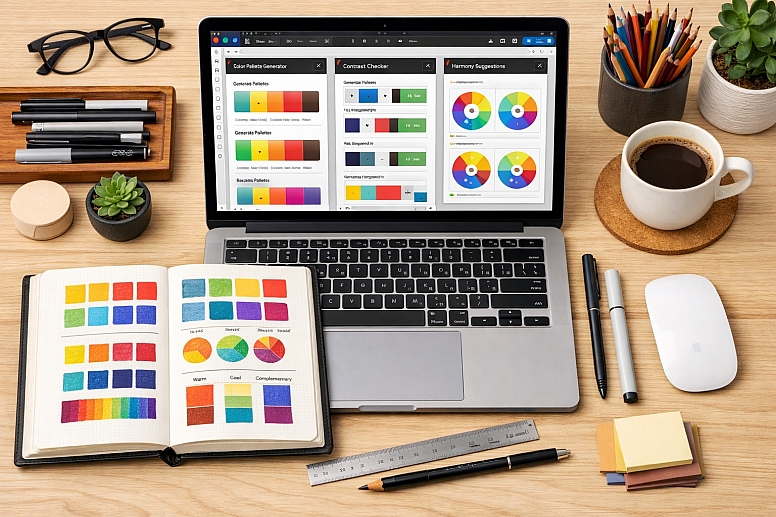
The Best Plugins for Color Palette Generation in Figma & Sketch
A well-constructed colour system is the foundation of any effective interface. It defines brand personality, ensures accessibility, and establishes visual hierarchy. While the fundamental principles of colour theory are applied across design tools, the implementation differs.
The best plugins for palette generation are not just colour pickers; they are integrated tools that automate harmony, enforce consistency, and bridge the gap between creative exploration and systematic implementation.
- Figmatic Philosophy: Plugins in Figma excel at integration, allowing direct palette import, real-time accessibility checks, and deep linking to design tokens and variables for scalable systems.
- Sketch-Centric Approach: The Sketch plugin ecosystem is historically strong for workflow automation, batch processing, and detailed colour management within the document, though newer plugins may be less actively developed than Figma's.
- Strategic Selection: The ideal plugin depends on your specific need: initial inspiration, system building from a brand colour, ensuring accessibility, or automating production workflows.
- Outcome: A streamlined workflow from colour discovery to a documented, accessible, and development-ready colour system.
The Integrated Workflow Advantage of Design Plugins
In the past, colour palette creation was a disjointed process: a designer might generate a palette in a web tool, manually input HEX codes into their design file, and then use a separate accessibility checker. Modern plugins collapse these steps into a unified workflow within the design environment itself.
The primary advantage is contextual application. A plugin like Image Palette in Figma allows you to extract a harmonious scheme directly from a hero image already in your mockup, ensuring the UI colours are intrinsically tied to the brand's visual assets. Similarly, a plugin like Color Designer generates tints and shades directly from your selected layer, creating a perfect monochromatic scale without leaving the software. This eliminates manual transfer errors and keeps the designer in a state of creative flow.
Furthermore, plugins provide guardrails for professional standards. Tools like Contrast in Figma or Stark in Sketch allow you to check colour contrast ratios against WCAG guidelines on the canvas itself, providing instant, actionable feedback. This integration makes accessibility a seamless part of the design process, not a burdensome final audit.
A Comparative Guide to Core Palette Generation Plugins
The following table breaks down the best plugins by their primary function, allowing you to select the right tool for each phase of your project.
| Plugin Name | Primary Function | Best For | Key Differentiator & Use Case |
|---|---|---|---|
| For Inspiration & Discovery | |||
| Coolors (Figma) | Super-fast random palette generation with locking controls. | Breaking creative block; exploring millions of proven combinations quickly. | Its speed and vast curated library make it ideal for the initial "what if" phase. Tap spacebar to shuffle palettes instantly. |
| AI Colour Palette Generator (Figma) | Generating palettes from descriptive keywords (e.g., "serene forest"). | Translating abstract brand moods or themes into tangible colour schemes. | Useful at project kick-off when you have a verbal brief but no visual direction yet. |
| Palette / Image Palette (Figma) | Extracting a colour palette from an image using machine learning. | Ensuring UI colours align perfectly with a brand's photographic style or mood board. | Run the same image through both plugins; they use different algorithms and will give you two distinct, high-quality options. |
| For Building Scalable UI Systems | |||
| Supa Palette (Figma) | Comprehensive colour system management: generation, editing, organisation, and accessibility rating. | Creating production-ready, documented colour systems for complex products (e.g., fintech dashboards). | An all-in-one powerhouse that shows live WCAG ratings (AAA/AA) for every colour and its shades. |
| Color Designer (Figma) | Generating vibrant, consistent tints and shades from a base colour. | Building full colour scales for UI states (hover, active, disabled) and backgrounds. | Produces cleaner, less "muddy" shades than simple opacity changes, leading to more professional UI. |
| Foundation – Color Generator (Figma) | Generating palettes compliant with major design systems (Material, Atlassian, etc.). | Ensuring colour choices are consistent with development frameworks like Material Design. | Removes guesswork by generating colours that already fit within established system constraints. |
| For Accessibility & Compliance | |||
| Contrast (Figma) | Checking colour contrast ratios of selected layers against WCAG standards. | Finalising any screen with text, ensuring designs are usable for everyone. | Provides a colour slider to find the nearest compliant colour instantly, making fixes effortless. |
| A11y – Color Contrast Checker (Figma) | Scanning all visible text in a frame for WCAG compliance. | Automated audits of entire screens or components for accessibility issues. | Batch-checking efficiency is superior for reviewing completed screens before handoff. |
| Stark (Sketch) | Checking contrast and simulating colour blindness. | A comprehensive accessibility suite within Sketch's workflow. | Offers both contrast analysis and vision deficiency simulation in one tool. |
| For Specialised & Advanced Workflows | |||
| Tokens Studio for Figma | Managing colours as part of a complete design token system (for multi-brand, multi-theme projects). | Large-scale design systems where colours must sync perfectly with development via tokens. | This is for system architecture, not just palette generation. It manages the single source of truth for colours across themes. |
| Tailwind Ink (Figma) | Generating full colour ranges that match Tailwind CSS naming conventions (e.g.,blue-100toblue-900). |
Teams using the Tailwind CSS framework eliminate the design-development translation gap. | Ensures the palette you design is the exact palette developers implement by using their naming system. |
| Sketch Palettes (Sketch) | Exporting and importing fill presets (colours, gradients, patterns) between Sketch documents. | Sharing and maintaining consistent colour libraries across multiple Sketch files or team members. | Acts as a portable colour style guide within the Sketch ecosystem. |
The Evolving Plugin Ecosystem: Figma's Momentum vs. Sketch's Foundation
The search results reveal a clear divergence in the current state of plugin ecosystems between Figma and Sketch.
Figma's plugin environment is dynamic and rapidly evolving. The volume of dedicated, recently updated colour plugins is significant. This reflects Figma's dominant market position, which incentivises developers to create and maintain sophisticated tools. Plugins like Supa Palette and Tokens Studio are indicative of this trend, focusing on deep integration with Figma's native variables and design systems features for scalable, future-proof workflows.
Sketch's plugin ecosystem, while historically rich, shows signs of maturity. The main Sketch plugins page is a community-generated directory, and the platform itself notes that it does not check each plugin for functionality. Many highly-regarded colour plugins for Sketch, such as those listed in resources from 2021, may no longer be actively maintained. However, core utilities for contrast checking (Stark), gradient management (coolHue), and colour system visualisation (Prism) remain essential and effective for established Sketch workflows. The focus here is often on robust, time-tested utilities rather than the latest AI-powered generators.
Strategic Implementation and Workflow Integration
Selecting plugins is only the first step. Their power is unlocked through strategic integration into your design process.
- Establish a Clear "Source of Truth" Workflow. For a new brand project, your flow might be: Inspiration (Coolors or AI Generator) → Refinement (Supa Palette to build scales and check accessibility) → Implementation (applying colours as local styles or, better, as variables).
- Mandate Accessibility Checks. Make plugins like Contrast (Figma) or Stark (Sketch) non-negotiable in your team's review process. Set a standard that no screen is approved without a passing WCAG AA rating for all text.
- Leverage Automation for Consistency. Use Batch Styler in Figma to update colour styles across an entire file at once, or Sketch Palettes to share a master palette with your team. This prevents style drift and ensures visual cohesion.
- Document with Plugins. Use a plugin like Prism in Sketch to auto-generate a colour style guide artboard from your document colours, creating instant, clear documentation for developers or stakeholders.
Common Pitfalls and Misconceptions
Misconception: "More plugins equal a better workflow." Plugin sprawl leads to performance issues, menu clutter, and decision paralysis. The curated list above is a toolkit. Install only what you need for your specific projects. A minimal, effective setup for a UI designer might be: one inspiration plugin, one system builder, and one accessibility checker.
Pitfall: Treating Generated Palettes as Final. Plugins provide excellent starting points, but a human eye must finalise the system. Always review generated colours in context—on actual UI components, in both light and dark modes—and adjust for visual balance and brand appropriateness.
Misconception: "Accessibility is only about contrast." While contrast is paramount, it's not the only factor. Use the Colour Blind plugin in Figma to simulate how your palette appears to users with various colour vision deficiencies, ensuring your interface doesn't rely on colour alone to convey information.
Pitfall: Ignoring the Developer Handoff. The most elegant palette is useless if it's implemented incorrectly. For teams using Tailwind CSS, Tailwind Ink is a direct bridge. For others, use plugins that allow clear labelling and export of colour values (HEX, RGBA) to make the handoff documentation frictionless for engineers.
A Method for Building a Colour System with Plugins
- Define Parameters. Start with constraints: existing brand colours, a target industry (influencing psychology), and the technical framework (e.g., Tailwind CSS).
- Generate Foundation. Use Coolors or an AI Generator to explore directions. If you have key imagery, use Image Palette to extract a harmonious base.
- Build the System. Input your primary colour(s) into Supa Palette or Colour Designer. Generate a full scale of tints and shades (e.g., 50, 100, 200...900). Define secondary and accent colours using harmonious rules (complementary, analogous).
- Test Rigorously. Apply colours to a core UI kit (buttons, cards, alerts). Use Contrast on every text element. Use Color Blind to simulate deficiencies.
- Document and Distribute. Organise your final palette into named styles in Figma/Sketch. For teams, use Tokens Studio (Figma) or export via Sketch Palettes. Create a simple guide showing usage roles for each colour level.
Questions on Colour Palette Plugins
Are the best plugins for Figma also available for Sketch? Generally, no. The plugin ecosystems are native to each application. While core functions (like contrast checking) exist in both, the specific plugins, their interfaces, and their levels of active development are different. Always search within your specific design tool's plugin community.
What is the difference between a plugin like Color Shades and Supa Palette? Colour Shades is a single-function utility: you give it one colour, and it gives you a scale of darker and lighter versions. Supa Palette is a comprehensive system manager: it lets you create and manage multiple palettes, edit colours in different models (HSL, RGB), check accessibility for every swatch, and export organised tokens. The former is for speed; the latter is for scale and professionalism.
How do I choose between all the gradient plugins? It depends on the effect:
- uiGradients: For applying one of 350+ curated, linear gradient presets quickly.
- Mesh Gradient: For creating complex, multi-colour, non-linear gradients that are trendy for backgrounds.
- Noisy Gradients: For adding texture and a retro, grainy feel to gradients.
- Easing Gradient (Sketch): For applying sophisticated, non-linear colour transitions, especially useful for gradients fading to transparent.
Is Figma's own Colour Palette Generator a good starting point? Yes, Figma's native Color Palette Generator is an excellent, integrated starting point for creating harmonious schemes directly within the platform. It's simple, stays in your workflow, and is perfect for quick exploration before potentially moving to a more advanced system-building plugin for refinement and documentation.
LEAVE A COMMENT
Recent Posts


0.0527