

How to Use Colour Libraries to Speed Up Your Design Process
A colour library is the operational engine of a design system. It is a single, managed source of truth for every colour used in a product or brand, replacing ad-hoc selection with systematic reuse.
Using a library correctly eliminates guesswork, ensures cross-platform consistency, and allows designers to focus on solving user problems rather than manually matching HEX codes. Speed is gained not through haste, but through the elimination of repetitive decisions and corrections.
- Core Function: A colour library pre-defines all permissible colours and their specific use cases.
- Primary Mechanism: It replaces manual colour picking with selection from a constrained, approved list.
- Strategic Outcome: Drastically reduced production time, guaranteed visual cohesion, and a scalable foundation for theming and accessibility.
- Key Workflow Shift: Moving from "What colour should this be?" to "Which library colour is appropriate for this component?"
The Systematic Efficiency of a Constrained Palette
Without a library, every design decision involves a colour choice. This creates a compounding tax on time: selecting a shade of blue for a button, then trying to remember or manually recreate that exact shade for a link, a border, and a chart. Inconsistencies creep in, leading to later "pixel-pushing" corrections across dozens of screens. A colour library pays this tax upfront by making one definitive decision for each colour role.
The efficiency gain is multifaceted. Decision fatigue is eliminated. A designer building a dashboard does not ponder the exact blue for a primary action; they select "Primary-600" from the library. Collaboration velocity increases.
When a library is shared across a team, feedback shifts from "make this button bluer" to "this should use the Primary-700, not Primary-600." Handoff to development is streamlined, as the library maps directly to a code token system (e.g.,--color-primary-600). Most critically, global updates become instantaneous. Changing the brand's core primary colour from one blue to another is a one-minute change in the library source, propagating automatically to every button, link, and icon in the project.
The Architecture of a Professional Colour Library
An effective library is not a simple list of favourite colours. It is a structured system built for utility.
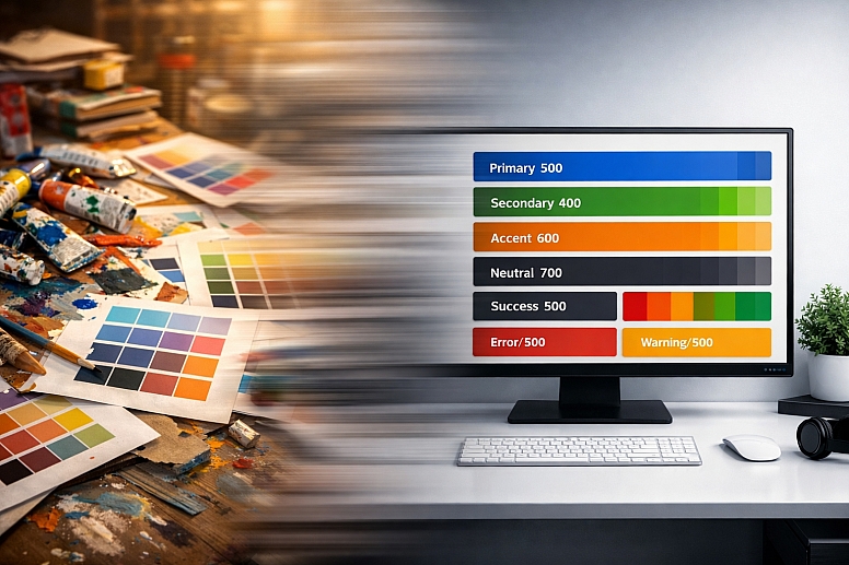
1. The Foundation: Semantic Naming and Role Definition: Colours must be named for their purpose, not their appearance. This decouples the design logic from the specific hue, allowing the underlying colour values to change (e.g., for a dark mode theme) without breaking the system.
- Poor Names:
Light Blue,Dark Blue,Grey - Semantic Names:
color-primary,color-primary-hover,color-text,color-background,color-success,color-error
This semantic structure ensures that a "success" message is always green (or its semantic equivalent in another theme), regardless of which designer is working on the file or which platform is being designed for.
2. The Scale: Tints, Shades, and Consistent Steps: A single "brand blue" is insufficient for interface design. A library requires a scale for each core colour.
- Typical Scale: A range from 50 (lightest tint) to 900 (darkest shade), with consistent perceptual steps between each level (e.g.,
primary-50,primary-100,primary-200...primary-900). - Use Case Mapping:
primary-50: Light backgroundsprimary-100: Subtle hover statesprimary-500: The core brand colourprimary-700: Primary buttons, important textprimary-900: Dark mode primary elements
This scale provides a finite, predictable set of options for creating contrast, hierarchy, and state changes (hover, active, disabled).
3. The Structure: Core Categories for UI Design: A comprehensive library is organised into logical categories:
- Primary Palette: The core brand colours and their full scales.
- Secondary/Accent Palette: Supporting colours for differentiation (e.g., for tags, categories, secondary CTAs).
- Neutral Palette: A scale of pure grays (or warm/cool grays) for text, backgrounds, borders, and disabled states.
- Semantic Palette: Colours with fixed meaning: Success (green), Warning (amber/Orange), Error (red), Information (blue).
4. Integration with Design Tools: Styles, Variables, and Plugins: The library must be embedded into the design tool to be usable.
- In Figma, this means creating Color Styles (or, preferably, Variables for modern systems).
- In Sketch, it means creating Layer Styles and Color Variables.
Once defined, these styles appear in the inspector panel, allowing for one-click application.
Plugins like Supa Palette (Figma) or Prism (Sketch) can automate the generation and organisation of these styles from a master palette.
Five Contexts for Implementing Colour Libraries
1. Building a New Product from Scratch
- Constraints: No legacy styles; need to establish a system that will scale for years.
- Common Mistakes: Defining only a handful of colours, which forces designers to break the system later. Using placeholder colour values that become "good enough" and are never replaced.
- Practical Implementation: Start by defining the semantic roles you will need (primary, success, error, background, surface, text). Use a tool like Supa Palette to generate a full 9-step scale for your primary and secondary colours. Create these as Variables in Figma (or Color Variables in Sketch) from day one. Build your first UI components (buttons, inputs) using only these library variables. This ensures the system is validated and used from the outset.
2. Refactoring a Legacy Design File with Inconsistent Colours
- Constraints: Hundreds of legacy screens with hard-coded, inconsistent colour values.
- Common Mistakes: Manually updating each layer, which is error-prone and unsustainable. Creating a new library but not enforcing its use, leading to two parallel systems.
- Practical Implementation: First, audit the existing file to identify the most commonly used colours. Use a plugin like Batch Styler (Figma) to find and replace all instances of a specific HEX code with a new colour style. Define your new, clean library based on this audit. Systematically replace old colours with new styles using batch operations, focusing on one component type at a time (e.g., all buttons, then all text colours).
3. Managing a Multi-Brand or White-Label Product
- Constraints: One core product UI must be skinned with multiple, distinct brand colour schemes.
- Common Mistakes: Duplicating the entire design file for each brand, making updates a nightmare.
- Practical Implementation: Build the entire product UI using semantic colour variables (e.g.,
color-primary,color-background). Do not use hard-coded values. Then, create separate modes or theme libraries for each brand (e.g., "Brand A Theme," "Brand B Theme") that provide the specific colour values for each semantic variable. Switching the theme mode instantly reskins the entire product. This is best achieved with Figma's Variables or advanced plugin suites like Tokens Studio for Figma.
4. Enforcing Accessibility in a Large Design Team
- Constraints: Multiple designers must produce accessible work without being experts in WCAG contrast ratios.
- Common Mistakes: Providing a palette without clear usage rules, leading to low-contrast pairings.
- Practical Implementation: Build the library with pre-defined, accessible pairings. For example, the library should not just contain
gray-700, but also a documented rule: "gray-700is for primary text only on the backgrounds ofgray-50,white, orprimary-50." Use plugins like Contrast (Figma) to validate these pairings when building the library. In handoff documentation, explicitly list the approved text/background combinations.
5. Streamlining Handoff to Multiple Development Teams
- Constraints: Different development squads (web, iOS, Android) need to implement the same colours accurately.
- Common Mistakes: Sending static style guides that developers must manually transcribe, leading to drift.
- Practical Implementation: Structure the library to mirror the development token architecture. Use a naming convention that developers expect (e.g.,
primary/600). Then, use a syncing tool like Tokens Studio for Figma (which can export tostyle-dictionaryformat) or a shared Storybook integration to automatically publish the library as code tokens. This makes the library the single source of truth that updates both design and code simultaneously.
A Comparison of Library Management Approaches
| Approach | Tool/Feature | Mechanism for Speed | Best For | Limitation |
|---|---|---|---|---|
| Basic Shared Styles | Figma/Sketch Color Styles | One-click application from a dropdown list. | Small teams, single-brand projects with a stable palette. | Difficult to manage at scale; no theming capability. |
| Design Variables | Figma Variables, Sketch Color Variables | Enables modes (e.g., light/dark theme) and aliasing for complex logic. | Modern systems, multi-theme products, complex states. | Steeper learning curve; requires upfront system planning. |
| Plugin-Powered Systems | Tokens Studio for Figma, Supa Palette | Automates generation, organisation, and sync to code tokens. | Large teams, enterprise design systems, multi-platform products. | Adds dependency on a third-party plugin; can be complex. |
| Document-Centric | Separate Library File (.figor.sketch) |
A dedicated "source" file that teams publish styles from. | Centralised control in a structured team environment. | Requires manual publishing/updating steps; can get out of sync. |
Advanced Implementation: Variables, Modes, and Code Sync
For expert users, modern libraries leverage Variables (Figma) or Color Variables (Sketch). This allows for:
- Modes: A single button component can use the variable
color-primary. In "Light Mode," this variable is set to a dark blue. In "Dark Mode," the same variable is set to a light blue. Switching the document mode instantly updates all instances correctly. - Aliasing: A variable can reference another. You can set
color-borderto aliasneutral-300. Later, if you change the value ofneutral-300, both the neutral colour scale and all borders update. - Math and Logic: Some systems allow for derived values (e.g.,
color-hover: primary-600 at 90% opacity).
The pinnacle of efficiency is code synchronisation. Using a plugin like Tokens Studio for Figma, the colour library is defined as a set of design tokens. These tokens can be automatically exported in a format (like JSON) that a development build process consumes, updating the live CSS or app theme files. This creates a closed loop where a change in the design library propagates automatically to the design file and, with the right pipeline, to the live product, eliminating manual translation entirely.
Common Pitfalls and Misconceptions
Misconception: "A colour library stifles creativity." A library does not dictate what to design, only how to consistently apply colour to that design. It removes the repetitive, low-value task of colour matching, freeing cognitive bandwidth for solving actual user experience problems, layout, and micro-interactions—the true realms of creative design work.
Pitfall: Building a library without user input from engineering. If the library's naming and structure do not align with how developers think about and implement colour, it will create friction, not speed. Collaborate with engineering during the library's creation to adopt a naming convention (like BEM or a token hierarchy) that works for both disciplines.
Misconception: "Our library is done once we create the styles." A library is a living product. It requires governance: a process for requesting new colours, deprecating old ones, and documenting changes. Without an owner and a versioning strategy, it will decay into chaos.
Pitfall: Only defining colours for "happy path" screens. Libraries must account for all states: error, warning, success, disabled, hover, active, and selected. If these states aren't defined in the library, designers will improvise inconsistent solutions, breaking the system's integrity at the edges.
A Method for Implementing a Speed-Optimised Colour Library
- Audit and Define Requirements. Inventory existing colours (if any) and list all necessary colour roles (primary, secondary, error, backgrounds, text, etc.). Consult with developers on naming conventions.
- Generate the Core Scales. Use a plugin like Supa Palette or Color Designer to create full, perceptually uniform scales (50-900) for your primary and secondary colours from your base brand hues.
- Build the Semantic Structure. In your design tool, create variables or styles using semantic names (
color-primary-500,color-background,color-text-primary). Apply the colour values from your generated scales. - Apply to Core Components. Build or rebuild your foundational UI components (Button, Input, Alert, Card) using only these library variables/styles. This tests the library's viability.
- Document and Distribute. Create a dedicated page or document showing all colours, their uses, and—critically—the approved accessibility pairings (e.g., "Text on Background" combinations that pass WCAG AA).
- Integrate with Workflow. Train the team to use the library styles exclusively. Use batch-replace plugins to migrate legacy work. Set up code sync if applicable.
- Govern and Evolve. Appoint a library owner. Establish a process for proposing changes (e.g., via a shared ticket). Log versions and changelogs.
Questions on Colour Libraries
What's the difference between a Colour Style and a Colour Variable? A Colour Style (Figma/Sketch) is a static, named colour swatch. A Colour Variable is a more powerful entity that can have different values in different "modes" (like light/dark theme) and can be aliased (referenced by other variables). Variables are the modern foundation for scalable systems; styles are a simpler, legacy-compatible feature.
How many colours should be in a library? Quality over quantity. A robust library for a complex product might have 6-8 core hues, each with a 9-step scale (54-72 colours), plus a neutral gray scale (9 more), and a few fixed semantic colours (red, green, orange, blue). This totals ~70-90 individual colours, but they are systematically derived, not arbitrarily chosen. A smaller brand site might need only 20-30.
How do you handle colours for data visualisations (charts, graphs)? Data visualisation colours should be a separate, specialised sub-library within the main system. These palettes must be crafted for categorical distinction (for pie charts) or sequential/divergent perception (for heatmaps). They should still be managed as variables (e.g.,data-categorical-1,data-sequential-100) to maintain control, but their design principles are distinct from UI colours.
Can a colour library work for marketing/brand materials and product UI? They can be linked, but they often serve different masters. The Brand Identity Library is expressive, containing many tints and tones for logos, print, and campaigns. The Product UI Library is functional, built for contrast, accessibility, and states. The best practice is to derive the UI library's core hues from the brand library, ensuring harmony, but allow the UI library its own, more constrained structure optimized for digital interaction.
LEAVE A COMMENT
Recent Posts


0.0163