

How to Use Colour to Improve Readability in Typography
Readability is the ease with which a reader can recognize words, sentences, and paragraphs. Colour is a fundamental—and often misapplied—tool in controlling it. The strategic use of colour in typography reduces eye strain, accelerates information processing, and establishes a clear hierarchy, directly impacting user comprehension and experience.
This approach focuses on the measurable contrast between text and its background, the psychological weight of colour, and the systematic application of these principles to body copy, headings, and interactive text.
- Core Principle: Readability is governed by luminance contrast, not hue contrast.
- Primary Metric: The contrast ratio between text and background must meet or exceed WCAG (Web Content Accessibility Guidelines) standards.
- Strategic Application: Colour establishes typographic hierarchy and defines interactive states without sacrificing legibility.
- Key Outcome: Text that is effortlessly parsed and understood by the broadest possible audience, regardless of visual ability.
The Mechanics of Luminance Contrast
The human eye distinguishes letters primarily through differences in luminance—the perceived brightness of a colour. Two colours can be distinctly different hues (e.g., red and green) but have identical luminance values, causing them to blend together for many readers. This is the foundation of colour vision deficiency (CVD) issues, but it affects all readers under suboptimal conditions.
The WCAG 2.1 guidelines provide the definitive standard for digital readability:
- Level AA (Minimum): A contrast ratio of at least 4.5:1 for normal text (under 18pt or 14pt bold). For large-scale text (over 18pt or 14pt bold), a ratio of 3:1 is sufficient.
- Level AAA (Enhanced): A contrast ratio of at least 7:1 for normal text and 4.5:1 for large-scale text.
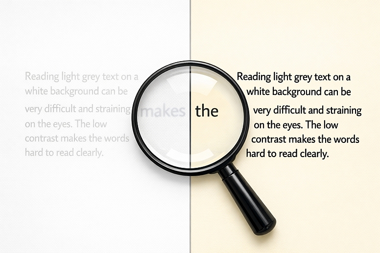
A contrast ratio of 4.5:1 means the lighter colour (typically the background) is 4.5 times brighter than the darker colour (typically the text). Pure black (#000000) on pure white (#FFFFFF) achieves a ratio of 21:1. Using a dark grey (#333333) on white achieves a strong ratio of approximately 12.6:1, often preferred for reducing harshness while maintaining excellent readability. Failure to meet these ratios is a direct functional failure of the design, leading to user abandonment and accessibility non-compliance.
A Structured System for Typographic Colour
Effective typographic colour is applied through a systematic hierarchy that aligns with the document's information structure.
1. Defining the Foundational Pairing: Body Text on Background: This is the non-negotiable starting point. The highest contrast ratio in the design should be reserved for the primary body text.
- Best Practice: Use a near-black text on a near-white background, or the reverse for dark modes. For example:
- Light Mode: Text:
#1A1A1A(Dark Grey) on Background:#FFFFFF(White). Ratio: ~16.5:1. - Dark Mode: Text:
#E6E6E6(Light Grey) on Background:#121212(Near Black). Ratio: ~14.5:1.
- Light Mode: Text:
- Common Mistake: Using pure black (
#000000) on pure white for long-form text. The extreme contrast can cause a "halation" effect for some readers, where text appears to glow, increasing eye fatigue. A very dark grey is often more comfortable.
2. Establishing Hierarchy with Colour Value and Saturation: Secondary levels of information are signalled by a reduction in visual weight, achieved by adjusting colour value and saturation.
- Headings (H1, H2): Can use a brand colour, provided it maintains the required contrast ratio against the background. A deep brand blue or green often works.
- Sub-headings & Tertiary Text (H3, H4): Use a slightly lighter value of the heading or body colour.
- Meta-Data, Captions, Placeholder Text: Use a mid-tone grey (e.g.,
#666666or#767676). This clearly denotes less important information without disappearing.
3. Applying Colour for Interactive and Semantic States: Colour must indicate function and state change unambiguously.
- Hyperlinks: Require a distinct colour and a non-colour indicator (like an underline). The link colour must have a 3:1 contrast ratio against the surrounding body text (in addition to its contrast against the background) so it is identifiable for users who cannot perceive hue. A classic blue (
#0066CC) is standard for a reason. - Hover/Active States: Darken the link colour or increase the underline weight.
- Visited Links: Desaturate or change the hue of the link colour (e.g., from blue to purple).
- Form Validation: Use semantic colours paired with icons: red (
#D93025) for errors, green (#0B7B4E) for success. Ensure the text of the message itself passes standard contrast ratios.
Five Contexts for Applying Readable Typographic Colour
1. Long-Form Editorial Website or Blog
- Constraints: Extended reading requires maximum comfort and minimal eye strain over long periods.
- Common Mistakes: Using a coloured or textured background for the main text column. Employing a font weight that is too thin in the chosen colour.
- Practical Application: Use a serif or highly legible sans-serif font in a dark grey (
#2D2D2D) on a warm off-white background (#FAFAFA). Set line height to 1.5–1.8 times the font size. Use a bold accent colour only for pull-quotes, key term highlights, and hyperlinks, ensuring all meet contrast guidelines. For a deeper exploration of the theory behind these choices, you can read about the power of colour in typography.
2. Data-Dense Dashboard or Analytics Interface
- Constraints: Must present complex numerical and label information that can be scanned quickly and accurately.
- Common Mistakes: Using colour as the only differentiator for data categories. Using low-contrast labels on charts.
- Practical Application: For chart data labels and axis text, use the same high-contrast body text colour. Directly label lines and bars instead of relying on a separate colour key. In data tables, use a very subtle background tint (e.g.,
#F8F9FA) on alternate rows, with text maintaining full contrast. Use a single, high-contrast accent colour to highlight key metrics or trends within the data.
3. Mobile Application UI
- Constraints: Limited screen space, variable lighting conditions, and interaction via touch targets.
- Common Mistakes: Font sizes that are too small, making contrast ratios irrelevant. Using translucent text overlays on busy images.
- Practical Application: Adhere to platform-specific minimum text size guidelines (e.g., iOS's 17pt for body). Increase the contrast ratio target to at least 4.8:1 to compensate for glare and varied viewing angles. For text overlayed on images, use a dark scrim or opaque background panel behind the text to guarantee contrast, rather than trying to find a colour that works on all possible image parts.
4. Brand Identity with Low-Contrast Aesthetics
- Constraints: Brand guidelines dictate a light, delicate colour palette (e.g., pastels, light grey on white).
- Common Mistakes: Applying the low-contrast brand colours directly to body text, rendering it illegible.
- Practical Application: Separate brand colours from UI/typographic colours. Use the delicate palette for large graphical elements, backgrounds, and headings at large sizes. For all running text, buttons, and functional typography, introduce a separate, accessible colour palette that lives alongside the brand guide. The text can be a dark charcoal that complements, rather than matches, the primary brand pastels.
5. Presentation Slides (Keynote, PowerPoint)
- Constraints: Viewed from a distance in rooms with uncontrolled lighting (projector washout, overhead lights).
- Common Mistakes: Complex, gradient-filled backgrounds with text in a complementary but low-contrast colour.
- Practical Application: Use a simple, solid, high-contrast background. Dark background (
#121212) with light text (#FFFFFF) often projects with more clarity than light backgrounds. Use an extra-large font size (36pt for headers, 24pt+ for body). Limit text per slide to ensure the high-contrast typography can be read from the back of the room.
A Comparative Analysis of Text/Background Contrast Scenarios
| Scenario | Recommended Text Colour (Hex) | Recommended Background Colour (Hex) | Approx. Contrast Ratio | Rationale |
|---|---|---|---|---|
| Optimal Long-Form Reading (Light Mode) | #1A1A1A(Very Dark Gray) |
#FEFEFE(Off-White) |
~16.5:1 | High contrast without the harshness of pure black, reducing eye strain. |
| Optimal Long-Form Reading (Dark Mode) | #E6E6E6(Light Gray) |
#121212(Near Black) |
~14.5:1 | Prevents "halation" of pure white text in low-light environments. |
| Secondary/De-emphasized Text | #666666(Mid Gray) |
#FFFFFF(White) |
~5.7:1 | Clearly legible but visually recedes, perfect for captions or bylines. |
| Primary Action Link | #0066CC(Strong Blue) |
#FFFFFF(White) |
~6.0:1 | Meets all WCAG standards, is culturally recognized, and provides needed contrast against black text. |
| Text on a Brand-Coloured Button | #FFFFFF(White) |
#0B7B4E(Brand Green) |
~5.0:1 | Ensures button text is legible; the button's size provides additional affordance. |
Advanced Considerations for Typographic Colour
For expert implementation, move beyond basic contrast checks.
Colour Vision Deficiency (CVD) Simulation: A link colour may pass a 3:1 contrast ratio with body text for a full-colour vision user but fail for someone with deuteranopia (red-green blindness). Use tools like the Stark plugin (Figma/Sketch) or Chrome DevTools to simulate your designs under various CVD conditions. Ensure that the semantic meaning (error, success, link) is not lost.
Adapting to Ambient Light and Device Settings: Modern operating systems feature night shifts (blue light reduction) and dark modes. Test your colour palette in these modes. A blue link in a night-shift filter may shift towards purple and lose contrast. Using a slightly more saturated blue can ensure it remains distinct.
Font Rendering and Weight: The perceived thickness of a font varies by operating system (Windows ClearType vs. macOS font smoothing). A light or thin font weight may appear to "disappear" even at a technically passing contrast ratio. Always test critical body text at 400 (Regular) or 500 (Medium) weights, especially on the web.
Common Pitfalls and Misconceptions
Misconception: "This colour combination has high contrast, so it's readable." Hue contrast (red vs. green) is not luminance contrast. The only reliable method is to test with a contrast checker tool (like WebAIM's) or a plugin that calculates the ratio mathematically. Do not rely on visual estimation.
Pitfall: Transparent Text and Overlays. Placing white text at 60% opacity over a hero image fails because the contrast ratio changes for every pixel beneath it. The solution is to place a solid or gradient scrim between the image and text, creating a consistent background for the type.
Misconception: "Large text doesn't need high contrast." While the WCAG requirement is lower (3:1), this is a minimum, not a target. For critical headings or text in challenging environments (like presentations), aiming for the higher 4.5:1 or even 7:1 ratio is a best practice for clarity.
Pitfall: Styling Focus Indicators. Keyboard users navigate via a focus ring (often a blue outline). Removing this or styling it with a low-contrast colour (e.g., a light grey) makes the site unusable for them. Ensure focus indicators have a minimum 3:1 contrast ratio against the background.
A Method for Implementing Readable Typographic Colour
- Start with Neutrals. Define your core body text and background colours as a high-contrast neutral pair (e.g., Dark Gray/White). This sets your baseline readability.
- Define a Hierarchical Scale. Create a scale of 4-5 grey values from your text colour to your background colour. Assign these to specific text roles (H1, H2, Body, Caption, Disabled).
- Add Colour with Constraint. Introduce your brand or accent colours. Test each one for contrast against your chosen backgrounds. For any that fail, create a darker or lighter accessible variant to be used specifically for text.
- Systematize Interactive States. Define link, hover, active, visited, error, and success colours. Verify link-vs-text and link-vs-background contrast.
- Test Rigorously.
- Contrast: Use automated checkers on entire screens.
- CVD: Simulate designs for protanopia, deuteranopia, tritanopia.
- Real Devices: View on phone, tablet, and monitor in different lighting.
- Zoom: Test at 200% browser zoom to ensure spacing and colour still work.
- Document the System. Create a typography style guide that shows each text style with its colour, background, and resulting contrast ratio. This ensures consistency and educates your team.
Questions on Colour and Readability
Does font choice affect how colour is perceived? Yes. A geometric sans-serif font (like Helvetica) with even stroke widths may hold up better at lower contrasts than a highly stylized serif or a very thin script font. The x-height and letter spacing also play a role; more open letterforms can tolerate slightly lower contrast. Always test your specific font.
How do you handle readability in dark mode? The principles invert. Avoid pure white (#FFFFFF) on pure black (#000000) for the same halation reasons. Use a dark grey background (#121212to#1E1E1E) and an off-white text (#E0E0E0to#F5F5F5). Desaturate link colours slightly, as saturated colours can vibrate against dark backgrounds. Reduce overall brightness for all UI elements.
What about coloured text on a coloured background? This is high-risk. The only safe method is to use a text colour from the extreme end of one colour's tint/shade scale and a background from the opposite end of another. For example, a very dark shade of blue text on a very light tint of yellow. Even then, a contrast checker is mandatory. Generally, it is safer to use neutrals for text or background.
Are there tools to automate this process in design? Yes. Plugins are essential:
- Figma/Sketch: Stark (contrast checker, CVD simulation). A11y - Color Contrast Checker (batch checks all text in a frame).
- Browser: WebAIM WAVE browser extension. Chrome DevTools (inspect element, then check the "Color" contrast in the Styles panel). Integrate these into your design and review workflow.
LEAVE A COMMENT
Recent Posts


0.0428