

The History of the Color Wheel: From Newton to Modern Design
The color wheel is more than a diagram; it is a foundational tool that maps the logical relationships between colors. Its evolution over centuries bridges a gap between scientific discovery and practical application in art and design.
Understanding its history clarifies why we use it today and how its structure dictates successful color choices.
Core Summary
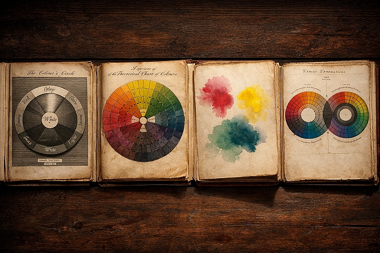
- Scientific Origin: The color wheel originated with Isaac Newton’s 1666 prism experiments, which proved white light contains a spectrum and led him to arrange these colors in a circle.
- Core Purpose: It provides a systematic visual model for understanding color relationships, organizing hues by how they are created and how they interact.
- Primary Models: Two main models exist: the additive (RGB) for light-emitting screens and the subtractive for pigments (RYB for artists, CMYK for print).
- Modern Evolution: The two-dimensional wheel has evolved into three-dimensional systems (like Munsell’s) and digital models (HSL, HSV) to better represent the full range of color perception.
- Universal Application: It is the basis for creating color harmonies (complementary, analogous, etc.) used universally across fine art, design, fashion, and digital interfaces.
More Than an Artist's Tool
The color wheel is often mistaken as a simple chart for painters. In reality, it is a conceptual map born from physics and refined through centuries of artistic and scientific inquiry. Its fundamental importance lies in providing a common language and a predictable system for color interaction, replacing subjective guesswork with reliable principles.
Before Newton, color was poorly understood. Prevailing theories, such as Aristotle’s, suggested colors arose from mixing light and dark. Newton’s experiments with a prism demonstrated that white light was composed of distinct spectral colors. By bending these colors into a circle, he created the first formal color diagram. This was not merely an illustration but a tool for predicting the results of mixing colored lights, establishing that color could be studied scientifically.
The real-world impact of this system is immense. It moved color from the realm of alchemy and inconsistent, often expensive, natural dyes to a domain of predictable mixing and reproduction. During the Industrial Revolution, standardized color wheels and charts became essential for manufacturing and commercial arts, allowing for color forecasting in advertising and fashion. Today, it underpins everything from a brand’s logo consistency to the user interface on your phone, ensuring visual communication is both effective and intentional.
The Mechanics of Color Order
At its simplest, a color wheel organizes hues (the pure color families) around a circle. The most common structure is based on three primary colors, which cannot be created by mixing other hues. From these, all other colors are derived.
The critical technical distinction lies in the medium of color:
Additive Color (Light): This model is based on mixing light, as with screens, projectors, or stage lighting. The primary colors are Red, Green, and Blue (RGB). When combined at full intensity, they create white light. The additive color wheel shows how mixing these colored lights produces secondary colors: cyan (green + blue), magenta (red + blue), and yellow (red + green). The center of an additive wheel is white.
Subtractive Color (Pigment): This model applies to physical surfaces that reflect light, such as paint, ink, or fabric. The classic artist's model uses Red, Yellow, and Blue (RYB) as primaries, which mix to create secondary colors: orange, green, and violet. The modern printing process uses a different subtractive primaries: Cyan, Magenta, Yellow, and Key (black) (CMYK), which can produce a wider gamut of printed colors. In subtractive mixing, combining all colors theoretically absorbs all light, resulting in black or a dark mud.
Beyond hue, the color wheel is a gateway to three essential dimensions of color:
- Hue: The base color itself (e.g., red, blue, yellow), represented on the outer ring of the wheel.
- Value: The lightness or darkness of a color, adjusted by adding white (tint), black (shade), or gray (tone).
- Saturation (or Chroma): The intensity or purity of a hue, ranging from vivid to dull.
While the basic wheel shows hue relationships, advanced systems like Albert Munsell’s (early 20th century) organize these three dimensions into a three-dimensional "color tree," providing a more complete and precise notation for color.
The Wheel in Professional Practice
1. Fine Art Painting
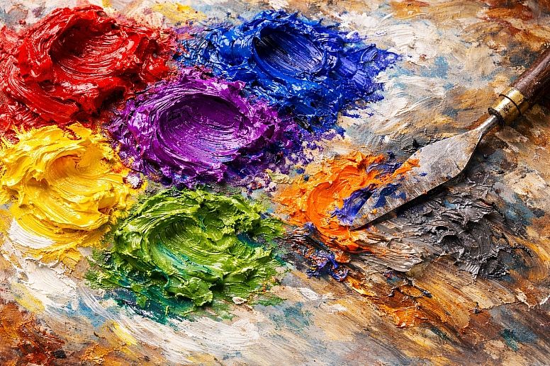
- Specific Constraints: Artists work with physical pigments that have varying opacity, tinting strength, and chemical properties. The RYB wheel provides a starting point, but pigment behavior often deviates from theoretical mixing.
- Common Mistakes: Relying solely on pre-mixed tube colors without understanding how to mix them; creating "muddy" colors by over-mixing complements without purpose.
- Practical Advice: Use the wheel to plan a limited palette. Select a primary triad (e.g., cadmium red, ultramarine blue, cadmium yellow) and learn to mix all secondaries and neutrals from them. Use complementary colors (opposites on the wheel) to mix dynamic shadows and neutralize intensity, rather than just using black.
2. Interior & Spatial Design

- Specific Constraints: Color perception is affected by fixed elements (lighting, room orientation, existing finishes), scale, and human psychology in a lived environment.
- Common Mistakes: Choosing colors from small swatches without testing in the space; ignoring the undertones of colors, leading to clashes; creating monotonous schemes without contrast.
- Practical Advice: Use analogous schemes (neighboring colors) for serenity and complementary schemes for energy. Apply the 60-30-10 rule: 60% dominant color (walls), 30% secondary (upholstery), 10% accent (art, pillows). Always observe large paint samples over several days in the room's natural and artificial light.
3. Branding & Graphic Design

- Specific Constraints: Colors must reproduce consistently across vastly different media (digital RGB screens vs. CMYK print) and evoke specific emotions aligned with brand identity.
- Common Mistakes: Using colors that are trendy but not distinctive or ownable; failing to check contrast ratios for accessibility; not defining a clear primary, secondary, and neutral color hierarchy.
- Practical Advice: Start with a primary brand color and use the wheel to find a complementary or split-complementary accent color for visual pop. Define a full palette with tints and shades for versatility. Always convert final RGB values to CMYK for print and verify web colors meet WCAG accessibility standards.
4. Digital UI/UX Design

- Specific Constraints: Design exists in the additive RGB space, must be legible on various screen qualities, and needs to guide user interaction intuitively.
- Common Mistakes: Overusing saturated colors, causing visual fatigue; poor contrast making text illegible; using color as the only indicator of meaning (problematic for color-blind users).
- Practical Advice: Use a tetradic or square scheme (four colors evenly spaced) to create a vibrant but balanced interface with clear functional zones. Establish a strict hierarchy: a primary action color, secondary informational colors, and neutral backgrounds. Use tools to simulate how palettes appear to users with color vision deficiencies.
5. Fashion & Textile Design
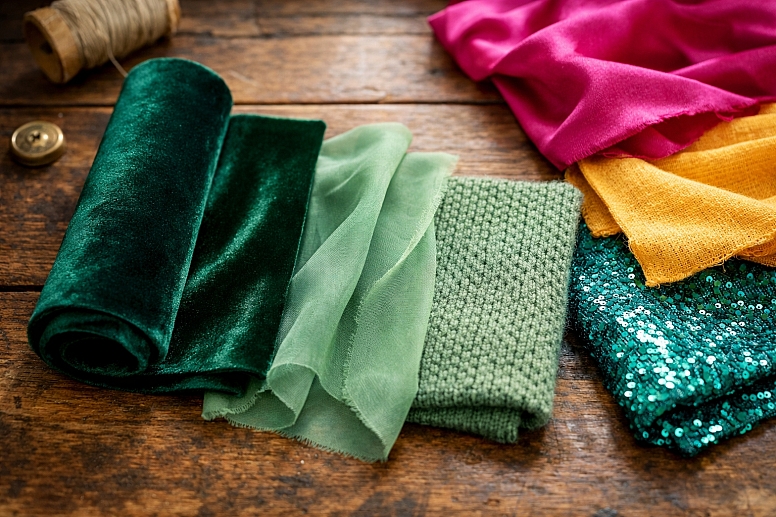
- Specific Constraints: Colors are subject to material dyes, seasonal trends, and the interplay of textures and light on fabric.
- Common Mistakes: Combining colors without considering their visual "weight" or context on the body; ignoring the psychological and cultural associations of colors for the target market.
- Practical Advice: Use monochromatic schemes (tints, tones, and shades of one hue) for sophisticated, elongating looks. Employ triadic schemes (three evenly spaced colors) for playful, dynamic collections. Always view color selections on the actual fabric (knit vs. woven) under different light sources.
Color Models Through History
The following table compares key historical and modern color systems, highlighting their primary contribution and limitations.
| System/Model (Date) | Creator/Origin | Key Contribution | Primary Use Context | Notable Limitation |
|---|---|---|---|---|
| Newton's Color Circle (1704) | Isaac Newton | First spectral arrangement in a circle; concept of complementary colors. | Scientific study of light. | Asymmetric, based on musical notes; no purples; black & white diagram. |
| RYB Color Wheel (18th Cent.) | Refined by artists & theorists | Standardized painter's primaries (Red, Yellow, Blue); intuitive for pigment mixing. | Traditional fine art and education. | Color gamut is limited; mixing rules are indicative, not perfectly predictive. |
| Munsell Color System (1905) | Albert H. Munsell | 3D model separating Hue, Value, and Chroma precisely; "color tree" structure. | Color science, standardization, and conservation. | Complex for casual use; not based on perceptual uniformity of later systems. |
| CMYK Color Model (20th Cent.) | Modern commercial printing | Subtractive primaries for full-color printing (Cyan, Magenta, Yellow, Black). | Commercial printing, packaging. | Color gamut differs from RGB screens, causing matching challenges. |
| RGB/HSL/HSV (20th Cent.) | Digital computing | Additive model for screens (RGB); user-friendly derivatives (Hue, Saturation, Lightness/Value). | Digital design, web, video. | Colors are device-dependent; they cannot be physically reproduced with pigments. |
| CIE 1931 & Lab (20th Cent.) | International Commission on Illumination | Mathematically defined color space based on human perception; device-independent. | Color management, advanced design, and scientific measurement. | Abstract and non-intuitive for direct artistic use. |
Expert-Level Considerations
Beyond basic harmonies, experienced practitioners account for several nuanced factors. Simultaneous contrast, a phenomenon where a color appears to shift based on its surrounding colors, means a gray will look warm on a blue background and cool on a red one. This makes choosing colors in isolation risky; they must always be evaluated in context.
The distinction between local color (the actual hue of an object) and perceived color (how it appears under specific light and next to other colors) is critical. A skilled painter or designer manipulates the latter, not the former. Furthermore, while the RYB wheel is taught universally, professional color matching—especially in manufacturing and digital design—relies on numerical color systems like Pantone, HEX, or Lab values to ensure absolute fidelity.
Finally, modern color theory acknowledges that color is not a purely visual phenomenon but a perceptual and cultural one. The "emotional weight" of a color and its symbolic meaning can vary dramatically across cultures, a consideration paramount in global design work.
Failure Modes & Common Misconceptions
A primary failure occurs when the wrong color model is applied to a medium—using RGB values for a printed brochure, for instance, will result in dull, inaccurate colors. Another common error is creating imbalance by using complementary colors at equal saturation and scale, which can be visually jarring rather than dynamic. Successful use often involves making one color dominant and its complement an accent.
Several persistent misconceptions surround the color wheel. One is that "primary colors" are universal. They are not: RYB are primaries for paint, RGB for light, and CMYK for ink. Another is that the wheel provides absolute mixing rules. Pigment chemistry means mixing a "perfect" red and blue may yield a muddy purple, not a vibrant violet. Finally, the idea that color meanings are fixed (e.g., red always means danger, blue always means calm) is a oversimplification that ignores cultural and contextual interpretation.
Selecting and Applying a Color System
Use this step-by-step method to choose and apply color logic for any project.
- Define the Medium and Output: Is the final output digital (RGB) or physical (CMYK/RYB)? This locks in your base color model. All decisions flow from this.
- Establish the Objective and Mood: What is the primary goal? To calm (analogous/neutral schemes), energize (complementary/triadic), or unify (monochromatic)? List 3-5 emotional or communicative goals.
- Select a Dominant Hue: Choose one key color that aligns with the mood and any brand or contextual requirements. This is your anchor.
- Apply a Harmony Rule: Use the wheel to generate a scheme. Common choices:
- For clarity and contrast: Complementary or split-complementary.
- For harmony and subtlety: Analogous.
- For rich complexity: Triadic or tetradic (use one color as dominant to avoid chaos).
- Expand into a Full Palette: Using your chosen hues, create a range of tints (add white), tones (add gray), and shades (add black). This provides versatility for backgrounds, text, highlights, and shadows.
- Test in Context and Iterate: View colors together at the correct scale and in the final environment. Check contrast for readability and adjust saturation/value until the relationship feels balanced.
- Specify Precisely: Convert your final selections into the appropriate numerical codes (HEX for web, Pantone for print, etc.) to ensure consistent reproduction.
Frequently Asked Questions
Did Isaac Newton invent the first color wheel? Yes. While others had studied color, Newton was the first to arrange the spectral colors discovered through his prism experiments into a circular diagram in his 1704 book Opticks. This is widely recognized as the origin point for the conceptual color wheel.
What is the difference between the RGB and RYB color wheels? RGB (Red, Green, Blue) is an additive model for mixing colored light, where all colors combine to make white. RYB (Red, Yellow, Blue) is a subtractive model for mixing pigments or paints, where all colors combine to approach black. They are different systems for different physical processes.
Why are there different versions of the color wheel? Different versions serve different purposes. The traditional RYB wheel is optimized for teaching artists' pigment mixing. The CMYK wheel is used for industrial printing. Modern digital wheels (HSL, HSV) are designed for intuitive use on computers. Each is a tool adapted for a specific medium and user need.
How is a modern color wheel used in digital design? Digital designers use color wheels within software to select hues and build harmonic palettes. They primarily work in RGB/HSL modes. The wheel helps create schemes for user interfaces, ensuring visual hierarchy, contrast, and mood. Advanced use involves checking accessibility contrast ratios and converting colors for different outputs.
Are color schemes from the wheel always effective? The schemes are reliable starting points for creating balance, but they are not infallible rules. Effectiveness depends on context, cultural interpretation, proportion, saturation, and application. Mastery involves knowing when to follow these guides and when to deviate from them for specific effects.
LEAVE A COMMENT
Recent Posts


0.0159