

The Role of Color in Creating Emotional Branding
Color is the most immediate sensory input a brand can provide. It functions as a non-verbal, pre-attentive trigger that activates memory, conditions emotion, and builds a lasting psychological association.
In emotional branding, color is not an aesthetic afterthought; it is a primary vector for encoding a brand's personality and values directly into the subconscious of the consumer, creating loyalty that transcends product features or price.
- Primary Function: Color is a direct conduit to the emotional brain, bypassing rational analysis.
- Core Mechanism: It builds associative memory by repeatedly pairing a specific color with a brand experience.
- Strategic Goal: To own a color so definitively that it becomes a shorthand for the brand's entire emotional promise.
- Measurable Outcome: A distinct, ownable brand identity that fosters recognition, preference, and attachment.
Color as the Foundation of Brand Memory and Feeling
A brand is an entity built in the mind of the consumer, composed of rational attributes and, more powerfully, emotional impressions. Color acts as the anchor for these impressions. The human brain processes color and form in different pathways; color perception is faster and more directly linked to the limbic system, which governs emotion and memory. This is why a consumer can recognize a Tiffany & Co. robin's egg blue box from across a room and immediately feel a sense of luxury and anticipation before reading a single word.
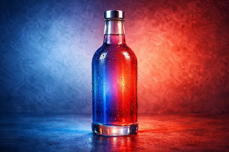
The strategic application of color in emotional branding is about classical conditioning. By consistently pairing a specific color or palette with positive experiences, quality service, or desirable outcomes, the color itself begins to evoke the intended emotion.
Coca-Cola's red doesn't just say "Coke"; through decades of consistent use in contexts of refreshment, social gathering, and celebration, it has come to evoke feelings of energy, familiarity, and shared happiness. This emotional equity is a defensible business asset. When a color is successfully emotionally branded, it creates a cognitive shortcut for decision-making, reducing the need for conscious evaluation and fostering instinctive preference.
The Psychological Architecture of Brand Color
The emotional power of a brand color is not random; it is built on a foundation of universal psychological principles, culturally shaped meanings, and deliberate sensory pairing.
1. Inherent Psychological Priming: All colors possess inherent, biologically influenced qualities that prime certain emotional states.
- Red: Increases heart rate and adrenaline. Primes feelings of excitement, urgency, and appetite. It demands immediate attention.
- Blue: Lowers heart rate and promotes calm. Primes feelings of trust, security, and dependability. It is the most commonly cited "favorite" color globally, associated with competence.
- Yellow: Stimulates mental activity and optimism. Primes feelings of cheerfulness, warmth, and caution (hence its use in warning signs).
- Green: Rests the eyes and is the easiest color for the retina to process. Primes feelings of balance, growth, and tranquility, with strong ties to nature and health.
These innate responses provide the raw emotional material from which a brand association is sculpted.
2. Cultural and Contextual Layering: Overlaying innate psychology is learned cultural meaning. A brand operating across borders must navigate this layer.
- White: In Western cultures, it signals purity, simplicity, and modernity (e.g., Apple). In many East Asian cultures, it is traditionally associated with mourning.
- Purple: Historically, the color of royalty due to the rarity of dye, it retains connotations of luxury, wisdom, and creativity across many cultures.
- Black: Communicates sophistication, power, and luxury (e.g., Chanel), but can also signify mourning or the avant-garde.
The most powerful emotional brands either leverage a nearly universal positive association (like blue for trust) or, through sheer consistency and quality, redefine a color's meaning within their category.
3. Sensory Branding and Synesthetic Pairing: Advanced emotional branding integrates color with other senses to create a richer, more memorable impression.
- Tiffany & Co.: The specific robin's egg blue (sight) is paired with the tactile experience of a white ribbon and the distinct sound of the box opening.
- Cadbury: Its patented Pantone 2685C purple (sight) is inextricably linked to the creamy taste and texture of its Dairy Milk chocolate (taste/touch).
This multi-sensory integration creates a stronger, more resilient memory trace, making the brand harder to imitate and the emotional connection more profound.
Five Archetypes of Emotional Branding Through Color
1. The Trust & Security Anchor (Financial, Healthcare, Technology)
- Emotional Goal: To alleviate anxiety and build unwavering confidence.
- Color Strategy: Dominant use of blue, often in deep, stable shades (navy, cobalt). Frequently paired with clean, crisp white and supporting grays.
- Mechanism: Leverages blue's universal association with competence, calmness, and dependability. The lack of overly emotional or trendy colors reinforces steadiness.
- Example: IBM ("Big Blue"). Its long-standing use of deep blue codes for intelligence, trustworthiness, and corporate stability, essential for a company selling complex business solutions.
2. The Joy & Optimism Engine (Food & Beverage, Toys, Entertainment)
- Emotional Goal: To evoke feelings of happiness, fun, and positive energy.
- Color Strategy: Use of warm, high-energy colors like red, orange, and bright yellow. Often employs high saturation and contrast.
- Mechanism: Taps into red's ability to stimulate appetite and excitement and yellow's association with cheer. Creates a sense of immediate, accessible pleasure.
- Example: McDonald's. The iconic red and yellow combination is scientifically tailored: red triggers excitement and urgency (encouraging quick decisions), while yellow evokes cheer and friendliness. It creates a consistent emotional signature of fast, happy consumption.
3. The Natural Harmony & Wellness Advocate (Organic, Beauty, Outdoor)
- Emotional Goal: To convey authenticity, balance, and holistic well-being.
- Color Strategy: Earth tones (browns, greens, tans), organic greens, soft blues, and muted, natural hues. Avoids synthetic-looking brights.
- Mechanism: Uses colors directly found in nature to signal purity, sustainability, and a return to essentials. Green, in particular, is associated with health, growth, and tranquility.
- Example: The Body Shop. Its use of deep green communicates a direct, honest connection to nature, reinforcing its brand values of ethical sourcing and environmental activism, creating an emotional bond with conscious consumers.
4. The Luxury & Exclusivity Signal (High-End Fashion, Automotive, Jewelry)
- Emotional Goal: To inspire desire, signify status, and create a sense of refined sophistication.
- Color Strategy: Neutral foundations (black, white, charcoal, cream) accented with deep, rich colors (burgundy, navy) or metallics (gold, silver). Palettes are often restrained and monochromatic.
- Mechanism: Black and white convey timelessness, elegance, and clarity. The scarcity of color itself becomes a marker of exclusivity. Metallic accents directly reference precious materials and craftsmanship.
- Example: Chanel. The stark, high-contrast black and white is the foundation of its identity, representing classic, revolutionary elegance. It feels both timeless and modern, creating an emotional aura of aspirational sophistication.
5. The Innovation & Future Focus (Tech Startups, Renewable Energy, Aerospace)
- Emotional Goal: To communicate cutting-edge capability, intelligence, and a visionary mindset.
- Color Strategy: Often uses blue as a trust base but introduces unexpected, vibrant accents (electric blue, magenta, bright cyan) or full-spectrum gradients.
- Mechanism: Combines the trust of blue with accents that break convention, signaling creativity and forward motion. Gradients symbolize fluidity, data flow, and limitless potential.
- Example: Adobe. Its shift from a solid red logo to the vibrant, gradient "A" symbolizes creativity in motion. The spectrum of color reflects the full range of creative tools and possibilities, emotionally positioning the brand at the dynamic center of the digital creative world.
A Comparative Analysis of Emotional Color Archetypes
| Archetype | Primary Emotion | Dominant Colors | Color Psychology in Action | Example Brand Logic |
|---|---|---|---|---|
| Trust & Security | Confidence, Calm, Reliability | Blues, Whites, Grays | Blue lowers physiological arousal, promoting a sense of safety and rational trust. | PayPal: Blue signals security for financial transactions. Samsung: Deep blue communicates reliable, high-tech innovation. |
| Joy & Optimism | Happiness, Energy, Excitement | Reds, Oranges, Yellows | Warm colors stimulate and excite, triggering impulsive, positive reactions. | Netflix: Bold red is dramatic and captivating, promising entertainment. Fanta: Orange is playful, fun, and directly associated with its flavor. |
| Natural Harmony | Peace, Authenticity, Growth | Greens, Browns, Earth Tones | Earth colors ground the brand in nature, evoking honesty, stability, and wellness. | John Deere: Green and yellow firmly root the brand in agriculture and growth. Aveda: Earthy tones and green communicate plant-based, holistic beauty. |
| Luxury & Exclusivity | Desire, Sophistication, Status | Blacks, Whites, Neutrals, Metallics | Absence of color signals refinement; neutrals feel timeless and considered. | Mercedes-Benz: Silver/Black conveys engineering prestige and luxury. Tiffany & Co.: The specific blue becomes the feeling of exclusive luxury. |
| Innovation & Future | Curiosity, Intelligence, Vision | Blue + Vibrancy, Gradients | Stable blue provides trust; vibrant accents shatter expectations, signaling new frontiers. | IBM: Deep blue for trust, with a vibrant 8-bar logo for modern, cognitive solutions. Spotify: Acid green on black feels digital, energetic, and personalized. |
Advanced Considerations for Building Emotional Equity
For experts, emotional branding with color involves managing perception over time and across touchpoints. Color Consistency is non-negotiable; any deviation in shade or application dilutes the conditioned response. This requires stringent brand guidelines governing color across all media, from digital RGB to physical Pantone matches.
Cultural Calibration for Global Brands is a complex layer. A brand like Coca-Cola maintains its core red globally but may adjust secondary colors in marketing campaigns to align with local cultural celebrations and emotions without compromising its primary equity.
Furthermore, owning a color category is the pinnacle of emotional branding. When a brand successfully "owns" a color (e.g., Tiffany Blue, UPS Brown, Cadbury Purple), it achieves a powerful market monopoly on that emotional space. This is defended legally (through trademark) and experientially (through relentless consistency), making it exceptionally difficult for competitors to encroach.
Common Pitfalls and Misconceptions
Misconception: "We can pick our brand colors based on the founder's preference." This is the most common strategic error. Personal preference is irrelevant if it does not align with the emotional needs of the target audience and the competitive landscape of the industry. The choice must be strategic, not personal.
Pitfall: Following Color Trends at the Expense of Brand Essence. While refreshing accents can be trend-informed, the core emotional color palette should be timeless. A bank that rebrands with a trendy pastel color may look modern for a season but will lack the enduring, stable feeling required for long-term trust.
Misconception: "Our logo color is our brand color." The emotional work is done by the systematic application of the color across every customer touchpoint: website, product, packaging, retail environment, uniforms, and advertising. The logo is simply the most concentrated symbol of this broader system.
Pitfall: Neglecting the Competitive Color Landscape. Choosing a color without analyzing competitors can lead to blending in. If every fintech uses blue, a new brand must consider how to use blue differently (a unique shade, a bold application) or whether a strategically different color (like a trustworthy green) could carve out a distinct emotional position.
A Method for Developing an Emotionally Resonant Color Strategy
- Define the Core Brand Emotion. Articulate the single, primary feeling you want consumers to associate with your brand (e.g., "empowered," "tranquil," "inspired"). This is the non-negotiable goal.
- Audit the Competitive Emotional Landscape. Map key competitors by their dominant color and the emotion it projects. Identify gaps or over-saturated emotional positions.
- Anchor with a Primary Emotional Color. Based on psychological principles and the competitive gap, select a primary hue that directly evokes your core emotion. Validate that it has no severe negative connotations in key markets.
- Build a Supporting Palette for Nuance. Choose secondary and accent colors that modify or enhance the primary emotion (e.g., a tranquil blue primary supported by a soft, growth-oriented green accent for a wellness brand).
- Create a Comprehensive Application Blueprint. Document exactly how the palette is used to engineer experiences: "Primary Blue is used for interactive elements to build trust in the journey; Accent Green highlights positive outcomes and success states."
- Implement with Monolithic Consistency. Apply the system across all brand assets. Enforce color matching rigorously to build a consistent, conditioned response.
- Measure Emotional Resonance. Use brand tracking surveys to measure associations over time. Ask questions like: "What three words come to mind when you see this color?" and "How does this brand make you feel?"
Questions on Color in Emotional Branding
Can a brand change its emotional color successfully? Yes, but it is a high-risk, high-reward endeavor that must be managed as a strategic migration, not a sudden switch. It requires a clear rationale (e.g., modernizing, reaching a new audience) and a substantial communications effort to re-associate the new color with the brand's core values. Example: Mastercard's evolution to a simpler, gradient-interlocked circles logo retained its red and yellow heritage while feeling more digital and connected.
How many colors should be in an emotional brand palette? An effective system needs range but not complexity. A typical structure includes: 1 Primary Emotional Color, 1-2 Secondary Support Colors, 1-2 Accent Colors for highlights, and a suite of 3-4 Neutrals (black, white, grays, beige). This provides enough tools for expressive storytelling without diluting the core emotional signal.
Is it better to be culturally neutral or culturally specific with color? It depends on brand ambition. A global mass-market brand (e.g., Coca-Cola) will choose a color with broad, positive resonance (red). A brand rooted in a specific cultural tradition (e.g., a Chinese tea company) might deliberately use culturally specific colors (red, gold) to communicate authenticity and heritage to its core audience. The strategy must match the brand's origin story and growth plans.
How does color emotional branding work in a digital, saturated market? In digital spaces, cut-through is paramount. This often means higher saturation or bold contrast to capture scrolling attention, but the underlying emotional principle remains. A fintech app must still use its colors to build trust first; the vibrancy is applied to accents and interactions to create a feeling of smart, effortless control rather than sterile bureaucracy.
LEAVE A COMMENT
Recent Posts


0.037