
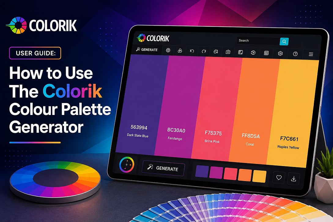
User Guide: How to Use The Colorik Colour Palette Generator
This guide will teach you exactly how to use the Colorik Colour Palette Generator, from your first visit to creating and exporting a professional colour scheme. We'll cover every button, shortcut, and control, so you can work efficiently and confidently.
Getting Started with Colorik
To begin, navigate to the Colorik colour palette generation tool. When the page opens, you'll see your first colour palette immediately; no action is required. By default, Colorik presents a palette containing 5 colours, each displayed as a large, coloured tile. This is your starting point for any project.
The Colorik color palette generator is available in both Light Mode and Dark Mode; both are completely free to use. You can switch between them at any time to suit your preference or working environment.
Understanding the Colour Palette Generator
The main area of the page displays your current palette as a row of colour swatches. Each swatch shows a dominant colour. Below or within each swatch, you'll find its hexadecimal colour code (e.g., #92959e). This is the primary value you'll use for copying and applying colours in your design work.
Changing the Number of Colours
You can adjust the palette size by adding or removing individual colours:
- To add a colour: Click the plus (+) icon that appears between existing colour swatches. This inserts a new colour at that position in the palette.
- To delete a colour: Click the X (close/delete) button on an individual colour swatch. This removes that specific colour from the palette.
- Default: The palette starts with 5 colours.
- Maximum: Colorik supports up to 10 colours in a single palette.
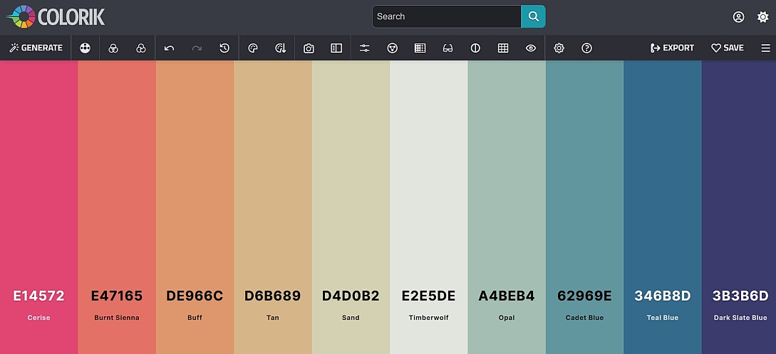
This approach gives you precise control over the palette composition, letting you insert colours exactly where you want them and remove specific colours without affecting the rest of the palette.
Top Toolbar Overview
The top toolbar contains the main controls for generating and managing palettes.

From left to right:
- 1. Generate: Generates a new palette based on your selected method.
- 2. Generation Methods: Opens a menu to select a colour scheme rule.
- 3. Mix Locked Colours: Generates new colours by blending your locked colours with other colours in the palette.
- 4. Generate App Theme: Creates a complete app theme from your locked colours, including colours for success, warning, danger, and other UI states.
- 5. Undo: Reverses the last action.
- 6. Redo: Re-applies an action that was undone.
- 7. Palette History: Opens a list of your previously generated palettes.
- 8. View Palette: Opens the Quick View panel to see and copy colour values in multiple formats.
- 9. Sort Colors: Reorders the colours in your palette according to different criteria.
- 10. Pick Colors from Image: Extracts a colour palette from an uploaded image.
- 11. Make a Collage: Creates a visual collage of your colour palette with your chosen image.
- 12. Adjust Palette: Opens sliders to fine-tune the entire palette's Hue, Saturation, Brightness, and Temperature.
- 13. Color Wheel: Opens an interactive colour wheel for editing individual colours with a lightness slider and draggable colour picker circles.
- 14. Gradient Builder: Creates CSS gradients from your palette colours with angle controls, live previews, and export options.
- 15. Color Blindness: Shows before and after previews of your palette for different types of colour vision deficiency.
- 16. Contrast Checker: Checks the contrast ratio for each colour in your palette.
- 17. Palette Variations: Generates alternative versions of your palette in different styles and moods.
- 18. Visualizer: Previews your palette in real-world design contexts including UI/Web, Illustration, Branding, and Typography.
- 19. Color Blending Settings: Controls how colours mix when generating gradients or adding new colours.
- 20. Help: Opens a quick guide and keyboard shortcuts reference.
Generating New Colour Palettes
This is the core function of Colorik. There are two primary ways to generate a completely new colour combination:
- On-screen control: Click the Generate icon (the first icon from the left on the top toolbar).
- Keyboard shortcut: Press the Space bar on your keyboard. This is the fastest way to cycle through palettes.
Generation Methods
The second icon from the left on the top toolbar opens the Generation Methods menu. This allows you to generate palettes based on specific colour relationships rather than random combinations.
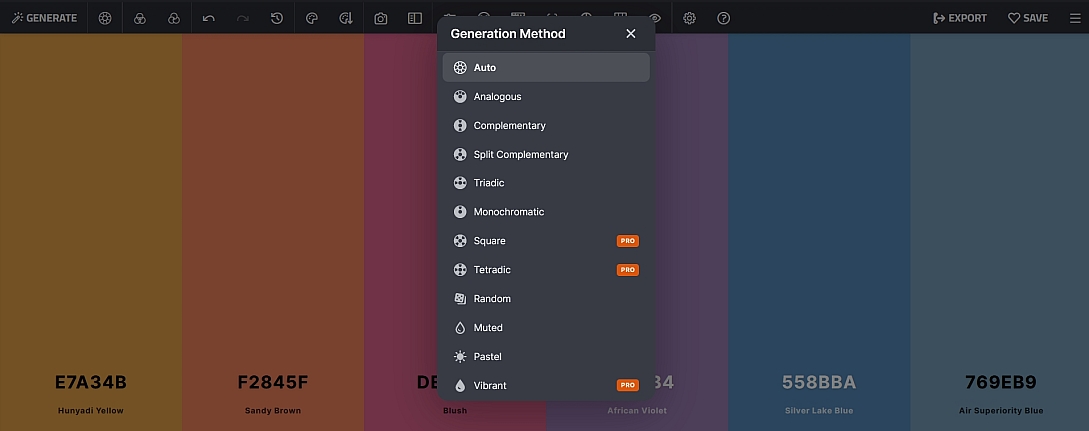
Select a method to generate a new palette following that colour scheme:
Standard Methods (Free)
- Auto: The default method. Colorik automatically selects the most suitable colour relationship based on the current palette and locked colours.
- Analogous: Creates a palette using colours that are adjacent to each other on the colour wheel. Produces harmonious, low-contrast schemes often found in nature.
- Complementary: Generates a palette based on colours opposite each other on the colour wheel. Creates high-contrast, vibrant combinations.
- Split Complementary: Uses a base colour plus the two colours adjacent to its complementary colour. Offers strong contrast with more variety than a simple complementary scheme.
- Triadic: Creates a palette using three colours evenly spaced around the colour wheel. Produces balanced, vibrant schemes with good contrast.
- Monochromatic: Generates a palette using variations in lightness and saturation of a single hue. Creates clean, cohesive schemes.
- Random: Generates a completely random palette with no specific colour relationship.
- Muted: Creates a palette of desaturated, subdued colours. Ideal for sophisticated, understated designs.
- Pastel: Creates a palette of soft, light, and delicate colours. Ideal for gentle, calming designs, children's products, or spring-themed projects.
Pro Methods (Requires Subscription)
- Square PRO: Creates a palette using four colours evenly spaced around the colour wheel (90° apart). Offers balanced variety with multiple contrasting points.
- Tetradic PRO: Generates a double-complementary scheme using two complementary colour pairs. Provides wide variety and strong contrast.
- Vibrant PRO: Generates a palette of highly saturated, intense colours. Perfect for bold, energetic designs.
After selecting a generation method, press the Generate button or Space bar to apply it. The method will remain active until you select a different one or switch back to Auto.
Mix Locked Colours
The third icon on the top toolbar is Mix Locked Colours. When you have one or more colours locked in your palette, clicking this icon generates new colours by blending your locked colours with other colours in the palette. This is useful for:
- Creating harmonious variations of a brand colour
- Exploring subtle shifts in tone while keeping a core colour fixed
- Generating additional colours that complement your locked choices
The keyboard shortcut for Mix Locked Colours is 0 (zero).
Generate App Theme
The fourth icon on the top toolbar is Generate App Theme. When you have colours locked in your palette, clicking this icon generates a complete application theme based on your locked colours.
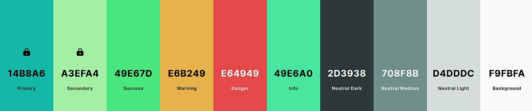
The theme includes:
- Primary: The main brand or accent colour used for key UI elements such as buttons, links, and active states.
- Secondary: A supporting colour used for less prominent UI elements, backgrounds, or accents.
- Success: A colour for positive feedback and confirmations.
- Warning: A colour for cautions and alerts.
- Danger: A colour for errors and destructive actions.
- Info: A colour for informational messages.
- Neutral Dark: A dark neutral colour for text, headings, and dark UI elements.
- Neutral Medium: A mid-tone neutral for secondary text, borders, and dividers.
- Neutral Light: A light neutral for backgrounds, cards, and subtle UI elements.
- Background: Suitable background colours for your application.
This feature saves significant time when designing user interfaces, as it automatically derives a complete, cohesive colour system from your core palette colours.
Undo and Redo
The fifth and sixth icons on the top toolbar are simple Undo and Redo arrows:
- Undo: Reverses your last action. Use this if you accidentally delete a colour, change a value, or make any other change you want to revert.
- Redo: Re-applies an action that you previously undid. This allows you to step forward again if you change your mind.
The keyboard shortcuts are Ctrl + Z for Undo and Ctrl + Y for Redo.
Palette History
The seventh icon on the top toolbar is Palette History. Click this to view a list of your previously generated palettes. You can click any palette in the history to restore it as your current palette, making it easy to revisit a scheme you liked.
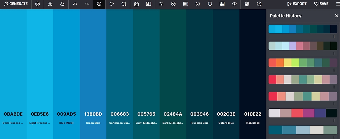
This is particularly useful when:
- You generated a palette you liked but accidentally changed it
- You want to compare several different schemes side by side
- You need to return to an earlier version of your palette
View Palette (Quick View Panel)
The eighth icon on the top toolbar is View Palette. This opens the Quick View panel, which displays comprehensive colour information for each colour in your palette, with a copy icon for each value.
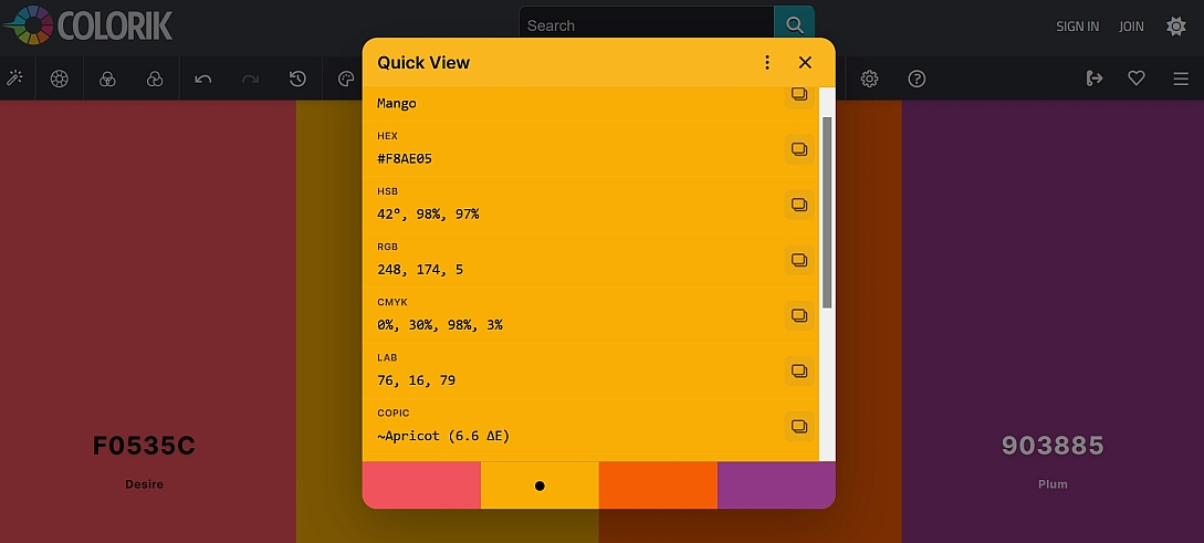
By clicking on a colour name within the Quick View panel (e.g., "Raisin Black"), you can change the display format. The available formats are:
- Name: The colour name
- Hex: Hexadecimal value (e.g., #2C1F2D)
- RGB: Red, Green, Blue values (e.g., 44, 31, 45)
- HSL: Hue, Saturation, Lightness values
- HSB: Hue, Saturation, Brightness values (e.g., 296°, 31%, 18%)
- CMYK: Cyan, Magenta, Yellow, Key values (e.g., 2%, 31%, 0%, 82%)
- LAB: Lightness, A, B values (e.g., 14, 9, -7)
Clicking the format name cycles through these options, allowing you to view and copy the colour in your preferred format. Each value has its own copy icon for easy copying to your clipboard.
The Quick View panel also displays closest colour matches from popular colour systems, including:
- COPIC: Closest Copic marker match (e.g., ~Aubergine (10.2 ΔE))
- PRISMACOLOR: Closest Prismacolor pencil match (e.g., ~PC213 (7.6 ΔE))
- PANTONE: Closest Pantone match (e.g., ~EVENING-BLUE (6.8 ΔE))
- RAL: Closest RAL colour match (e.g., ~RAL 5011 Steel blue (3.3 ΔE))
- HKS: Closest HKS colour matches (e.g., ~HKS 35 K (31 ΔE) / ~HKS 35 N (31 ΔE))
Sort Colors
The ninth icon on the top toolbar is Sort Colors. Clicking this opens a menu that lets you reorder the colours in your palette according to different criteria. This is useful for organising your palette in a logical sequence for presentations, gradients, or specific design applications.
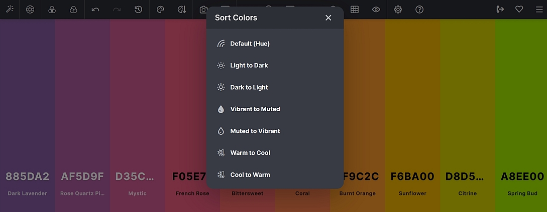
The available sort options are:
- Default (Hue): Arranges colours by their position on the colour wheel. This is the standard order and often the most visually balanced.
- Light to Dark: Orders colours from the lightest to the darkest. Useful for creating smooth gradient progressions or when you need to see the range of lightness in your palette.
- Dark to Light: Orders colours from the darkest to the lightest. The reverse of Light to Dark.
- Vibrant to Muted: Arranges colours from the most saturated to the least saturated. Helpful when you want to see the intensity range of your palette.
- Muted to Vibrant: Orders colours from the least saturated to the most saturated. The reverse of Vibrant to Muted.
- Warm to Cool: Arranges colours from warm hues (reds, oranges, yellows) to cool hues (blues, purples, greens). Useful for creating temperature-based gradients.
- Cool to Warm: Orders colours from cool hues to warm hues. The reverse of Warm to Cool.
Each sort option reorders your palette instantly, allowing you to find the arrangement that best suits your project. The sort shortcuts are also available via keyboard:
- L: Sort by Lightness
- H: Sort by Hue
- S: Sort by Saturation
- P: Sort by Temperature
Pick Colors from Image
The tenth icon on the top toolbar is Pick Colors from Image. This tool allows you to extract a colour palette directly from any image. It is particularly useful when you have a reference image, photograph, or existing design asset and want to build a colour scheme from it.
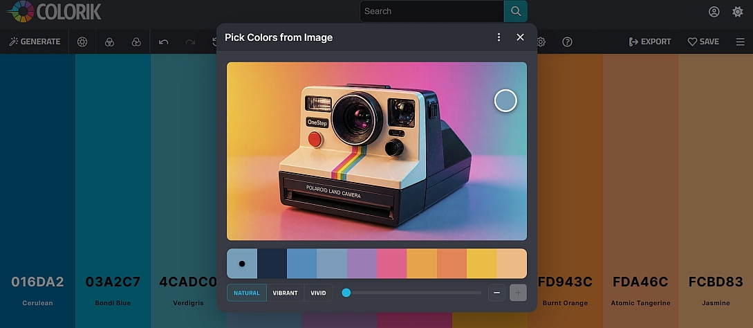
To use this feature:
- Click the Pick Colors from Image icon (tenth from the left on the toolbar).
- In the panel that opens, drag and drop an image into the designated area, or click "browse" to select an image file from your computer.
- Colorik will automatically analyse the image and generate a 10-colour palette preview.
- The extracted palette is displayed with several options to refine the results:
- Natural: Generates a palette that closely matches the original colours of the image.
- Vivid: Creates a more saturated, vibrant version of the extracted palette.
- Vibrant: Similar to Vivid, offering a lively, intensified colour set.
- You can fine-tune the extraction using:
- Slider: Drag the slider to select a different variation of colours from the image. This lets you explore alternative extractions from the same image.
- Magnifying colour picker circles: Drag these circles manually over the image to pick specific colours from precise locations. Each circle represents one colour in the extracted palette, and dragging it to a different area of the image updates that colour in real-time.
- Once you're happy with the extracted palette, click the three dots to open options, then choose to either open the palette in the generator or export it.
This feature is invaluable for:
- Creating brand palettes from existing logos or marketing materials
- Building colour schemes inspired by photographs, nature, or art
- Quickly generating a palette from a client's reference image
Make a Collage
The eleventh icon on the top toolbar is Make a Collage. This feature creates a visually appealing collage that combines your chosen image with your colour palette, perfect for presentations, social media posts, or sharing with clients.
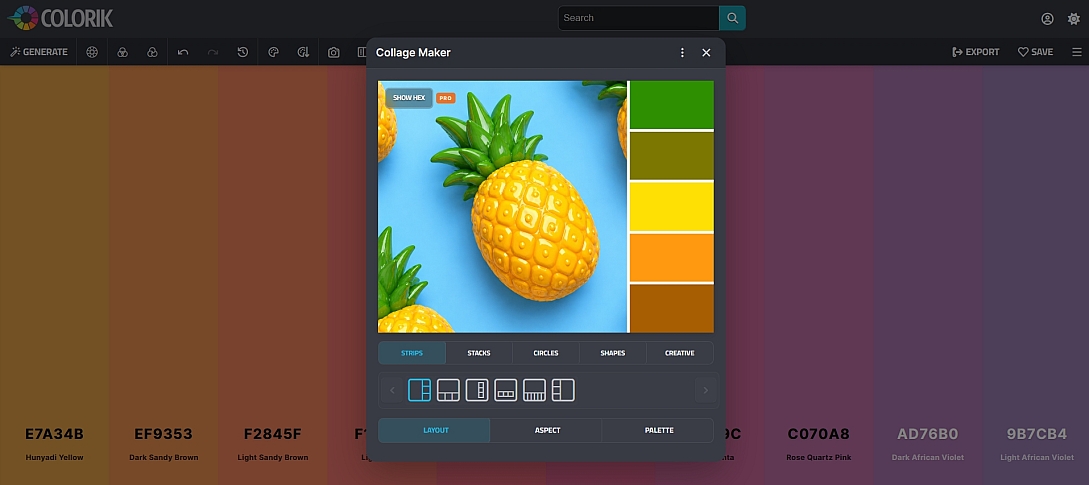
To use this feature:
- Click the Make a Collage icon (eleventh from the left on the toolbar).
- In the panel that opens, drag and drop an image into the designated area, or click "browse" to select an image file from your computer.
- Colorik will generate a collage featuring your image alongside the colours from your current palette.
- You can customise your collage using the following options:
- Layout options: Choose from a variety of arrangements including:
- Strips: Horizontal or vertical colour bands
- Stacks: Layered colour blocks
- Circles: Circular colour swatches
- Shapes: Various geometric arrangements
- Creative layouts: Artistic and dynamic compositions
- Aspect ratios: Select from different dimensions to suit your needs, including:
- Square (1:1): Ideal for Instagram, profile pictures, and social media posts
- Portrait (4:5): Perfect for Pinterest, Instagram Stories, and mobile content
- Landscape (16:9): Great for YouTube thumbnails, Twitter headers, and presentations
- Horizontal (3:2): Standard for photography and print
- Additional ratios: For various social media and design requirements
- Palette options: Choose between Natural, Vivid, and Vibrant versions of your palette to affect how colours appear in the collage.
- Slider: Drag the slider to select a different variation of colours from the image for the collage.
- Magnifying colour picker circles: Drag these circles manually over the image to pick specific colours from precise locations, updating the collage in real-time.
- Layout options: Choose from a variety of arrangements including:
- Once you're happy with the collage design, you can download it as a .png image file or copy it directly to the clipboard.
This feature is perfect for:
- Creating mood boards and inspiration boards
- Presenting colour palettes to clients in a visual format
- Sharing colour schemes on social media platforms
- Building visual content for branding and marketing materials
- Creating portfolio pieces that showcase your colour choices alongside reference imagery
Adjust Palette
The twelfth icon on the top toolbar is Adjust Palette. This opens a panel containing four sliders that let you fine-tune your entire palette globally:
- Hue: Shifts all colours around the colour wheel. Drag left or right to rotate the hue of every colour in your palette simultaneously.
- Saturation: Controls the intensity of all colours. Drag left to desaturate (make more muted) or right to saturate (make more vivid).
- Brightness: Adjusts the lightness or darkness of all colours. Drag left to darken or right to lighten the entire palette.
- Temperature: Shifts the overall warmth or coolness of the palette. Drag left for cooler tones (more blue) or right for warmer tones (more orange).
A key feature of the Adjust Palette panel is the before and after preview. As you drag any slider, you'll see a live split comparison showing your original palette alongside the adjusted version. This allows you to see exactly how your changes affect the colours before committing to them.
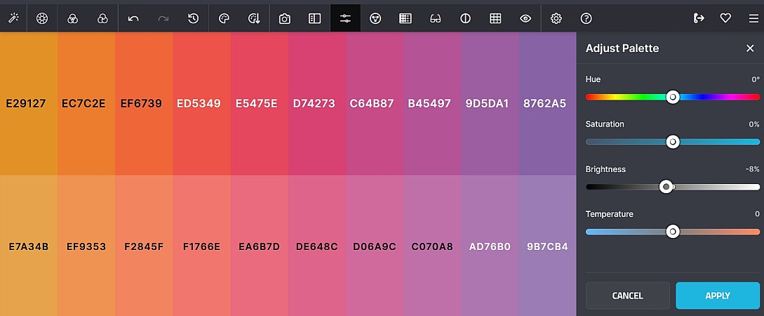
This feature is useful when:
- You have a palette that's almost right but needs a slight tonal shift
- You want to explore variations of a colour scheme without generating entirely new palettes
- You need to adjust a palette to match specific brand guidelines or seasonal moods
- You want to see how your palette would look with different saturation or brightness levels
Once you're happy with the adjustments, click Apply to update your palette, or use the Reset button to return all sliders to their default positions.
Color Wheel
The thirteenth icon on the top toolbar is the Color Wheel. This opens an interactive colour wheel that provides precise control over individual colours in your palette.
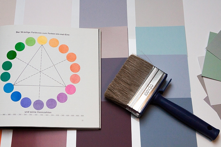
To use this feature:
- Click the Color Wheel icon (thirteenth from the left on the toolbar).
- The panel opens, showing a full colour wheel with draggable colour picker circles representing each colour in your palette.
- You can interact with the colour wheel in the following ways:
- Drag a colour picker circle: Click and drag any of the coloured circles on the wheel to change that colour's Hue and Saturation. The circle moves to your chosen position on the wheel, and the corresponding colour in your palette updates in real-time.
- Lightness slider: A slider beneath the colour wheel lets you adjust the lightness (brightness) of the currently selected colour. Drag the slider up to lighten or down to darken the colour.
- As you make adjustments, you'll see the colour swatches in your palette update immediately, giving you instant visual feedback.
- To select which colour to edit, simply click on its colour picker circle on the wheel, or click directly on the colour swatch in your palette.
- Once you're happy with your adjustments, you can close the panel, and your changes will be saved.
This feature is particularly useful when you need precise control over individual colours in your palette: far more precise than using the Adjust Palette sliders, which affect the entire palette globally. Use the Color Wheel when:
- You want to fine-tune a specific colour to match an exact brand shade
- You need to adjust the saturation or hue of just one colour without affecting others
- You want to visually explore colour variations using the interactive wheel
Gradient Builder
The fourteenth icon on the top toolbar is the Gradient Builder. This feature creates CSS gradients from your palette colours, with extensive controls for angle, live previews, and export options. It's perfect for web designers, UI developers, and anyone who needs gradient code for their projects.
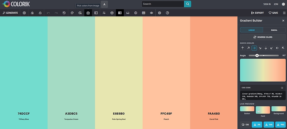
To use this feature:
- Click the Gradient Builder icon (fourteenth from the left on the toolbar).
- The panel opens, showing a gradient preview generated from your current palette colours.
- You can control the gradient using the following options:
- Reverse Colours button: Click this button to reverse the order of colours in the gradient. This instantly flips the direction of the colour transition.
- 8 Quick Angle buttons: These preset buttons provide instant angle selection for common gradient directions:
- 0° (horizontal left-to-right)
- 45° (diagonal bottom-left to top-right)
- 90° (vertical bottom-to-top)
- 135° (diagonal bottom-right to top-left)
- 180° (horizontal right-to-left)
- 225° (diagonal top-right to bottom-left)
- 270° (vertical top-to-bottom)
- 315° (diagonal top-left to bottom-right)
- Angle slider: For more specific angle requirements, drag the slider to set any angle between 0° and 360°. This gives you precise control beyond the preset quick angles.
- The gradient updates in real-time as you adjust the angle or reverse the colours.
- The panel displays the generated CSS code in a code box. Click the copy icon next to the code to copy it to your clipboard for use in your projects.
- Live Previews: The Gradient Builder shows three live previews of how your gradient will look in real-world applications:
- Button: Preview of the gradient applied to a button element
- Card: Preview of the gradient applied to a card/container element
- Background: Preview of the gradient as a full background
- CSS Copy Button: A simple CSS copy button is also available for quickly copying the CSS code without opening the code box.
- Export Options: Download your gradient as an image file:
- JPG: Free download, suitable for most use cases
- SVG: PRO feature, ideal for scalable vector graphics
- PNG: PRO feature, best for high-quality transparent backgrounds
This feature is invaluable for:
- Web developers needing CSS gradient code for buttons, headers, or backgrounds
- UI designers creating gradient-based interface elements
- Exporting gradient images for use in design software, presentations, or social media
- Quickly generating gradient variations from your existing colour palette
Color Blindness
The fifteenth icon on the top toolbar is the Color Blindness simulator. This feature shows you how your colour palette will appear to people with different types of colour vision deficiency. It's an essential tool for designers who want to create accessible and inclusive designs.
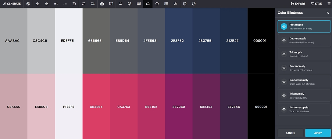
To use this feature:
- Click the Color Blindness icon (fifteenth from the left on the toolbar).
- The panel opens, showing your current palette alongside a preview of how it appears with different types of colour blindness.
- You can view your palette through the following types of colour vision deficiency:
- Protanopia: Red-blind: complete absence of red retinal photoreceptors. Reds appear darker and shift toward greens.
- Deuteranopia: Green-blind: complete absence of green retinal photoreceptors. Greens appear darker and shift toward reds.
- Tritanopia: Blue-blind: complete absence of blue retinal photoreceptors. Blues appear darker and shift toward greens and yellows.
- Protanomaly: Red-weak: reduced sensitivity to red light. Reds appear less vibrant and shift toward greens.
- Deuteranomaly: Green-weak: reduced sensitivity to green light. The most common form of colour blindness. Greens appear less vibrant.
- Tritanomaly: Blue-weak: reduced sensitivity to blue light. Blues appear less vibrant and shift toward greens.
- Achromatopsia: Complete colour blindness: no colour perception, seeing only in shades of grey.
- A key feature of this panel is the before and after preview. Your original palette is shown alongside the simulated version for each type, allowing you to see exactly how the colours are affected.
- As you click through each type, the preview updates instantly to show you the simulated view.
This feature is essential when:
- Designing websites, apps, or interfaces that need to be accessible to all users
- Creating colour-coded information (charts, graphs, maps) that must be readable by colour-blind users
- Ensuring brand colours maintain their intended effect across different visual abilities
- Testing colour combinations for contrast and distinction when viewed through different colour blindness filters
If you notice that colours in your palette become indistinguishable under a certain type of colour blindness, consider adjusting your palette to include more contrast or using additional visual cues (icons, patterns, text labels) to convey information.
Contrast Checker
The sixteenth icon on the top toolbar is the Contrast Checker. This tool checks the contrast ratio of each colour in your palette against both white and black text, helping you ensure your colour combinations are accessible and readable.
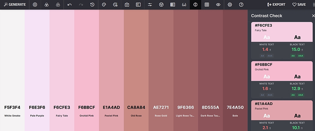
To use this feature:
- Click the Contrast Checker icon (sixteenth from the left on the toolbar).
- The panel opens, displaying each colour from your palette alongside its contrast information.
- For each colour, the Contrast Checker shows:
- White Text: The contrast ratio of the colour against white text, with a pass/fail indicator.
- Black Text: The contrast ratio of the colour against black text, with a pass/fail indicator.
- Each colour displays its hex value and colour name (e.g., #2E3134: Onyx).
- Contrast ratios are displayed numerically (e.g., 13.1:1) with an accessibility rating (AA, AAA, or Fail).
- The panel provides a legend in red, amber, and green for interpreting the results:
- AA (>=4.5): Meets the Web Content Accessibility Guidelines (WCAG) AA standard for normal text. This is the minimum recommended level for accessibility.
- AA (>=3.0): Meets the WCAG AA standard for large text (18pt or 14pt bold).
- AAA (>=7.0): Meets the WCAG AAA standard for enhanced accessibility. This is the highest level of contrast compliance.
- Fail (<3.0): Does not meet minimum accessibility standards. Colours with this rating should be avoided for text and important interface elements.
Example results from a typical palette:
- Onyx (#2E3134): White Text: 13.1:1 (AA) / Black Text: 1.6:1 (Fail)
- Pastel Blue (#C3CCD5): White Text: 1.6:1 (Fail) / Black Text: 12.9:1 (AA)
- Mustard Green (#798937): White Text: 3.9:1 (AA) / Black Text: 5.4:1 (AA)
- Deep Raspberry (#873355): White Text: 8.0:1 (AA) / Black Text: 2.6:1 (Fail)
This feature is essential when:
- Designing websites, apps, or any digital product that needs to be accessible
- Choosing text and background colour combinations
- Ensuring your design meets legal accessibility requirements
- Creating interfaces that work for users with low vision or visual impairments
Always check the contrast of your text and background colour combinations before finalising your design. The Contrast Checker helps you identify problematic combinations early in the design process.
Palette Variations
The seventeenth icon on the top toolbar is Palette Variations. This feature generates alternative versions of your current palette in different styles and moods, giving you a wide range of options to explore without starting from scratch.
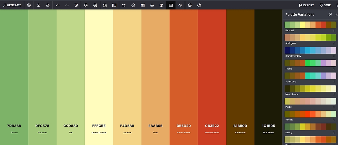
To use this feature:
- Click the Palette Variations icon (seventeenth from the left on the toolbar).
- The panel opens, showing your original palette alongside a selection of variations.
- You can generate variations in the following styles:
- Original: Your current palette (the starting point).
- Remixed: A fresh take on your palette with the same base colours but rearranged or slightly adjusted.
- Analogous: A palette based on colours adjacent to your original colours on the colour wheel. Creates harmonious, low-contrast schemes.
- Complementary: A palette based on colours opposite your original colours on the colour wheel. Creates high-contrast, vibrant combinations.
- Triadic: A palette using three colours evenly spaced around the colour wheel, derived from your original colours.
- Split Comp: A split-complementary scheme using your base colour plus the two colours adjacent to its complement.
- Monochrome: A palette of different shades and tints of a single base colour from your original palette.
- Pastel: A softer, lighter version of your palette with reduced saturation and increased brightness.
- Vibrant: An intensified version of your palette with increased saturation for a more energetic feel.
- Moody: A darker, more subdued version of your palette with reduced brightness and increased depth.
- Warm: A warmer-toned version of your palette, shifting colours toward reds, oranges, and yellows.
- Cool: A cooler-toned version of your palette, shifting colours toward blues, purples, and greens.
- Muted: A desaturated version of your palette with reduced colour intensity for a more subtle effect.
- Shades & Tints: A palette showing both dark shades and light tints of your base colours, providing a full tonal range.
- Click on any variation to apply it as your current palette.
Each variation maintains the core character of your original palette while exploring different colour relationships and moods. This feature is invaluable when:
- You like your current palette but want to explore alternative options
- You need to adapt a palette for different seasons, audiences, or brand guidelines
- You want to see how your palette would look in different styles without manually adjusting each colour
- You need inspiration for expanding or refining your colour scheme
Visualizer
The eighteenth icon on the top toolbar is the Visualizer. This feature shows you how your colour palette will look in real-world design contexts, helping you see how your colours work together in practical applications before you start designing.
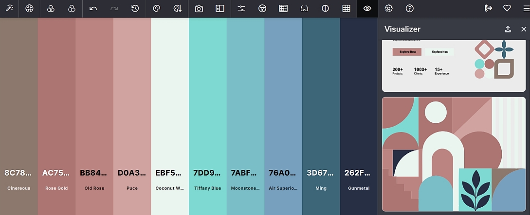
To use this feature:
- Click the Visualizer icon (eighteenth from the left on the toolbar).
- The panel opens, showing previews of your palette applied to different design contexts.
- You can view your palette in the following contexts:
- UI/Web: See how your palette looks in a user interface or website layout, including buttons, cards, navigation bars, and other common UI elements.
- Illustration: Preview your palette in an illustrative scene, showing how the colours work together in artwork and graphics.
- Branding: See how your palette appears in brand applications including logos, stationery, and marketing materials.
- Typography: View your palette applied to typographic layouts, showing how text and background colours interact in reading contexts.
- Each context provides a realistic preview that updates in real-time as you make changes to your palette.
- Upload SVG: You can upload your own SVG (Scalable Vector Graphics) file to see how your palette applies to your own designs. Click the upload area and select an SVG file from your computer. Colorik will apply your palette colours to the uploaded SVG, giving you a personalised preview of how your colours work with your own artwork or designs.
This feature is invaluable when:
- You want to see how your palette will look in a real design before committing to it
- You need to test if your colours work well together in different contexts
- You want to present your palette to clients with contextual visual examples
- You're designing a UI and need to see how your colours look on buttons, cards, and other elements
- You want to preview your palette on your own designs using the SVG upload feature
Color Blending Settings
The nineteenth icon on the top toolbar is Color Blending Settings. This feature controls how colours mix when Colorik generates gradients or adds new colours to your palette. The blending mode affects the overall feel and harmony of your colour combinations.
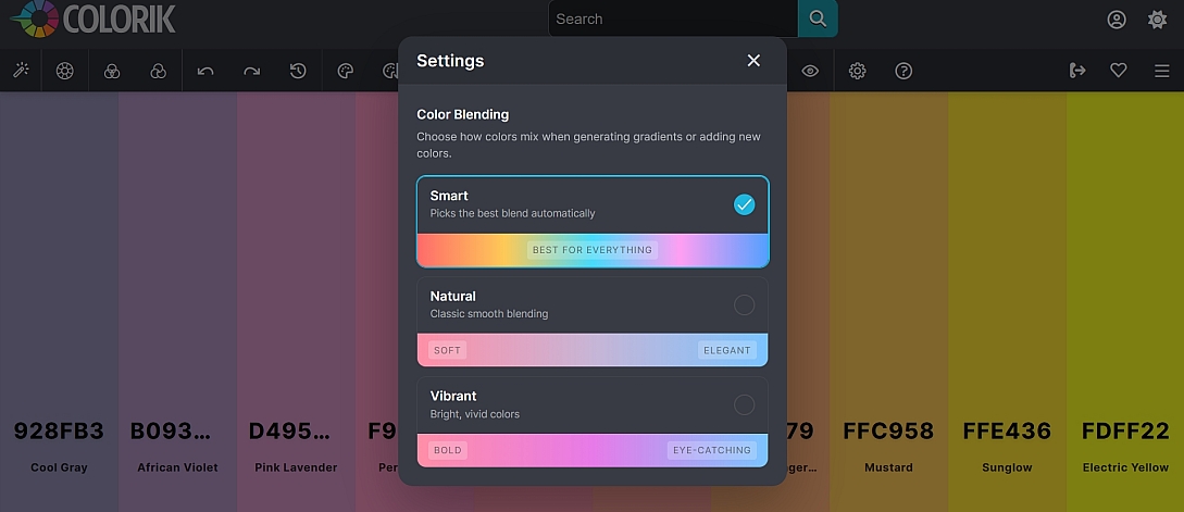
To use this feature:
- Click the Color Blending Settings icon (nineteenth from the left on the toolbar).
- The panel opens, showing the available blending modes.
- Select one of the following options:
- Smart: The default setting. This mode intelligently selects the best blending approach for your specific colours and context. It's recommended for most use cases and works well across all types of palettes.
- Natural: Creates soft, elegant colour transitions with a gentle, organic feel. Ideal for designs that require subtlety, sophistication, or a more restrained colour palette. Perfect for nature-inspired designs, wellness brands, and elegant UI.
- Vibrant: Produces bold, eye-catching colour mixes with high saturation and energy. Perfect for designs that need to grab attention, such as marketing materials, event branding, or youthful, energetic products.
- Your selection applies immediately to:
- Gradient generation: When you use the Gradient Builder (icon 14), the blending mode affects how colours transition between each other.
- Adding new colours: When you add colours to your palette (using the + icon between swatches), the blending mode influences how the new colour relates to existing colours.
This feature is useful when:
- You want to fine-tune how your colours interact with each other
- You're creating a gradient and want a specific type of colour transition
- You want to ensure new colours added to your palette blend harmoniously
- You're working on a project that requires a specific aesthetic (soft, elegant, or bold)
Experiment with different blending modes to see how they affect your palette. The Smart mode is a great starting point, and you can switch to Natural or Vibrant to achieve a specific mood.
Help
The twentieth icon on the top toolbar is Help. This opens a reference panel containing a quick guide to Colorik's core features and a complete list of keyboard shortcuts. It's your go-to resource when you need a reminder of how something works.
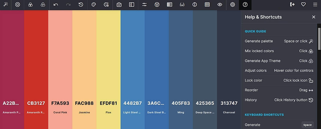
To use this feature:
- Click the Help icon (twentieth from the left on the toolbar).
- The panel opens, displaying two sections:
- Quick Guide: A concise overview of essential Colorik features, including how to generate palettes, mix locked colours, adjust colours, lock/unlock, reorder, and access history.
- Keyboard Shortcuts: A complete reference of all available keyboard shortcuts, organised by function (Generation, Locking, Schemes, Sorting, etc.).
- Browse through the quick guide to familiarise yourself with Colorik's core features.
- Refer to the keyboard shortcuts section to learn time-saving shortcuts for common actions.
This feature is useful when:
- You're a first-time user and want a quick overview of what Colorik can do
- You've forgotten how to perform a specific action
- You want to learn keyboard shortcuts to speed up your workflow
- You need a quick reference while working
Export Palette & Quick Actions
Below the top toolbar, you'll find the Export Palette section with three separate export icons and a comprehensive set of Quick Actions. This is where you can share, export, and use your palette across different platforms, codebases, and design tools.
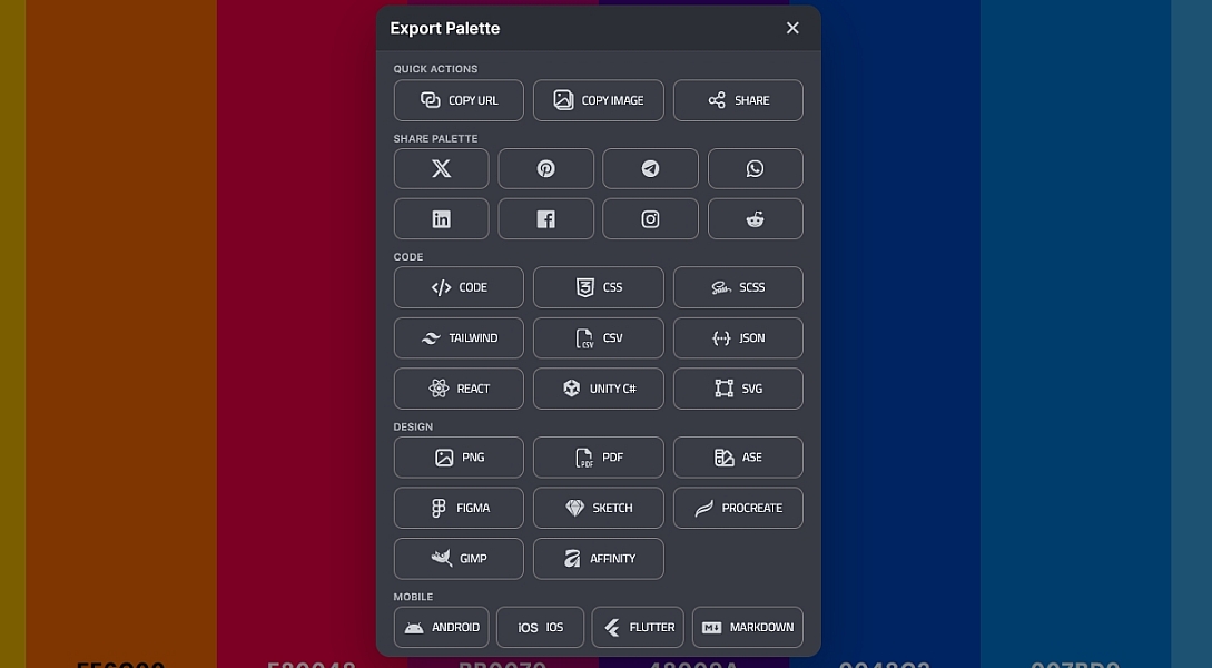
Quick Actions
These are the first three options available for quickly sharing or copying your palette:
- Copy URL: Copies a shareable link to your current palette to your clipboard. Perfect for sharing with colleagues or clients.
- Copy Image: Copies the palette as an image to your clipboard. Ideal for pasting directly into presentations, documents, or design discussions.
- Share: Opens a sharing menu to post your palette directly to social media platforms:
- Twitter (X)
- Telegram
Code Formats
Export your palette as code for web and app development. These formats are ideal for developers who need to integrate the palette directly into their projects:
- HTML: HTML/CSS code with colour swatches
- CSS: CSS variables and colour definitions
- SCSS: SCSS variables for Sass projects
- Tailwind: Tailwind CSS configuration format
- CSV: Comma-separated values for spreadsheets and data import
- JSON: JSON format for APIs and data exchange
- React: React component code with theme variables
- Unity C#: C# colour definitions for Unity game development
- SVG: Scalable Vector Graphics format
Design Formats
Export your palette for use in professional design tools and creative applications:
- PNG: Portable Network Graphics image format
- PDF: Portable Document Format for printing and presentations
- ASE (Pro only): Adobe Swatch Exchange format for Adobe Creative Cloud applications
- Figma: Import directly into Figma design files
- Sketch: Import into Sketch design files
- Procreate: Import into Procreate for digital illustration
- GIMP: Import into GIMP (GNU Image Manipulation Program)
- Affinity: Import into Affinity Designer/Photo
Mobile Formats
Export your palette for mobile app development across different platforms:
- Android: Android XML colour resources
- iOS: iOS colour definitions (UIColor/Color)
- Flutter: Flutter Dart colour definitions
- Markdown: Markdown format for documentation
To use any of these export options:
- Click the relevant category icon (Quick Actions, Code, Design, or Mobile).
- Select the specific format you need from the dropdown or list.
- Copy the generated code, share or download the file as appropriate.
Save Palettes
The second icon at the end of the toolbar is the Save Palette feature. This allows you to save your current palette to your Colorik library for future reference and organisation. Note: A login is required to use this feature.
To save a palette:
- Click the Save Palette icon (second from the right on the toolbar).
- A dialog box opens where you can add details to organise your saved palette:
- Name: Give your palette a descriptive name (e.g., "Summer Brand 2024", "Minimalist UI").
- Description: Add a brief description of the palette's purpose, inspiration, or use case.
- Tags: Add keywords to help you find the palette later (e.g., "branding", "web", "summer", "minimal").
- Categories: Assign the palette to one or more categories for better organisation.
- Color Families: Save colour swatches with associated colour families for reference.
- Custom Books: Organise your saved colours into custom books or collections.
- Click Save to store the palette in your library.
Palette Library
Once you've saved palettes, you can access your Palette Library where all your saved palettes are stored. The library offers powerful organisation and search features:
- Sorting Options: Sort your saved palettes by:
- Styles: Sort by the style or mood of the palette (e.g., Modern, Vintage, Minimal).
- Colours: Sort by the dominant colours or colour families in the palette.
- Categories: Sort by the categories you've assigned to your palettes.
- Contrast: Sort by contrast level (high, medium, low).
- Discover Palettes: Browse and discover palettes saved by other users, filtered by:
- Styles: Find palettes by visual style.
- Colours: Search for palettes containing specific colours.
- Categories: Browse palettes by category.
- Contrast: Find palettes with specific contrast characteristics.
- Collections: Create collections to group related palettes together. You can:
- Name your collection: Give each collection a descriptive name (e.g., "Client Projects", "UI Designs", "Seasonal Palettes").
- Add palettes to collections: Organise your saved palettes into these collections for easy access.
This feature is invaluable when:
- You want to build a library of colour palettes for future reference
- You need to organise palettes by client, project, or theme
- You want to share palettes with team members or clients
- You need to quickly find a palette you created previously
- You want to discover new palettes created by other designers for inspiration
Working with Individual Colours
Each colour in your palette has its own set of interactive controls. Hover your mouse over any colour swatch to reveal its options.
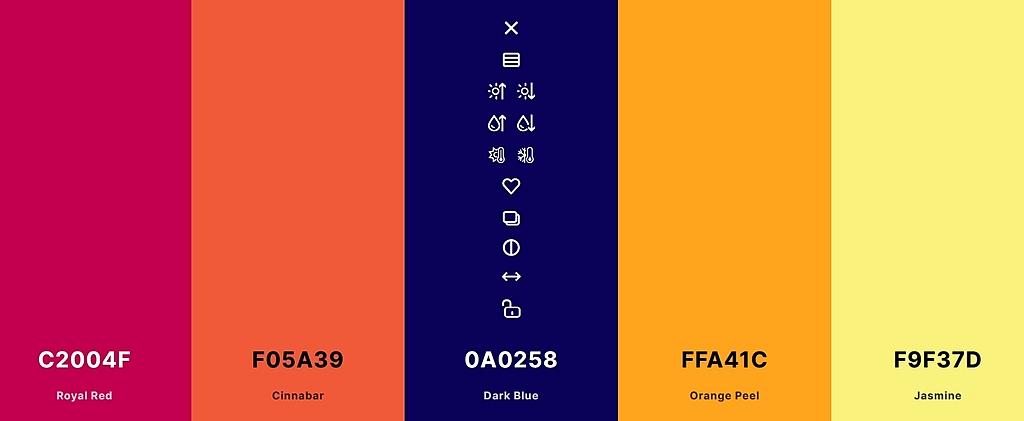
- Lock / Unlock a Colour: Click the lock icon on a colour swatch to lock it. A locked colour will not change when you generate a new palette. This is essential for preserving a key colour while experimenting with others. Click the lock again to unlock it. (Note that the Adjust Palette sliders affect locked and unlocked colours equally, as they apply globally to the entire palette.)
- Reorder Colours: You can drag and drop any colour swatch to a new position within the palette. This helps you organise colours by importance or sequence. (Note that using the Sort Colors icon will override any manual reordering.)
- Individual Colour Edit: Clicking the colour's hex code opens the color picker for that colour. You can use the color picker to select a new colour and copy the hex value directly from there.
- Show Shades: Click to view and select from a range of shades and tints derived from the selected colour. This is useful for quickly finding lighter or darker variations without manually adjusting sliders.
- Lighter: Click to lighten the colour by a set increment. Repeated clicks will progressively lighten the colour.
- Darker: Click to darken the colour by a set increment. Repeated clicks will progressively darken the colour.
- Saturate: Click to increase the saturation of the colour, making it more vivid and intense.
- Desaturate: Click to decrease the saturation of the colour, making it more muted and subdued.
- Warmer: Click to shift the colour toward warmer tones (reds, oranges, and yellows).
- Cooler: Click to shift the colour toward cooler tones (blues, purples, and greens).
- Save Color: Click to save the individual colour to your library for future use. (Login required.)
- Copy Hex: Click to copy the colour's hexadecimal value directly to your clipboard.
- Check Contrast: Click to check the contrast ratio of the individual colour against both white and black text. This helps you determine whether the colour is suitable for text or background use.
Colour Codes and Copying Colours
Every colour swatch displays its HEX code prominently. To copy a colour value, either click the copy hex icon on each individual colour or follow these steps:
- Click directly on the HEX code text (e.g., #92959e) displayed on the swatch to open the color picker.
- The code is automatically selected. Click the "Copy Hex" button to add it to your clipboard for use in other software.
For additional colour formats, open the Quick View panel using the View Palette icon (eighth on the toolbar) as described above.
Keyboard Shortcuts
Using keyboard shortcuts is the fastest way to navigate Colorik. Below is a complete list of confirmed shortcuts, also available in the Help panel.
| Action | Shortcut |
|---|---|
| Generate New Palette | Space |
| Mix Locked Colors | 0 |
| Undo | Ctrl + Z |
| Redo | Ctrl + Y |
| Unlock All Colors | U |
| Lock All Colors | Ctrl + Shift + L |
| Lock/Unlock Color 1 | Ctrl + 1 |
| Lock/Unlock Color 2 | Ctrl + 2 |
| Lock/Unlock Color 3 | Ctrl + 3 |
| Lock/Unlock Color 4 | Ctrl + 4 |
| Lock/Unlock Color 5 | Ctrl + 5 |
| Lock/Unlock Color 6 | Ctrl + 6 |
| Lock/Unlock Color 7 | Ctrl + 7 |
| Lock/Unlock Color 8 | Ctrl + 8 |
| Lock/Unlock Color 9 | Ctrl + 9 |
| Lock/Unlock Color 10 | Ctrl + 0 |
| Analogous Scheme | A |
| Complementary Scheme | C |
| Split Complementary Scheme | K |
| Triadic Scheme | T |
| Square Scheme | Q |
| Tetradic Scheme | E |
| Monochromatic Scheme | M |
| Muted Scheme | G |
| Random Scheme | R |
| Vibrant Scheme | V |
| Sort: Lightness | L |
| Sort: Hue | H |
| Sort: Saturation | S |
| Sort: Temperature | P |
Creating a Palette Step by Step
Here is a practical workflow for creating a palette from scratch:
- Open Colorik Generate. Navigate to colorik.com/generate.
- Start with the default palette. You'll see an automatic 5-colour scheme.
- Adjust the number of colours. Use the plus (+) icons between swatches to add colours, or the X on a swatch to delete it. You can add up to 10 colours total.
- Choose a generation method. Click the second icon on the top toolbar to select a colour scheme method (Auto, Analogous, Complementary, Triadic, etc.) to guide your palette creation.
- Generate new combinations. Press the Space bar or click the Generate icon to cycle through palettes until you find a base you like.
- Lock key colours. Click the lock icon on colours you want to keep. Then, press Space again to generate new variations while preserving your locked colours.
- Mix locked colours (optional). Click the third icon (Mix Locked Colours) or press 0 to blend your locked colours with others for harmonious variations.
- Generate an app theme (optional). Click the fourth icon to create a complete UI colour system from your locked colours, including success, warning, danger, and other state colours.
- Extract colours from an image (optional). Click the tenth icon (Pick Colors from Image), drag and drop, or browse for an image. Use the slider to explore different colour variations, or drag the magnifying colour picker circles manually over the image to pick specific colours from precise locations. Refine using Natural, Vivid, or Vibrant buttons before applying.
- Create a collage (optional). Click the eleventh icon (Make a Collage) and upload an image. Choose from layout options (strips, stacks, circles, shapes, creative layouts) and aspect ratios (square, portrait, landscape, horizontal). Use the slider to explore different colour variations from the image, or drag the magnifying colour picker circles manually for precise colour selection.
- Fine-tune the entire palette. Click the twelfth icon (Adjust Palette) and use the Hue, Saturation, Brightness, and Temperature sliders. Watch the before and after preview to see how your changes affect the palette before applying.
- Edit individual colours precisely. Click the thirteenth icon (Color Wheel) to open the interactive colour wheel. Drag the colour picker circles to adjust Hue and Saturation, and use the Lightness slider to fine-tune individual colours.
- Create a gradient (optional). Click the fourteenth icon (Gradient Builder) to generate a CSS gradient from your palette. Adjust the angle using the quick angle buttons or slider, reverse the colours if desired, and copy the CSS code or download as JPG (free), SVG (PRO), or PNG (PRO).
- Check accessibility with Color Blindness simulation. Click the fifteenth icon (Color Blindness) to preview how your palette appears to users with different types of colour vision deficiency. Review each type (Protanopia, Deuteranopia, Tritanopia, Protanomaly, Deuteranomaly, Tritanomaly, Achromatopsia) and adjust your palette if any colours become indistinguishable.
- Check contrast for each colour. Click the sixteenth icon (Contrast Checker) to verify that your colour combinations meet accessibility standards. Ensure that AA or AAA ratings are achieved for all text and background combinations.
- Explore variations (optional). Click the seventeenth icon (Palette Variations) to see alternative versions of your palette in different styles (Remixed, Analogous, Complementary, Triadic, Monochrome, Pastel, Vibrant, Moody, Warm, Cool, Muted, Shades & Tints). Apply any variation that better suits your needs.
- Preview your palette in context. Click the eighteenth icon (Visualizer) to see how your palette looks in UI/Web, Illustration, Branding, and Typography contexts. Upload your own SVG to see how your palette applies to your own designs.
- Adjust blending settings (optional). Click the nineteenth icon (Color Blending Settings) and choose Smart, Natural, or Vibrant to control how colours mix when generating gradients or adding new colours.
- Sort the palette. Click the ninth icon (Sort Colors) and choose an order that suits your project, or use the keyboard shortcuts (L, H, S, P).
- Copy colours. Use the copy hex icon on each swatch, or click the HEX code to open the color picker and click the "Copy Hex" button. For additional formats, open the Quick View panel (eighth icon) and click on a colour name to cycle through available formats (Name, Hex, RGB, HSL, HSB, CMYK, LAB), then use the copy icon next to each value.
- Export or share. Use the Export Palette section below the toolbar to copy your palette as a URL or image, share it on social media, or export it in your preferred format:
- Quick Actions: Copy URL, Copy Image, or Share on social media (Twitter, Pinterest, Telegram, WhatsApp, LinkedIn, Facebook, Instagram, Reddit).
- Code: HTML, CSS, SCSS, Tailwind, CSV, JSON, React, Unity C#, SVG.
- Design: PNG, PDF, ASE (Pro), Figma, Sketch, Procreate, GIMP, Affinity.
- Mobile: Android, iOS, Flutter, Markdown.
- Save your palette (login required). Click the second icon from the right (Save Palette), give your palette a Name, Description, Tags, and Categories. Create Collections to organise related palettes. Access your saved palettes in your Library where you can sort by Styles, Colours, Categories, or Contrast, and discover palettes from other users.
Tips for Using Colorik
- Lock first, then generate. Locking a colour and pressing Space is the most efficient way to explore variations around a core brand colour.
- Use Generation Methods. If you're unsure where to start, try Auto for a balanced approach, Monochromatic for a safe, cohesive scheme, or Complementary for maximum contrast. The method you select will guide every subsequent generation until you change it.
- Mix locked colours for subtle variations. Once you have a key colour locked, use the Mix Locked Colours feature to generate harmonious alternatives while keeping your primary colour fixed.
- Generate app themes for UI design. If you're designing a website or application, use the Generate App Theme feature to instantly create a complete colour system with success, warning, danger, and info states.
- Use Undo/Redo freely. Don't be afraid to experiment. The Undo and Redo buttons (or Ctrl+Z and Ctrl+Y) let you safely explore different options.
- Use Palette History. Don't be afraid to generate many palettes. If you lose one you liked, the History button (seventh icon) is your safety net.
- Sort for order. After finalising colours, use the Sort Colors menu or shortcuts to arrange them in a logical sequence (e.g., by lightness for a clear gradient, or warm to cool for a temperature-based design).
- Extract from images for inspiration. Use the Pick Colors from Image feature to build palettes from photographs, existing designs, or nature. Drag the slider to explore different variations, and use the magnifying colour picker circles to select precise colours from specific areas of the image.
- Create collages for presentations. Use the Make a Collage feature to create stunning visual presentations of your palette alongside reference imagery. Experiment with the slider for different colour variations and use the magnifying colour picker circles for precise colour selection. Choose layouts and aspect ratios that match your intended use: from Instagram posts to client presentations.
- Fine-tune with Adjust Palette. Use the Hue, Saturation, Brightness, and Temperature sliders to make global adjustments to your palette. The before and after preview helps you see exactly what effect your changes will have before applying them.
- Precise individual editing with Color Wheel. For pixel-perfect control over individual colours, use the Color Wheel. Drag the colour picker circles to adjust Hue and Saturation, and use the Lightness slider for precise brightness control. This is especially useful for matching exact brand colours.
- Build gradients from your palette. Use the Gradient Builder to quickly generate CSS gradients. Experiment with the quick angle buttons or use the slider for specific angles. The live previews (Button, Card, Background) help you see how the gradient will look in real UI contexts.
- Check accessibility with Color Blindness simulator. Always review your palette through the Color Blindness simulator, especially for public-facing designs. If colours become indistinguishable under any type, consider adding additional visual cues or adjusting your colour choices.
- Always check contrast. Use the Contrast Checker (sixteenth icon) to verify that your text and background colour combinations meet WCAG accessibility standards. Aim for AA or AAA ratings.
- Explore Palette Variations. If you like your palette but want to see different interpretations, use the Palette Variations feature. It's a quick way to explore styles like Pastel, Moody, Warm, Cool, or Shades & Tints without starting over.
- Preview with Visualizer. Use the Visualizer to see how your palette performs in real design contexts before you start building. Upload your own SVG to test your palette on your own designs.
- Adjust blending settings for mood. Experiment with Smart, Natural, and Vibrant blending modes to see how they affect the interaction between colours in gradients and when adding new colours.
- Use the Help panel. If you ever get stuck or forget a shortcut, click the Help icon (twentieth) for a quick reference guide and complete keyboard shortcuts list.
- Export for your workflow. Whether you're a developer, designer, or content creator, use the Export Palette section to get your colours in the format that works best for you: from CSS code to Figma files to social media sharing.
- Save and organise your palettes. Create a library of your best palettes by saving them with descriptive names, tags, and categories. Use Collections to group related palettes for easy access.
- Discover inspiration. Browse the Discover section in your Palette Library to find palettes saved by other users, filtered by styles, colours, categories, or contrast.
Frequently Asked Questions
How many colours does Colorik generate by default?
Colorik generates a palette with 5 colours by default.
Can I change the number of colours?
Yes. You can click the plus (+) icon between swatches to add a colour, or click the X on a swatch to delete it. The palette can contain up to 10 colours.
What is the maximum number of colours?
The maximum number of colours in a palette is 10.
How do I generate a new palette?
You can generate a new palette by clicking the Generate icon on the top toolbar or by pressing the Space bar on your keyboard.
What are the Generation Methods?
The Generation Methods include Auto (default), Analogous, Complementary, Split Complementary, Triadic, Monochromatic, Random, Muted, Pastel and Vibrant. Square and Tetradic are available in the PRO version.
What does Mix Locked Colours do?
Mix Locked Colours (third icon) generates new colours by blending your locked colours with other colours in the palette. Use it to create harmonious variations while keeping your core colours fixed.
What does Generate App Theme do?
Generate App Theme (fourth icon) creates a complete application colour system from your locked colours, including colours for success, warning, danger, info, backgrounds, and text.
What do the Undo and Redo buttons do?
Undo (fifth icon) reverses your last action. Redo (sixth icon) re-applies an action you previously undid. Use them to safely experiment or correct mistakes.
What is Palette History?
Palette History (seventh icon) stores all the palettes you've generated. You can click any palette in the history to restore it as your current palette.
What is View Palette?
View Palette (eighth icon) opens the Quick View panel, where you can see and copy colour values in multiple formats (HEX, RGB, HSL, HSB, CMYK, LAB) and view closest colour matches from COPIC, PRISMACOLOR, PANTONE, RAL, and HKS systems.
What does Sort Colors do?
Sort Colors (ninth icon) reorders your palette according to different criteria: Default (Hue), Light to Dark, Dark to Light, Vibrant to Muted, Muted to Vibrant, Warm to Cool, or Cool to Warm. Keyboard shortcuts are also available (L, H, S, P).
What does Pick Colors from Image do?
Pick Colors from Image (tenth icon) extracts a 10-colour palette from an uploaded image (drag and drop or browse). You can refine the results using the slider to explore different colour variations, or drag the magnifying colour picker circles manually over the image to pick specific colours from precise locations. Natural, Vivid, and Vibrant buttons are also available.
What does Make a Collage do?
Make a Collage (eleventh icon) creates a visual collage combining your chosen image with your colour palette. You can choose from multiple layout options (strips, stacks, circles, shapes, creative layouts) and aspect ratios (square, portrait, landscape, horizontal) to suit different uses. The slider lets you explore different colour variations from the image, and the magnifying colour picker circles allow manual colour selection from specific image areas. Natural, Vivid, and Vibrant palette options are also available.
What does Adjust Palette do?
Adjust Palette (twelfth icon) opens a panel with Hue, Saturation, Brightness, and Temperature sliders that apply global changes to your entire palette. A before and after preview shows you the effect of your adjustments before you apply them.
What does the Color Wheel do?
The Color Wheel (thirteenth icon) opens an interactive colour wheel where you can edit individual colours with precision. Drag the colour picker circles to adjust Hue and Saturation, and use the Lightness slider to control brightness. This gives you precise control over individual colours in your palette.
What does the Gradient Builder do?
The Gradient Builder (fourteenth icon) creates CSS gradients from your palette colours. It includes a Reverse Colours button, 8 quick angle presets, and an angle slider for precise control. A CSS code box with a copy icon lets you copy the code, and 3 live previews (Button, Card, Background) show how the gradient will look. You can download the gradient as JPG (free), SVG (PRO), or PNG (PRO).
What does the Color Blindness simulator do?
The Color Blindness simulator (fifteenth icon) shows before and after previews of your palette for different types of colour vision deficiency: Protanopia, Deuteranopia, Tritanopia, Protanomaly, Deuteranomaly, Tritanomaly, and Achromatopsia. It helps you design accessible palettes that work for colour-blind users.
What does the Contrast Checker do?
The Contrast Checker (sixteenth icon) checks the contrast ratio of each colour in your palette against both white and black text. For each colour, it displays the contrast ratio (e.g., 13.1:1) and indicates whether it passes accessibility standards for white text and black text separately. The tool uses WCAG guidelines with ratings for AA (>=4.5), AA large text (>=3.0), AAA (>=7.0), and Fail (<3.0) to help you ensure your designs are readable and accessible.
What does Palette Variations do?
Palette Variations (seventeenth icon) generates alternative versions of your palette in different styles: Original, Remixed, Analogous, Complementary, Triadic, Split Comp, Monochrome, Pastel, Vibrant, Moody, Warm, Cool, Muted, and Shades & Tints. It's a quick way to explore different moods and colour relationships.
What does the Visualizer do?
The Visualizer (eighteenth icon) shows previews of your palette in real-world design contexts: UI/Web, Illustration, Branding, and Typography. You can also upload your own SVG to see how your palette applies to your own designs.
What do Color Blending Settings do?
Color Blending Settings (nineteenth icon) controls how colours mix when generating gradients or adding new colours. Options include Smart (best for everything), Natural (soft and elegant), and Vibrant (bold and eye-catching).
What does the Help icon do?
The Help icon (twentieth) opens a reference panel with a Quick Guide to Colorik's core features and a complete list of Keyboard Shortcuts.
What export formats are available?
Colorik offers a wide range of export formats:
- Quick Actions: Copy URL, Copy Image, Share (Twitter, Pinterest, Telegram, WhatsApp, LinkedIn, Facebook, Instagram, Reddit).
- Code: HTML, CSS, SCSS, Tailwind, CSV, JSON, React, Unity C#, SVG.
- Design: PNG, PDF, ASE (Pro), Figma, Sketch, Procreate, GIMP, Affinity.
- Mobile: Android, iOS, Flutter, Markdown.
How do I save a palette?
Click the Save Palette icon (second from the right on the toolbar). A login is required. Add a Name, Description, Tags, and Categories to organise your saved palette. You can also save colour swatches with colour families and custom books.
How do I organise my saved palettes?
In your Palette Library, you can sort saved palettes by Styles, Colours, Categories, or Contrast. You can also create Collections with custom names to group related palettes together.
Can I discover palettes from other users?
Yes. The Discover section in your Palette Library lets you browse palettes from other users, filtered by Styles, Colours, Categories, or Contrast.
How do I use the colour values?
Colour values are displayed as HEX codes on each swatch. Use the copy hex icon on each colour, or click the code to open the colour picker and click "Copy Hex". For additional formats, open the Quick View panel (eighth icon). Click on a colour name within the panel to cycle through the available display formats (Name, Hex, RGB, HSL, HSB, CMYK, LAB), then use the copy icon next to each value.
Can I create smaller palettes?
Yes, you can reduce the palette size by clicking the X on any swatch to delete it.
You're now ready to start creating beautiful, accessible colour palettes with Colorik. Begin by visiting the Generate page, play with the Space bar to find inspiring combinations, and use the locking, sorting, and adjustment tools to refine your scheme.
With the Color Blindness simulator, Contrast Checker, Palette Variations, Visualizer, Color Blending Settings, Help panel, comprehensive Export options, and powerful Save Palette features, you have everything you need to create, test, organise, export, and share inclusive, readable, versatile, and perfectly crafted palettes for any project.
Whether you're a beginner or a seasoned designer, Colorik's interface makes colour exploration both simple and powerful.
Recent Posts



0.074